|
| Group |
Round |
C/R |
Comment |
Date |
Image |
| 93 |
Jul 21 |
Reply |
It looks to me like it would be sketchy as to whether those edits were permitted. Details may be found on the Photo Travel Division Educational Resources page: https://psa-photo.org/useruploads/files/ptd_-_photo_travel/Editing-Techniques-in-Photo-Travel.pdf
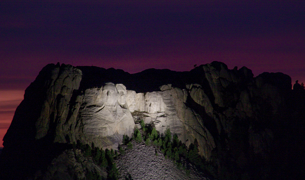
As for how the image would fare, I have to start off by saying I'm pretty inexperienced in regard to competition and exhibition. I'm currently taking the "Image Evaluation" course, which focuses on evaluating one's own images (not on critiquing others'), and, were this my image, I'd assess it as not strong on impact, and marred by the lack of detail in the facial features in the sculpture. My instructor in that course has really worked to direct my attention to matters of impact, and facet of my work that I find hard to improve. (I'm sorry to report that the course is being discontinued.) |
Jul 20th |
| 93 |
Jul 21 |
Reply |
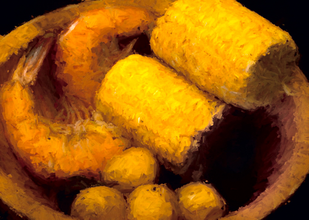
Well, sorry to say, it looks like there's just not enough data there for that poor potato to be recognizable as one. Tried taking it over into the LAB color space to edit it (not for the faint of heart) and had to impact the overall color scheme a bit, and even then with limited success. |
Jul 19th |
 |
| 93 |
Jul 21 |
Comment |
|
Jul 19th |
| 93 |
Jul 21 |
Comment |
Darcy, my apologies! I only just realized that I'd never actually posted my comments. It's a striking image, and well done overall. You weren't helped at all by the harsh artificial lighting, but you did well in spite of it. I really like the very late twilight purples, too. the framing works very well, placing the sculpture slightly off center. My initial thoughts were that there was too much extraneous mountain on the right, but on further reflection I think it serves to set the story in context. So often we see only the faces, and don't grasp the scale of the setting.
The next suggestions reflect more a matter of my personal taste than a criticism of the image: I think the image benefits from bringing up the exposure just a small amount, the shadows quite a bit, and dropping the highlights. I also think it benefits from a radial filter over the sculpture, lowering the contrast, and the highlights and white a bit further, and (maybe not so obvious) dropping the blacks, too. Another similarly placed radial to bump texture and clarity (not too much!), and reduce the dehaze, helps restore some of the three-dimensionality in the faces lost to the harsh lighting. |
Jul 19th |
 |
| 93 |
Jul 21 |
Reply |
Thanks, Ed, very gratifying feedback from you. Of course, one can't take credit for the movements of the sun, planets, and moon ... the image would have been nothing without that ... |
Jul 19th |
| 93 |
Jul 21 |
Reply |
Thanks, Michael. It really is pretty straightforwwrd, and I find it a pretty intuitive approach, especially when the adjustments I'm making are of a kind that I'm quite familiar with. When I first started working with Lightroom CC Classic, I frequently found myself thinking: I wish I could brush in ... (fill in the blank with whatever, hue, specific color saturation, split toning, etc.) ... things that can't be done with filters ... the history brush (combined with ACR) gives one *exactly* those capabilities. |
Jul 18th |
| 93 |
Jul 21 |
Comment |
Very evocative, Paul. The warm tones set a mood of pleasure and comfort. The very tight framing tells me this is an intimate story. The filter effect reminds me of Renoir and his group portrait scenes. There is a cohesion of effects that works very well. If I could quible for a moment, I'd suggest that a little cool color might give the eye some relief from all that heat. If I get a moment, I'll try fiddling with tinting the deep shadows with some blue or purple. If I like the effect, I'll post with info on the specific steps. |
Jul 8th |
| 93 |
Jul 21 |
Comment |
Very nice image, showcasing two different kinds of birds in the same shot. Are you *certain* that the egret detail is unrecoverable? Looks like theres quite a bit there ... perhaps fiddling locally with texture and/or clarity? I think the image justies the effort, if you're so inclined.
I think it was a good strategy to sharpen the heron; it does "pull" the heron forward. If I may make a suggestion, though: in the real-world, if you got the bird sharp, then you'd expect the rocks and grasses a mere foot further away to by fairly sharp, too.
So I'd suggest, maybe, that you try painting in, with a soft brush, very low opacity and flow, a little sharpening applied to the area in back of the heron. Very light sharpening, though, not as much as for the heron.
I think of this as "dodging and burning" with sharpness instead of luminosity. (I also find that "burning" a warmer color temperature and "dodging" a cooler temperature, if done subtly, helps to great dimensionality.) |
Jul 4th |
| 93 |
Jul 21 |
Reply |
Thank you, Darcy! It really always comes down to, first, asking myself "what do I need to fix?"; second, "how do I fix it?"; next, do what I *think* will fix it; and lastly, ask "did that fix it?" ... and if not, I try to make a mental note as to what it did instead, so I have that tool next time. And Google serch and YouTube help a lot, too. |
Jul 4th |
| 93 |
Jul 21 |
Reply |
Not your mistake, Ed! 'Twas mine! Thanks, though ... |
Jul 2nd |
| 93 |
Jul 21 |
Reply |
And I suppose those kayakers lacked the consideration to stay put for a few minutes while you worked the scene? Sigh ... |
Jul 2nd |
| 93 |
Jul 21 |
Comment |
Oh, and kudos for the discipline you've set yourself. I fear that at my present rate, I've been hard pressed recently to come up each month with two images I'd consider worth bothering other folks with. I'll keep trying though. |
Jul 2nd |
| 93 |
Jul 21 |
Comment |
Nice scene and an attractice story; makes one want to do the same.
I find the tree on the RHS disturbing, even though it does provide some balanace to the dark area on the LHS. I'm not at my own computer at the moment, so I'm not able to experiment, but I have a feeling that cropping off the right side to an approximately square crop, or maybe even a vertical 4x5 crop, would let the kayakers balanace the trees on the left, and the sinuous lines in the water would assume more importance. |
Jul 2nd |
| 93 |
Jul 21 |
Comment |
Very interesting image, Jerry. Kudos for noticing it. And for noticing something that can actual work in this medium. I often "see" amazing ordinary things, but find that they don't look half as interesting once I get back to Lightroom.
Do you experiment with "creative cropping?" I find that Burly's oddly shaped mass in the lower portion of the frame competes for attention with his very expression "face" in the upper portion. |
Jul 2nd |
7 comments - 7 replies for Group 93
|
7 comments - 7 replies Total
|


