|
| Group |
Round |
C/R |
Comment |
Date |
Image |
| 93 |
Mar 21 |
Reply |
And FWIW, if you have the pixels and are into that sort of thing, the "wavy waves" would make (IMNSHO) a nice abtract. |
Mar 24th |
| 93 |
Mar 21 |
Comment |
OOPS! I think it's more important to say something in a way that others can follow than in a way they like. Sorry 'bout that. Hopefully I can do better here:
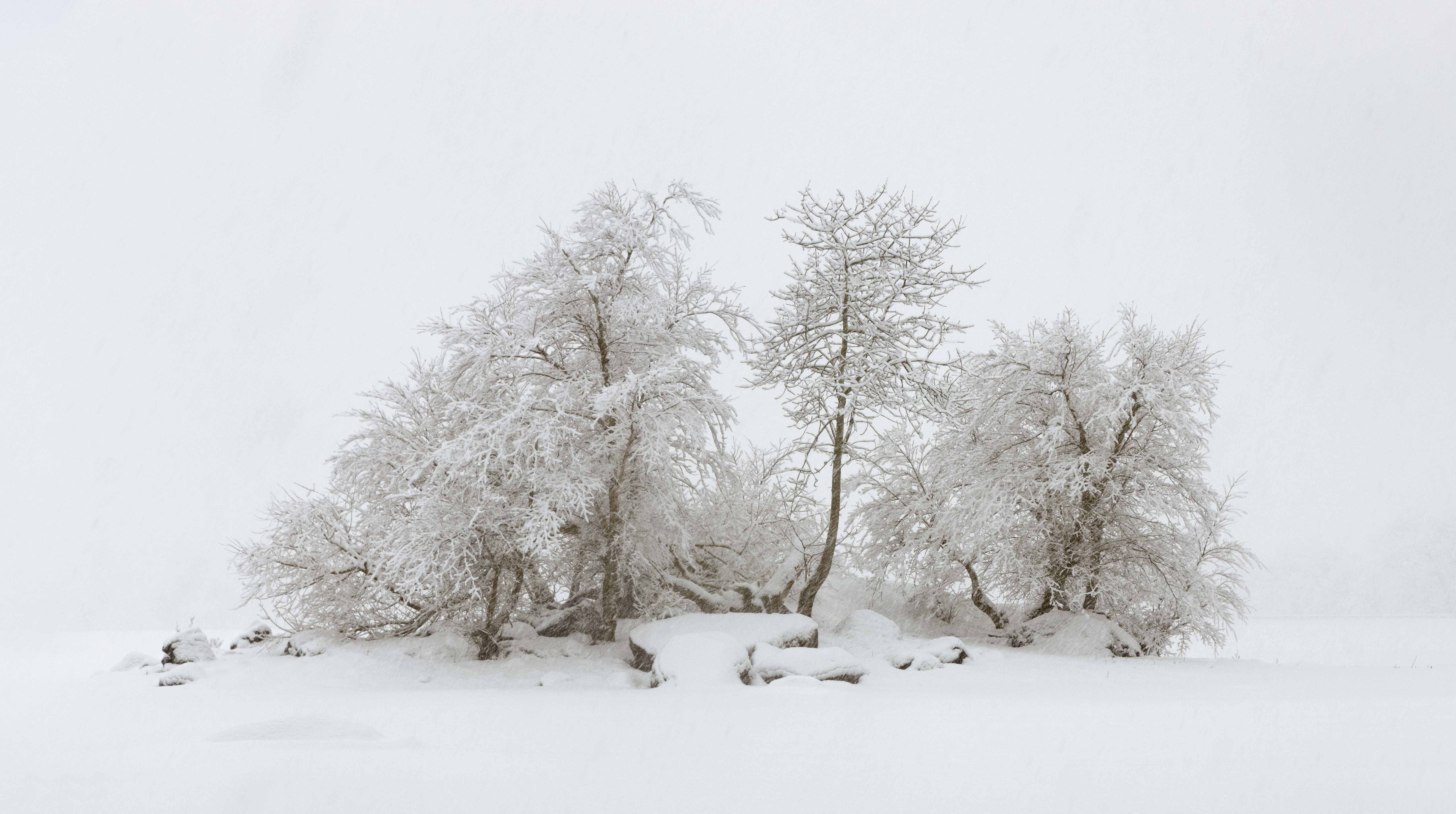
Problematic: A problem for me (and maybe for others). In this case, my problem is that I can't figure out what I'm supposed to be looking at. The overall effect is dramatic, but it's almost *too much*. Is the image about the mountain? Or the Snake River? About the way debris (maybe some pretty big debris) gets snagged in the river? About low clouds? About high clouds? About this is ranch land, too? I gather the intention is that the image is about *all* of that, but that's pretty difficult to pull off.
Sinuous: "S" shaped. Like the silky smooth wavy waves in the lower right hand corner. They're beautiful! And once i notice them, my eyes forget all about the other stuff in the image, while they try to figure out just what's going on with those waves. |
Mar 24th |
| 93 |
Mar 21 |
Reply |
Thanks, Jerry. It's funny. In post, I worked to create that sense of serenity, but I gotta say, in the field it was anything but! Really challenging shooting conditions, and I was hurrying cuz I dreaded hiking for an hour or more in the snow in the dark for the return trip. |
Mar 23rd |
| 93 |
Mar 21 |
Reply |
Thanks, Jeff, yup, I did eventually decide to crop it out. Funny isn't it? Often I find that I get sentimentally attached to something and have a hard time letting go of it, even when it's to the detriment of the image. Thanks for the comment. I posted the results in a comment below. |
Mar 23rd |
| 93 |
Mar 21 |
Reply |
Thanks, Larry, I did go back in and fix the bright area, recropped, and fixed the color balance. (See below for the results). Appreciate the input. I've printed large on photorag, and this is eventualy going on the wall. |
Mar 23rd |
| 93 |
Mar 21 |
Comment |
Thanks, everyone, for your comments. I took them all in, and went back into the image, recropped it to give the island some "breathing room" and eliminated a lot of the bottom, including the problematic break in the ice. While I was at it, I decided I really needed to adjust the color balance -- which I must say was really, really tricky. But I'm pleased with the results. |
Mar 23rd |
 |
| 93 |
Mar 21 |
Comment |
I like this a lot, Paul, very moody. I think you could even get away with "tweaking" the curve further, if you wish.
There *are* two matters that, to me, are problematic. One is that there is so much going on, I find my eyes keep wondering around a bit aimlessly. The second matter is the sinuous waves action in the lower right hand corner. I find that once my eye notices those waves, I'm so fascinated by them, because they're so different in texture from the rest of the image, and I'm trying to understand what they are. I suspect *that* isn't where you wanted my eye to ultimately come to rest. |
Mar 23rd |
| 93 |
Mar 21 |
Comment |
I'm, sorry, Michael, next round I'll get my behind in gear sooner. At this point, I really have nothing to add to other folks' comments. I do like the image, and kudos for getting a different take on the location. |
Mar 23rd |
| 93 |
Mar 21 |
Reply |
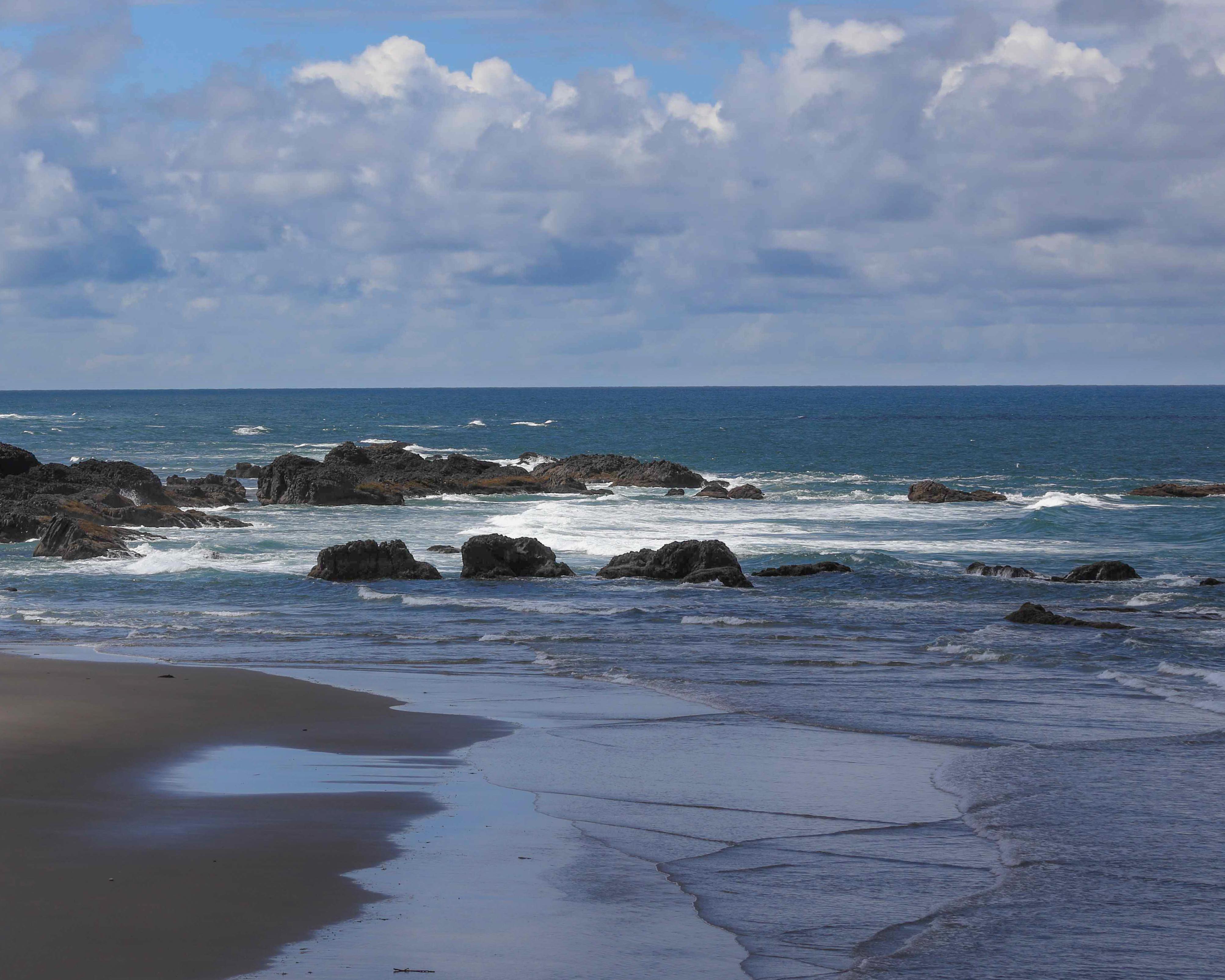
I did also find the balance to be problematic; there is nothing on the right side to "even up the scales" so to speak. My own preference (I don't see it as a "rule" everyone should follow) is to avoid including works of man in a landscape image. Of course, here that would have been impossible.
I did experiment with a very different crop, that tells a very different story from the one you had in mind, a story of the vastness of the sea and sky. Just a different story, not a better one. |
Mar 21st |
 |
| 93 |
Mar 21 |
Comment |
"Pacific" indeed! I think "peaceful" and "serene" are two of the most difficult feelings to convey in an image that remains engaging.
Took me a while to understand what you did in post. In fact, I actually had to try to reproduce it start from your original. As near as I can tell, you pulled the exposure down by about a stop and then pushed the shadows, highlights, and whites back up. Unfortunately, this ends up blowing out a lot of the highlights in the clouds, and I find the blue sky just a bit past plausible (though perhaps that's what the famous "big sky" looks like -- don't see much of that in my parts).
I tried, instead, to my a bit more moderate with the global adjustments (pulled down the exposure by half a stop, boosted the shadows aggressively, the black less so, and the whites only slightly).
I think this a good case study in using one gradient for the sky, pulling the shadows back down and the exposure down a bit further; and another for the ground -- or sea in this case -- here restoring a bit of exposure, but dropping the contrast and whites, as well as aggressively pulling down the clarity. I did, of course, have to erase out the filters on the left side sand, rocks, and cliffs.
|
Mar 21st |
 |
| 93 |
Mar 21 |
Comment |
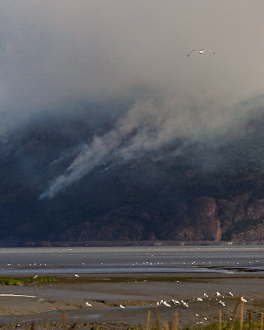
I found it difficult to comment on this image, not because of flaws in the image, but because my personal photography interests are in a different direction, and I kept studying the image through the lens of my own artistic goals. That's my shortcoming, and I apologize for it.
Reading Ed's comment, and your reply to Michael's comment, I better understood what you were trying to do, so I do have a couple of thoughts. This image might work best as an overview image, accompanying two or three zoomed- or cropped-in details. I suspect there's noy enough data in this image to crop in on the plane, but I though you could definitely crop in tight around the bird, maybe boost the clarity and pull up the highlights a bit to make the smoke more distinct, and it would help with telling that part of the story. Attached to give you a sense what I mean. |
Mar 21st |
 |
| 93 |
Mar 21 |
Comment |
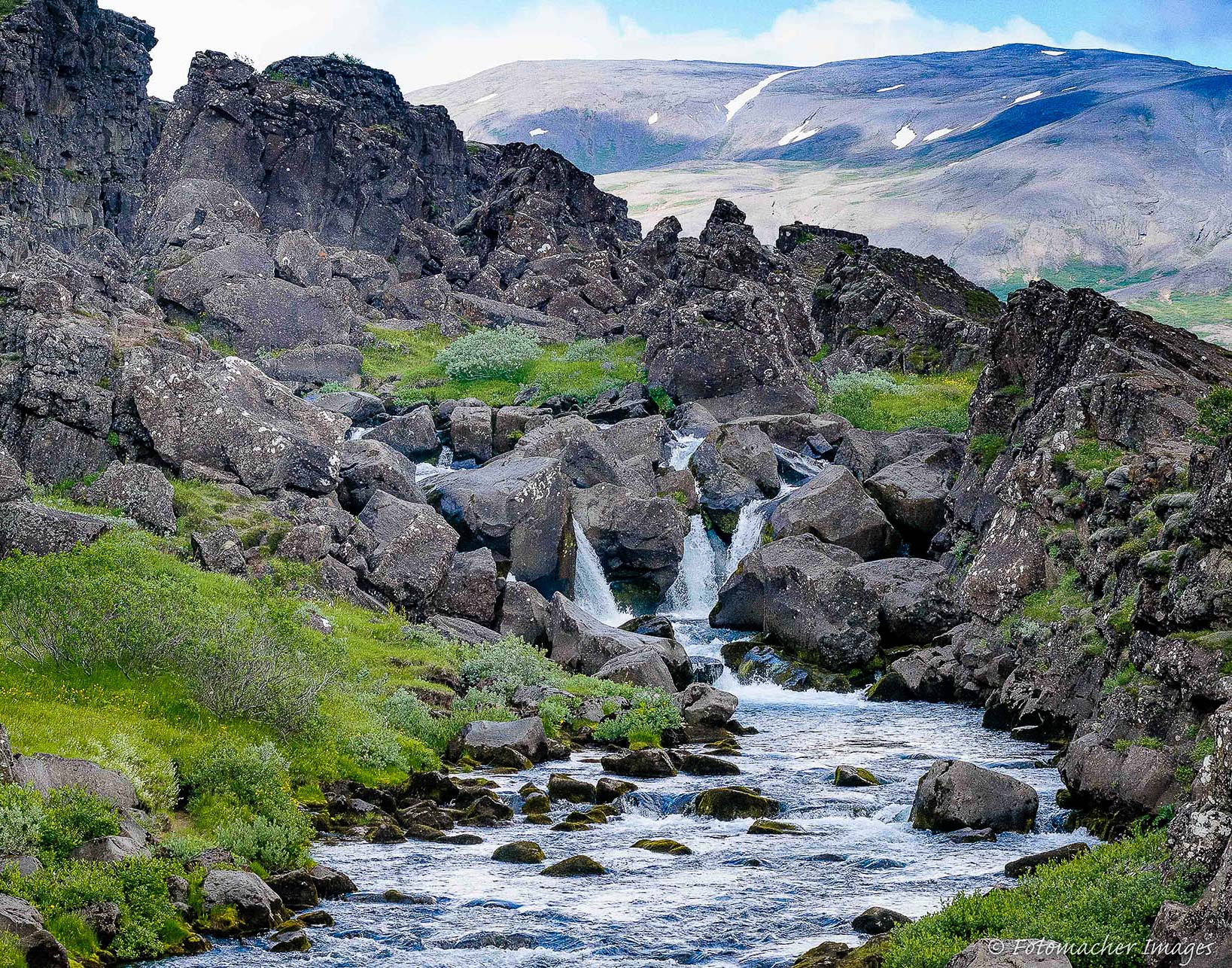
I *do* like this. I'm less concerned about the composition than same of the other folks, though I do like Darcy's crop.
Bumping the contrast does seem beneficial, but I'd be very very cautious about the saturation. In fact, when I bumped the contrast, I actually felt I needed to back off the saturation, esp. that of the greens.
I felt I could get away will pulling down the shadows and blacks a bit further, and that added drama to the lava outcropping.
I felt the foliage areas benefitted from reducing the luminance of the greens and aquas, and shifting them very gently towards the yellows.
One concern: this might be purely a side effect of the JPEG compression (so frustrating, huh?), but the image looks to my eye to be oversharpened. This is especially noticable in the water and foliage. I brushed in a bit of clarity reduction around the water which I felt restored a more natural look to the water.
|
Mar 21st |
 |
| 93 |
Mar 21 |
Comment |
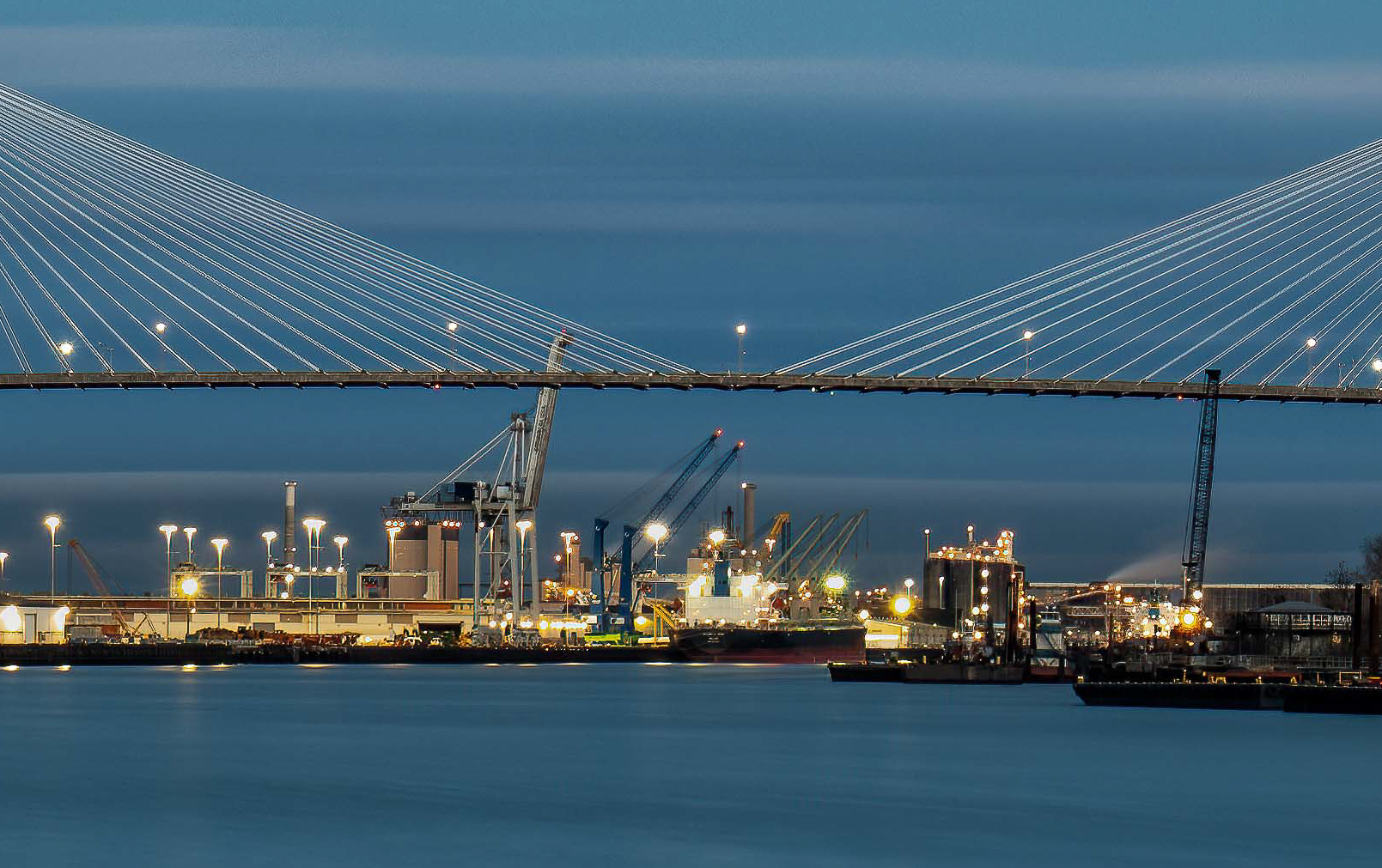
Agree re: the balance issue. That said, the colors are gorgeous, and I really like the glow of the lamps that one gets with a long exposure, set against the blues of the sky. Regarding the line of clouds: I think the main problem here is that the line coincides with the tops of the pylons.
I believe there's a story in there, right in the center. I'm posting a crop -- not because it's a good image in itself, but because it illustrates the point. If the opportunity presents itself again, and if you have a lens long enough, there might be something there ... |
Mar 21st |
 |
| 93 |
Mar 21 |
Comment |
Note that "Original 2" and "Original 3" images are transposed. |
Mar 3rd |
| 93 |
Mar 21 |
Reply |
Thanks, Larry. I see what you mean about the overly bridght waster area to the right. Don't know how I missed that. I do want the viewer to be aware of the frozeon water over there, but it *is* too bright. I may go back and tone it down to be more like the analogous area to the left.
As for making a high key image, yes I do like that sort of thing, but I couldn't make this image work for me. I think there's a fundamental challenge in the very narrow range of tones. |
Mar 3rd |
| 93 |
Mar 21 |
Reply |
Thanks, Paul. I do tend to run on a bit, I fear. Glad to know I didn't overdo it. |
Mar 3rd |
9 comments - 7 replies for Group 93
|
9 comments - 7 replies Total
|


