|
| Group |
Round |
C/R |
Comment |
Date |
Image |
| 8 |
Oct 25 |
Comment |
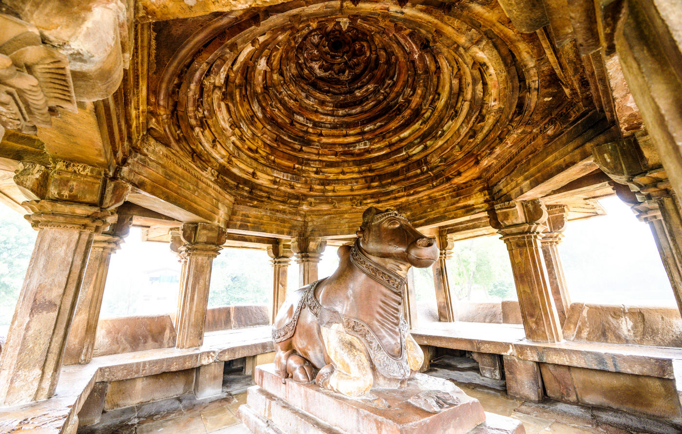
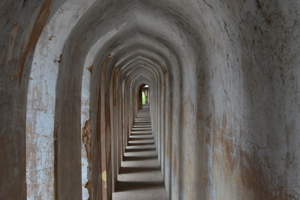
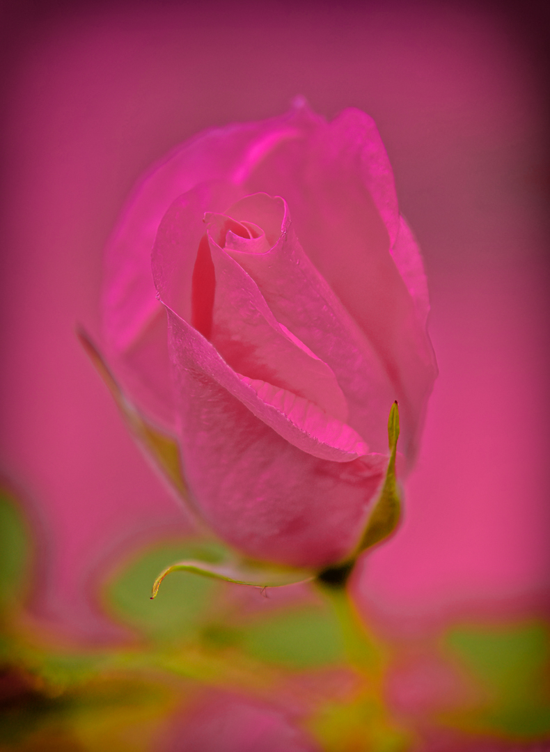
1. I would crop out the red roof.
2. Boost clarity and contrast selectively on the embossed patterns to make the craftsmanship pop. Shooting in RAW helps to do that in post.
3.Enhance the warm tones of the wood and consider subtle vignette to draw the eye inward.
4. In this scenario, as per conventional thinking taking photographs without any specialized lens , it seems to me that I have two options...
a) Use a shallow depth of field (e.g., f/2.8-f/4) to isolate one prayer wheel while softly blurring the others. This creates a focal anchor and evokes intimacy.
OR
b) deep focus (f/8-f/11) can emphasize repetition and symmetry if aiming for a more architectural or meditative feel.
It does show two spinning wheels (seems to me with a slight blur)
Interesting POV. Nice work. |
Oct 5th |
| 8 |
Oct 25 |
Comment |
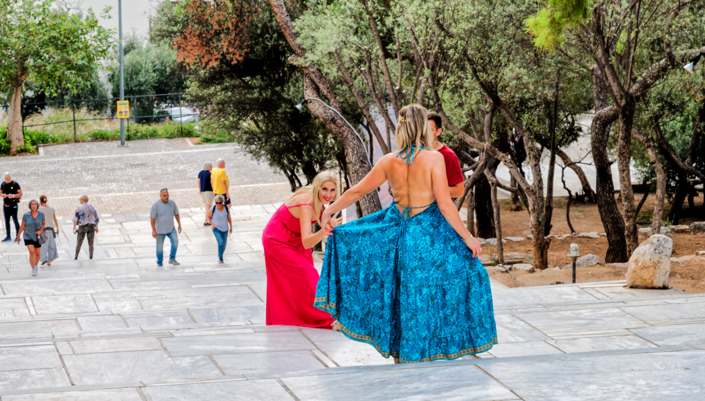
The image captures a moment of motion within a clean, modern indoor space. The use of reflection in the glass storefront adds a subtle layer of depth and symmetry, especially with the 'logo' anchoring the left side.
The red shirt and red logo create a strong visual focal point, while the muted tones of the second individual
(brown jacket, green cap) offer balance. The circular floor patterns subtly guide the viewer's eye across the scene.
Soft, diffused lighting keeps the mood neutral and commercial. There's no harsh shadowing, which suits the indoor mall setting.
There is a sense of rhythm in the image. I thought of multiple ways to better crop this image but to me it seems that this is the best.
Great example of street photography. Great Work. |
Oct 5th |
2 comments - 0 replies for Group 8
|
| 96 |
Oct 25 |
Reply |
Thank You very much. Excellent editing . |
Oct 20th |
| 96 |
Oct 25 |
Reply |
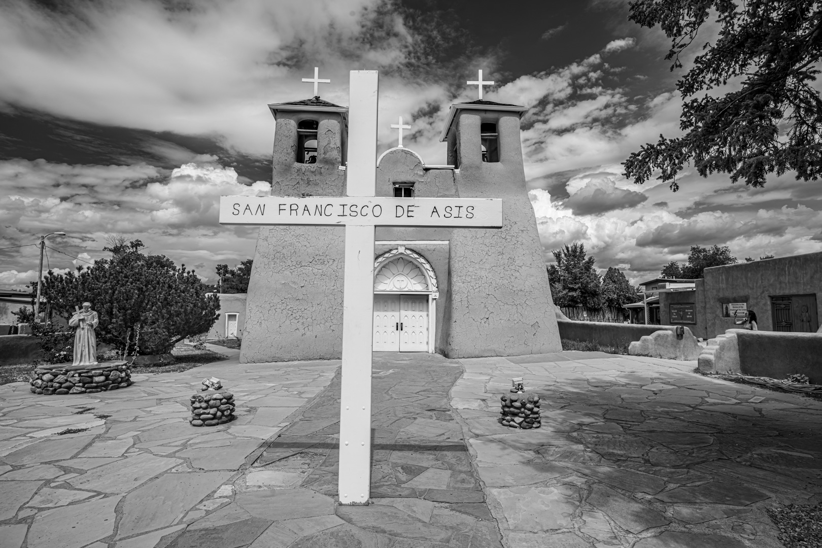
Good Points. Thanks.
"I find the buildings to either side to be distracting": I deliberately kept them to add a time stamp to the photograph. As you know this is a famous place and has been photographed famous American photographers of the past. |
Oct 20th |
| 96 |
Oct 25 |
Comment |
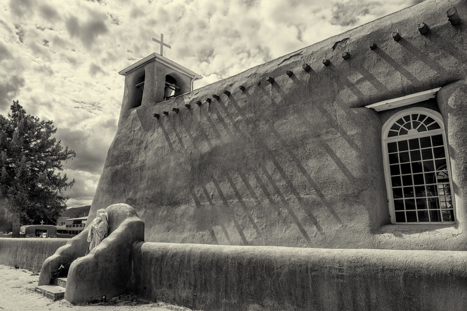
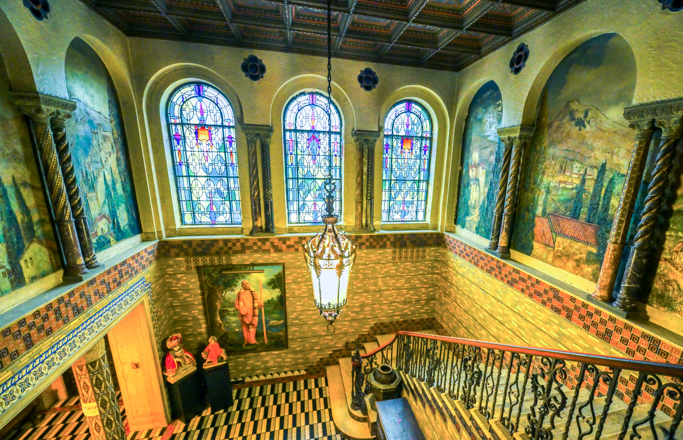
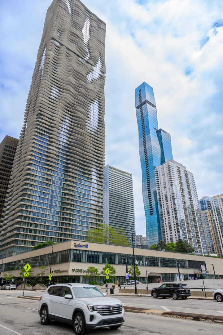
The low-angle shot dramatically exaggerates the building's height, creating a sense of awe and vertical momentum. It invites the viewer to look up-literally .The repeating pattern of protruding window units creates a dynamic three-dimensional texture.
To me this image is good by itself reflecting the photographers vision and artistic intent. To look for engineering precision then maybe tilt correction is needed to ensure vertical lines are truly vertical, even with a 24mm..
Excellent Work. |
Oct 10th |
| 96 |
Oct 25 |
Comment |
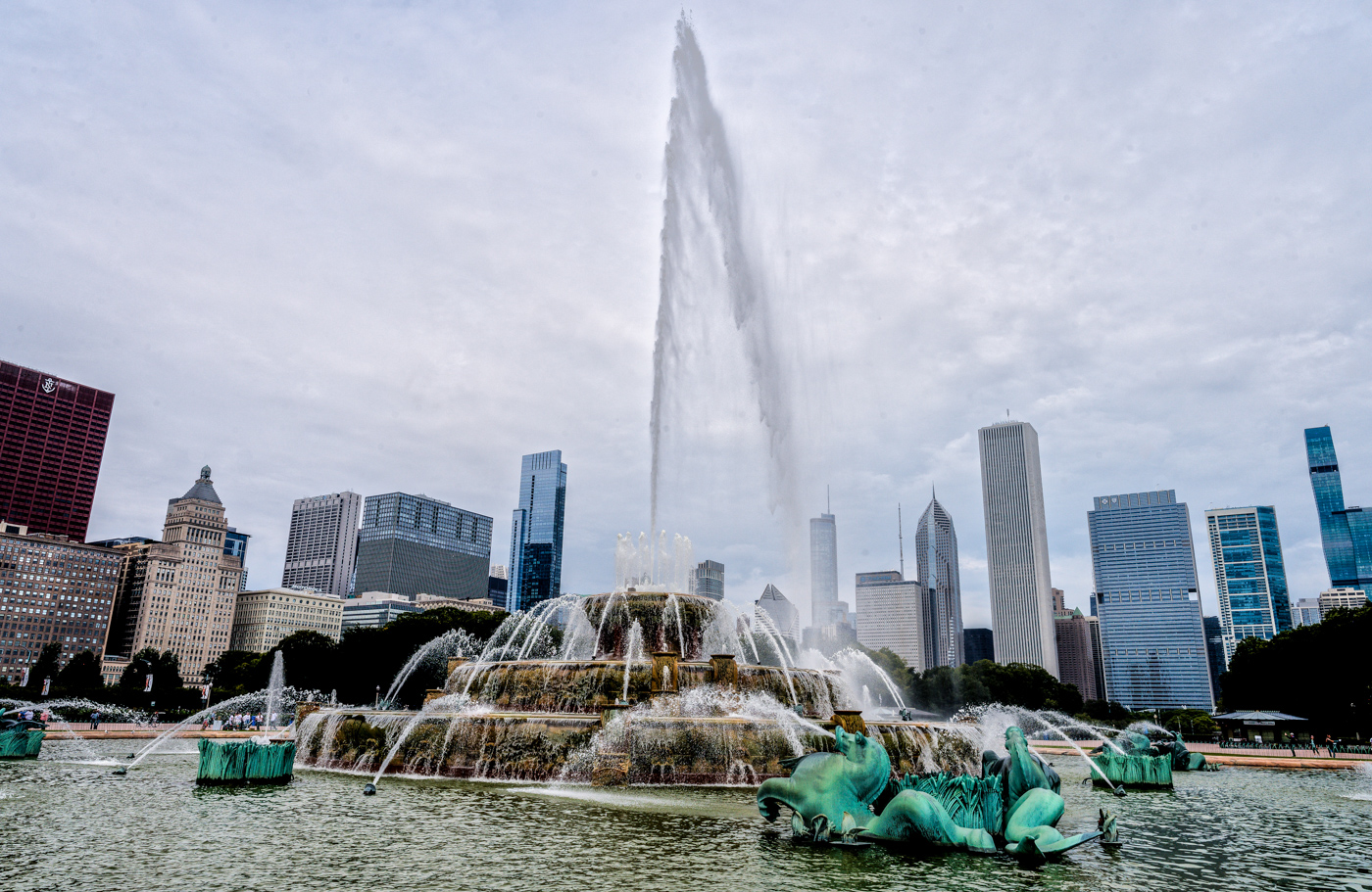
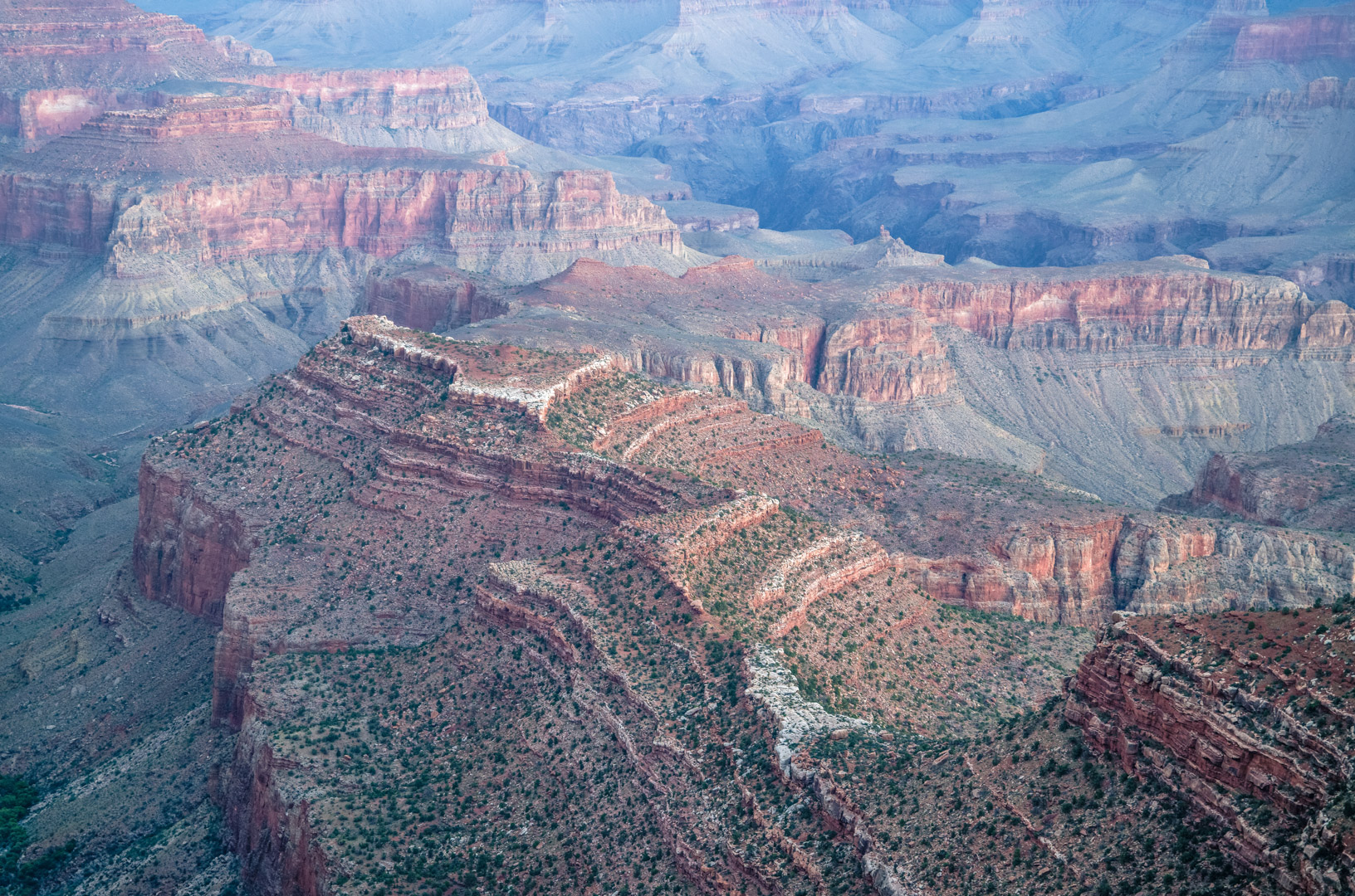
Are these 3 images tied together or a single one. ?
Overall , the intersection placement creates natural leading lines, guiding the viewer's eye from the foreground architecture toward the towering background. This seems to bring a sense of balance. The layering of trees, cars, and signage adds urban texture and realism, grounding the image in everyday life.
It is a good image but a different one. Nice Work. |
Oct 10th |
| 96 |
Oct 25 |
Comment |
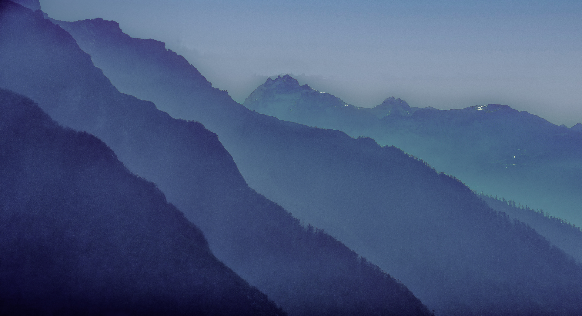
Mysterious but very interesting. Super Composition, asymmetrical framing adds visual tension. Very Creative and bold idea. The lighthouse positioned in the top left corner creates a sense of isolation . Its small scale against the vast cliff emphasizes vulnerability and resilience. I also love the muted color grading complementing to the mood of mystery and solitude. Great Work. |
Oct 10th |
| 96 |
Oct 25 |
Reply |
Yes. It was taken during midday. I didn't have the luxury to take photos and explore the place in the golden hours. Nor did I want to .
As mentioned I used Wide 14mm and walked close to the structures to bend and to curve the perspective. I never intended to be representation of a reality , rather my interpretation and dramatization of it.
I have seen photographs of this very same structure with medium format camera and subsequently cropped. Technically, from the perspective point it is correct but has a different feel to it.
Question is what do we want ? How does it appeal to us ? In all cases I found that this architecture has a unique architecture balance. |
Oct 10th |
| 96 |
Oct 25 |
Reply |
Yes. As mentioned I used Wide 14mm and walked close to the structures to bend and to curve the perspective. I never intended to be representation of a reality , rather my interpretation and dramatization of it.
I have seen photographs of this very same structure with medium format camera and subsequently cropped. Technically, from the perspective point it is correct but has a different feel to it.
Question is what do we want ? How does it appeal to us ? In all cases I found that this architecture has a unique architecture balance. |
Oct 10th |
| 96 |
Oct 25 |
Comment |
While the second one is more painterly , first seems to me has more dimensionality. Personally I prefer the first one. For the first one I will slightly boost reds and oranges while preserving natural greens to heighten contrast. Second one looks more flat for me.
However , to be sure , it is important to mention that both the images are excellent.
|
Oct 10th |
| 96 |
Oct 25 |
Comment |
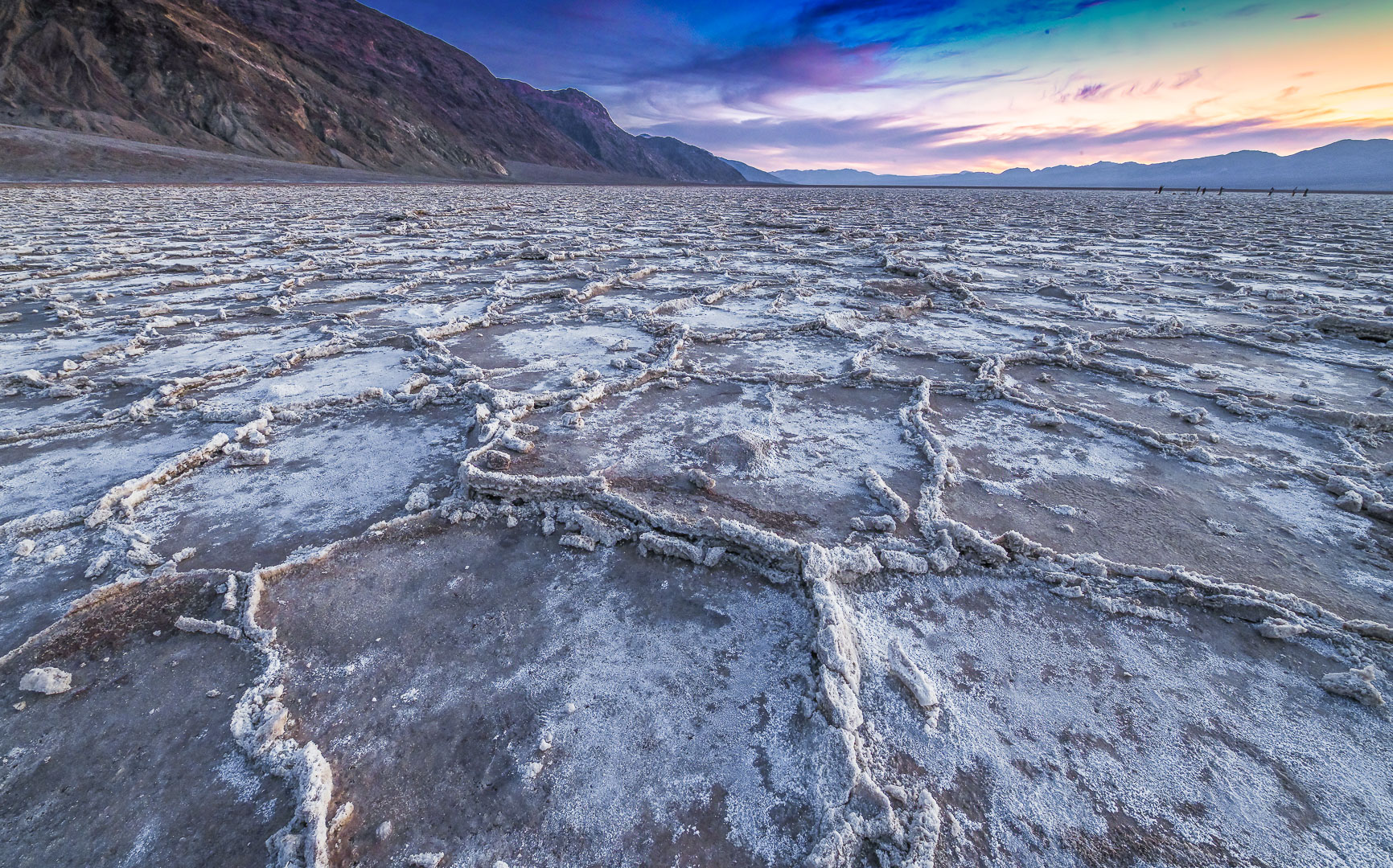
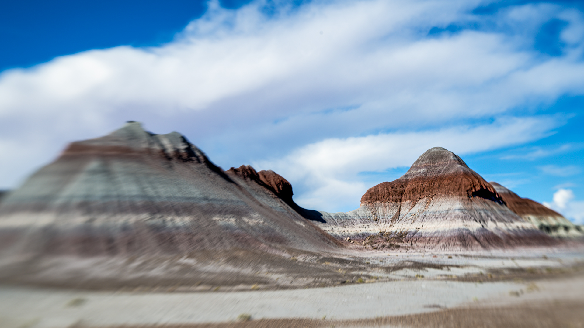
I have been at Mesquite Dunes place at Death Valley , but this can be taken anywhere . Stunning Image. Wow. A compelling study in minimalism and natural abstraction. From Farming to deep shadows all come together to emphasize the sculptural quality of the dune. We can make multiple variations of it by doing this and that , but by itself this is a very good image. Great Work. |
Oct 10th |
5 comments - 4 replies for Group 96
|
7 comments - 4 replies Total
|