|
| Group |
Round |
C/R |
Comment |
Date |
Image |
| 49 |
Oct 22 |
Comment |
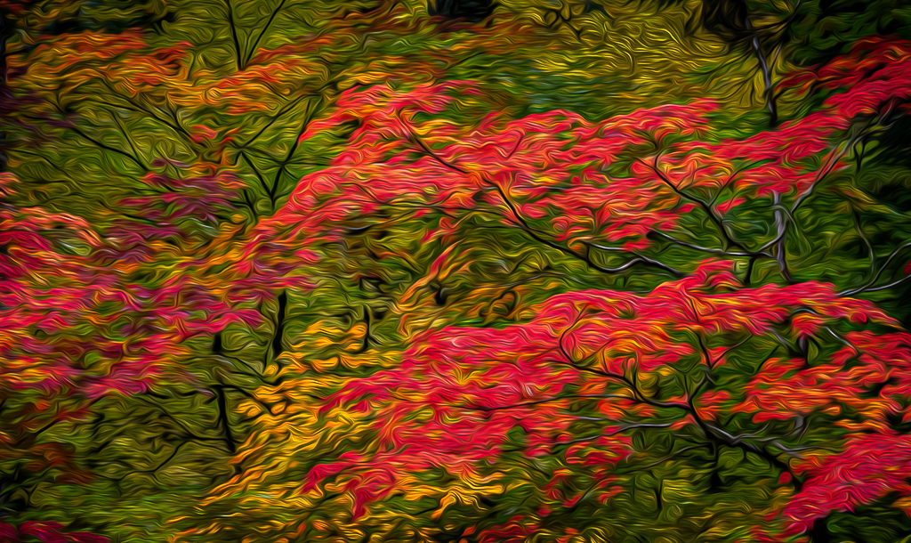
Josh, maybe trying to work the blue and green saturation and liminosity sliders to get the look tgat you are after? |
Oct 21st |
| 49 |
Oct 22 |
Comment |
Ok dicky thanks. |
Oct 19th |
| 49 |
Oct 22 |
Reply |
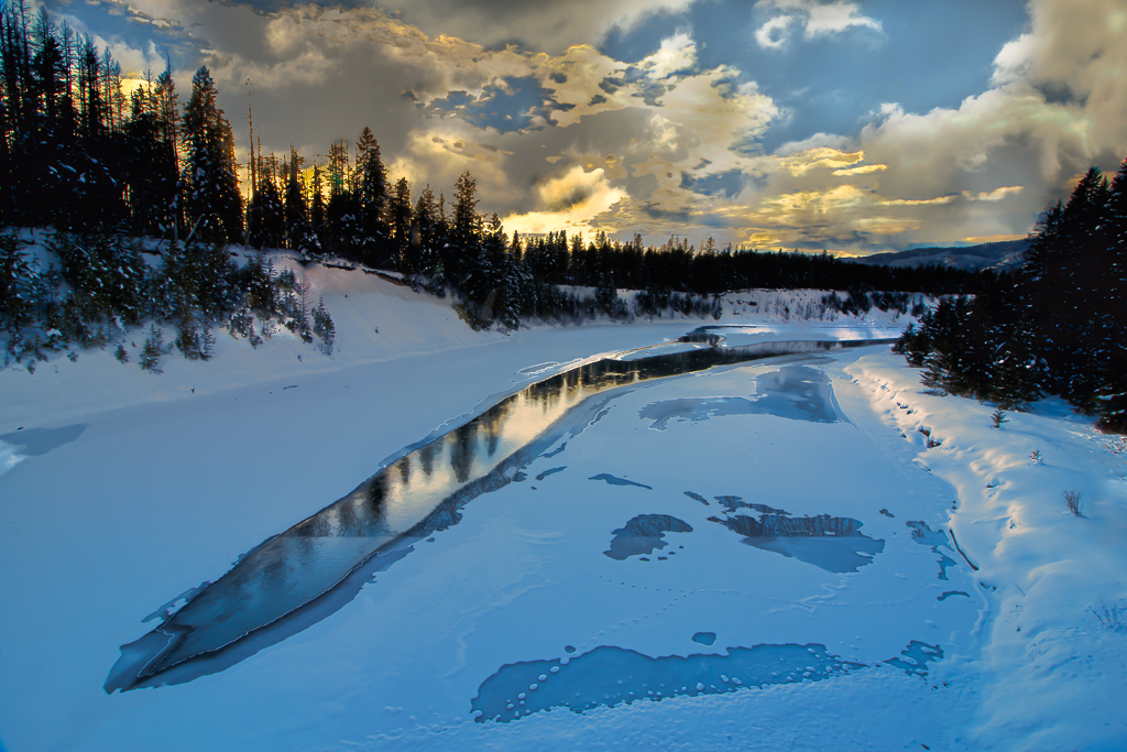
I think that works. Then I might clone out that dead tree center left near the lake. |
Oct 19th |
| 49 |
Oct 22 |
Comment |
Dicky,
What a wonderful image! I really like how you have captured the sun's rays streaming into the room. Well seen and captured! Like the others, I think this is just way too busy. I'd suggest cropping off the left half of the image from right in front of the deer. This would then place the focus for the viewer on those wonderful sun streams towards the door on the right. |
Oct 18th |
| 49 |
Oct 22 |
Comment |
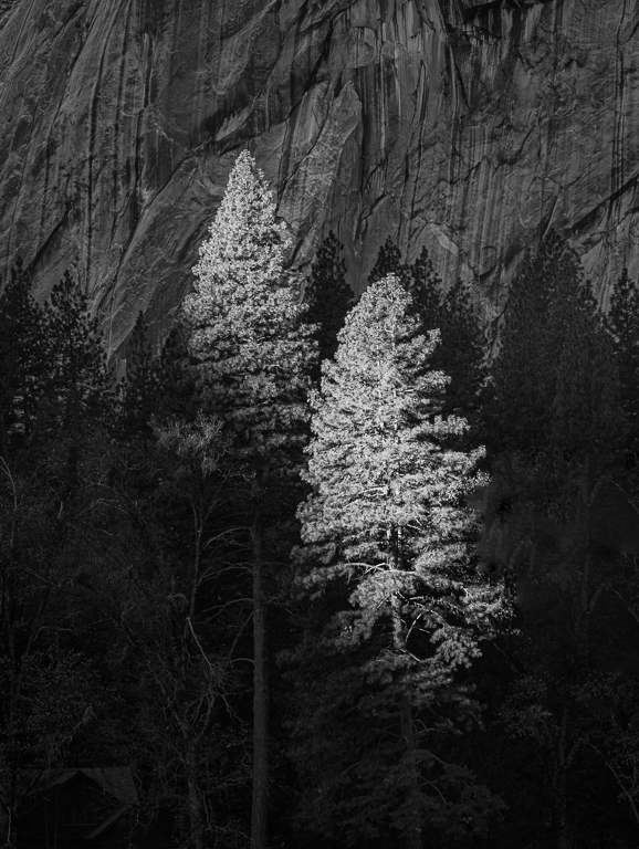
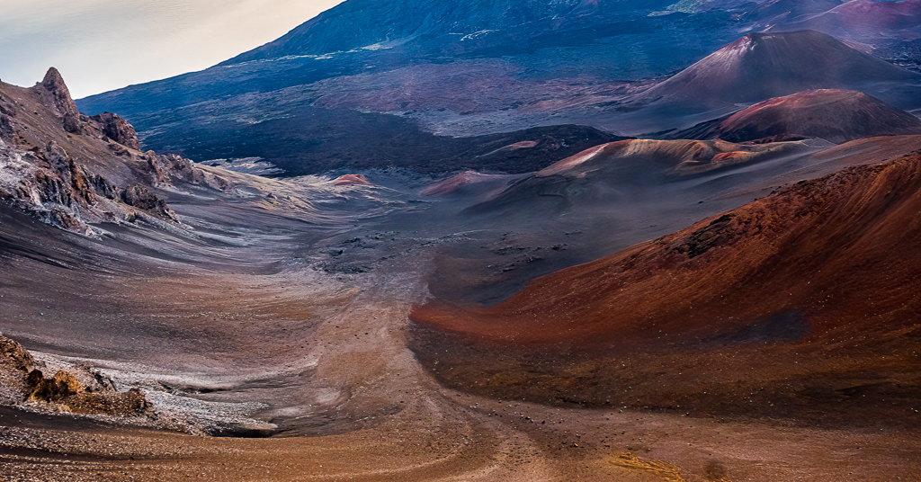
Alan,
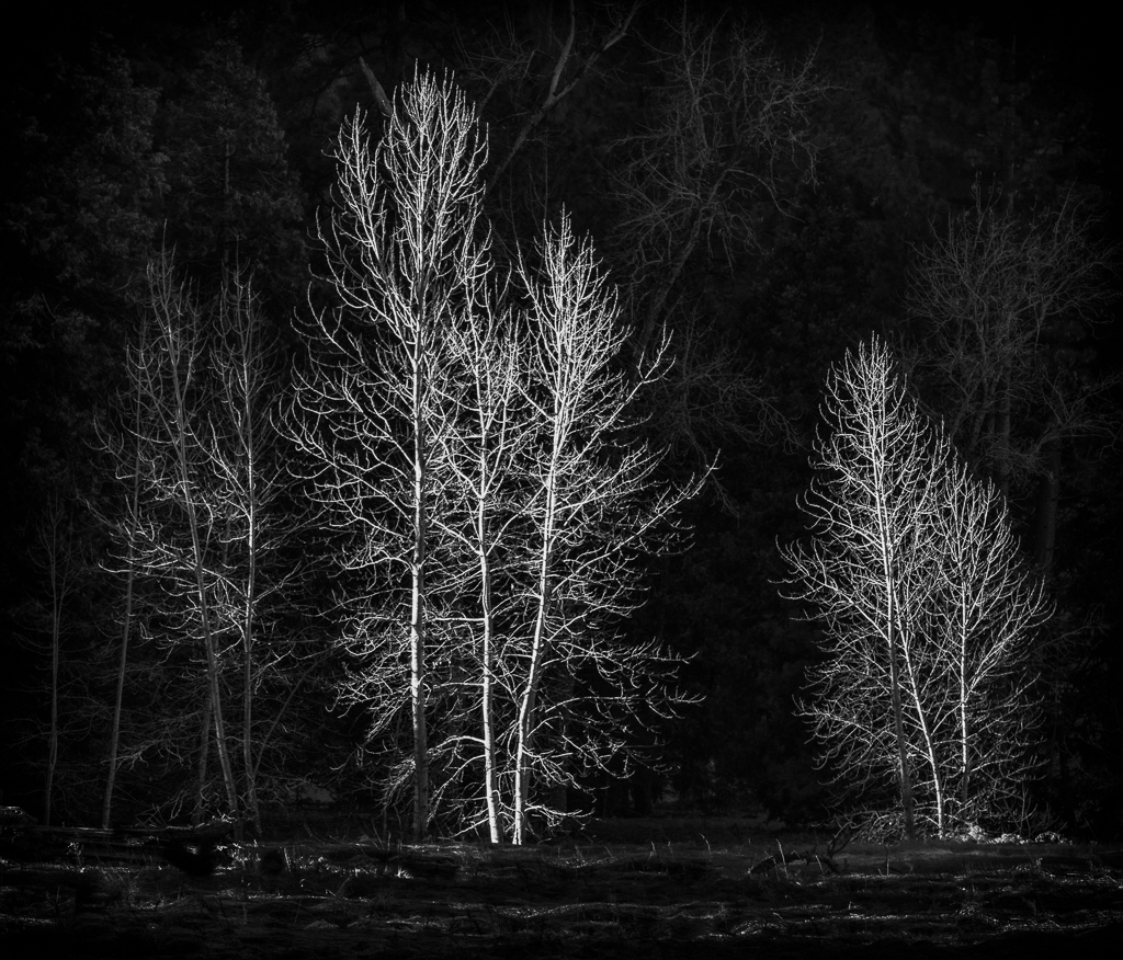
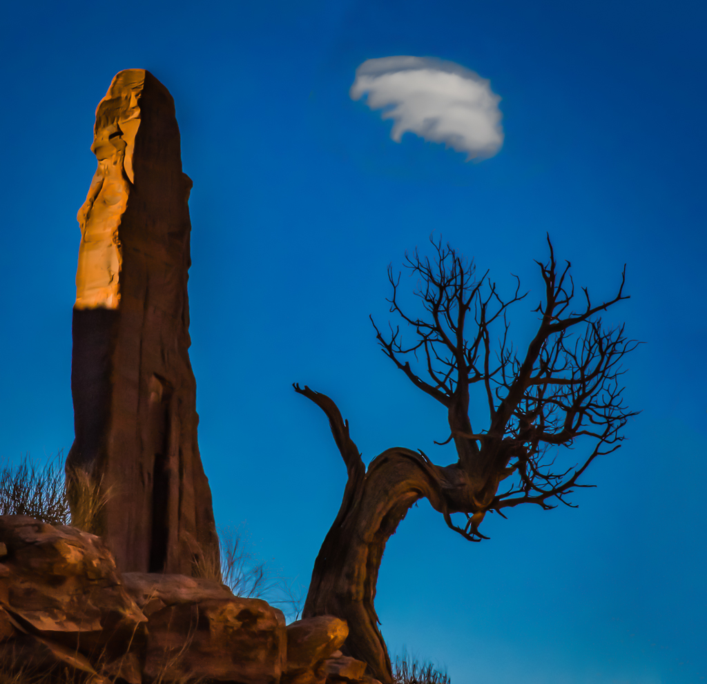
Kudos for taking a minimalist perspective! All blacks or whites. I agree with the other commenters that you might want to clone the second tallest tree. I wonder if adding white space to the right and subtracting it from the left will enhance the image. Then the top branch is leaning into more space? It's like having the picture of a bird with room in front of it so it has a place to fly towards. |
Oct 18th |
| 49 |
Oct 22 |
Comment |
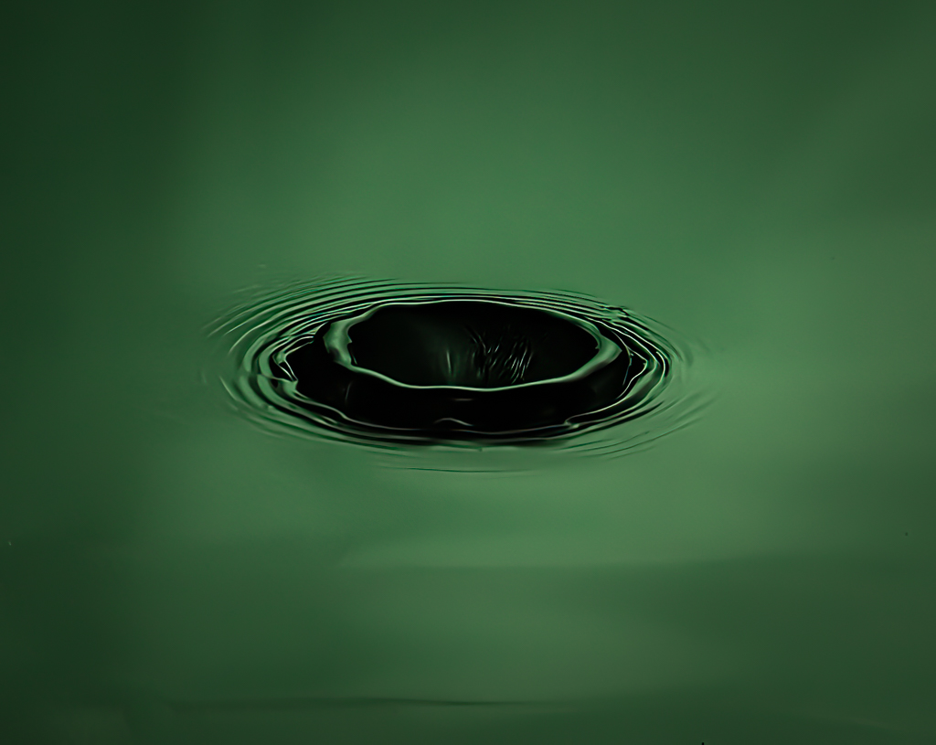
Josh,
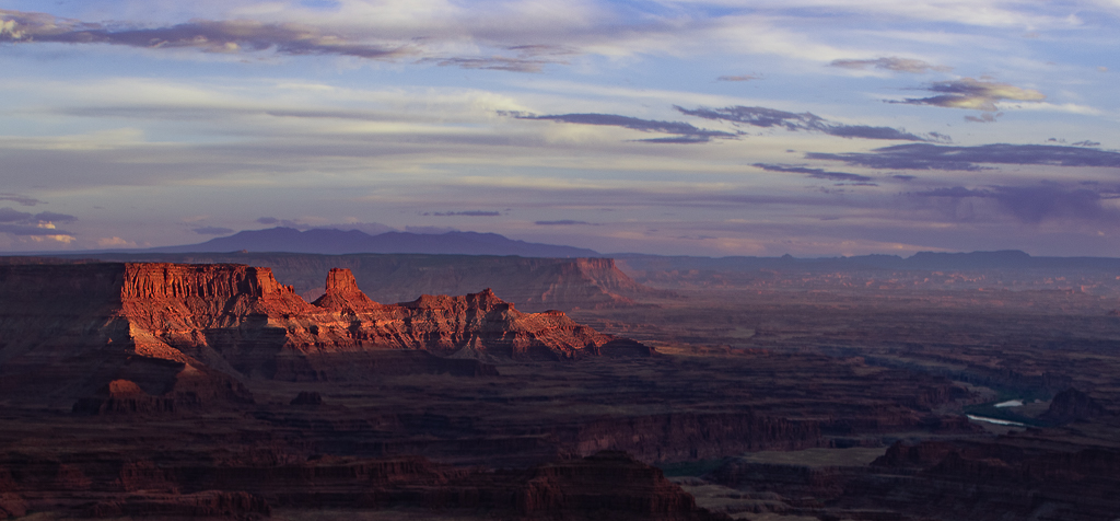
Kudos for thinking in a minimalist kind of way and for smoothing out the water with a 30 sec. exposure! I think I might call this "tranquility." You might experiment with cropping the trees. Would this be more effective if it had more of a pano look by making the trees and the water each take up 50% of the canvas? Give it a try on screen and tell us what you think. |
Oct 18th |
| 49 |
Oct 22 |
Comment |
Jo-Ann,
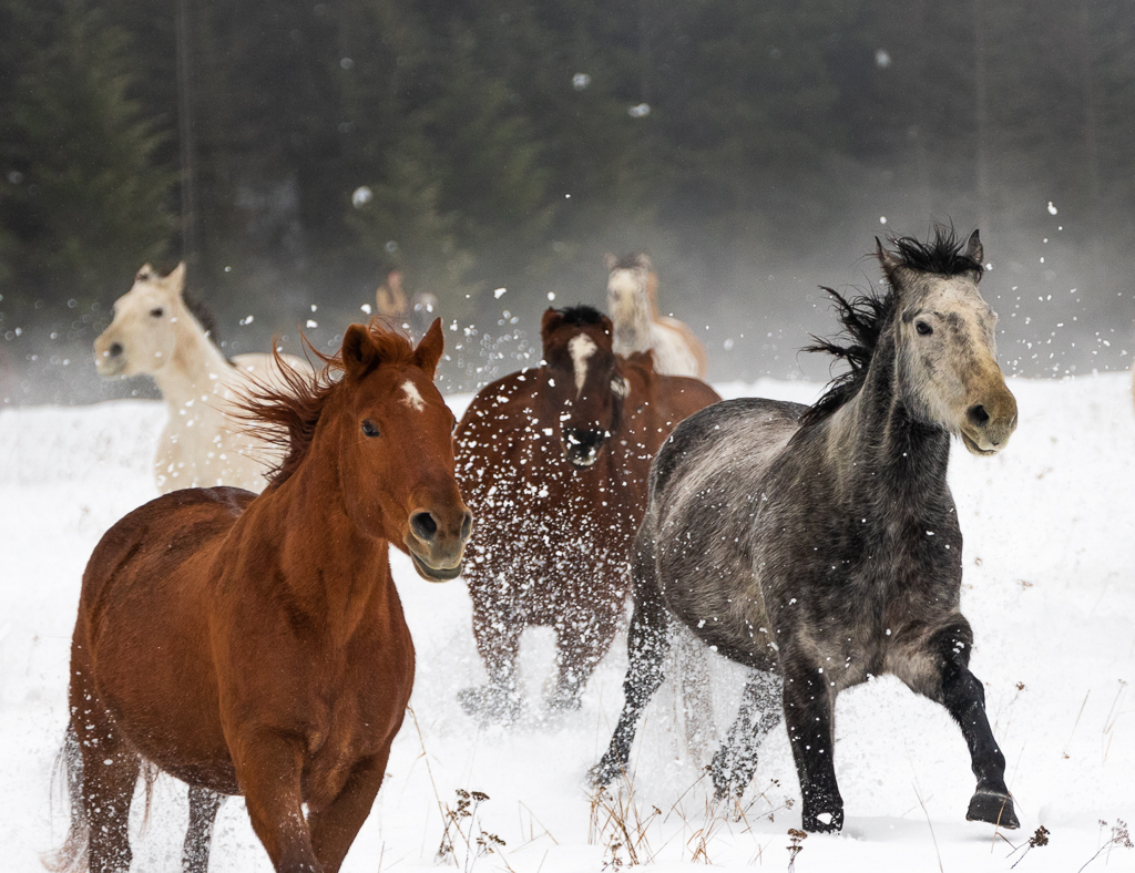
Great shot of your granddaughter! So glad you rem oved the distracting elements in the background of the "original" image! Love the shirt and its message and most importantly that her arms and pen do not block our ability to read the message! That takes patience, so kudos to you! About the only other recommendation I would make is to ask your granddaughter to take off the mask for the photo op and then put it back on. |
Oct 18th |
| 49 |
Oct 22 |
Comment |
Craig,
Sounds like a fun outing! I agree with some of the other commenters how she pops off the page and I also commend you on your sky replacement. Never would have noticed it. Did you use PS or luminar to do that?
While a really like the sharpness of her eyes and the nose ring, I cannot help but try to figure out her tattoos, which are blurry. I especially want to understand the tattoo of the man on her shoulder, but cannot. Perhaps the solution is to cone out the tattoos? But that's a lot of work!
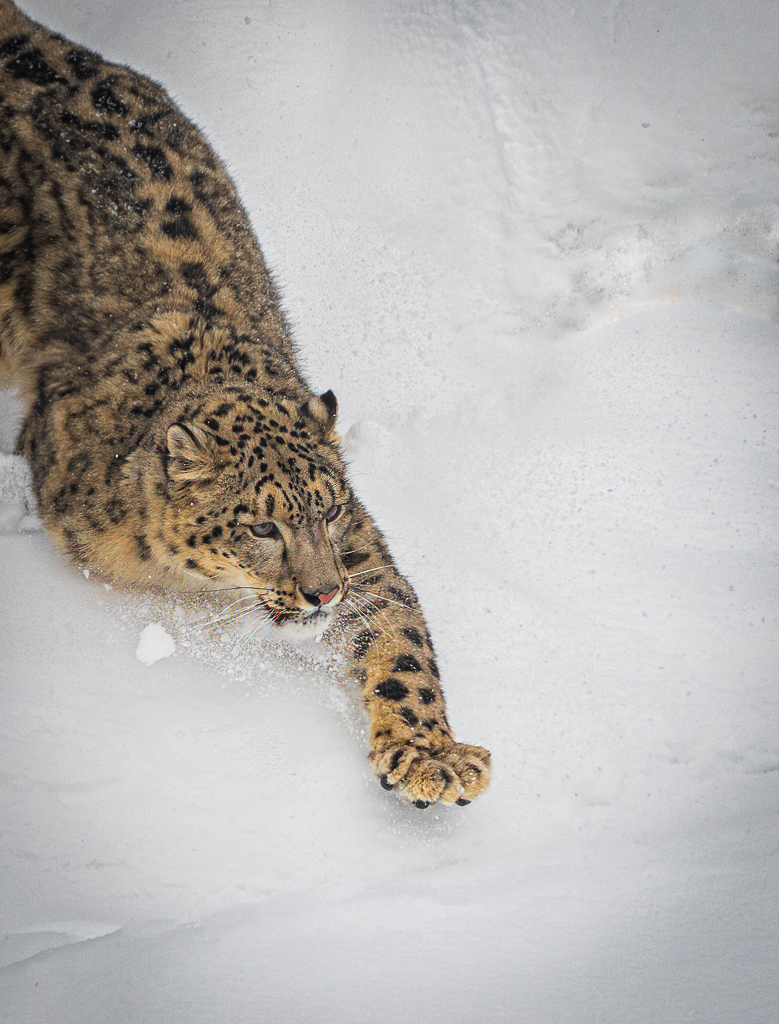
|
Oct 18th |
| 49 |
Oct 22 |
Comment |
Owen,
Welcome to the group! Really like what you have done with this shot! The strength of the phot is the double s curve that others have mentioned. It lets your eye work its way through the image. Great job! My suggestions would be to tone dow the highlights. This will bring down the brightness in the yellow trees in the mid ground and background. It would also take down the brightness of the barn. I would also consider cropping about 1/5 of the image from the bottom. You might consider cloning out the building on the left. I like how the first curve has a "bookend" with a yellow tree. |
Oct 18th |
| 49 |
Oct 22 |
Comment |
Josh, thanks for your ideas. I especially like vignetteing thought. |
Oct 11th |
| 49 |
Oct 22 |
Comment |
Thanks joann |
Oct 10th |
10 comments - 1 reply for Group 49
|
| 67 |
Oct 22 |
Comment |
I considered b&w but did not think there were enough true blacks and whites. I'm delighted to have had you show me I was wrong. Thanks |
Oct 27th |
| 67 |
Oct 22 |
Comment |
Ok I see what you are talking about. Like the crop. I gets the viewer to just focus on the curved lines, which is what I had in mind. Thanks all. |
Oct 18th |
| 67 |
Oct 22 |
Comment |
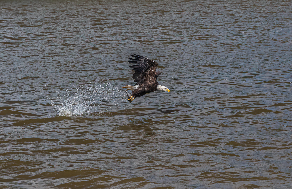
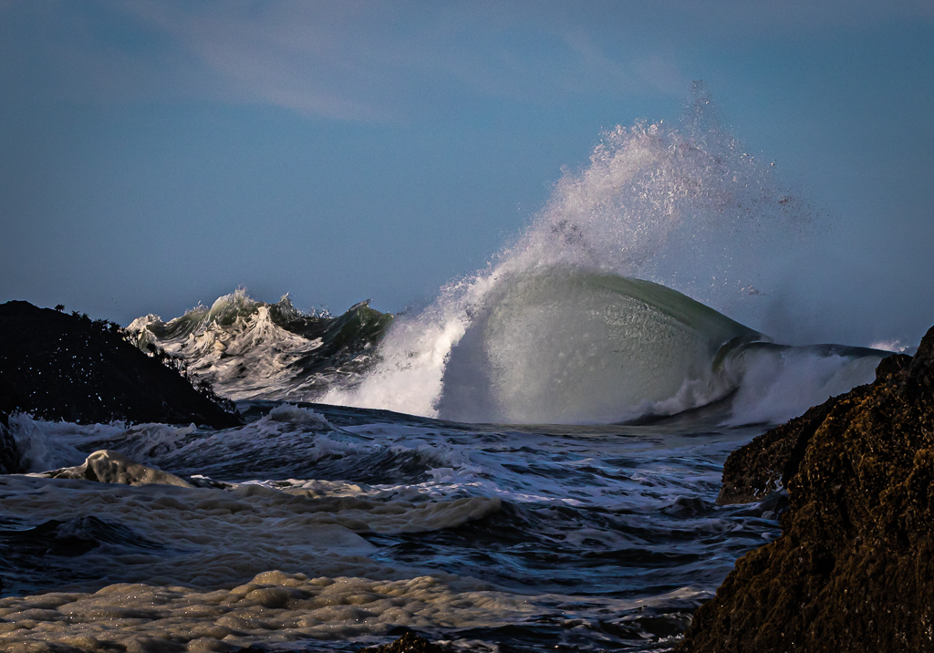
Cindy,
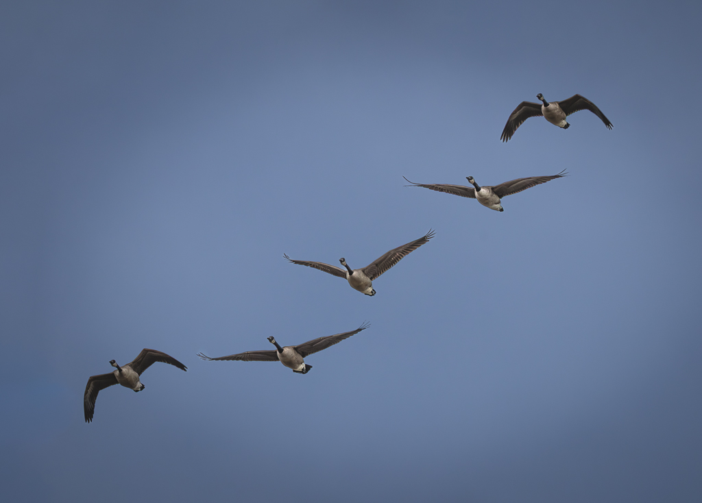
This is a great capture of a dramatic moment! I agree with our other commenters that you could try opening up the shadows on the lower bird. You did a great job on the white values on both birds. If you want to bring back the tips of the wings, you might try increasing the canvas in PS and then try content aware fill. Sometimes it works and other times well it doesn't. I also like Larry's suggestion about taking a lot more than you need. In this case you might have gotten a pretty cool reflection to add to the "fight." |
Oct 18th |
| 67 |
Oct 22 |
Comment |
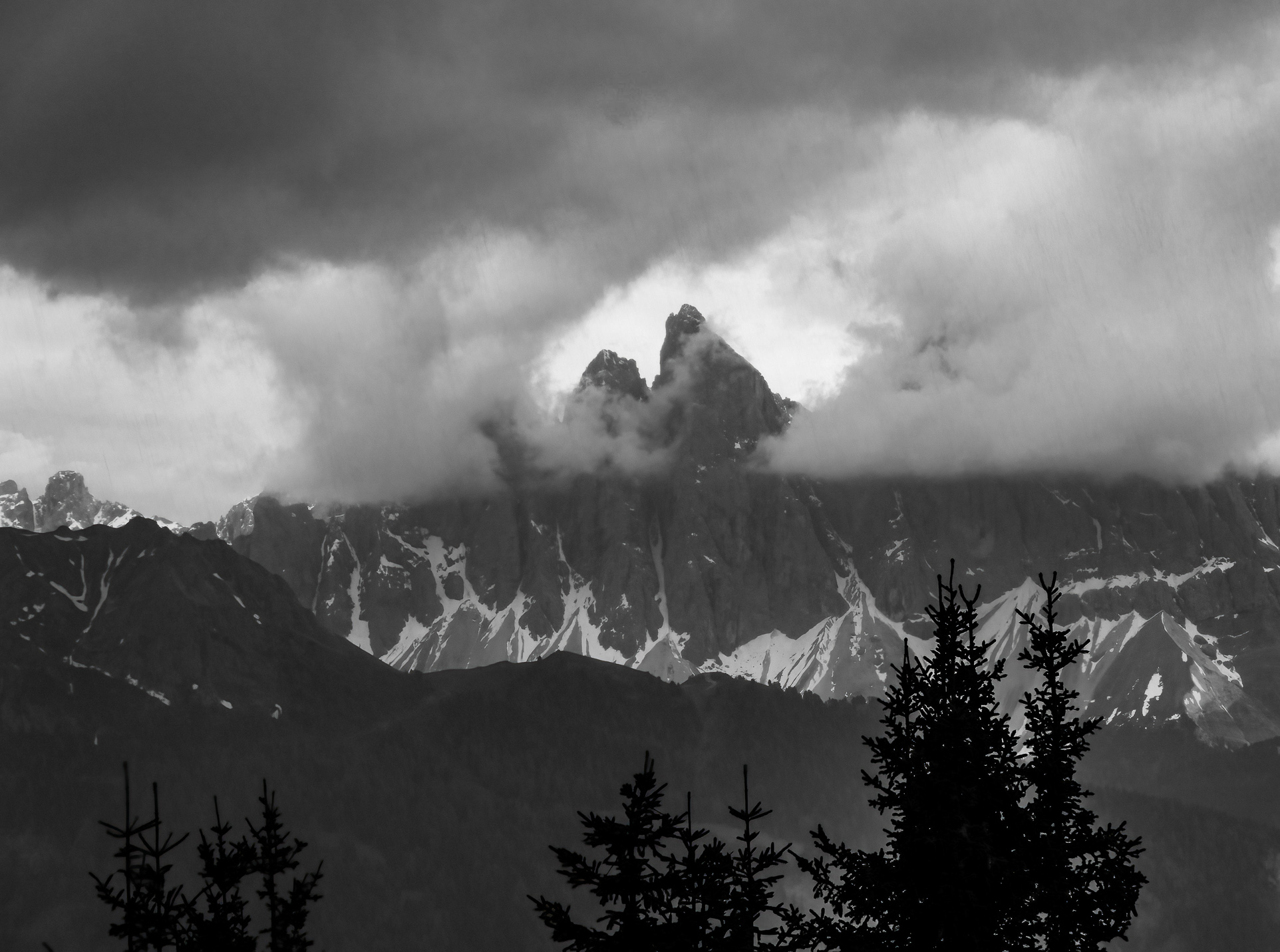
Frank,
Kudos for this shot! It does look like you have captured an image of an owl at night! I think eliminating the branches with a crop was the right way to go. The story here is about an owl at night, not about branches. They do not add to the impact. I might be tempted to lighten the owl him/herself and perhaps the roof he/she is standing on. Then let the window and background drop off into semi darkness as you havd done. Great shot! |
Oct 18th |
| 67 |
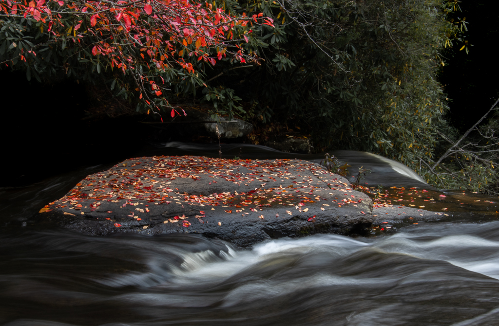
Oct 22 |
Comment |
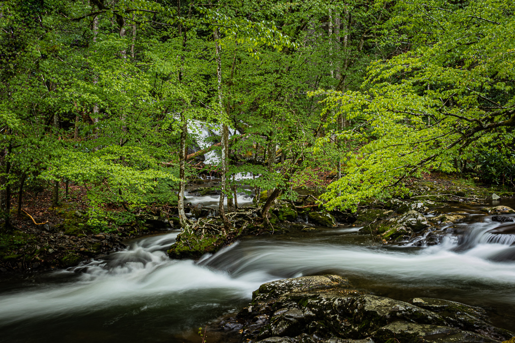
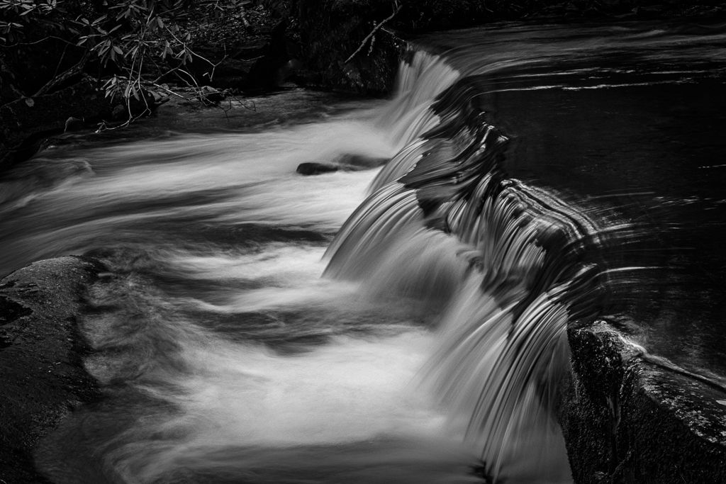
Michael,
What a great shot! Using .5 sec gave a desirable silky effect to the running water. I agree with the other commenters about a sligh crop on the top and I'd also take some off the left side. The only other suggestion I might make is that perhaps this could be even more dramatic had you stood about 10 feet to the right? Was that even possible? |
Oct 18th |
| 67 |
Oct 22 |
Comment |
Frank, Let me try that! Thanks for the thought! |
Oct 11th |
| 67 |
Oct 22 |
Comment |
Cindy, thanks for your feedback. I darkened the background to get the viewer to focus on the curved part. On cropping on the left, which element on the left did you find the most distracting, lower left or upper left? |
Oct 8th |
7 comments - 0 replies for Group 67
|
17 comments - 1 reply Total
|