|
| Group |
Round |
C/R |
Comment |
Date |
Image |
| 2 |
Apr 26 |
Reply |
Thanks Piers. I'm always open to suggestions. That's what I like about this forum. |
Apr 16th |
| 2 |
Apr 26 |
Comment |
I thought of that (1/3) for the eye, but chose to let you proceed with it if you chose.
For additional reference, I lightened up the eye just a bit to make it more prominent.
|
Apr 16th |
| 2 |
Apr 26 |
Comment |
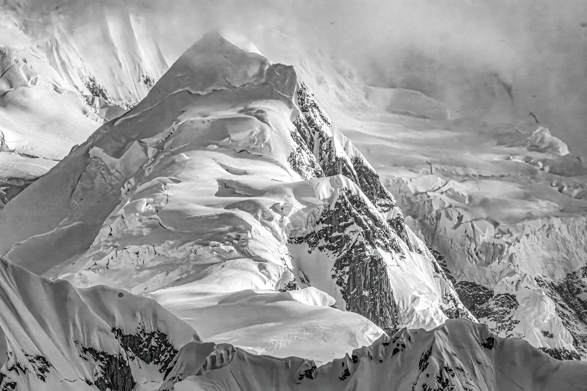
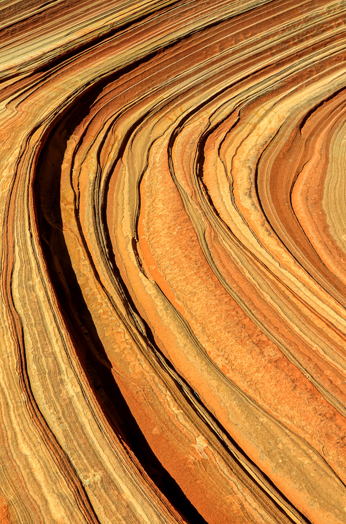
Martin, I, too, like the fuller story with the Pano and the 2nd structure. Interesting how there is "0" detail in either the mountains or the sky. That, alone helps make the two figures stand out nicely.
Well done.
|
Apr 16th |
| 2 |
Apr 26 |
Comment |
Hello Stanley,
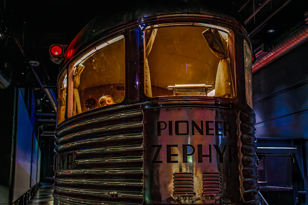
Your use of panning, shutter speed and a small aperture have worked very nicely in this dramatic image. The fact that the two carts are just a few cm apart really adds to the drama of this image.
My only suggestion would be to crop down about 1/4 of the way into this image to eliminate a near-duplicate blurred (far) wall to the closer one. That would create more of a powerful panoramic style image that would be fun to have printed and framed. |
Apr 15th |
| 2 |
Apr 26 |
Comment |
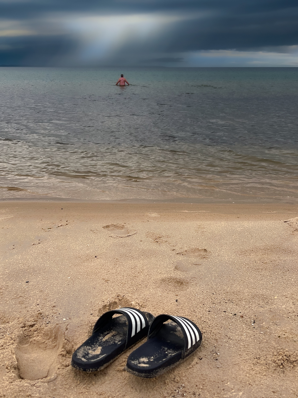
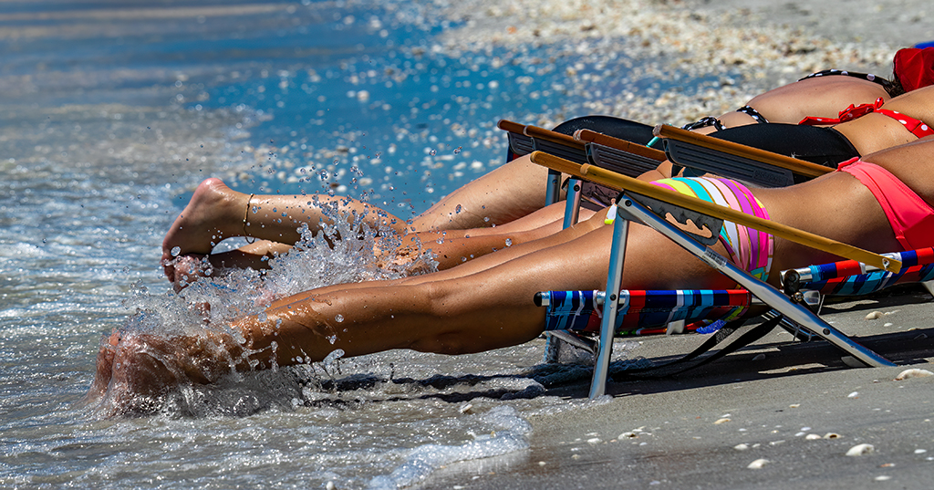
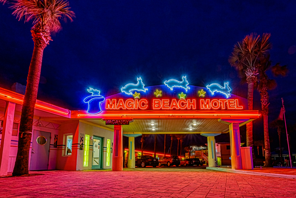
Hi Karen.
I've been to this beach - one of the very few along the Atlantic coast of Florida that have actual rock outcroping along the beach.
Your image is an interesting contrast between the calm waters and the impending storm. Like Piers noted, there are very strong directional lines for the eyes to be led.
Very nice.
Thanks for the historic comparison, too. |
Apr 15th |
| 2 |
Apr 26 |
Comment |
Hi Shirley.
Very nice image and I-phone capture.
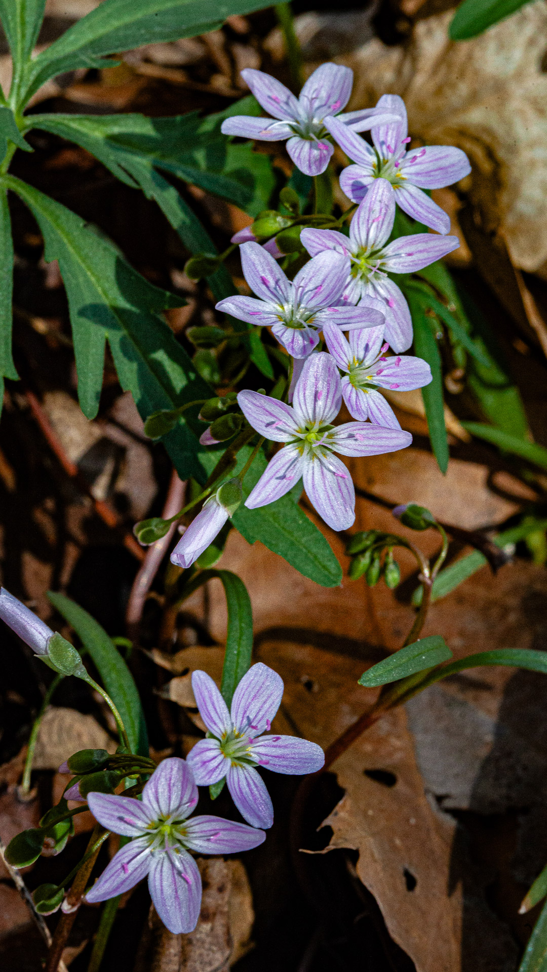
I've been doing quite a bit of flower photography as of late, and I know there are many schools of thought about how much DOF or softness to create. It's up to the creator. The biggest thing is separation from the background. You've done a very nice job of darkening that. I have mixed feelings about the vignette. I like the concept, but think it is a bit overdone. Did you try the black vignette? That, too, will make your white flowers pop. Just a thought, but you do have a very nice image. |
Apr 15th |
| 2 |
Apr 26 |
Comment |
|
Apr 15th |
 |
| 2 |
Apr 26 |
Comment |
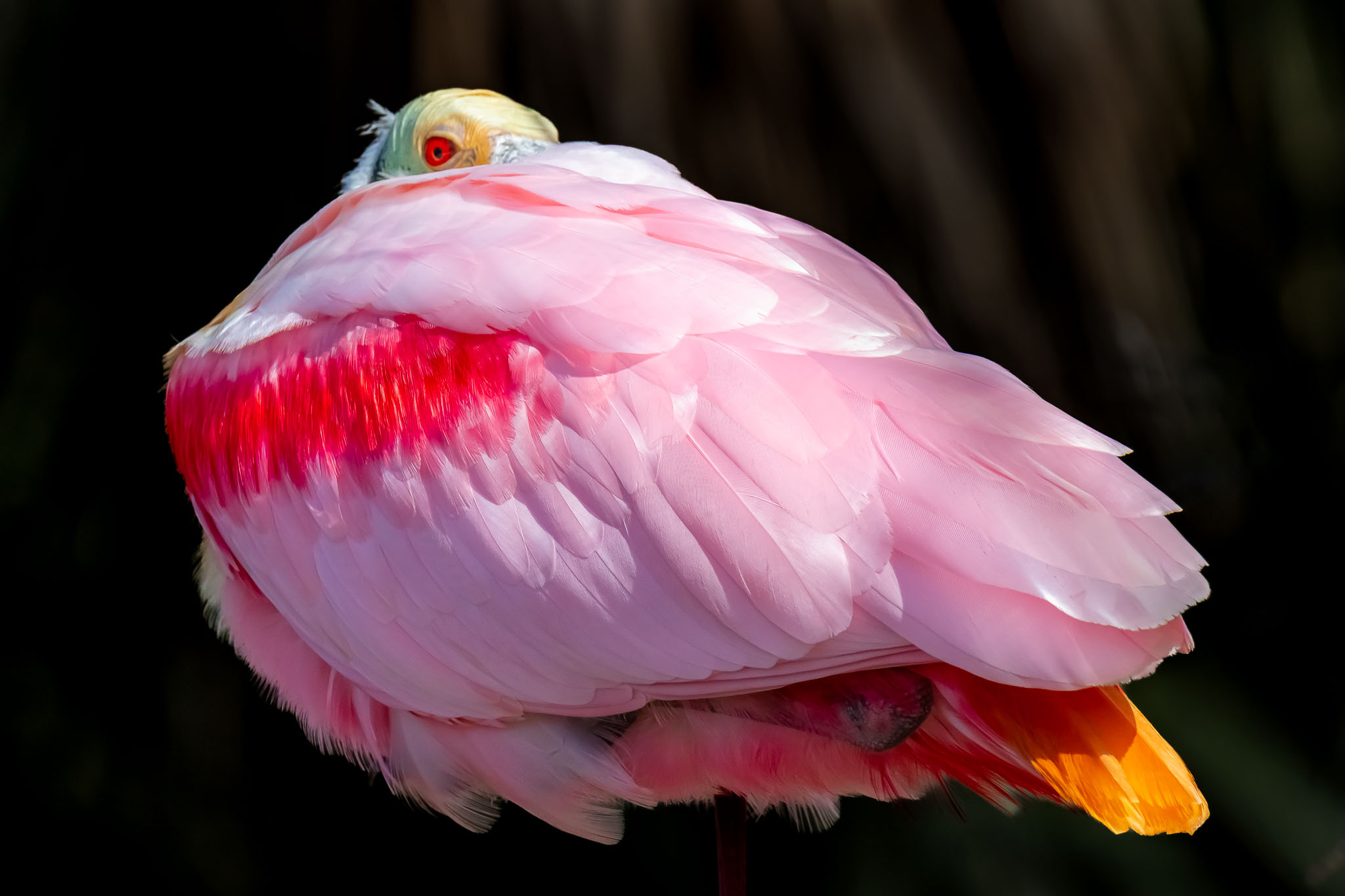
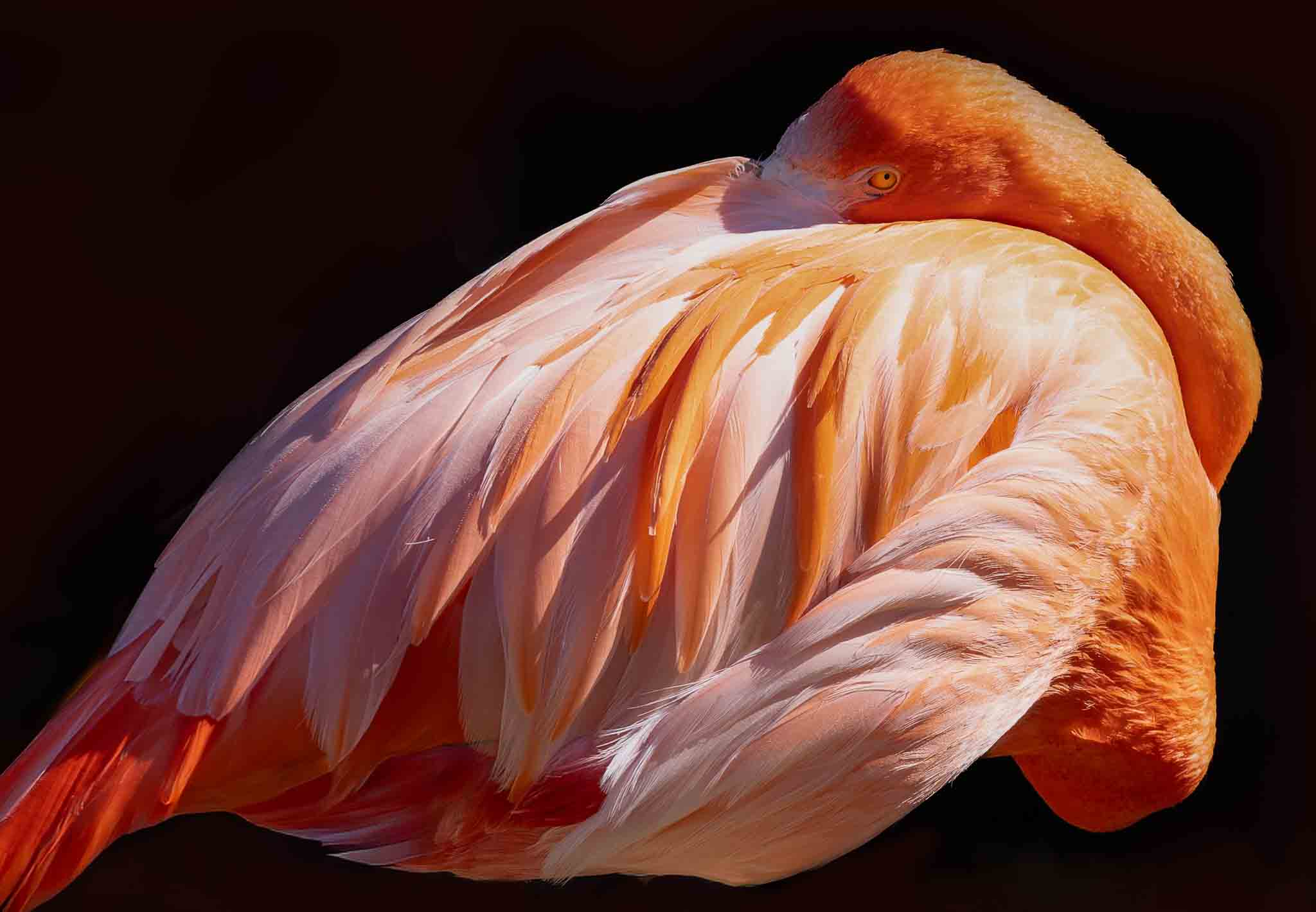
Piers, Your image is very similar to my Roseate Spoonbill image from last month. I like it very much - especially the single eye visible over the back.
My preference for a very colorful and unique bird such as this Flamingo is the color version. I like what you did to eliminate the background clutter. Given that the eye is so important in this composition (as it is in all bird photography) it gets lost in the BW version. It's now just part of the grey-ness.
For reference, I have a very similar (color) image hanging on the wall in my house. I did not take that particular image, but I like it very much. It is just the body, head resting against its back, no legs. I took the liberty of doing a similar style with yours. I feel it's much more intimate.
Apologies to Martin for removing his favorite portion of the image |
Apr 15th |
| 2 |
Apr 26 |
Reply |
Martin, I had to laugh when I read your comments - given your professional background. |
Apr 15th |
7 comments - 2 replies for Group 2
|
7 comments - 2 replies Total
|