|
| Group |
Round |
C/R |
Comment |
Date |
Image |
| 2 |
Sep 25 |
Comment |
Stanley, I too would like to know more about what I'm looking at. It's an interesting concept, but instantly recognizable as "not real". In my opinion, the two figures on the "pier" detract from the rest of the scene. The remainder is rather ethereal.
I'd like to know more about your intent and the setup. |
Sep 14th |
| 2 |
Sep 25 |
Comment |
Karen, there's part of me that likes the bigger story depicted in the original, but I'm also a fan of the simpler, minimalistic side of the creative vision. Well done.
I wasn't until I read your description and looked at the image again that I could see the visual evidence of the 2 flashes because of the shadows.
What fun you can have with still life imagery. |
Sep 14th |
| 2 |
Sep 25 |
Comment |
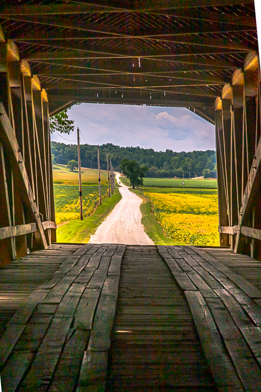
Shirley, this is certainly the type of image that I would capture if I had the privilege of strolling through this garden. Very pretty.
I love the low angle to get the viewer down to the handrail level and modify the perspective a bit. The edits you've made to create a more vibrant scene are very nice.
My first impression of this, though was....it's not centered in the frame. The small tree on the right, at the near edge of the bridge, is not visually strong enough, to counter the offset of the main subject in the frame.
A distracting item that caught my eye (like you saw and referenced in my image (smile!)) is a bright spot on the hillslope, It's slightly to the left when viewing straight down the bridge. I can't tell if it's a light colored rock or a sheet of plastic, but, it caught my eye and could easily be toned down. |
Sep 14th |
| 2 |
Sep 25 |
Comment |
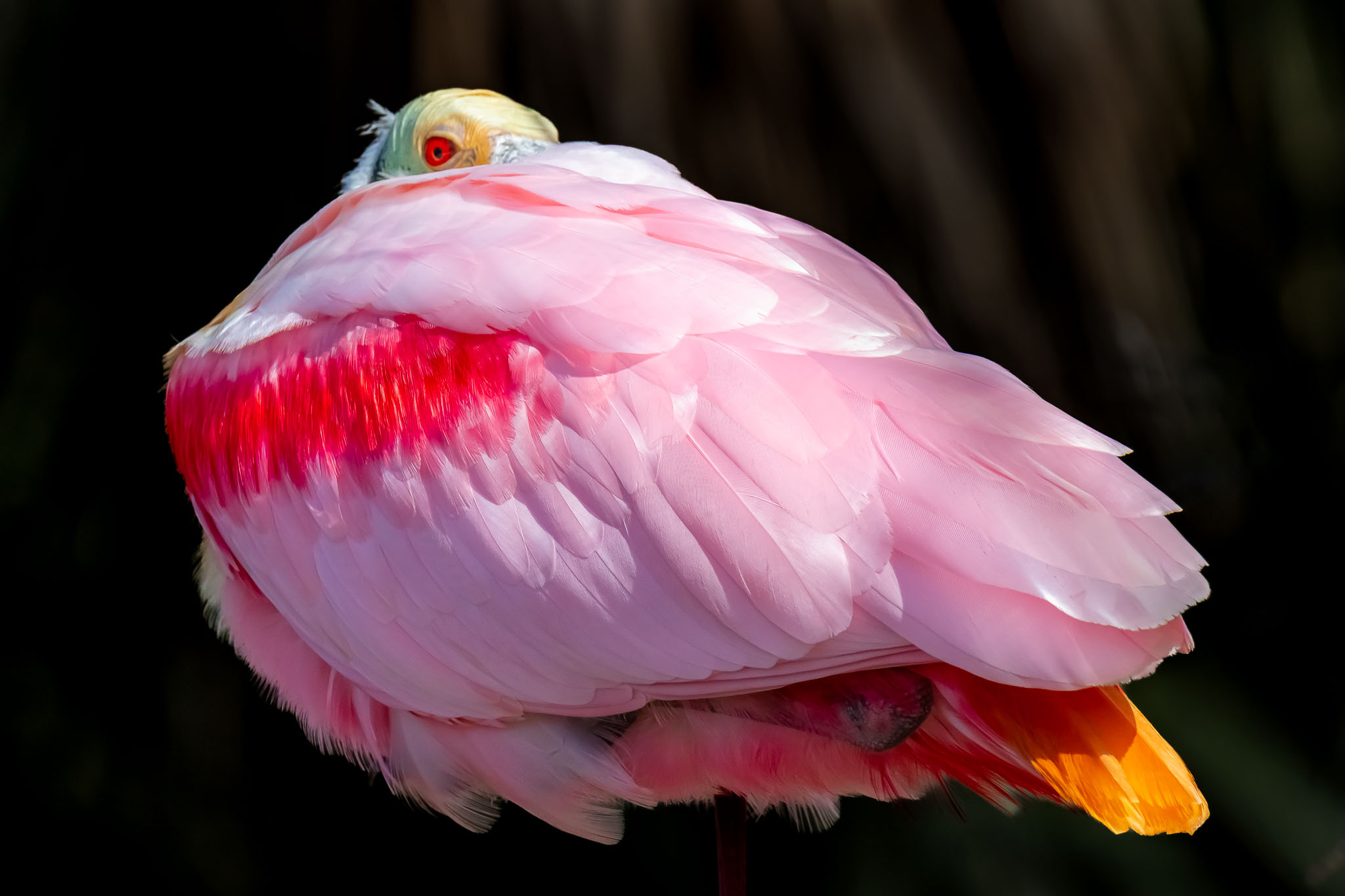
I like very much how your sky and clouds have been so subtly, yet dramatically, changed by your edits. The coloration and detail is wonderful.
I understand why the egrets are not bright given the time of day and cloud condition, but I might still try (if it was mine) to lighten them up a bit to accent them more.
I smiled when I read that you flipped the image to "read" the movement from left to right. I've learned that you are a strong proponent of doing that. BUT, I agree.
Well done.
|
Sep 14th |
| 2 |
Sep 25 |
Reply |
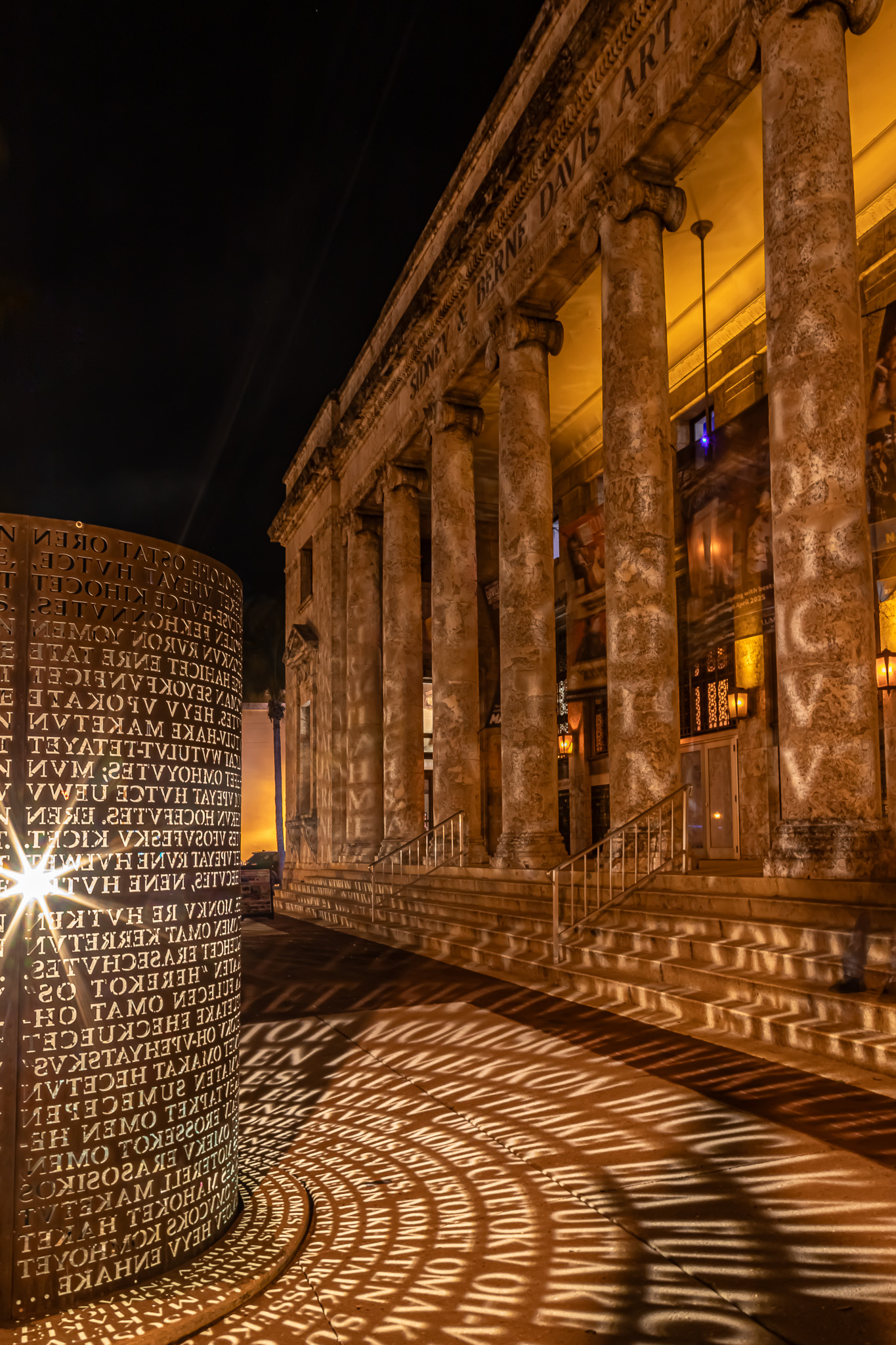
Thank you for your comments, Shirley.
Now, I'll have to do my own research to learn about a similar commemorative sculpture in Florida. Thanks for that information.
As of this weekend, this framed print is hanging in a local Museum of Art in NE Indiana as part of our Fort Wayne Photographers Club exhibit. It's not printed on metal, but I certainly agree that it would look great on that medium. |
Sep 14th |
| 2 |
Sep 25 |
Reply |
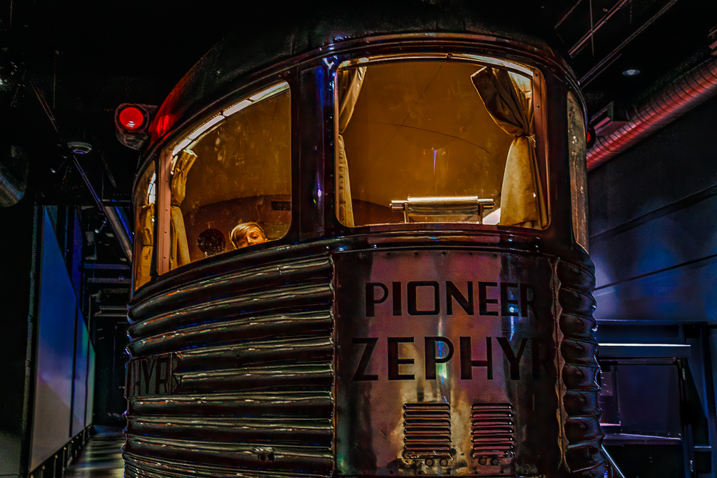
Hi Karen, Thanks for your comments.
I located what I think is the distracting circle you are referring to. For some reason, I had not caught my eye until you referenced it. I zoomed in on it and I believe it is a fastener used to retain the shape of the cylindrical commemorative sculpture as well as, likely, being used for some of the internal support for the light to be held in place.
Interesting how I never noticed it. If I had, I would have erased it.
As of this weekend the framed print of this image is in a local Art Museum in NE Indiana as part of our Photo Club exhibition. |
Sep 14th |
| 2 |
Sep 25 |
Comment |
Martin, I am familiar with the famous Infinity Room artist Yaoki Kasuma. I have been in two of her installations in art museums in different cities in the Midwest (US). I had to take my camera in with me each time - once I was allowed in with a tripod since it was very dark. It's a great experience.
I LOVE what your vision was to get someone of similar appearance to be an impromptu model mimicking the artwork. Your recoloring of the coat is perfect. Again, great vision!! |
Sep 3rd |
5 comments - 2 replies for Group 2
|
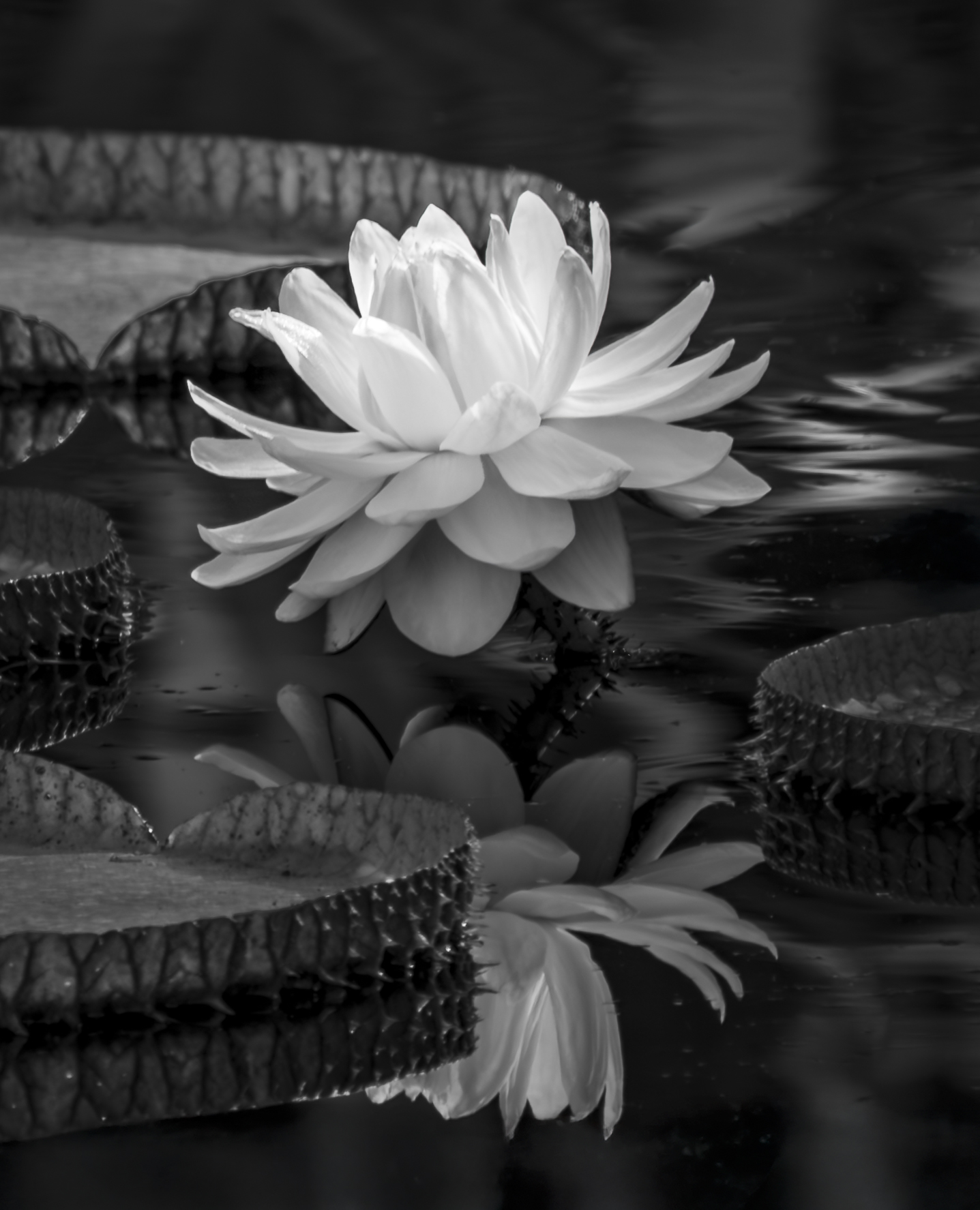
| 55 |
Sep 25 |
Comment |
Carol, I was not at all surprised to see a water lily submission from you. I know these are one of your favorite subjects.
I feel that your BW treatment of this one left the entire scene as a bit flat. I'm certain your original was vibrant color, so I was thinking that (if it were mine) the BW treatment would be vibrant with contrast.
I took the liberty of modifying it with just a few LR sliders. Most were on the "+" side: (Exp, Contrast, Shadows, Whites, Texture, Clarity, Dehaze) except for Highlights (-16). What do you think? |
Sep 14th |
 |
1 comment - 0 replies for Group 55
|
6 comments - 2 replies Total
|