|
| Group |
Round |
C/R |
Comment |
Date |
Image |
| 2 |
Jul 25 |
Reply |
Glad you liked the image, Carol.
I really like the comments that my fellow Group 02 members come up with. That's what I like about this discussion group concept.
Yes, it was nice getting a comment from Tom. I'd love to get to know him better.
See you in October. |
Jul 28th |
| 2 |
Jul 25 |
Comment |
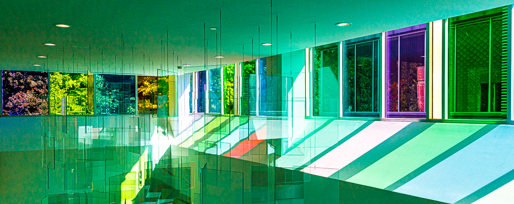
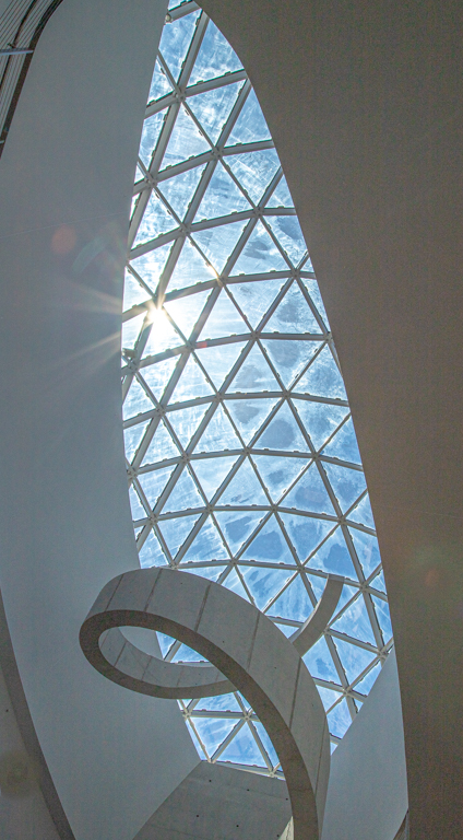
Hello Martin. I, too am a fancier of patterns and repetition, as well as minimalism. Well done.
I modified your image slightly(?) to accentuate the diagonals that exist due to top-hinged windows. Your presented image has these diagonals very subdued, but the image is dramatically changed by the accentuation of the diagonals. This was done by lowering the shadows and black sliders all the way to the left.
Overall, I think that I like your modification with 2 colored rectangles as the best of those presented (including mine). |
Jul 11th |
 |
| 2 |
Jul 25 |
Comment |
Well done, Stanley!
This is what I love about photography - the ability to either capture motion blur - or not. Sometimes the situation helps decide for you, but bravo to you for being able to capture motion (and emotion) so well.
Did you use a tripod, or did you have to hand-hold the camera for this image? |
Jul 11th |
| 2 |
Jul 25 |
Comment |
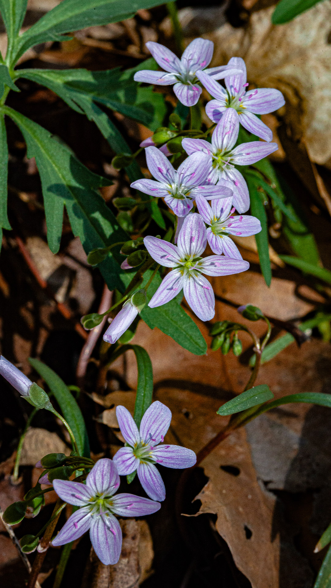
Very Nice, Karen!! I Love the triptych approach.
Was each days shoot the exact same arrangement, or did you modify the arrangement each time? My individual preference (of the 3) is the third image with four dominant buds standing proud in the center of the image. The 3 fallen petals help tell the story of the life cycle.
My only (constructive) criticism relates to the background. The dappled highlights of the yellowish background appear to be a bit too overexposed. The individual flowers in front of those areas seem to be overpowered by the brightness - especially in the middle image.
I REALLY like the "original" with the Lightpad. The stems, leaves and petals look translucent. I'll have to try that sometime.
Well done!! |
Jul 11th |
| 2 |
Jul 25 |
Comment |
Hi Shirley.
Beautiful house! I'm not at all surprised to see that it's in Charleston, but, like Piers referenced, many towns around the country have similar scenes. The (not so perfect) palm tree gives yours some reference.
I like the color-presented image over the BW version - although there's a lot that I like about the BW. My main concern with the BW is that the brick on the Limehouse St. side of the house is excessively dark. Both versions still have teltale signs of your phone in the reflection.
As you've noted from my presented image this month, I have an occasional tendency to oversatureate my images, but I feel like your presented image could use a little vibrancy boost. Reds and greens look a bit pale.
Well done.
|
Jul 11th |
| 2 |
Jul 25 |
Comment |
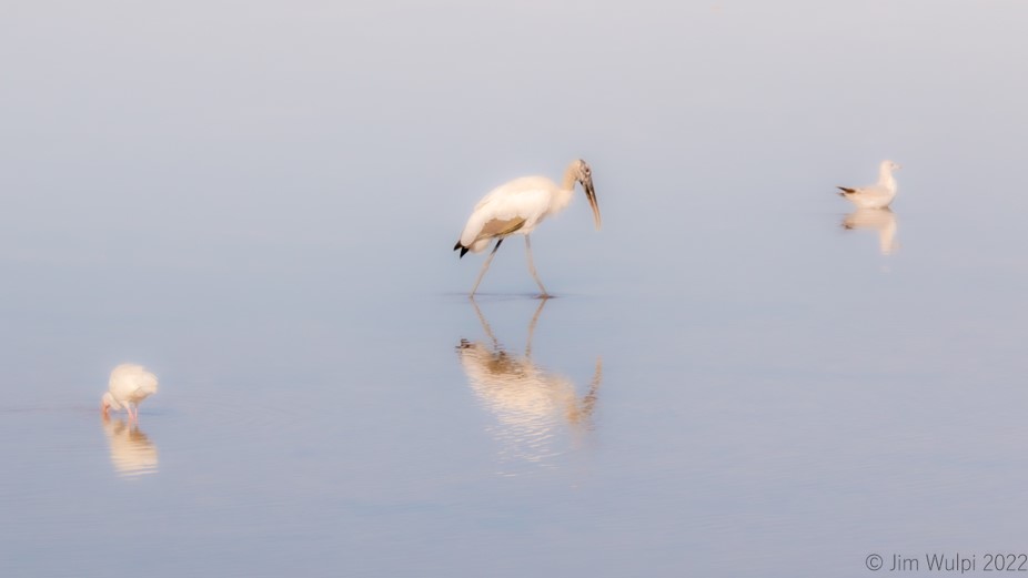
Hi, Piers.
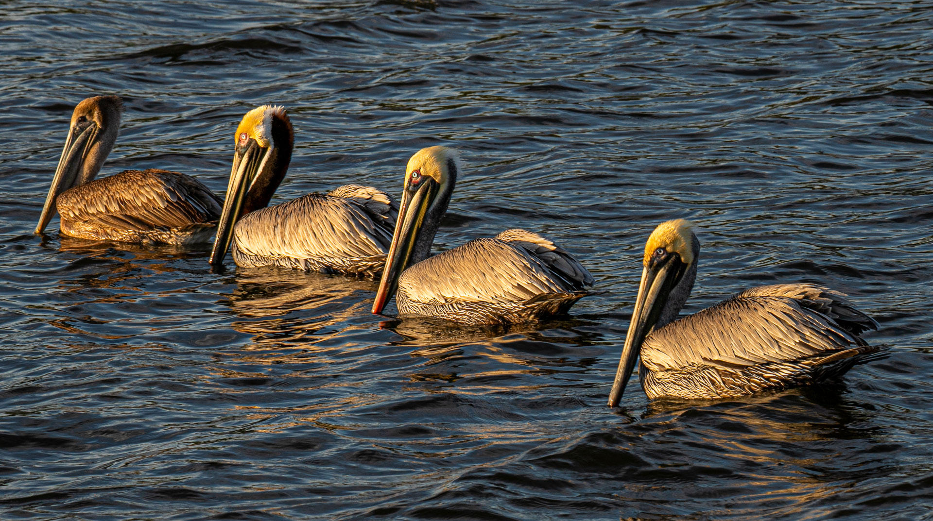
Especially since I'm seasonal resident of SW Florida, I have really enjoyed exploring and learning bird photography. Florida is a Mecca for Birders. It is (excuse the pun) a whole different (photographic) animal.
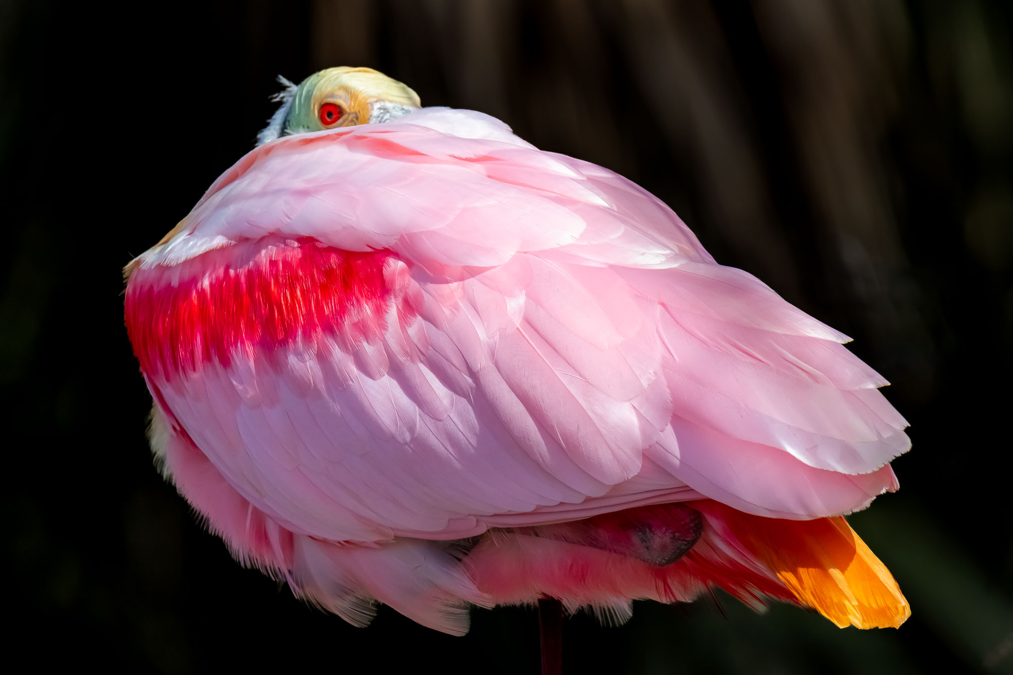
I love the catchlight that you captured in the birds eye in your presented image, but my first impression of the image, overall, is that I wasn't sure what I was looking at. The background wings without heads forced me to look for the shooting information - perhaps I was seeing a double/multiple exposure or a long exposure from the single bird. Your shutter speed told me otherwise. It wasn't until I saw your "Original 2" image that I saw the bigger picture and I feel it told the better story behind the cacophany of fluttering wings and the gathering of mud. I love the colors on the primary bird.
In the BW version, I feel that the background wings get lost in the darker shades.
In looking at your submitted image again, I felt that the head and breast of the featured Cliff Swallow were a bit too dark, not giving enough visual separation betweem it and the headless birds behind it. I took the liberty of lightening up those portions of the featured bird to provide better separation. I used a simple brush to mask it then raised the shadows and exposure slightly. |
Jul 11th |
 |
| 2 |
Jul 25 |
Reply |
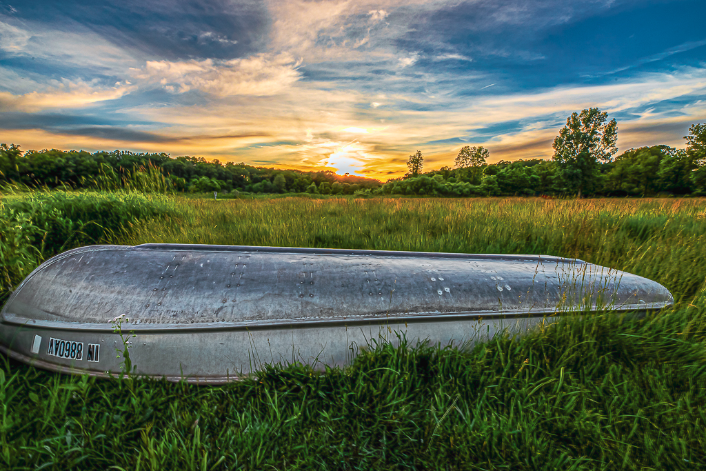
Thanks for your comments, Martin. The common perception among those in this group is, and I now agree, that the sky (especially) is a bit oversaturated. And, yes, the telltale signs of a dropped-in sky at the treeline is frustrating. I also agree that there needs to be a bit more space on the right side of the image.
I like and appreciate this forum to be able to capture all variaties of impressions - good and bad - relating to an image.
Thanks, again, for all that you do for this group. |
Jul 11th |
| 2 |
Jul 25 |
Reply |
Thanks for your comments, Piers. The common perception is, and I now agree, that the sky (especially) is a bit oversaturated. And, yes, the telltale signs of a dropped-in sky at the treeline is frustrating. Personally, I like the grasses in front of the boat - an indication that the boat has been there for quite a while.
I like and appreciate this forum to be able to capture all variaties of impressions relating to an image. |
Jul 10th |
| 2 |
Jul 25 |
Reply |
Thanks for your comments, Karen.
This is what I like about this forum; I agree (now) that this image is a bit too saturated, and that it needs extra space in front of the boat. While this version of the sky is fairly dramatic, I will also crop down slightly and put the treeline slightly closer to the top 1/3 line. |
Jul 10th |
| 2 |
Jul 25 |
Reply |
Thanks for your comments, Shirley. I agree that extra space is needed at the front of the boat. I should have caught that myself prior to submitting this. |
Jul 10th |
| 2 |
Jul 25 |
Reply |
Hi, Tom.
I winter in Ft Myers, and am a member of the Ft Myers Camera Club. I met you and your wife briefly at the Naples Swamp Bugggy races 2 winters ago. I hope our paths cross again.
Thanks for your input on my image and extending the space in front of the boat. I agree that it did need that.
I really like and appreciate this forum. Good feedback is so important.
I agree that the image is a bit too "overcooked". If I ever do get around to print this image, I will tone things down a bit - in addition to adding space in front of the boat. |
Jul 10th |
5 comments - 6 replies for Group 2
|
| 55 |
Jul 25 |
Comment |
Hi Carol.
I like the low angle vantage point for this shot. It is tack sharp. well done! The anticipation of the other players and referee really completes the story.
Take a look at my image over at Group 02 and let me know what you think. |
Jul 23rd |
1 comment - 0 replies for Group 55
|
6 comments - 6 replies Total
|