|
| Group |
Round |
C/R |
Comment |
Date |
Image |
| 2 |
May 25 |
Reply |
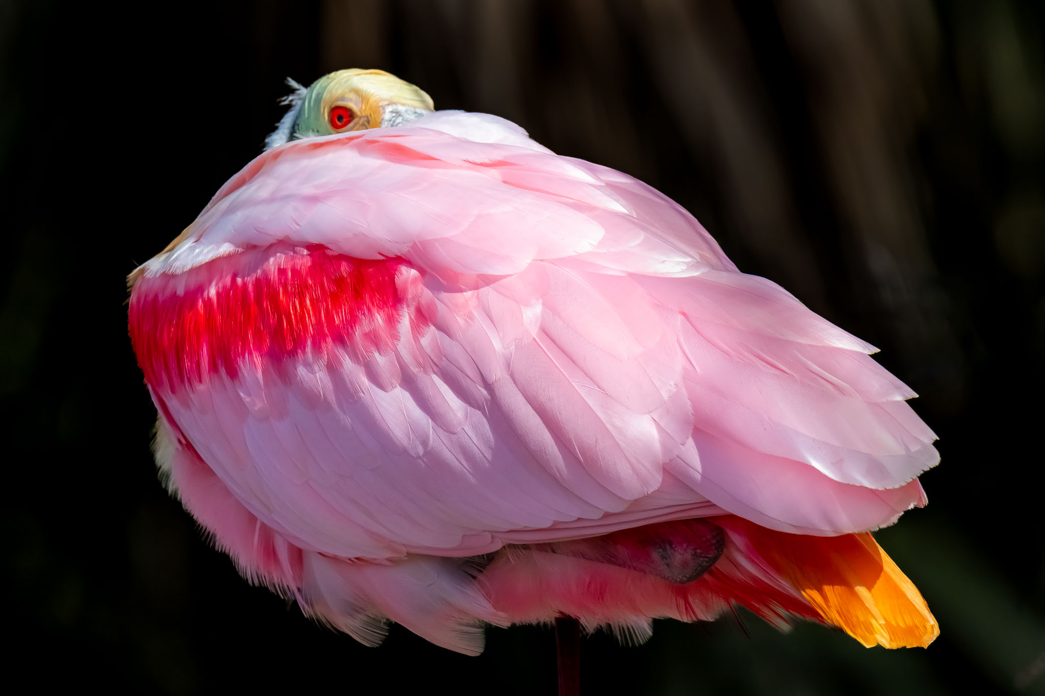
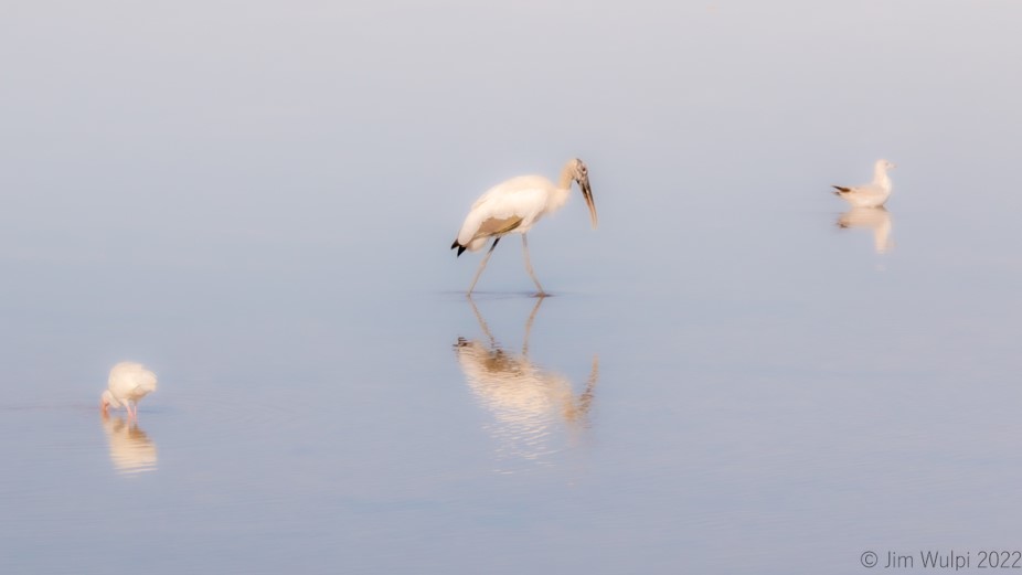
Karen,
In my description of this image, I neglected to include the fact that this is a female.
They have quite a bit of brown - especially the neck area during breeding season, which is when this image was taken. |
May 8th |
| 2 |
May 25 |
Comment |
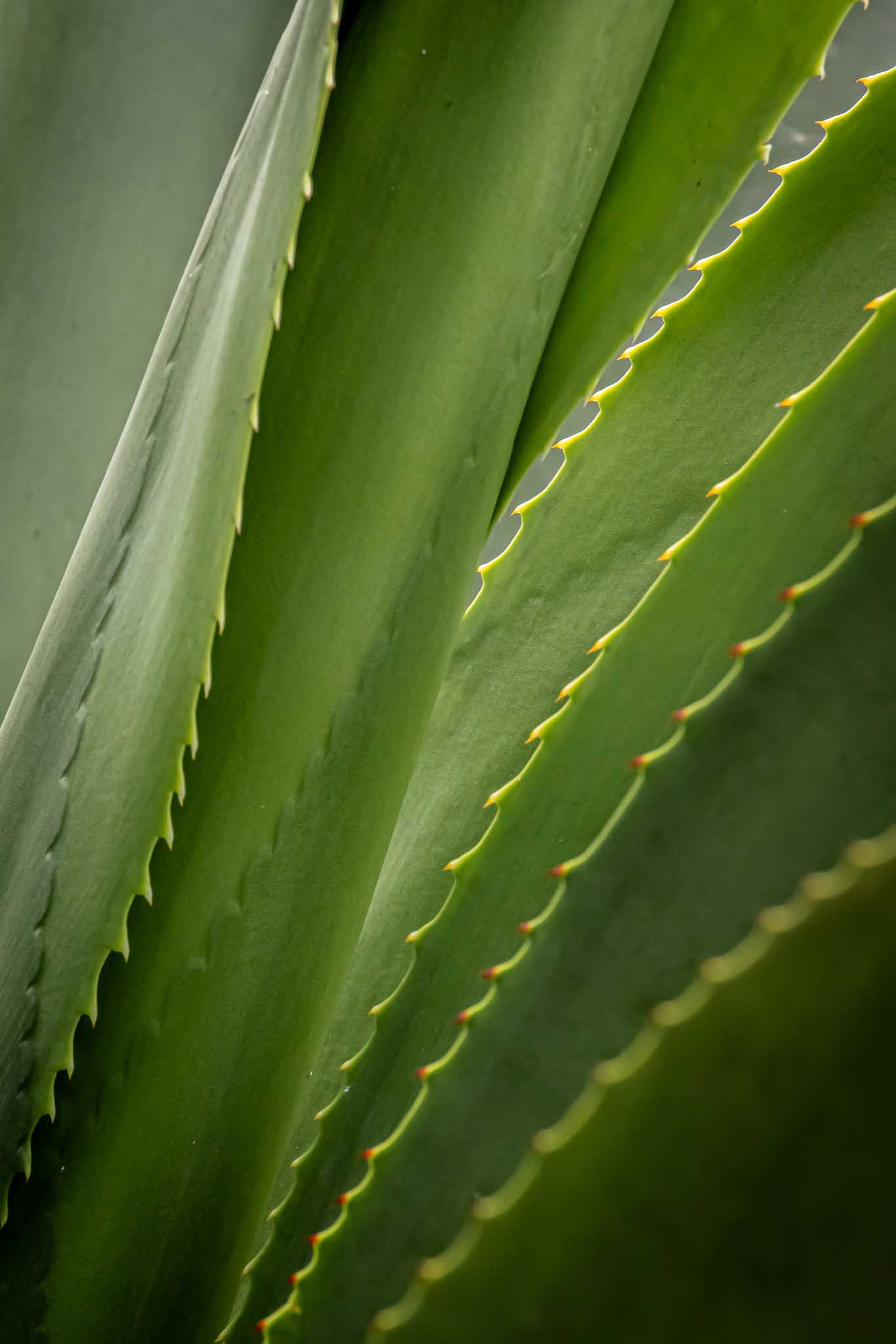
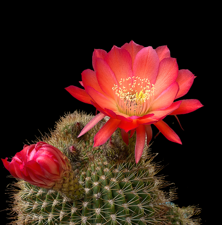
Hi Karen,
Sorry to hear that you're in a slump with your photography. Did you do the St Augustine Birding fest (being renamed) this year? I suggest doing a quick google search "tips to stimulate a photographic slump"...There's all types of articles to help.
Re: your current image, I just did a quick-and-dirty modification to it. The background is not advantageous, so I blacked it out in order to bring out the beautiful blooms of the cactus.
It's not perfect, but the new masking tools in LR are incredible at selecting specific aspects of any image. You can then select another aspect of the image and subtract it (or even a specific color range). Inverting that will help better define those tricky borders.
Anyway, there are lots of new ways to modify your images. It's fun to play around with then and learn new things.
|
May 7th |
 |
| 2 |
May 25 |
Comment |
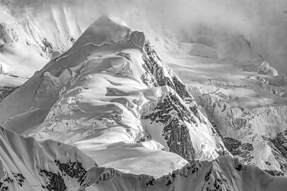
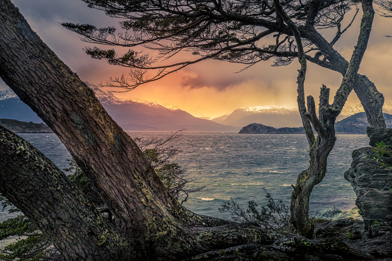
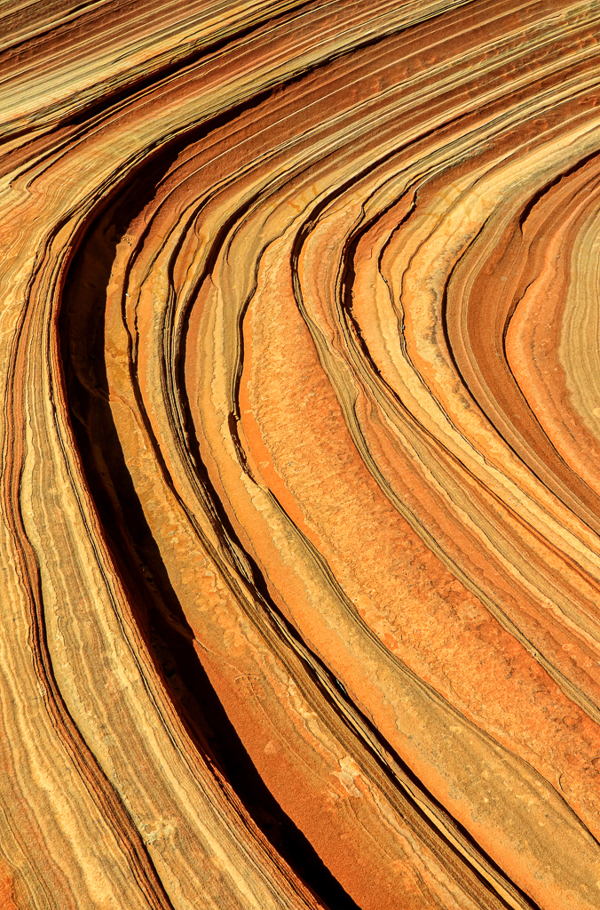
Stanley, This is an image after my own heart. I have a background in Geology and these types of landforms are fascinating to me. I did a quick google-infused learning about this area and saw that the rocks/mountains are actually very colorful due to the variety of sedimentary rock layers coupled with great forces within the earth forcing layers into contorted shapes, followed by weathering and erosion over millions of years. I included a generic color image of the same area.
I like the moodiness of the BW image. The fog is the primary reason why this works so well. My only suggestion would be to brighten the mass in the lower right corner in order to lend more scale and depth to the scene. As presented, that dark mass is lifeless and does not add anything to the story of the aged mountains.
I would also like to see the original color version.
Well done. (Also, I'm jealous of you and being able to get to this area.) |
May 4th |
 |
| 2 |
May 25 |
Comment |
Well done composite, Martin. You brought out the essence of the hard working guy. The dropped-in background really seals the story-telling aspect of your image. |
May 4th |
| 2 |
May 25 |
Comment |
Looks like a fun day at the track, Shirley.
After watching the Kentucky Derby yesterday, it's refreshing to see blue skies and a dry track (Smile!).
Like Piers pointed out, my initial viewing of your image presented a visual contradiction. The top edge of the scoreboard, the track rail and turf-to-dirt interface are all at an angle while the flagpoles and finish line post are all 90 degrees vertical.
The shadows in the hedge-spelled "Oaklawn" compete with the horses mane and the jockys arm.
This would have been a fun place to play around with panning and Motion blur.
|
May 4th |
| 2 |
May 25 |
Reply |
WOW, that edited version is so significantly better that the original. To my eye, the diagonal "frame" created by the foreground foliage now adds a great deal and actually helps balance the entire image. The power of the current editing software is incredible. Well done.
I understand the assignment was "No editing". I feel badly for being so harsh with my initial comments, but I hope you took it in the light in which it was intended - which was intended to be constructive. I know you are capable of so much better composition.
|
May 4th |
| 2 |
May 25 |
Comment |
Piers, thanks for your comments.
It's curious about the Anhingas and the Cormorants. Despite the fact that they are close cousins, the cormorants feathers are oiled enough to allow them to fly immediately after being in the water. Their beaks are different and their fish -catching style is different.
|
May 2nd |
| 2 |
May 25 |
Comment |
Piers, I've long admired the images you present each month for discussion - the versatility of topics, scenes and vision that you have. Regrettably, this one is not among my favorites.
You indicate that that you focused on a branch of a tree on the island, but the entire island (and resulting reflection) looks "soft". The framing of the near foliage is sharp, but the thin vines hanging down interrupts, and competes with, what the central theme of your images is - the island and its reflection.
I truly apologize for the criticism. I know your photographic expertise is so much better. |
May 1st |
6 comments - 2 replies for Group 2
|
6 comments - 2 replies Total
|