|
| Group |
Round |
C/R |
Comment |
Date |
Image |
| 2 |
Apr 25 |
Reply |
Shirley, I believe that what you're seeing "coming out of her glove" is her hair. |
Apr 4th |
| 2 |
Apr 25 |
Comment |
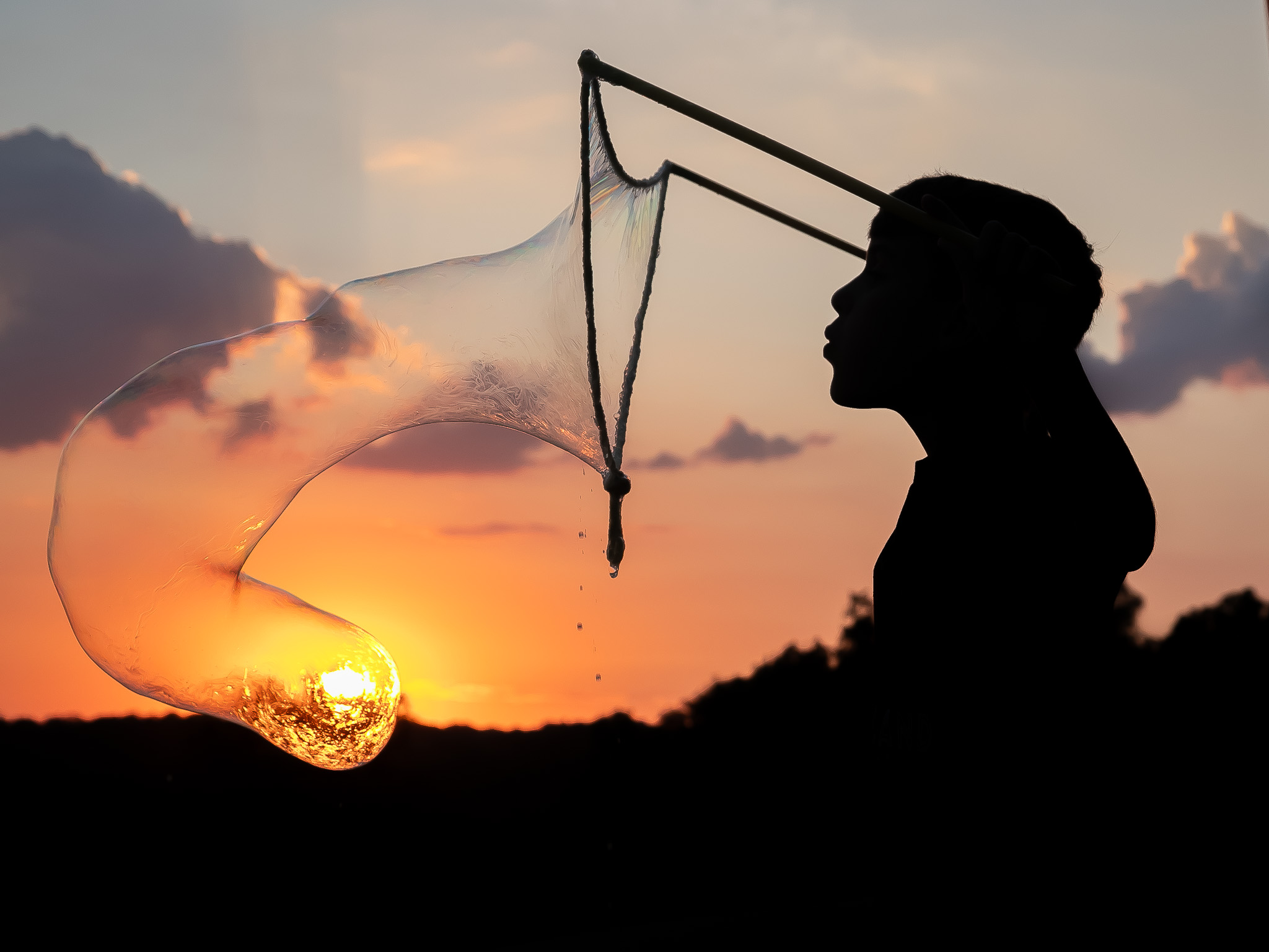
Martin,
I, too, vote for the cropped version. The intensity of his gaze is there to make sure he doesn't get a sound smack if he lightens up.
I like the bits of color in his shorts shirt and hat and her glove. The background colors are all in shade, thus are very subdued but still recognizable objects. The direct sun on the boxers indicates it's very late afternoon.
I think it's interesting that the setting for this sparring match is waterside. Good capture. |
Apr 4th |
| 2 |
Apr 25 |
Comment |
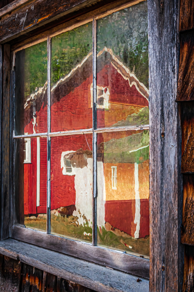
Stanley,
What a beautiful red, white, and wood-colored composition. The beautiful woman in the window (also dressed in red) really makes this scene and brings it to life and scale. The image would not be the same without her. The black shadow of the open windows compliments the blacks of the clothing. The wooden boards of the building adds a nice contrast to the reds and blacks.
Very nice image.
|
Apr 4th |
| 2 |
Apr 25 |
Comment |
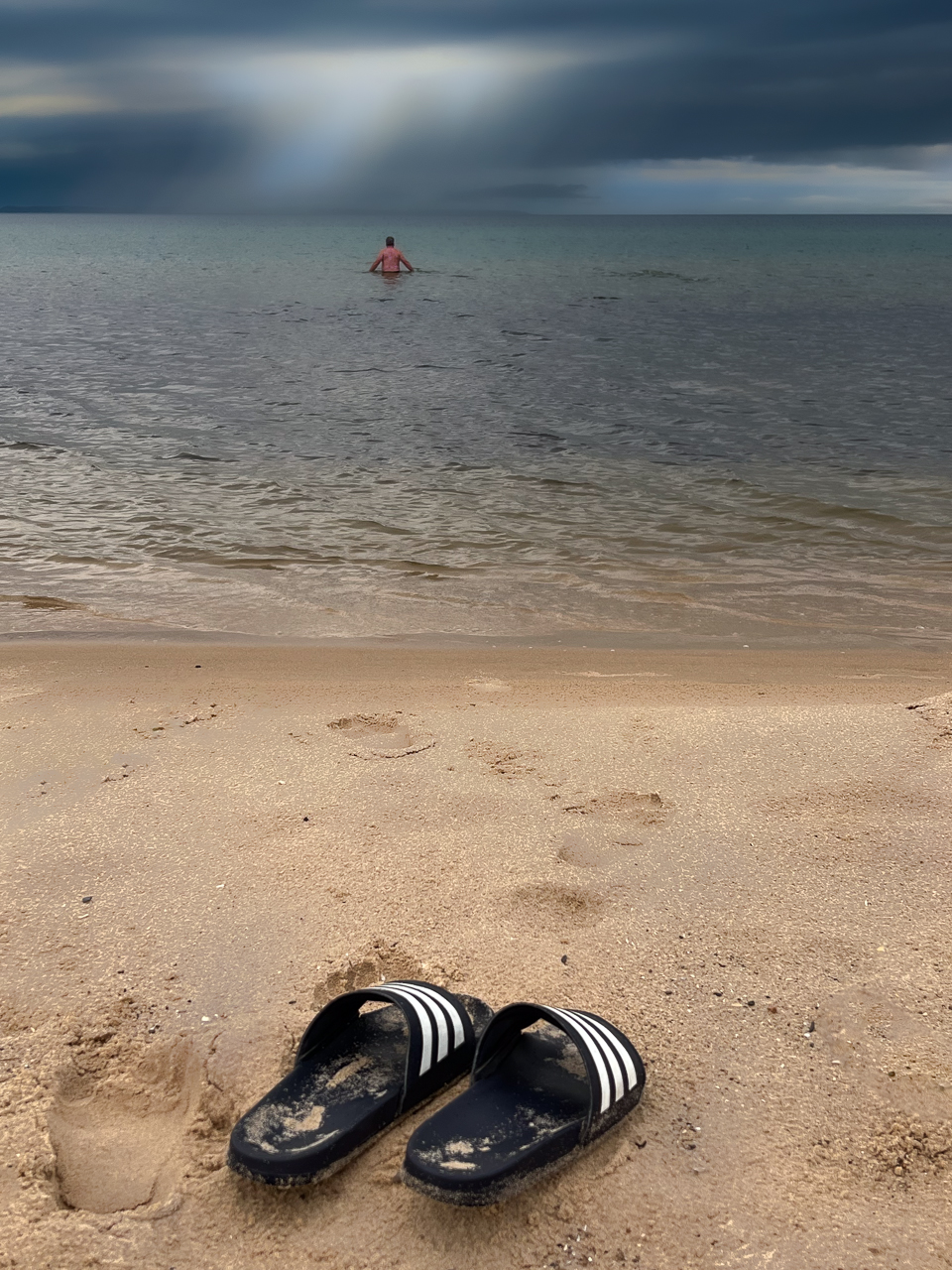
Hi Karen, This looks like it could have been taken at Washinton Oaks SP. Am I close?
I, too, have seen much buzz about ICM. One of the images I saw using this technique at a local art gallery show was incredible and I wanted to talk to the author of that image but just missed her. That image won an award. Mine did not. Her image was wall-worthy.
I like the concept, but there's a learning curve. So often it's hit-or-miss. Usually miss.
Most photographers who have an artistic mind are interested in learning what ICM can do. It can be fascinating. |
Apr 4th |
| 2 |
Apr 25 |
Comment |
Shirley,
I likely would have taken an image of the same scene - Iphone or big camera. The scene is very flat, so I took the liberty of bringing it into Lightroom (desktop, but you have the same capability on LR Mobile).
I masked the sky, and added some color and contrast to bring out the highest clouds, then added texture and clarity. Then, I masked the water and, again, added color (via Temp. slider). Overall, I then brought up the white of the ship and sails to end up with a (I think) much more pleasant image.
All masking and adjustment are very quick and rough, but it's doable.
A crop to eliminate some of the points of land are needed, too. |
Apr 4th |
 |
| 2 |
Apr 25 |
Comment |
Piers, Nice opportunity. You never know unless you ask. There's a lot that I like about the original that was cropped out of you BW conversion. I like the texture created by the "porthole-looking" rings on both of the distilling devices, and especially like the ring lights directly over each of those pieces of equipment that produce almost a "halo" effect signifying that that is where the "magic" happens - accompanied by a "choir of angels". But, that may be just me. (smile) So, I would have cropped it differently. If you would be allowed to get closer to the equipment, I would get up close to the base of those two primary pieces of equipment and shot up - at a steep angle - to capture those interesting pieces of port-hole texture.
Also, I've become pretty familiar with the AI removal tool, and it's amazing how well it can work, but, in your image, the elimination of the plastic crates for the raw materials left a sqare-ish shadow on the floor that is inconsistent with the adjacent rounded tanks. |
Apr 3rd |
| 2 |
Apr 25 |
Comment |
Piers,
Good Catch. It was a simple thing to rectify. I should have caught it myself.
Here's the reworked one with brighter legs.
Better? |
Apr 3rd |
 |
6 comments - 1 reply for Group 2
|
6 comments - 1 reply Total
|