|
| Group |
Round |
C/R |
Comment |
Date |
Image |
| 2 |
Feb 24 |
Reply |
See the changes I made and reposted to Garys comments |
Feb 9th |
| 2 |
Feb 24 |
Reply |
See the changes I made and reposted to Garys comments |
Feb 9th |
| 2 |
Feb 24 |
Reply |
Tor, See the changes I made and posted to Garys comments |
Feb 9th |
| 2 |
Feb 24 |
Reply |
See the changes I made and reposted to Gary's comments. |
Feb 9th |
| 2 |
Feb 24 |
Reply |
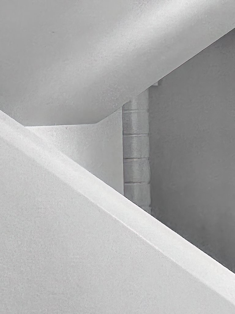
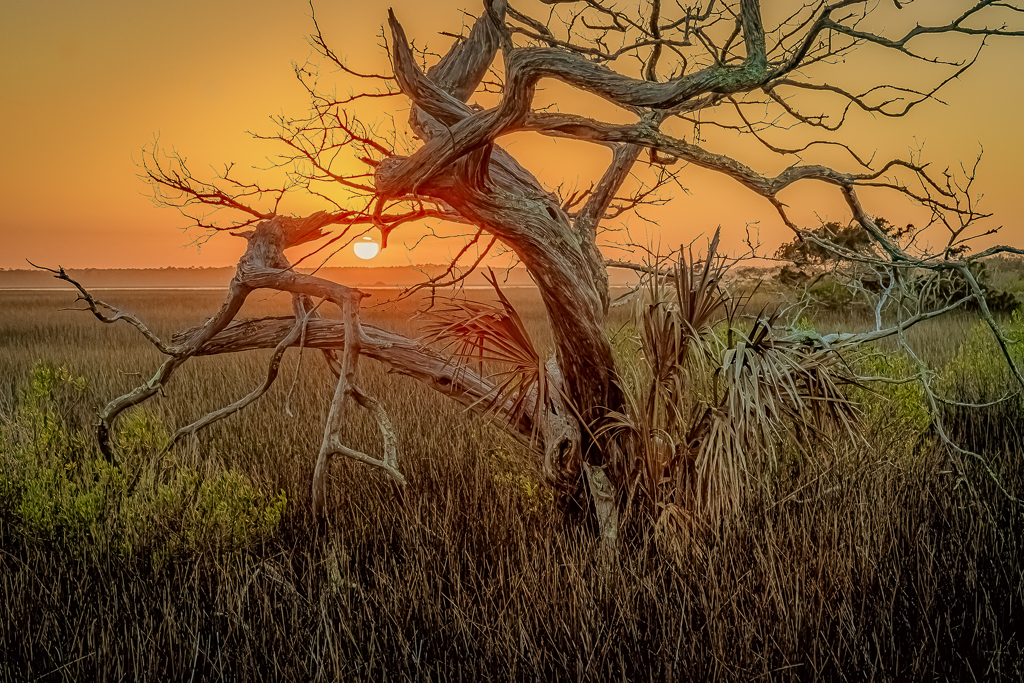
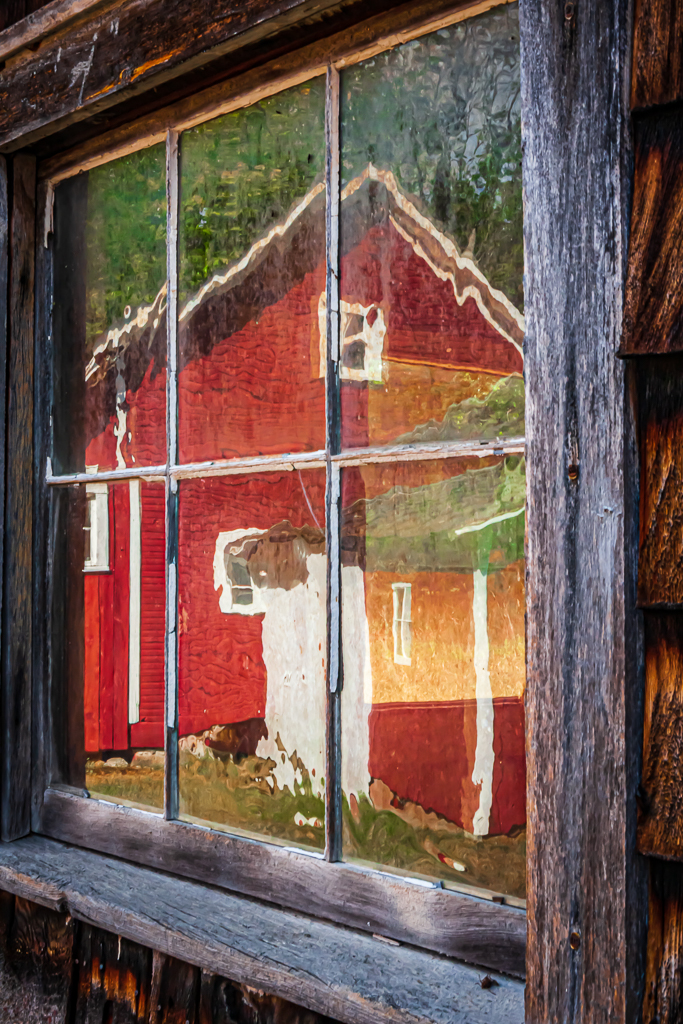
Gary,
Based on your suggestion and others, I've reworked my image to 1) eliminate the end newel post (Thanks generative fill), 2) reverse the image for better visual flow, and 3) extended the canvas just a hair to include the framing stone work surrounding the window on the outer edge. (Thanks again to generative fill with expanding canvas).
I'll be printing this and entering it in the Lee Co. Art Alliance gallery. |
Feb 9th |
 |
| 2 |
Feb 24 |
Reply |
The friend who we visit in that area lives just north of that castle, so we pass it anytime we come or go into "town". We went to a church service in the castle a few years ago, and that was interesting, but were pleased to see they've now replaced that service (once each month) with an open house every Sunday.
I will take to advice of those of you who noted the newel post as a distraction and clone it out, reverse the direction of visual flow, and print it.
Thanks for your input.
|
Feb 9th |
| 2 |
Feb 24 |
Reply |
Thanks, Gary.
If you note, another member of Group 02 made the same suggestions as you did about cropping out the final newel post and windows.
I like the right-leading "flip" in yours.
This is one of the things I like best about these discussion groups.
Thanks for the input.
|
Feb 8th |
| 2 |
Feb 24 |
Reply |
Tors,
It's interesting that you did the cropping that you did to my image, because, just earlier this evening another PSA member in one of my local Photo Clubs had the exact same suggestion after seeing my submission this month.
Then, I logged on to this page and saw your input. I will pursue that change and submit it into other competitions. Thanks |
Feb 7th |
| 2 |
Feb 24 |
Comment |
I, too, prefer the BW version of this image.
I feel that the intensity and musculature are accented better with the monochrome.
A bit more room around your subject would keep it from feeling cramped.
Well done.
|
Feb 5th |
| 2 |
Feb 24 |
Comment |
Tor,
I smiled when I first saw this image. I remember the days of having to reel back the tape with a pencil.
It looks like you had fun with Photoshop.
Let us know how this image fared in the competition. |
Feb 5th |
| 2 |
Feb 24 |
Comment |
Karen, congratulations on embarking on a different style of photography. I like the overall layout of this scene.
My first impression of this image, however, was one of slight confusion.
With the colorful flowers, the viewer assumes they would be fragrant; the tea pot and cup, also would be fragrant, but different.
The "smoke" from the teacup looks like it's from incense, and not steaming tea. That (incense) would lead to a clashing of natural fragrances.
My suggestion would be to make the tea cup depict (more realistically) that it's "steaming", and it would be much more pleasant to the visual and mental senses. |
Feb 5th |
| 2 |
Feb 24 |
Comment |
Sometimes, it's fun to just play.
It looks like you had fun with this. |
Feb 5th |
| 2 |
Feb 24 |
Comment |
I like the crop to eliminate clutter and choppy waters. The reversal of flight works well, too.
The powerful downsweep of the males wings provides stunning lines. My only suggestion would be to try to coax a bit more contrast between the very tip of the females wings with the woods at the distant edge of the lake. They are the same tone and the tips get lost. |
Feb 5th |
5 comments - 8 replies for Group 2
|
5 comments - 8 replies Total
|