|
| Group |
Round |
C/R |
Comment |
Date |
Image |
| 2 |
Sep 23 |
Reply |
Martin,
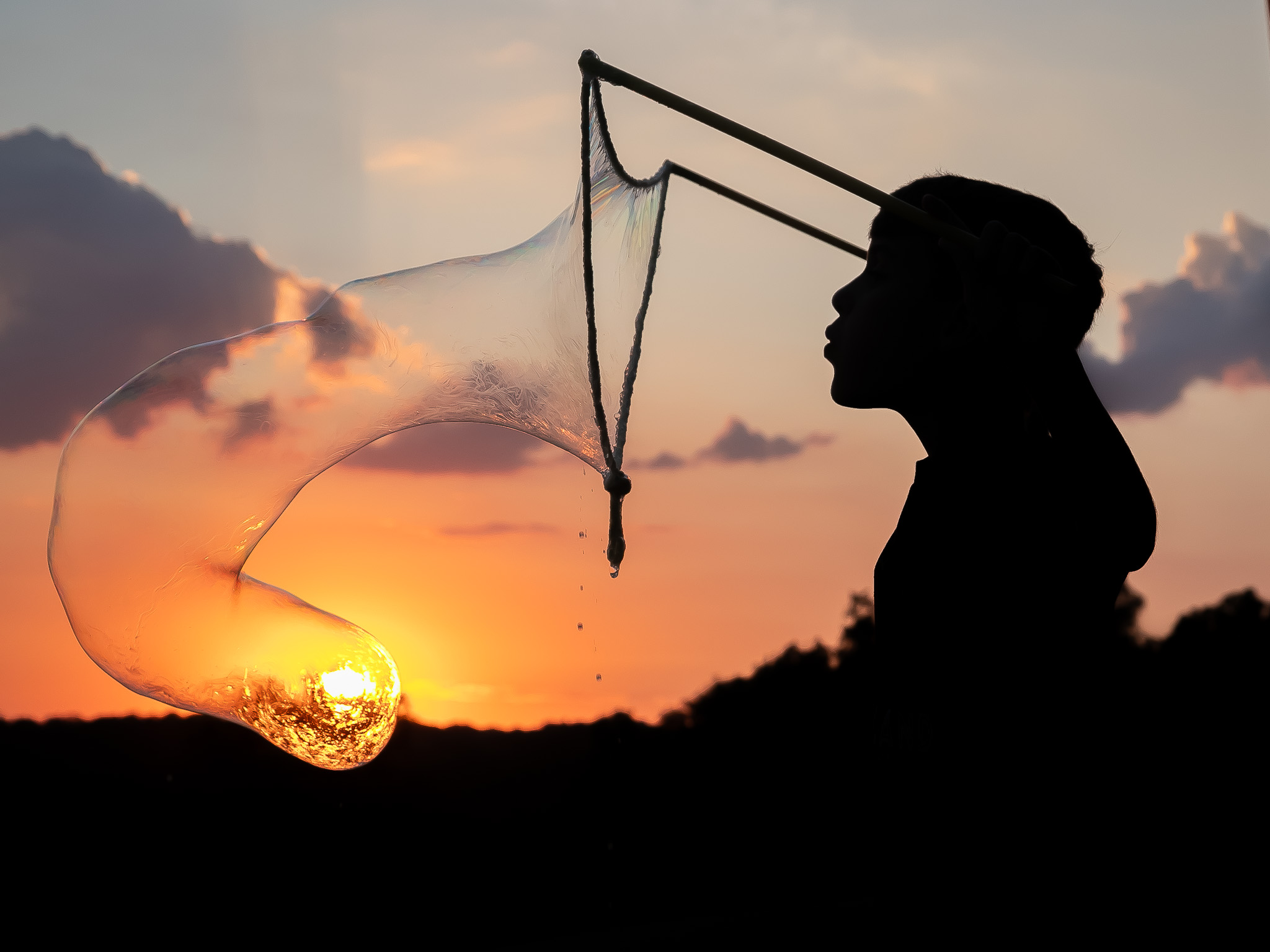
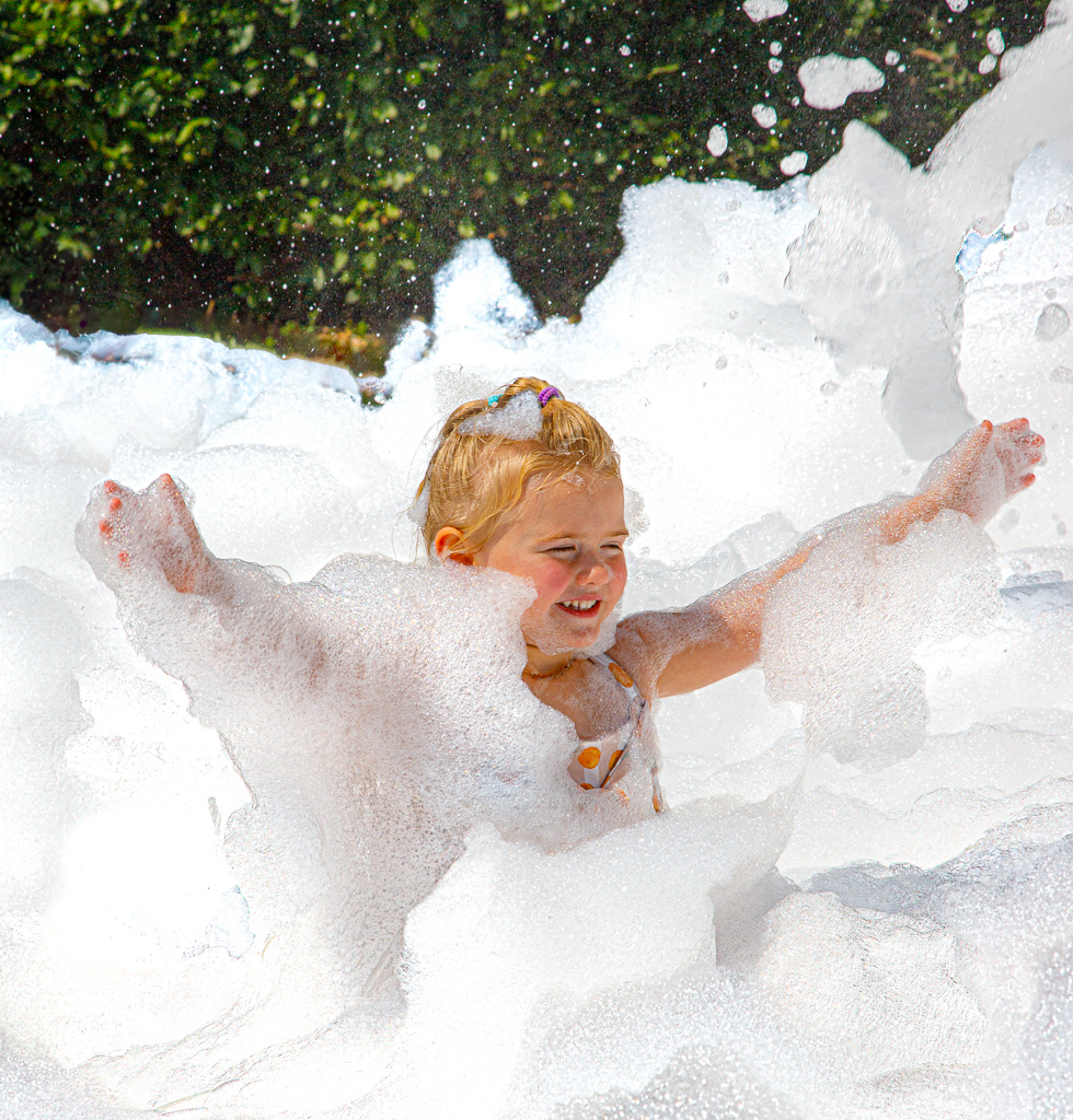
I finally got around to revisiting this image in Photoshop and was able to clone out the weird suds that were a distraction. I'm including the revised effort. |
Sep 18th |
 |
| 2 |
Sep 23 |
Reply |
Terri, I finally got around to revisiting this image in Photoshop and was able to clone out the weird suds that were a distraction. I'm including the revised effort.
|
Sep 18th |
 |
| 2 |
Sep 23 |
Comment |
Piers, Thank you for your comments. I spent quite a bit of time playing with the Texture/Claity/Dehaze sliders trying to get the right combiation of detail, color and essence of the suds and skin tones. I was a bit surprised, as well, that the Dehaze got as strong as it did, but I feel it's in the right spot. |
Sep 3rd |
| 2 |
Sep 23 |
Reply |
Thanks for your comments, Karen.
I have no more room in this frame to add to the right side. If I ever plan on printing this, I'll work with PS to add more space to the right, as well as tone down the highlights more.
I spent quite a bit of editing time working with the suds to get the right combination of brightness and texture. I felt I was close. |
Sep 3rd |
| 2 |
Sep 23 |
Reply |
Hi Terry, Welcome to our group. Your comments are appreciated.
Of all the images I had of this girl, and others, this one was my favorite due to exuberance of the moment. I don't feel that she needed to be looking at the camera to get the feeling I was after. The awkward area you reference in the suds.....I spent quite a bit of time trying to resolve that specific digital issue, but was unable to create a better alternative. If I ever plan to print this image, I'll re-address it.
|
Sep 3rd |
| 2 |
Sep 23 |
Comment |
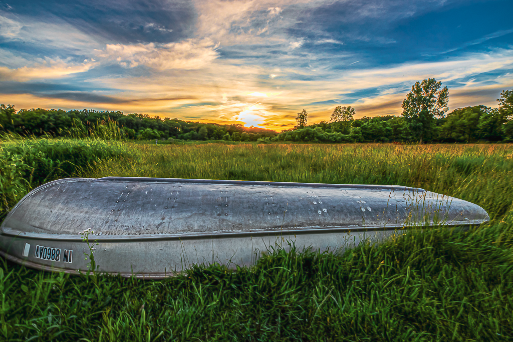
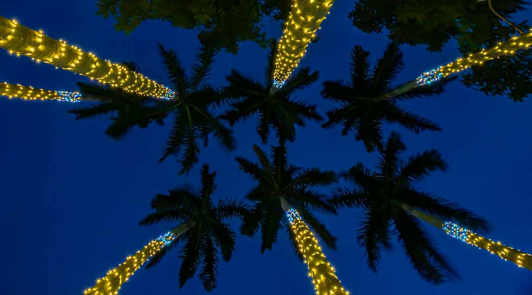
Martin, I like the essence of the scene but am conflicted about your treatment of the sky. Looking at the orginal image, it does not appear that an ominous storm is approaching, so I'm curious as to what prompted you to go so dark and foreboding (other than the current trend within your club). The boathouses (interestingly lashed down to the dock), the rocks and the green boat are the essence of the image. You edited the dark sky, but i feel it doesn't add to your image if is stays as-is. If dark sky is your goal, I feel that if the light (fluffy) portions of the clouds were lightened/highlighted and accented, that your dark sky would become an added element to the overall image.
Another part of me would like to have kept Mt. Vesuvius in the image for a sense of location and scale.
PS - Looks pretty windy. I hope your food didn't blow away! |
Sep 3rd |
| 2 |
Sep 23 |
Comment |
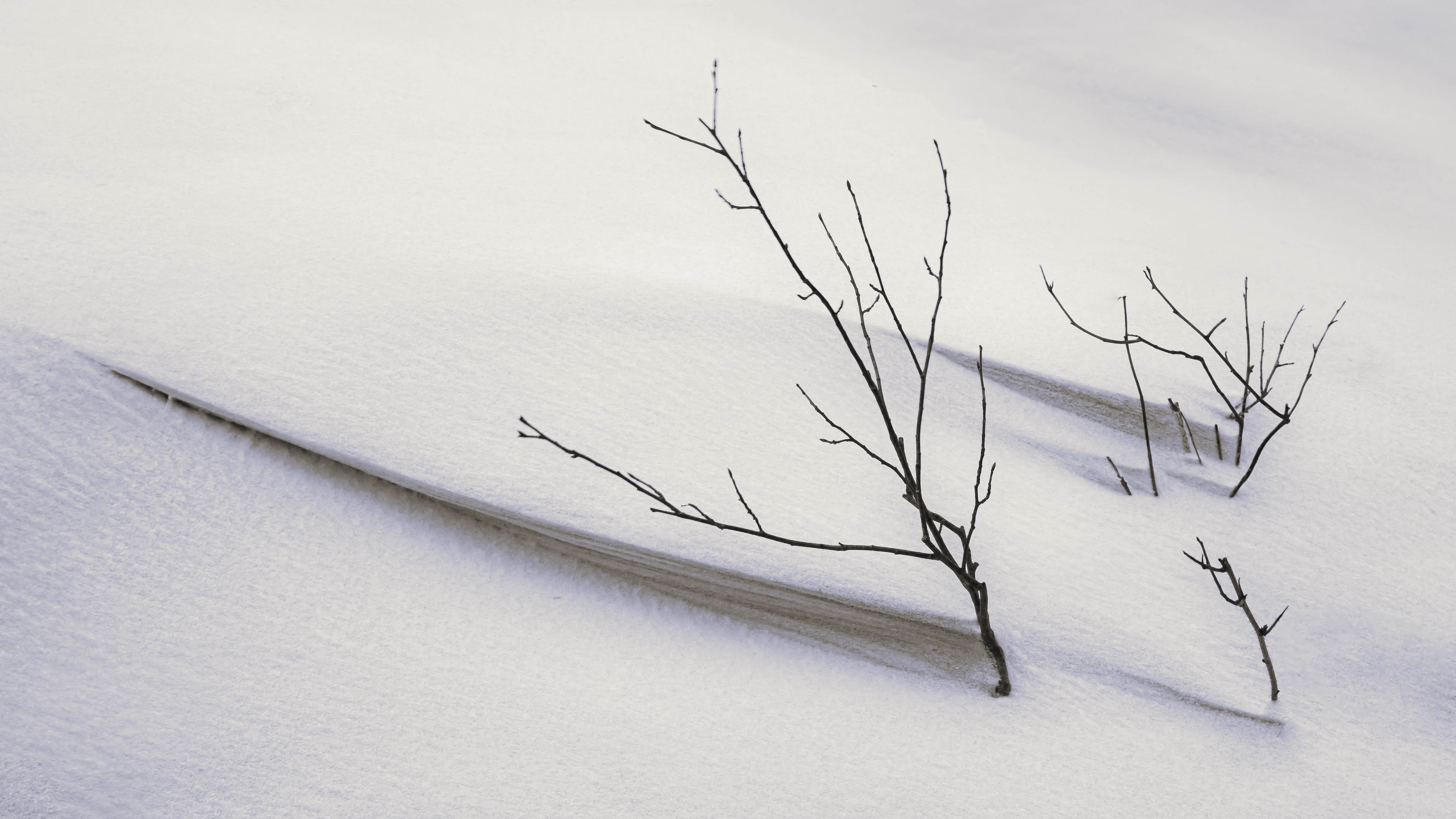
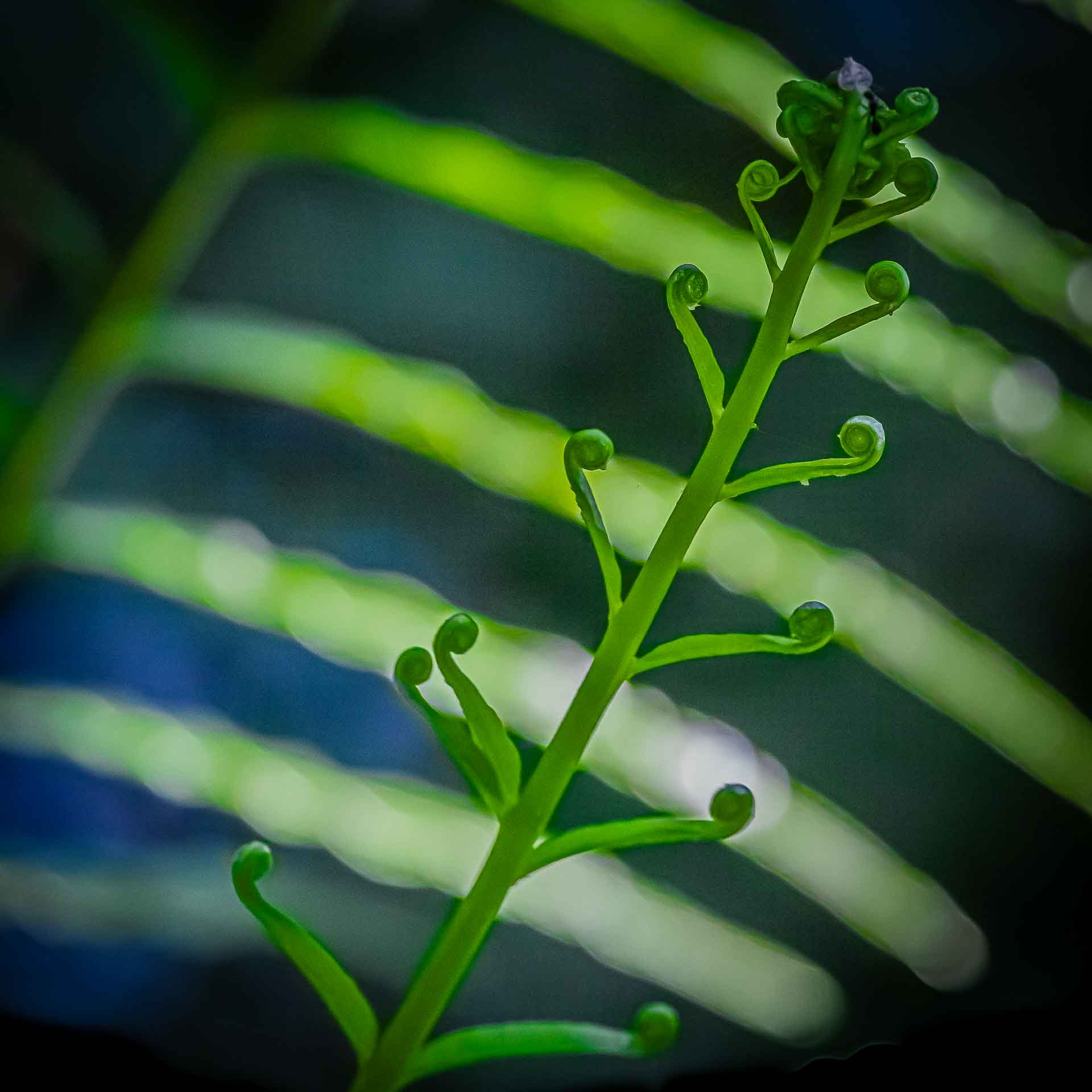
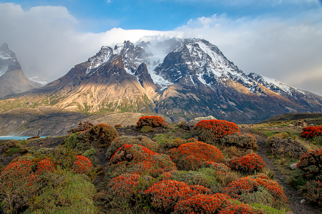
Karen, This is a WOW image that really makes me want to get back to the Smokies and spend more time there.
My thoughts: I like the hint of the motion blur (.4 sec), but I'm wondering if you played around with longer times to try to get smoother water lines. If this look is what you were gong for, it's fine.
When scanning around this image for the first time, I was drawn to the very tip of a rock along the bottom edge that is significantly brighter that the surrounding rocks. Looking at the original image, I saw a much larger version of that rock, but it had been cropped way down in your submitted image. My preference would be to keep that rock - it provides a base for the delicate flowering plants, otherwise the little blossoms are floating in space. Another option, if you want to maintain that crop, would be to darken that bright rock tip, and and it wouldn't be an issue.
I love the image!! well done. |
Sep 3rd |
| 2 |
Sep 23 |
Comment |
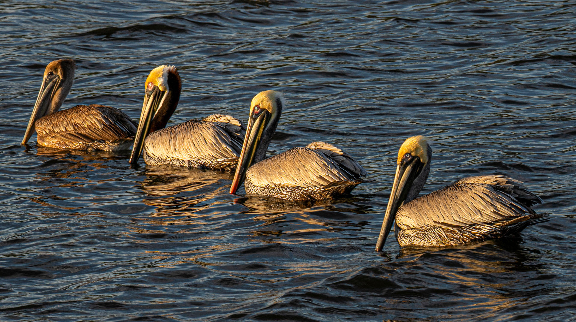
From both of my residences, (IN and Southwest FL), I have countless images of these birds. I love them for so many reasons. Consequently, I like everything about your image - the coloration of the water and subsequent background, the softness on the background... I really makes the "Great Blue" pop. My only critique is in the refelection of the birds head. The apparent stillness of the water belies that fact that a single ripple - even at 1/500sec. - can produce this type of distortion. |
Sep 3rd |
| 2 |
Sep 23 |
Comment |
I love the subtle tones of this impactful image. Well done.
Very nice focusing gradation on the backside for the snake, but I would have liked to see the foreground scales POP with clarity.
The eye is alluring, but, if it were mine, I might try to use a small mask to bring out some of the detail to accentuate the eyeball. |
Sep 3rd |
| 2 |
Sep 23 |
Comment |
Welcome to our group, Terri.
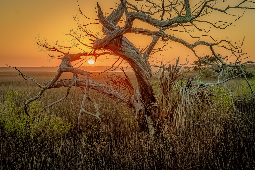
Both Karen and Piers make good points about the impact of the image. No sure what effect you were going for - outside of the potential sunset feel - but the image seems in limbo between the silhouette and the more illuminated, detail-oriented scene.
The orange gel already has a slight gradation from the lower right to the upper left, but that could easily be accentuated with a little post processing. |
Sep 3rd |
6 comments - 4 replies for Group 2
|
6 comments - 4 replies Total
|