|
| Group |
Round |
C/R |
Comment |
Date |
Image |
| 2 |
Jun 23 |
Reply |
Thanks for your comments, Piers.
The blue of the background water is reflecting the clear blue sky that day. I will take the suggestions from all in this group that I tone down the highlights in the background. When I do that, I'll decrease the blue a bit, too.
In addition to Street Photography, is there a similar category for Beach Photography? (asking for a friend) |
Jun 8th |
| 2 |
Jun 23 |
Reply |
Thanks for your comments. I'll certainly tone down the background beach and water before printing or marketing this image. |
Jun 8th |
| 2 |
Jun 23 |
Reply |
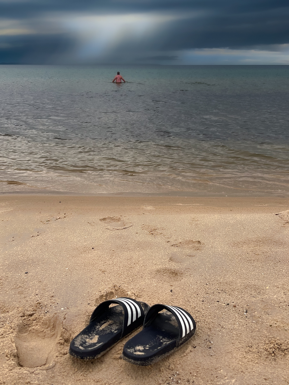
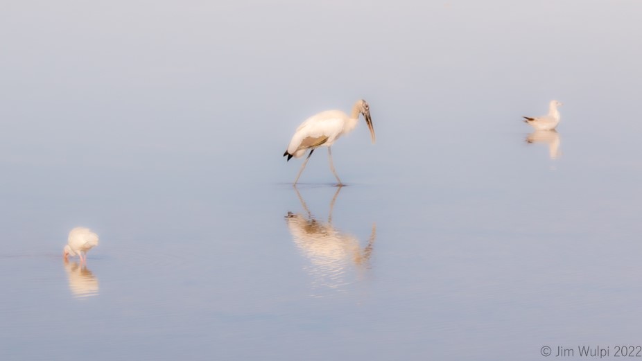
Susan, The shells are there.... a few scattered in the foreground but many more in the background down the beach. The GOOD shells are snapped up early each day by die-hard locals who are out there before sunrise.
Your observation about the bright background - and also stated by others - I'll tone that down before pursuing either printing or marketing - or both. |
Jun 8th |
| 2 |
Jun 23 |
Comment |
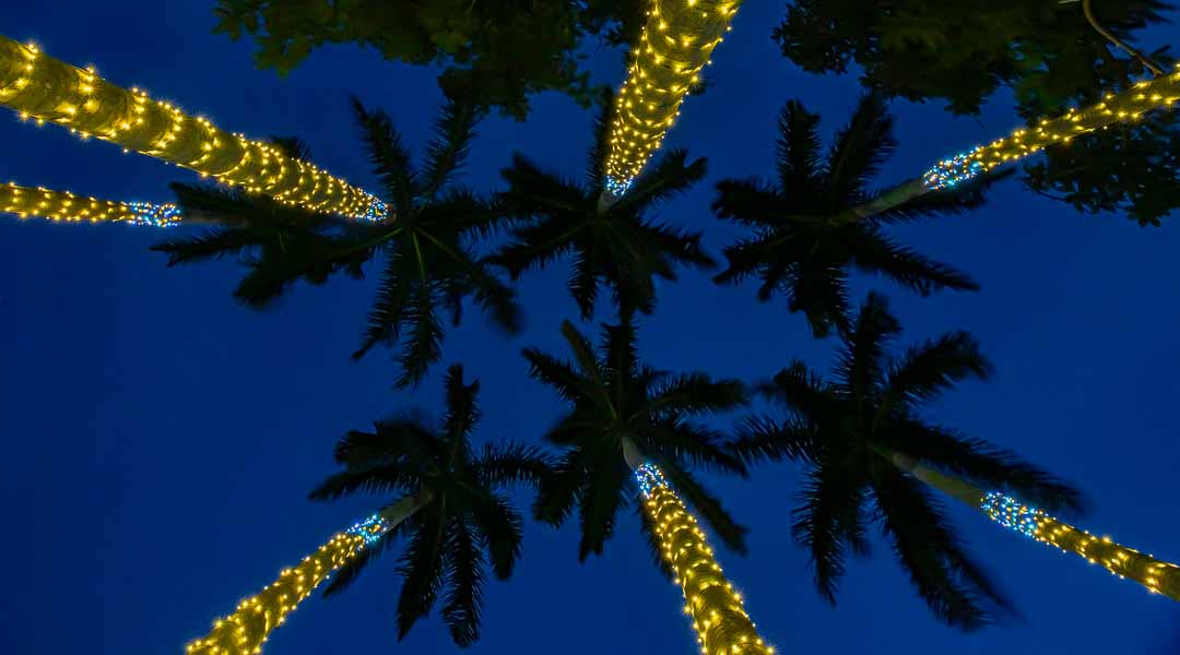
It's hard to keep from saying "WOW" when first viewing this image. I had to look up the "Adelaide Fringe Festival" - after Googling "Garden of Unearthly Delight". Looks like quite a spectacle.
Your subject is perfectly illuminated - in so many ways.
What a fun capture. |
Jun 5th |
| 2 |
Jun 23 |
Reply |
I'm going to have to try that. Well done! |
Jun 5th |
| 2 |
Jun 23 |
Comment |
Hi Susan,
I like this composition. The name is fitting. Dealing with a washed out sky is difficult when your depth of field has been so dramatically affected by its shallowness. The software can't discern the boundary between the sky and the very soft-focused flower in the background. |
Jun 5th |
| 2 |
Jun 23 |
Comment |
Shirley, This is VERY interesting with the monotone treatment. Your efforts have produced a painterly look to the beautiful flower. The contrast and shadows are stunning. It's hard to beat the natural colors of a flower, but this treatment is definitely printable and wall-worthy.
Well done. |
Jun 4th |
| 2 |
Jun 23 |
Comment |
Piers,
This certainly looks like an image I would try to capture. There's a lot going on, and you did a good job with the long exposure to capture the streaking lights.
The first thing that popped out to me was the red lights from distant towers or buildings an the (now) LH side. Since you're through with the initial competition, I would delete them to eliminate that distraction. Also, when you flipped the image, the "Exit 150A" sign now is backwards. That could be addressed in post. The white lights on the stairs on the left are a bit overexposed and could easily be toned down.
To my liking, the image is a bit unbalanced and, I feel, should be cropped in from the right. That area doesn't add much to your story. |
Jun 4th |
4 comments - 4 replies for Group 2
|
4 comments - 4 replies Total
|