|
| Group |
Round |
C/R |
Comment |
Date |
Image |
| 2 |
Jun 21 |
Comment |
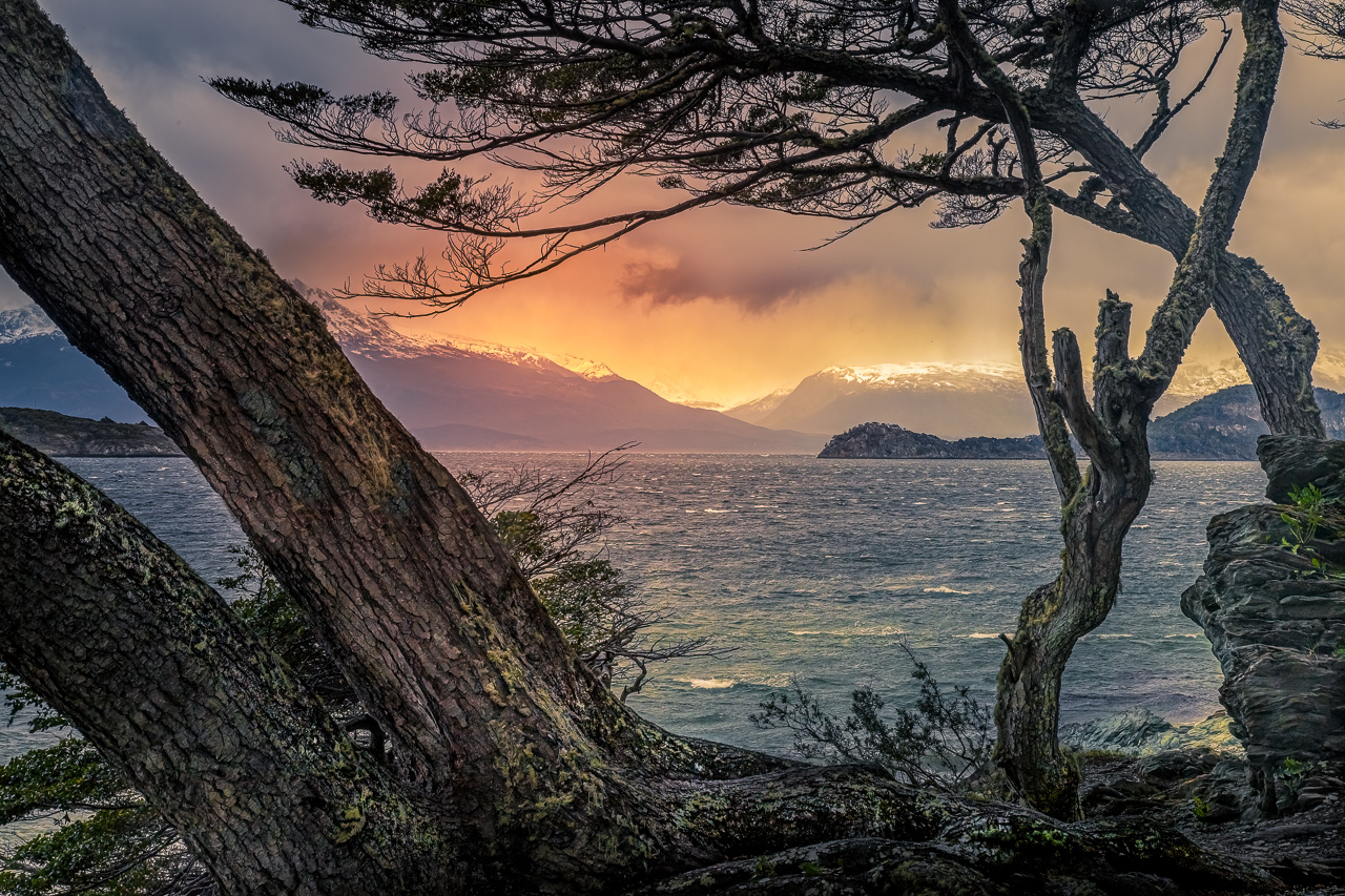
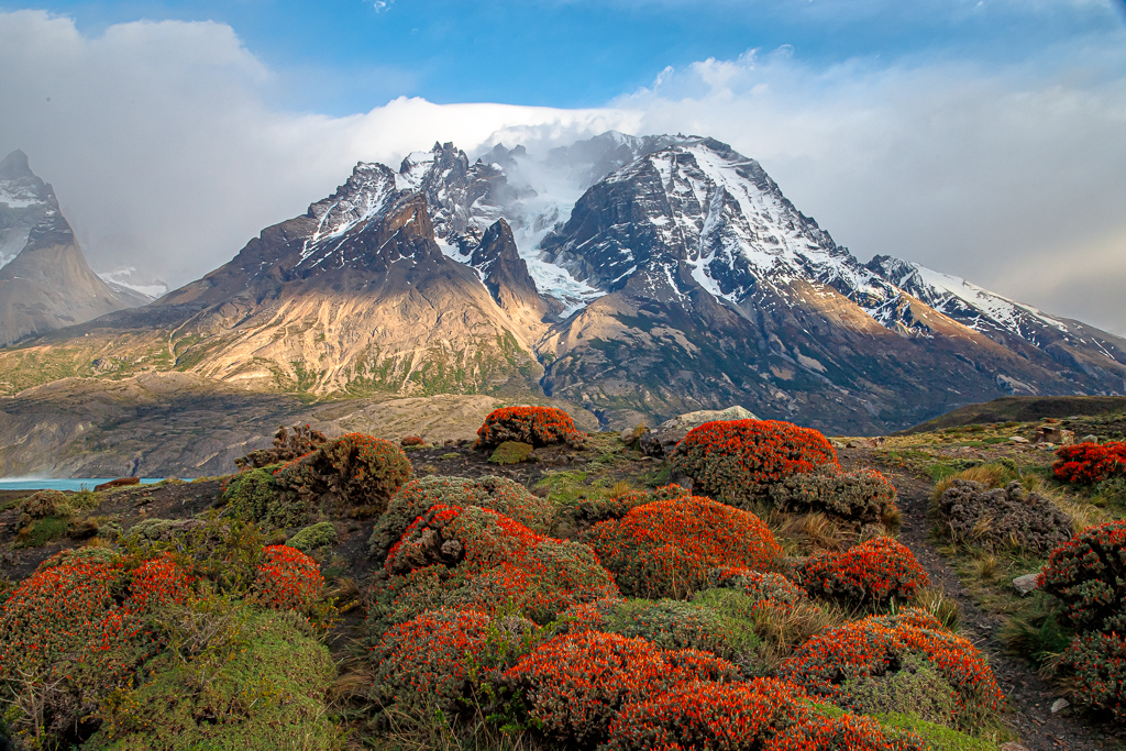
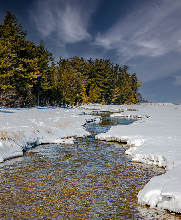
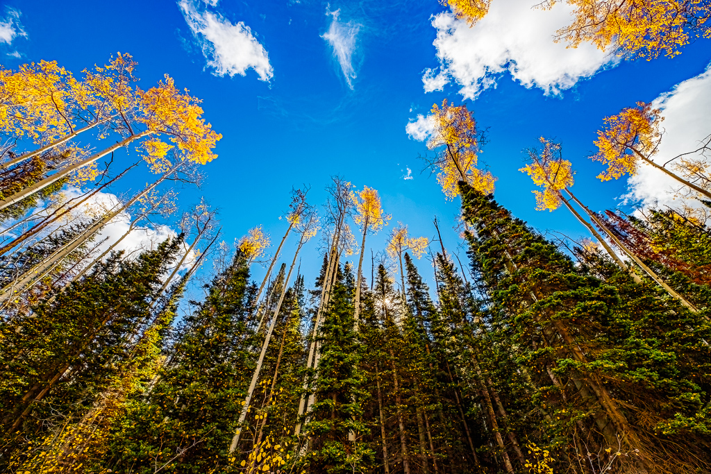
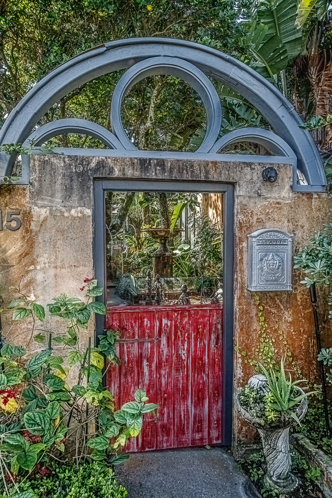
What a dramatic difference between your original image and this final version. Well done. I, too, like HDR, and this has the appearance of it - withoug being overdone. I like the sky.
This looks like a place I'd like to spend some time.
well done. |
Jun 21st |
| 2 |
Jun 21 |
Comment |
Like the others, I, too, was confused by the disconnect between the joyousness of the father/son making great memories, and the somberness of the graveyard. One is bright and crisp, the other pale and somber.
Your description adds a bit of clarification and artisitc license to this project, but, to the average person viewing this image, not knowing the backstory, it just seems muddled.
I love the effort, though. |
Jun 21st |
| 2 |
Jun 21 |
Comment |
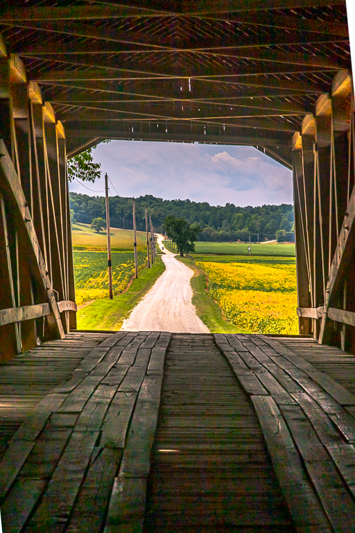
Well done, Karen.
This one is Wall-worthy. |
Jun 21st |
| 2 |
Jun 21 |
Comment |
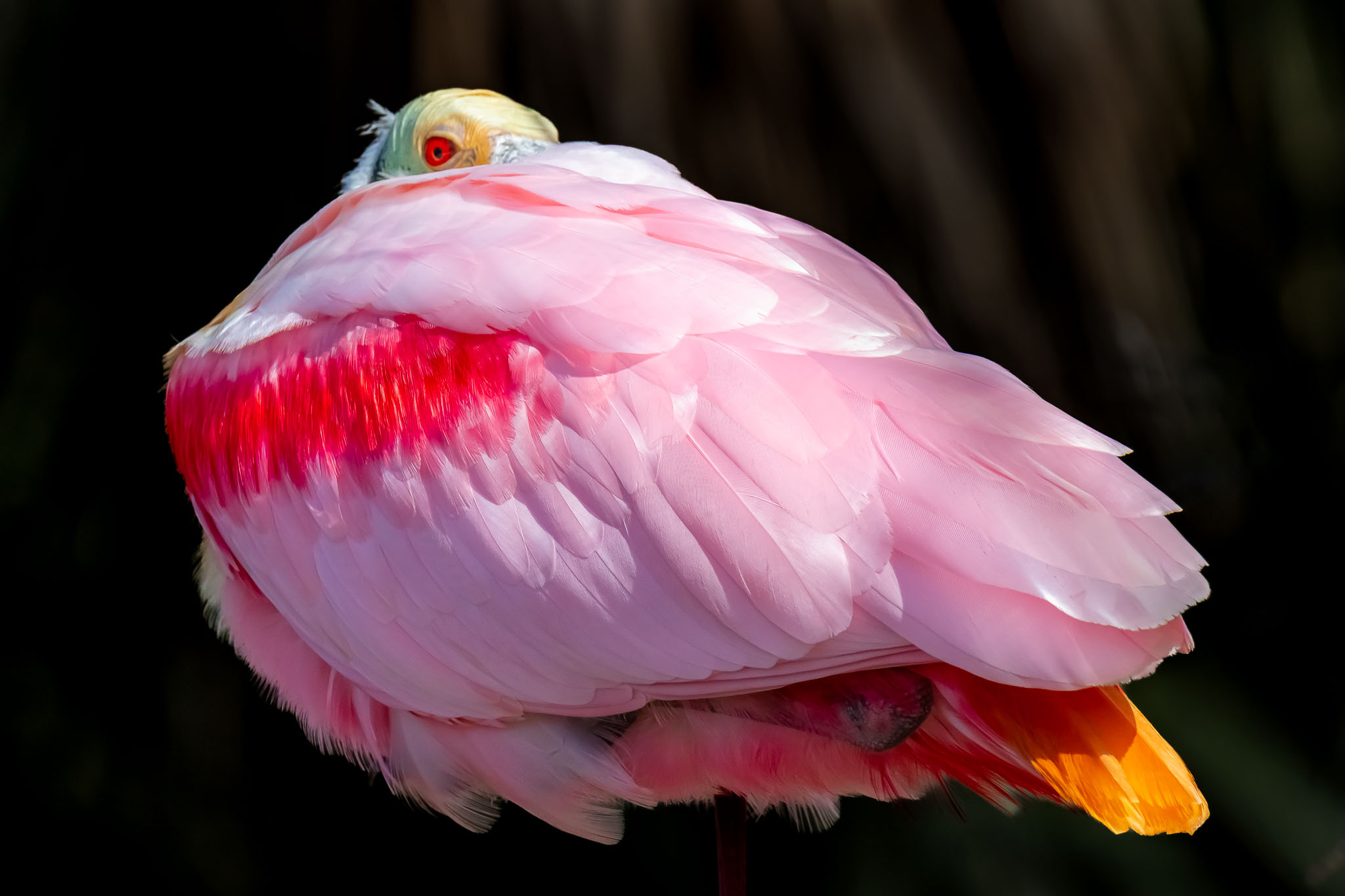
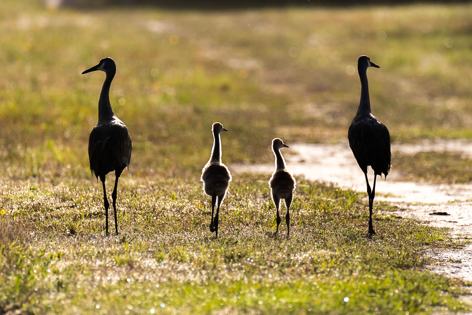
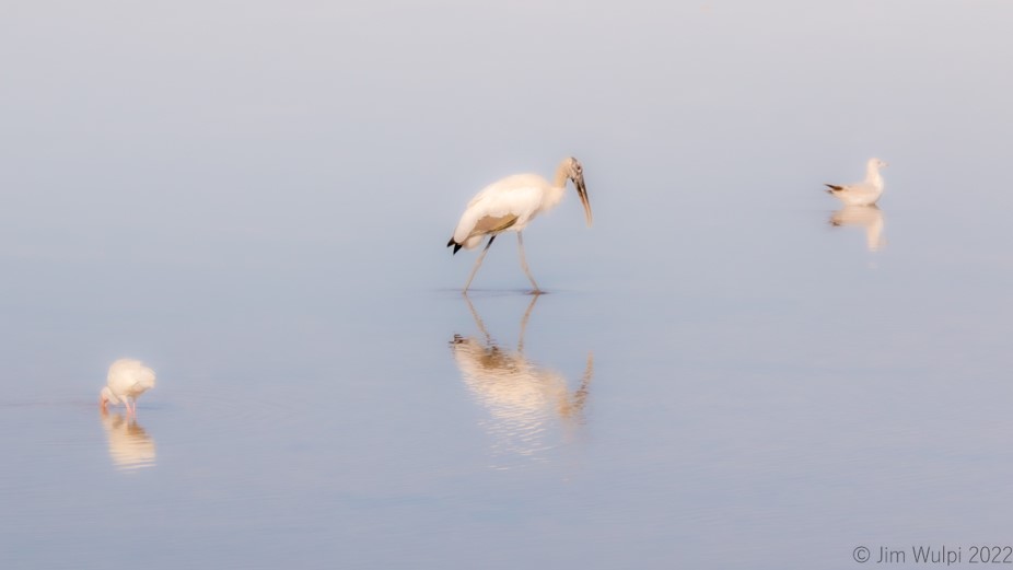
Hung, I'm just starting out on my bird photography quest. Your image is one to emulate! Excellent light, good use of f-stop for good depth of field, great, sharp focus, and good timing.
Well done. |
Jun 21st |
| 2 |
Jun 21 |
Comment |
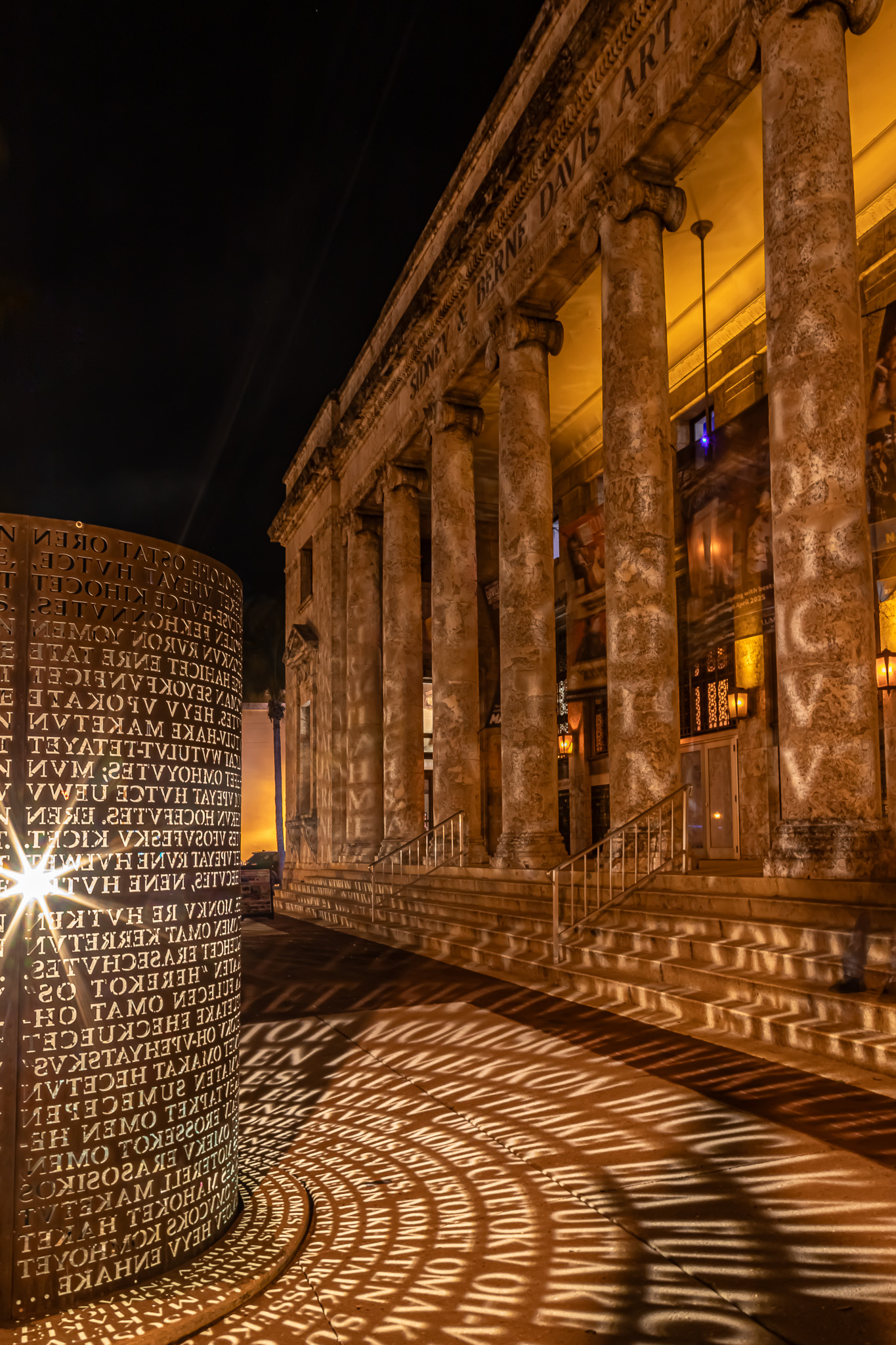
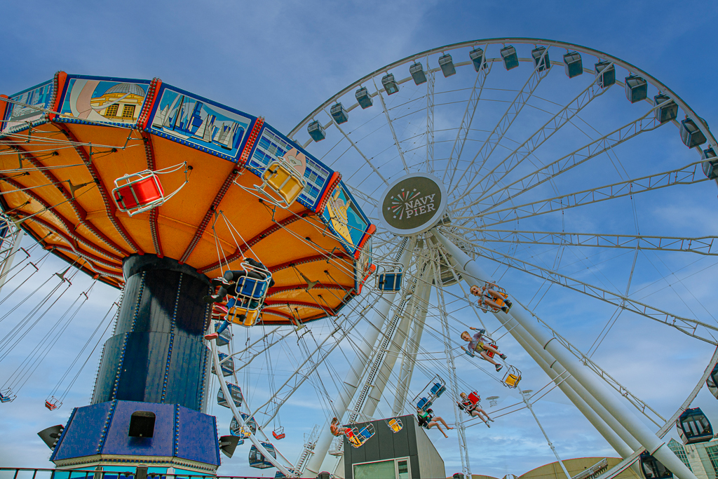
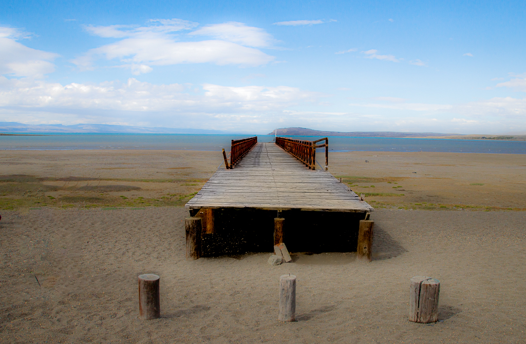
Piers, Your panoramic image, as presented, has 3 distinct sections. I like it as it is, but feel that the addition of the suns rays detracts from the scene. I hate to say it, but, it looks too "Photoshopped".
Perhaps just adding more contrast to the clouds and eliminating the suns rays would provide a good iamge you're working towards.
I love your efforts, though. |
Jun 21st |
| 2 |
Jun 21 |
Reply |
Jack, Thank you for the kind comments. |
Jun 21st |
| 2 |
Jun 21 |
Reply |
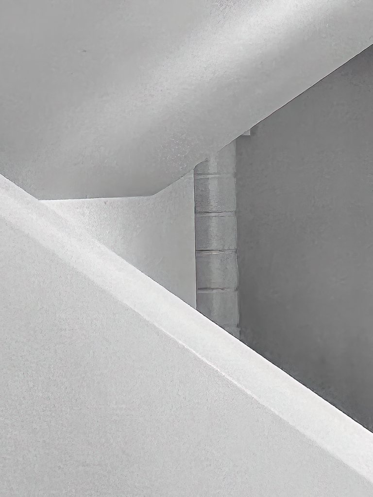
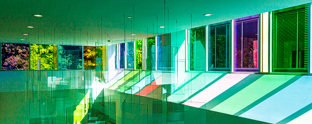
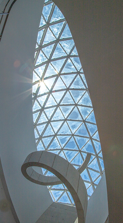
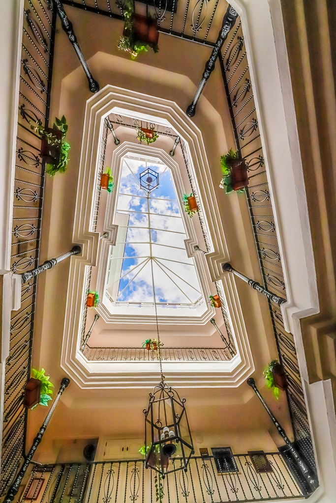
Piers, Thank you for your comment. I will work towards lightening up the interior sculpture as suggested.
Please also view my repsonse to Martins comments re: the umbrella - leave it in, or not. |
Jun 21st |
| 2 |
Jun 21 |
Reply |
Jaqueline, Thank you for your comments. Please see my response to Martin's post. |
Jun 21st |
| 2 |
Jun 21 |
Reply |
Karen, Thank you for your comments. Please see my response to Martin's post.
|
Jun 21st |
| 2 |
Jun 21 |
Reply |
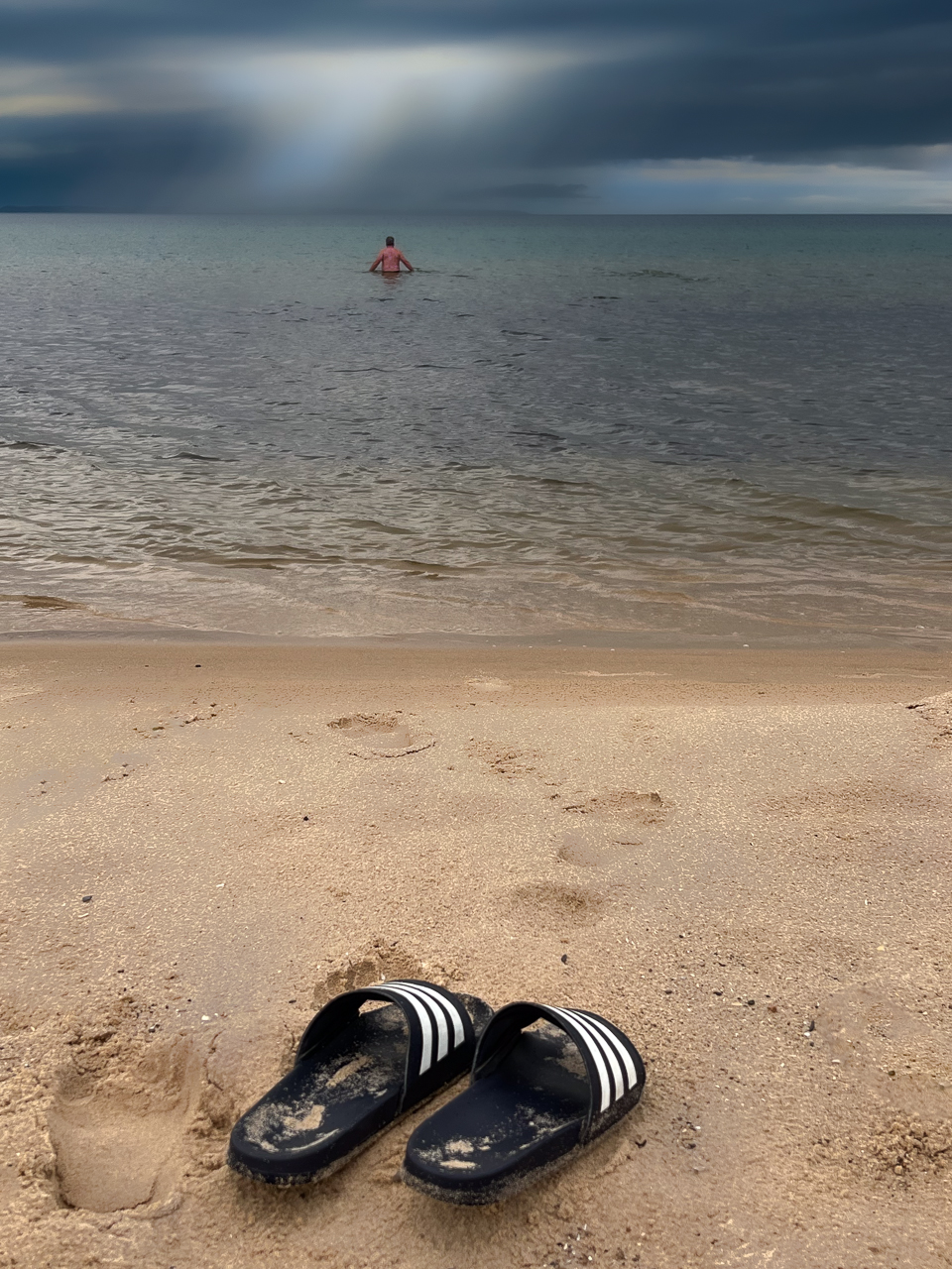
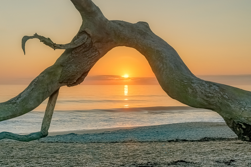
Martin,
I have multiple versions of this image, some with the beach umbrealla poking into the scene, then a bit later, the umbrella was gone.
There's a certain aspect to the inclusion of the umbrella that, I feel, lends an additional sense of "place" as well as depth. Despite being unseen, the umbrella indicates a beach as opposed to a rocky shoreline. That, to me, tells more of a story relative to the location of this scene. I don't disagree that there's a certain distration to the eye (with the inclusion of the umbrella), but then that leads to which is ultimately stronger.
Thank you for your comments. |
Jun 21st |
| 2 |
Jun 21 |
Reply |
Thank you for your sugestion, Shirley. I will try playing around with the Graduated filter to accentuate the interior sculpture - after a little straightening. |
Jun 21st |
| 2 |
Jun 21 |
Comment |
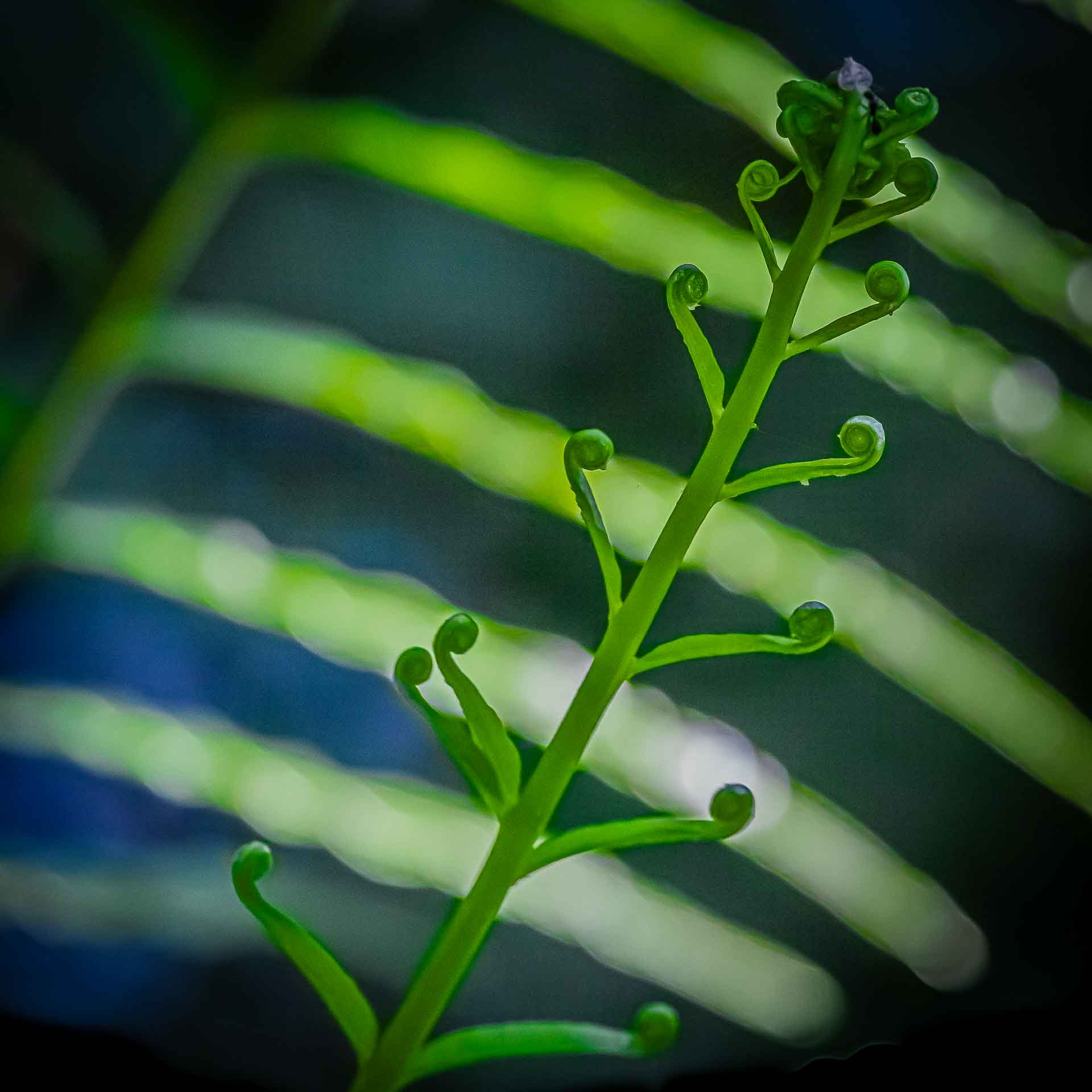
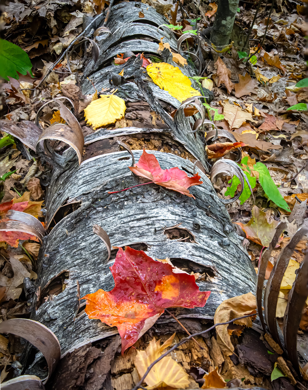
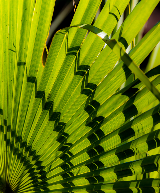
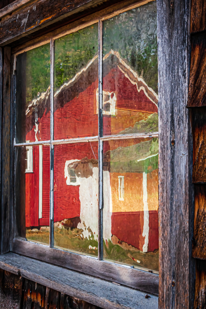
Shirley, I love the wood background. It appears "fence-like", but then notice the wood grain through the transluscent leaves. Leaving the blossom opaque really sets it off from the background.
The amount of empty space in the upper LH corner might be used similarly to the lower RH corner to avoid criticism.
I REALLY like this. Well done! |
Jun 1st |
6 comments - 6 replies for Group 2
|
6 comments - 6 replies Total
|