|
| Group |
Round |
C/R |
Comment |
Date |
Image |
| 26 |
Oct 22 |
Reply |
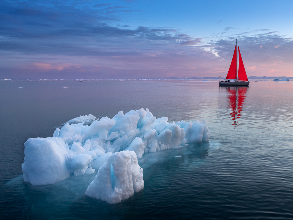
Thanks Tony.. we were on a red sail boat as well.. ;) |
Oct 20th |
| 26 |
Oct 22 |
Reply |
Thanks Mervyn. Much appreciated. |
Oct 15th |
| 26 |
Oct 22 |
Reply |
Thanks Bob. Glad you like it. |
Oct 12th |
| 26 |
Oct 22 |
Reply |
Thanks Jose. |
Oct 12th |
| 26 |
Oct 22 |
Reply |
Thanks Kirsti for the compliment. Much appreciated. Glad you like it. The light was just beautiful indeed. |
Oct 12th |
| 26 |
Oct 22 |
Comment |
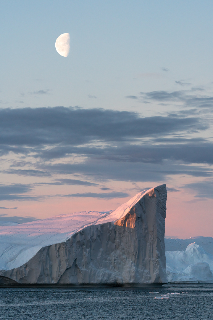
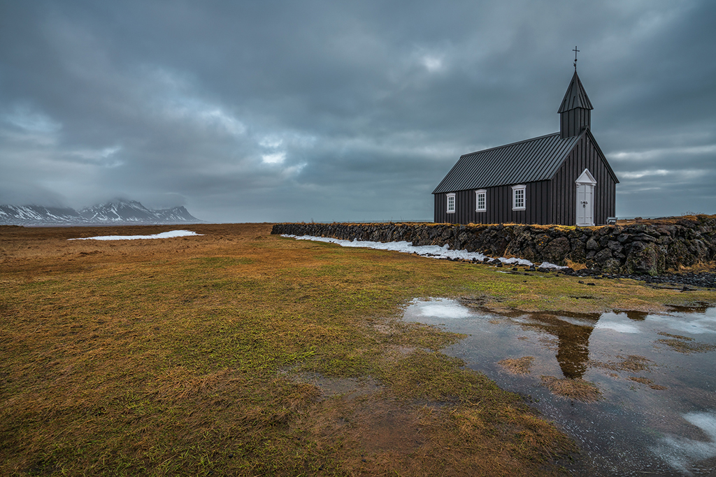
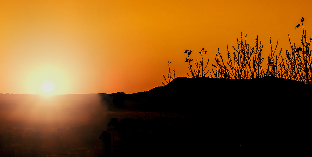
Very nice image!
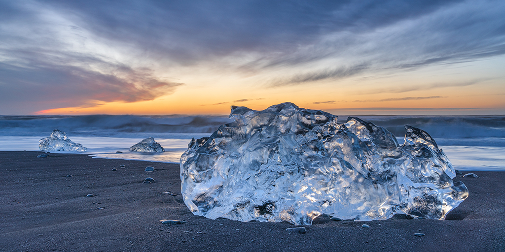
I like the silhouetted hills and tree branches, although I am not such a fan of the sun in the image when it is that bright (personal taste probably). I would try to make the sun a bit softer (together with the halo around it) so its edges are not that prominent in the image. Something like the quick edit below. I might also move the sun a bit to the right (not too close to the edge of the image). Nice image overall! |
Oct 10th |
 |
| 26 |
Oct 22 |
Comment |
A beautiful portrait and image!
Would it maybe have helped to get more emphasize on her face if you had either moved the model or yourself so her face would be in the little bit lighter area of the stairs? (I say this because her skin color is quite dark, so a light area behind would maybe give more emphasize).. Have you tried this maybe? Just an idea, not sure.. Nothing else to add or comment, just beautiful as is. |
Oct 10th |
| 26 |
Oct 22 |
Comment |
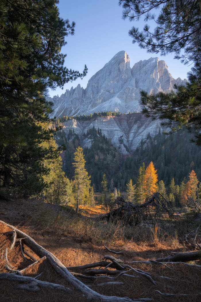
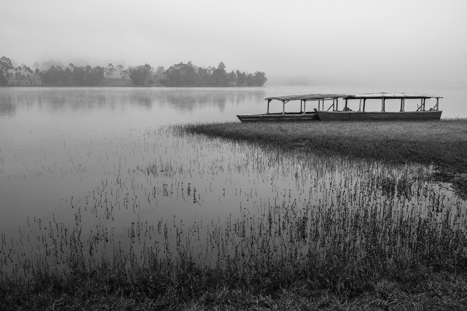
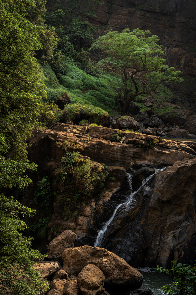
A very nice picture! Nothing to add, I would keep it this way. Beautiful scene, calm and nice green colors. Nice composition too! |
Oct 10th |
| 26 |
Oct 22 |
Comment |
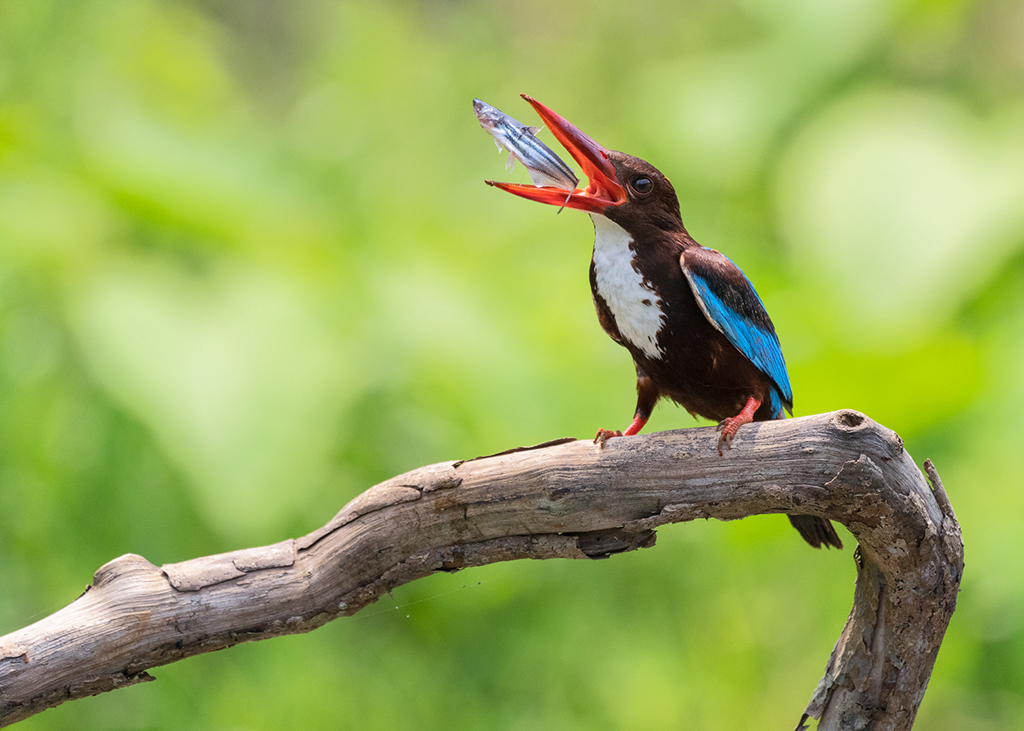
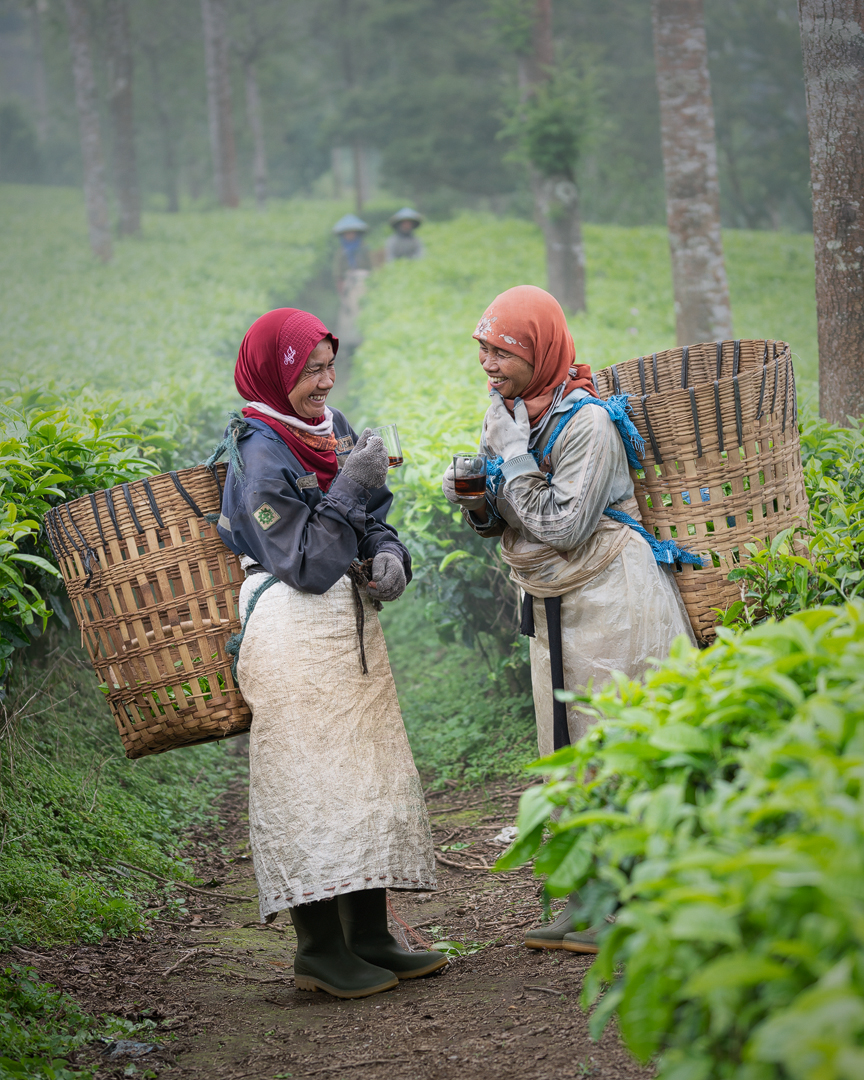
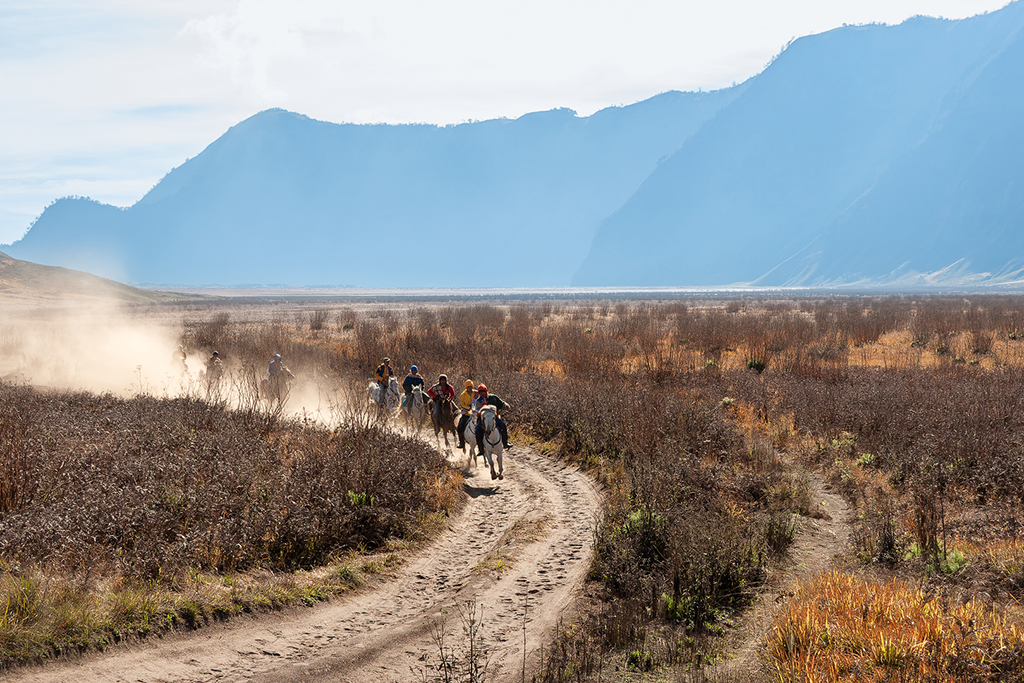
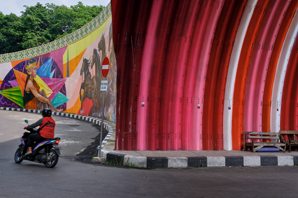
Welcome to Indonesia! Hope you had a wonderful time..
Same as the others, I do not have anything to add. A beautiful image! |
Oct 10th |
| 26 |
Oct 22 |
Comment |
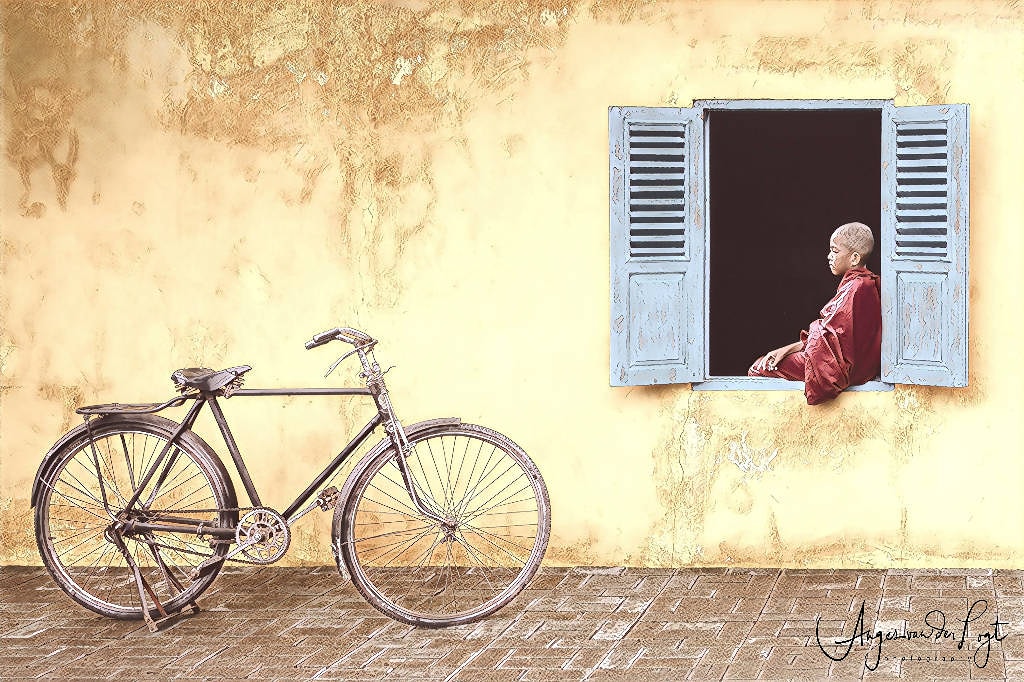
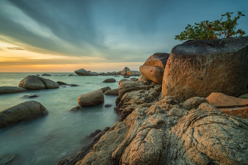
I seem to agree with Jose on the composition, the window on the right is bothering me a bit too.. but I would make it into a 4:5 image, and keep the FG as for me this is interesting as well. A little bit of dodging and burning would help to give more emphasize on the center of image. |
Oct 10th |
 |
| 26 |
Oct 22 |
Comment |
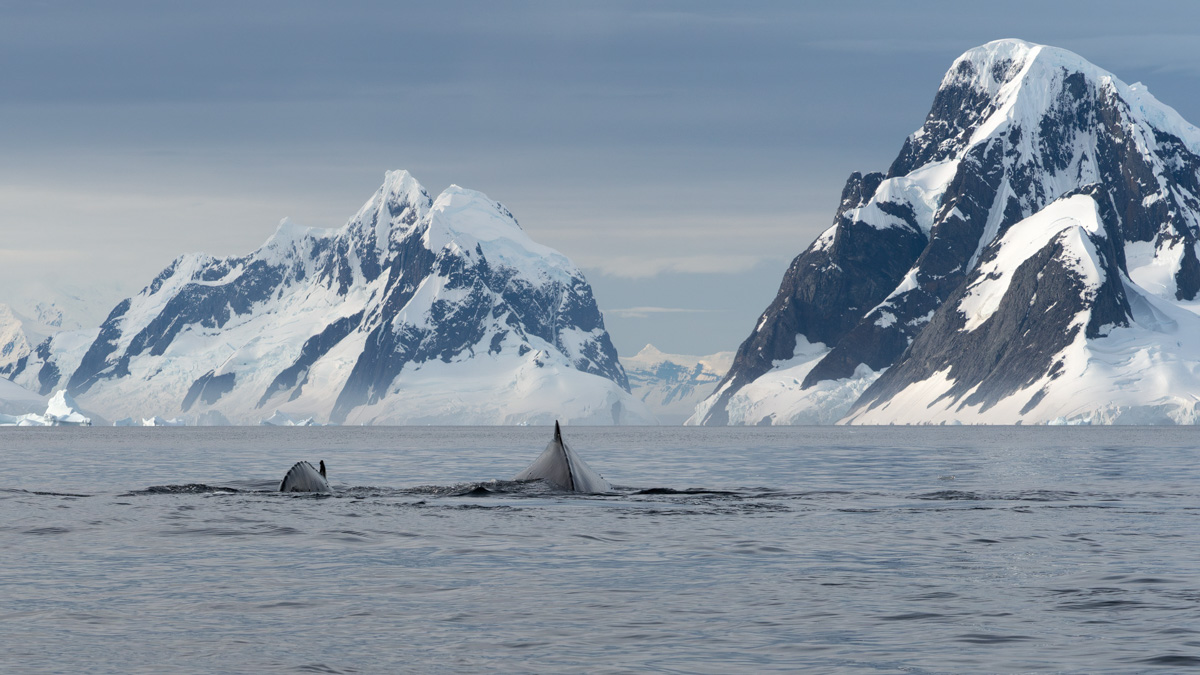
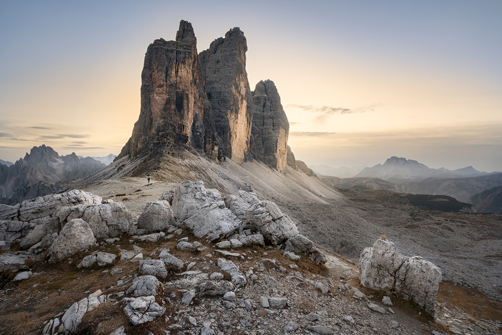
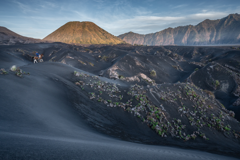
Welcome to the group Kirsti!
I like how the clouds stand out more in the BW version, although I find (personally) that the mountain has lost a bit of its details by making it into BW (I seem to like color more for the mountain). I must agree with the judge, as it lacks a strong POI in my opinion, the mountain itself does not seem to catch the eye that much. Moving the bird a bit more on top (and increase the size) might help (to the lighter area). |
Oct 10th |
6 comments - 5 replies for Group 26
|
6 comments - 5 replies Total
|