|
| Group |
Round |
C/R |
Comment |
Date |
Image |
| 26 |
Mar 22 |
Reply |
Thanks for your comment and advise! |
Mar 19th |
| 26 |
Mar 22 |
Reply |
Thanks, will try that out for sure! |
Mar 19th |
| 26 |
Mar 22 |
Reply |
Thanks for your input. Will definitely try the left side crop! |
Mar 19th |
| 26 |
Mar 22 |
Reply |
Thanks for the input. And yes this is with lighting, but also natural light from a window to the left. |
Mar 19th |
| 26 |
Mar 22 |
Comment |
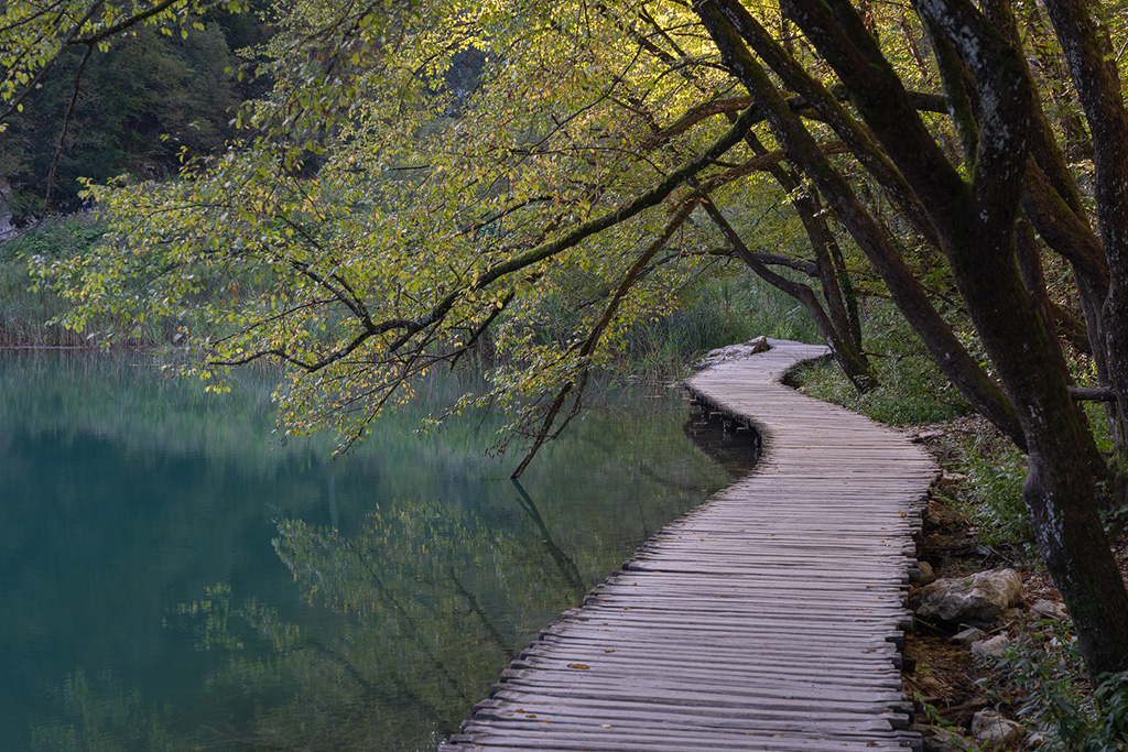
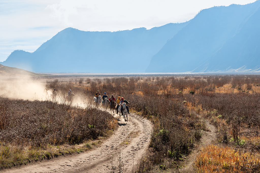
Very nice image indeed! Nice patterns.
On the left of the image the pattern follows the border very well. On the right it seems not be quite parallel yet (maybe my eyes hahaha). So maybe a bit of additional perspective correction on the right of the image? As the image is about the patterns, I think this would not be a problem, and pleases the eye a bit more (maybe).
Great image! |
Mar 14th |
| 26 |
Mar 22 |
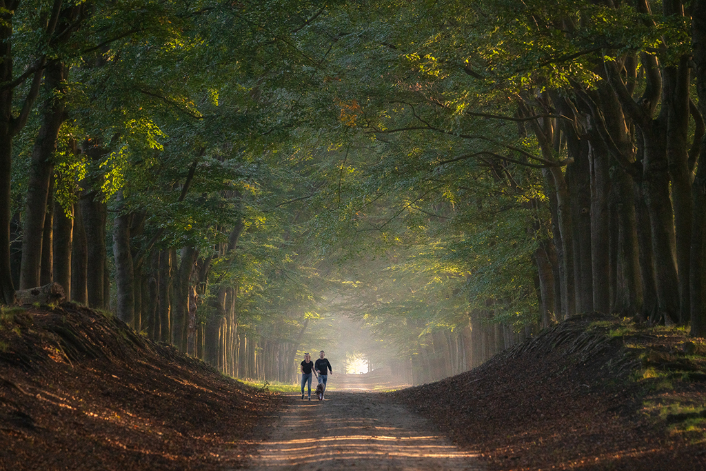
Comment |
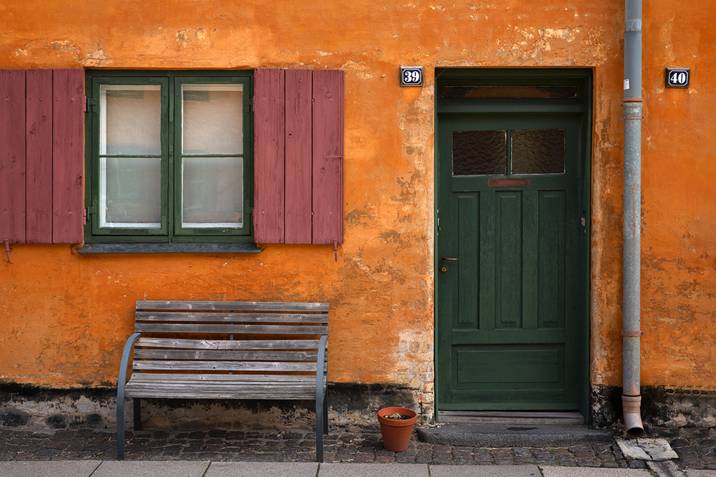
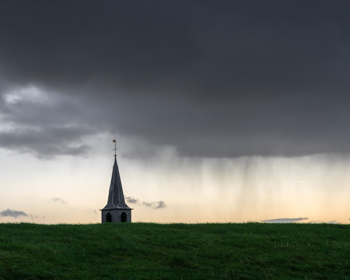
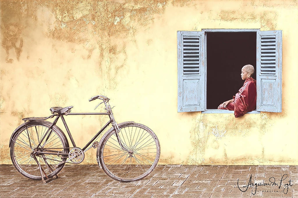
Very nice image indeed. Nice muted colors and opposite on the color wheel as weel (red and green). Also nice that the gate is in red as well. I agree with the comments above about the face too ;)
Only thing that comes to my mind if I would need to give a comment on how to improve the image is the point of the roof touching the white clouds. For me (personal) it is not touching it enough, or instead it should not touch it at all. Like having something touch the horizon, either you pass it enough or you stay below it with your subject. This feels the same for me. But that might be personal. In case you would like to change this image, you would either need to take this pic more from below or more from above (if at all possible). The latter I would prefer (the roof being topped by a bit of green in the background, but as said, that might not be possible at all in this situation).
Great image! |
Mar 14th |
| 26 |
Mar 22 |
Comment |
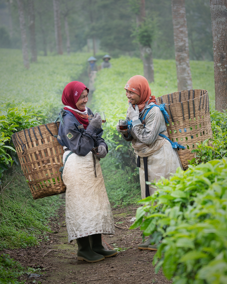
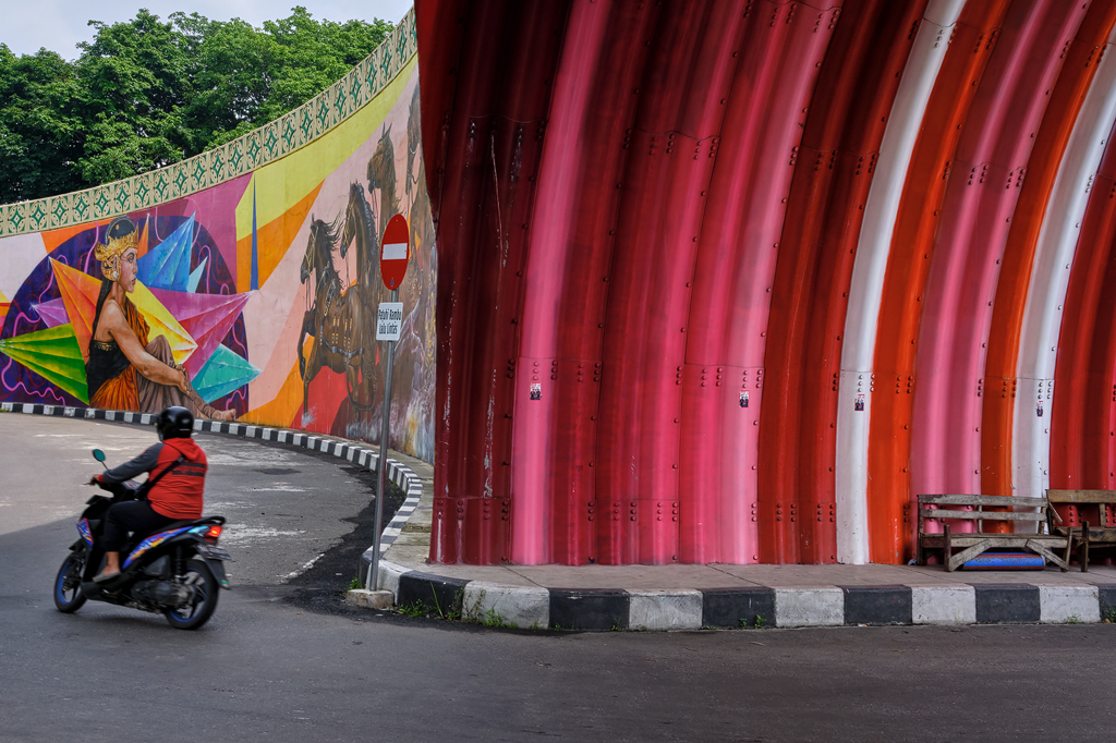
Nice street photo. And yes the light near her does really focus our eyes on her instead of the things around her which are a bit messy. She is well lit although on my computer the white clothes behind her seem a bit overexposed. I would try to bring that a bit down (just a bit, so you can see the details of the clothes a bit). And yes, I would have stepped a bit to the front to move the pole a bit to the left (and not being so much in the frame). Or maybe you could try a crop and crop a bit from the left so the pole moves to the left as well (then you will also maybe be able to get rid of the person near the left border, which you might or might not want, personal taste). Great image! |
Mar 14th |
| 26 |
Mar 22 |
Comment |
I agree with Jose on the color of the sky, seems not natural to me as well. About the space at the right, I find it also too tight. Maybe you could add some space with content aware or stamping. A very interesting image of the red tractor standing out between the sunflowers (red and green being opposite colors). |
Mar 14th |
| 26 |
Mar 22 |
Reply |
Thanks Bob, yes I personally also prefer the color version. I will try your suggestion to make more separation on the right side.. thanks for the input! |
Mar 12th |
4 comments - 5 replies for Group 26
|
4 comments - 5 replies Total
|