|
| Group |
Round |
C/R |
Comment |
Date |
Image |
| 26 |
Jun 21 |
Comment |
This is a beautiful flower image. But I do agree with Bob about the additional flower on the left and to clone that one out. Also I like the tip from Belinda to darken the background or overall image. The colours then seem to pop more and make it more interesting overall. Nothing to add otherwise. Lovely flower and image! |
Jun 14th |
| 26 |
Jun 21 |
Reply |
Will try a tighter crop too. Thanks! |
Jun 14th |
| 26 |
Jun 21 |
Reply |
Thanks for your input! |
Jun 14th |
| 26 |
Jun 21 |
Reply |
Will certainly try a vertical crop as well. Thanks for the tip! |
Jun 14th |
| 26 |
Jun 21 |
Reply |
Thanks for the input. Appreciated! |
Jun 14th |
| 26 |
Jun 21 |
Comment |
I like the creativity shown in this image and the subtle tones used. The only thing I can comment on maybe is that the petal of the flower just behind the butterfly seems to combine with the butterfly in the final image, probably because the colours are subdued in the final image, and therefore you cannot distinguish the butterfly from the petal that much. Maybe you could fix this by brightening the butterfly a bit ( so it stands out more in the image) or returning the color of the petal just a tiny bit. For the rest, a very nice and creative image! |
Jun 14th |
| 26 |
Jun 21 |
Comment |
Lovely image! I agree with the others, good choice of conversion to BW and cropping to vertical. I also agree with others that the clouds are a bit dominant, so getting rid of a part of them could be beneficial to the image. The cropping seems fine for me, although my eye seems to be drawn to a vertical bright tree branch on the left side of the frame (which I would clone out or crop out, or else give more space so it is not distracting). Very nicely done! |
Jun 14th |
| 26 |
Jun 21 |
Comment |
A very nice image and view! I very much like the afternoon light on the buildings. For me the reflection does not add to the image as it makes up only a small portion on the bottom, so if you had left that out I think it would be still be a strong image. For a reflection I would have taken more foreground I think. For me (personally) I find the image a bit over saturated, but this can also be my monitor. I am also not totally sure, but it seems the buildings still tend to lean a bit to the left, I would try to correct that (if this was my image). Further, the antenna on the roof of one of the buildings feels a bit too close to the border of the image, maybe you can just add a bit more space to the sky with content fill. ;) |
Jun 14th |
| 26 |
Jun 21 |
Comment |
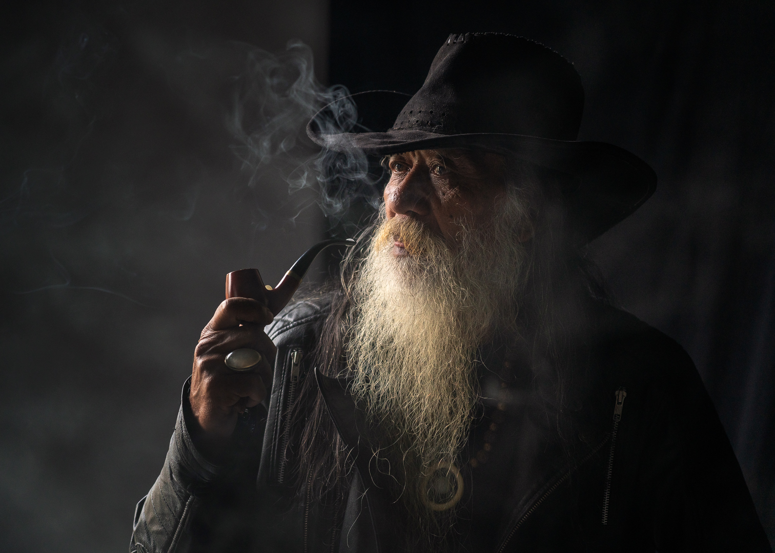
I love this image! I agree with Bob's comments and advise. Although I do not mind the brightness of the right hand side railing that much. What I would try though is to lighten the head of the man a bit, as it is now a black blob, without any details (ear and end of hairline). The curved lines are magnificent, and this image is very strong in storytelling. Very well done! |
Jun 14th |
5 comments - 4 replies for Group 26
|
5 comments - 4 replies Total
|