|
| Group |
Round |
C/R |
Comment |
Date |
Image |
| 26 |
May 21 |
Comment |
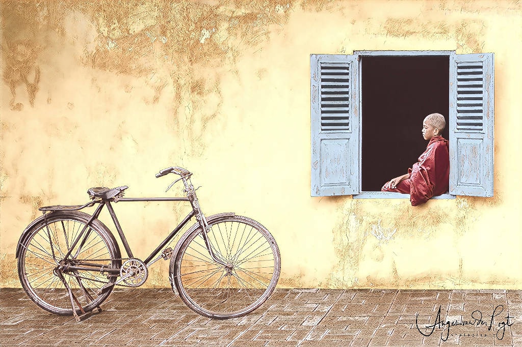
Very creative! I do find that the image lacks something, but not sure what. It might be a lack of shadows. Also I think that the eye is a bit out of focus in compare with the boy, if they would be in similar focus then it would be more convincing probably. But overall a very nice image indeed! |
May 10th |
| 26 |
May 21 |
Comment |
Very nice image of beautiful flowers indeed! For me, I would clone out the half shaped flowers at the left and right hand border, which makes a cleaner border and gives more focus to the flowers in the middle of the frame. But that is my taste probably. I do not mind the bold colours, although I would experiment with different colours as well, which could be done in post to ease the process. |
May 10th |
| 26 |
May 21 |
Comment |
A very creative edit and nice use of filters. I would not change anything. Like it the way it is now. Good job! |
May 10th |
| 26 |
May 21 |
Comment |
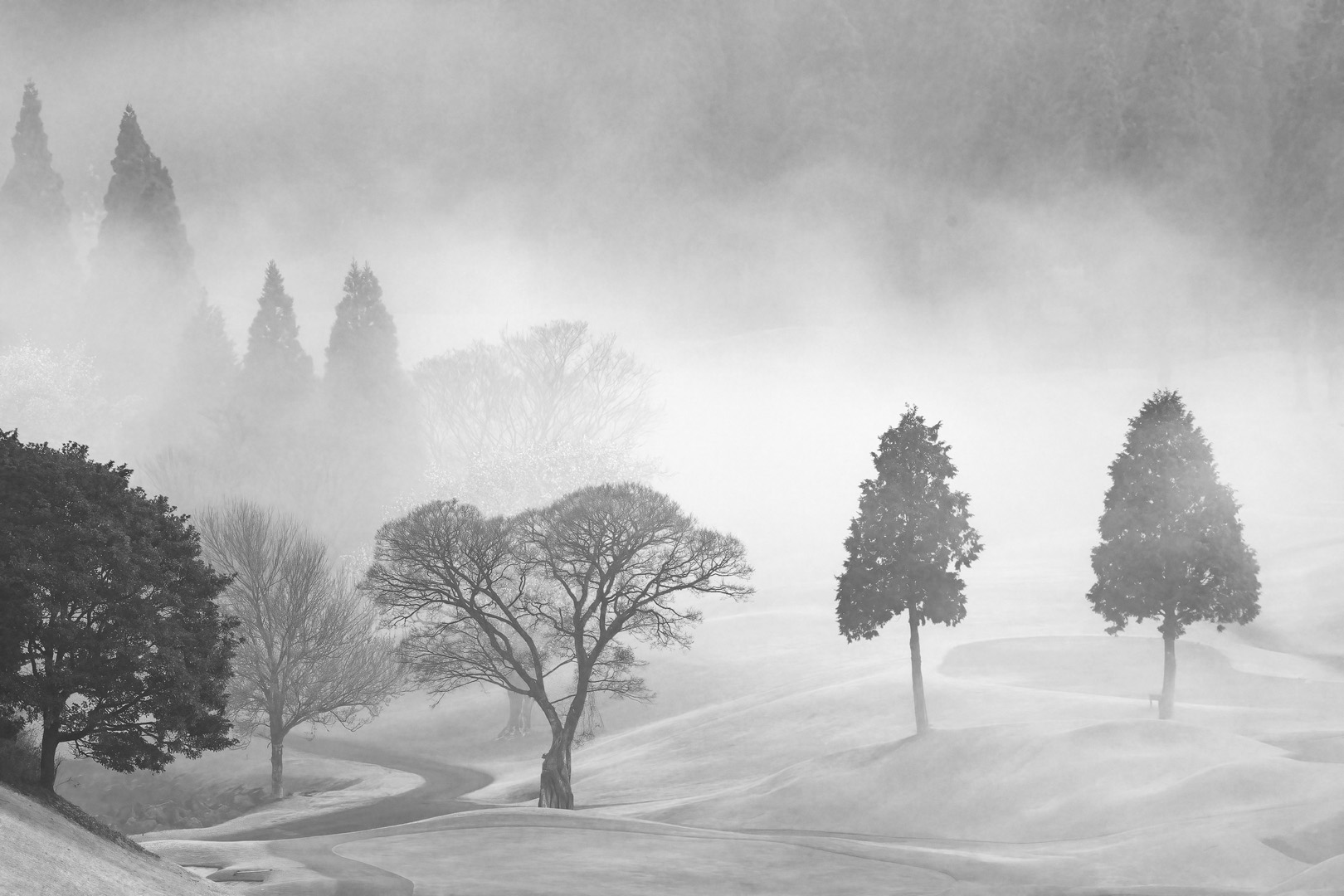
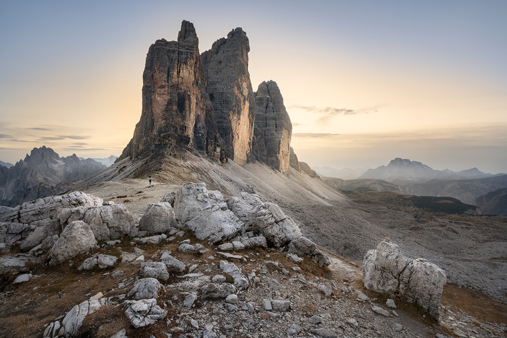
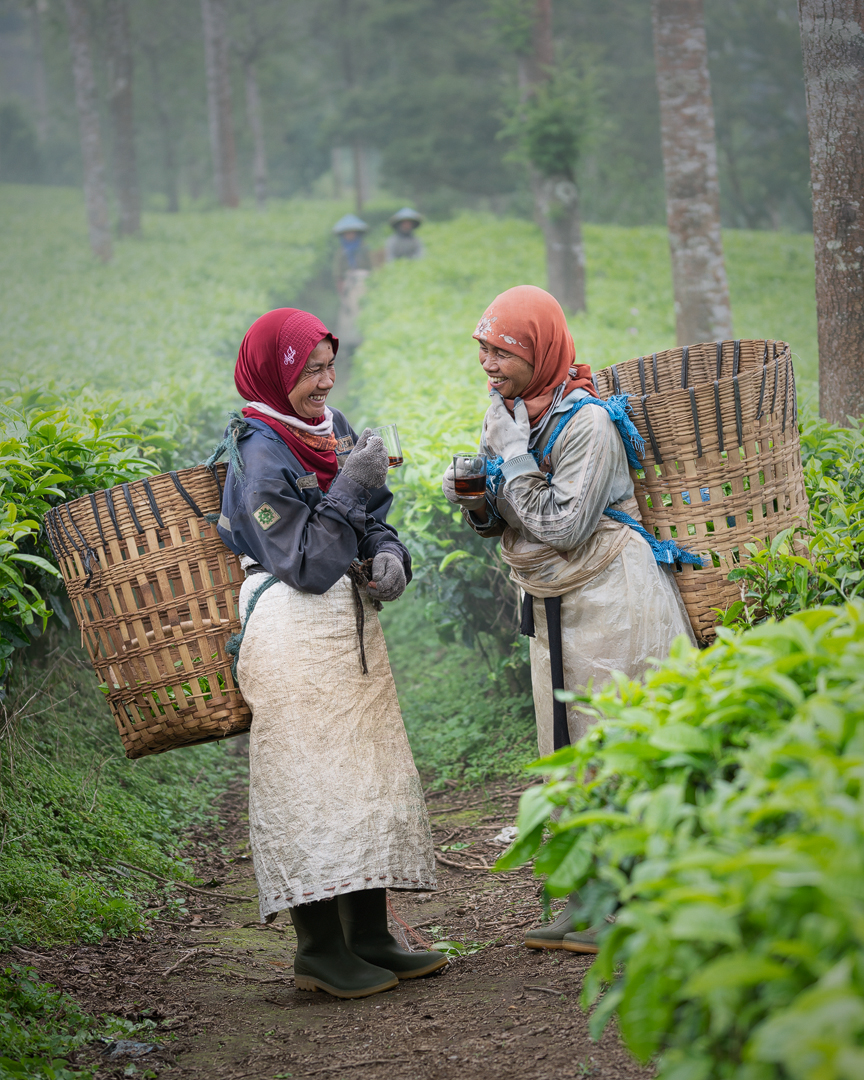
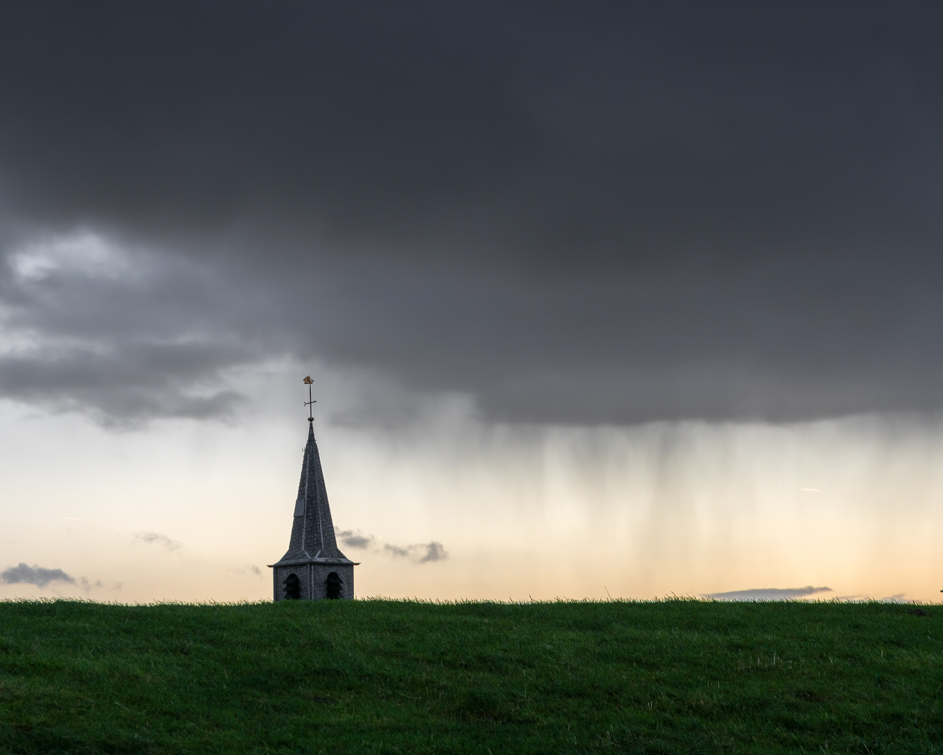
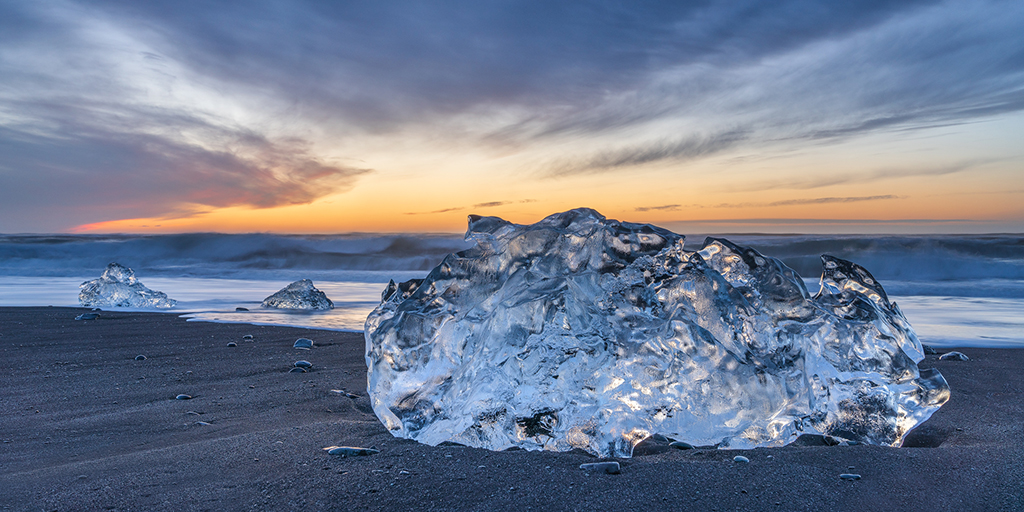
A very nice blue hour image. First I did not notice the bright streak on the horizon from the boat, but I think that you better remove it, as it adds nothing interesting to the image, and can only distract. I do not mind the reflections left and right of the pier either, I think they add to the composition and balance it, but actually rather find the two bright spots in the FG (near the beach) a bit distracting. If you are able to, I would clone those two areas out of the image, so you get a cleaner FG. But that is my opinion only. |
May 10th |
| 26 |
May 21 |
Comment |
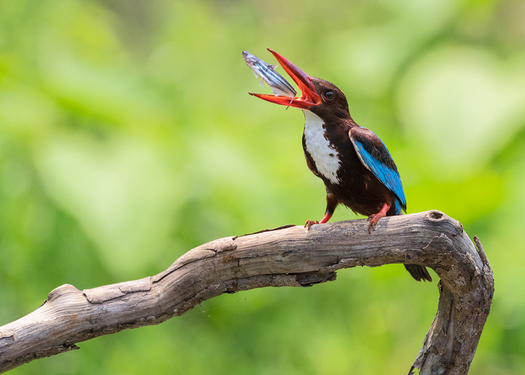
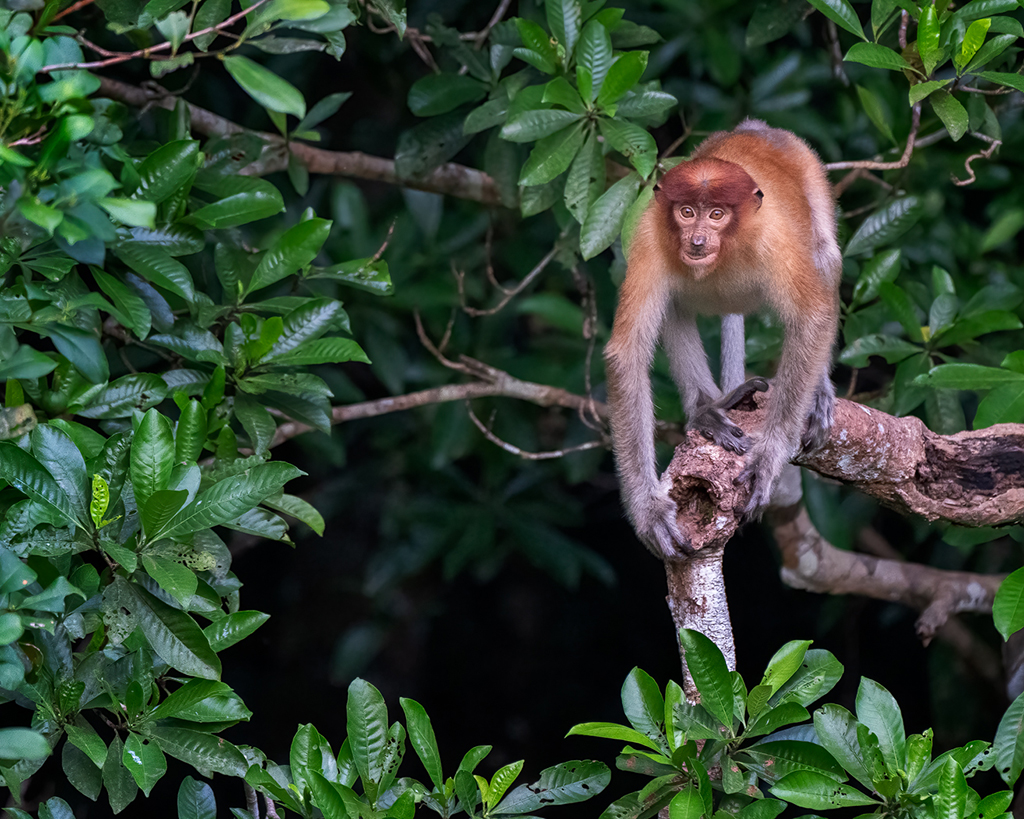
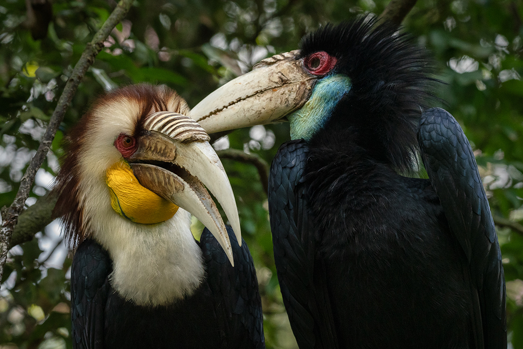
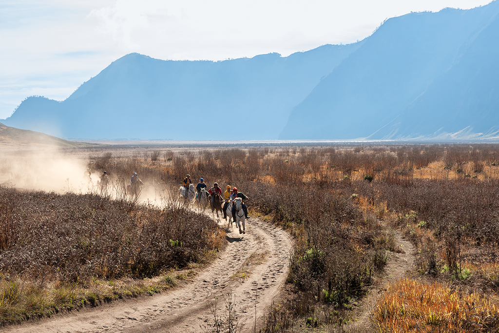
For me, if not submitted in a nature competition, I would remove the blue reflections, as they distract the eye. But you cannot do that of course for a nature division submission. Nice details indeed. For me, if I would have the opportunity, I would have taken them a bit more from the left hand side, so they seem to look a bit more into the camera, so you can create a bit more connection between them and the viewer of the image. But a very nice shot indeed! |
May 10th |
| 26 |
May 21 |
Comment |
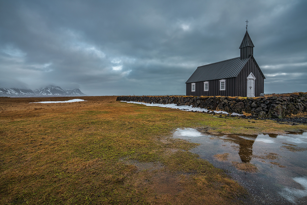
Although I agree with Jose that a real focus point might be missing a bit, I do like the overall image. I also like the editing, it makes it some more interesting and popping. I think this kind of image would very well suit as a background image, as it consists only of patterns. If you would use it on its own then definitely you would miss a focal point. |
May 10th |
| 26 |
May 21 |
Reply |
Thanks Belinda for your compliments, really appreciated! |
May 10th |
| 26 |
May 21 |
Reply |
Thanks Bob for your comments. Have not thought about cropping off the left as well, will definitely give that a try and see which one I like better! Thanks |
May 10th |
| 26 |
May 21 |
Reply |
Thanks Jose for your comments. I agree with your advice on the original image, and indeed have done the things you recommended. Thanks again |
May 10th |
| 26 |
May 21 |
Reply |
Thanks Bob for your comments and advice. I do like the darkening of the sky in the middle part of the image. I will give that a try myself! Thanks |
May 10th |
6 comments - 4 replies for Group 26
|
6 comments - 4 replies Total
|