|
| Group |
Round |
C/R |
Comment |
Date |
Image |
| 26 |
Mar 21 |
Reply |
I have taken that course as well! And yes.. I do not always see the benefit of flipping images either, but here I think it seems to work.. also from the comments of the other group members.. ;) |
Mar 8th |
| 26 |
Mar 21 |
Reply |
Wish I had tried the slower shutter speed at the time! |
Mar 8th |
| 26 |
Mar 21 |
Reply |
Thanks for the input! |
Mar 8th |
| 26 |
Mar 21 |
Reply |
Thanks Mervyn.. i see the improvemnents clearly! |
Mar 8th |
| 26 |
Mar 21 |
Comment |
I agree with Jose on this image. I also like this image much more than the one from last month. I like more natural looking images, that is why probably ;)
If this was my image, I would probably crop the image so the stem of the flower would be more or less in the center of the image (for me it is too much to the top of the image). I agree with Mervyn that the yellow is very bright, and I would tone this a bit down, and on my monitor it seems that this creates a slight white halo around the larger stems of the flower (because the yellow is very bright and the stems quite dark probably).
A very nice image with exploding colors and a nice color contrast. |
Mar 8th |
| 26 |
Mar 21 |
Comment |
A very interesting and colorful image! I also prefer the color version, much more contrast and interest. I like how you made the surface more textured and interesting. Agree with Mervyn, compliments on changing a simple scene into an interesting image. |
Mar 8th |
| 26 |
Mar 21 |
Comment |
I like the pastel colours in this image, as well as the soft lighting. I however agree with Jose about symmetry ;).. That is also true for the line of the edge of table (I assume?) that is not straight (just above the foot of the center glass), for me you could also clone that line out (no need for it). Further I agree with some of the other members about the top light area, better to tone that down or move the light source a bit further away from the glasses (if possible). Very nice image! |
Mar 8th |
| 26 |
Mar 21 |
Comment |
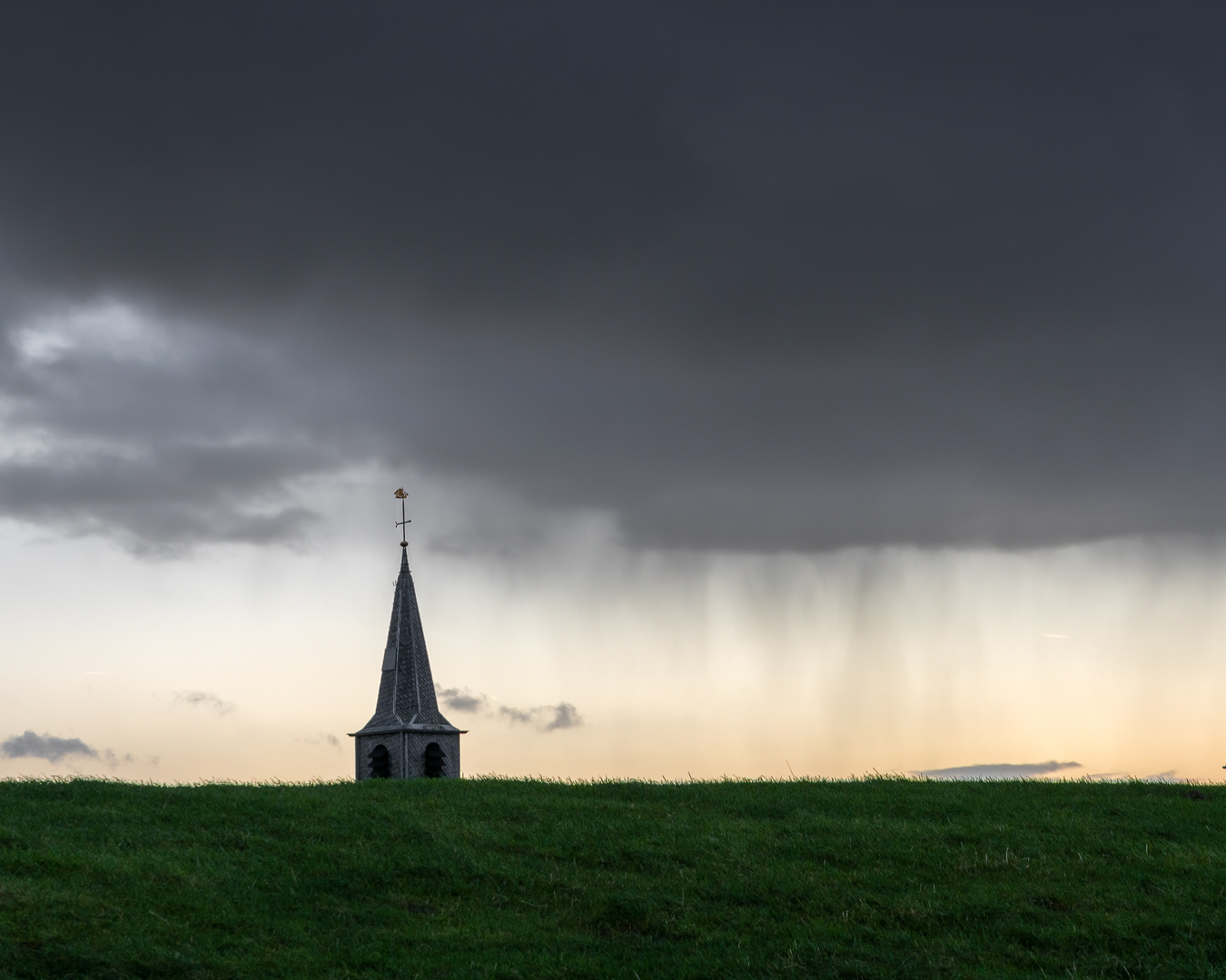
I like this image very much. The composition is very well executed and thought about. I like the striking lines and contrast, and also the fact that it is not quite clear what you see in the image (makes people look at it even longer to find out what it is). I would maybe try to darken the sky, but not to a total black, so people can still make out that the subject is a building. Very well executed image! |
Mar 7th |
| 26 |
Mar 21 |
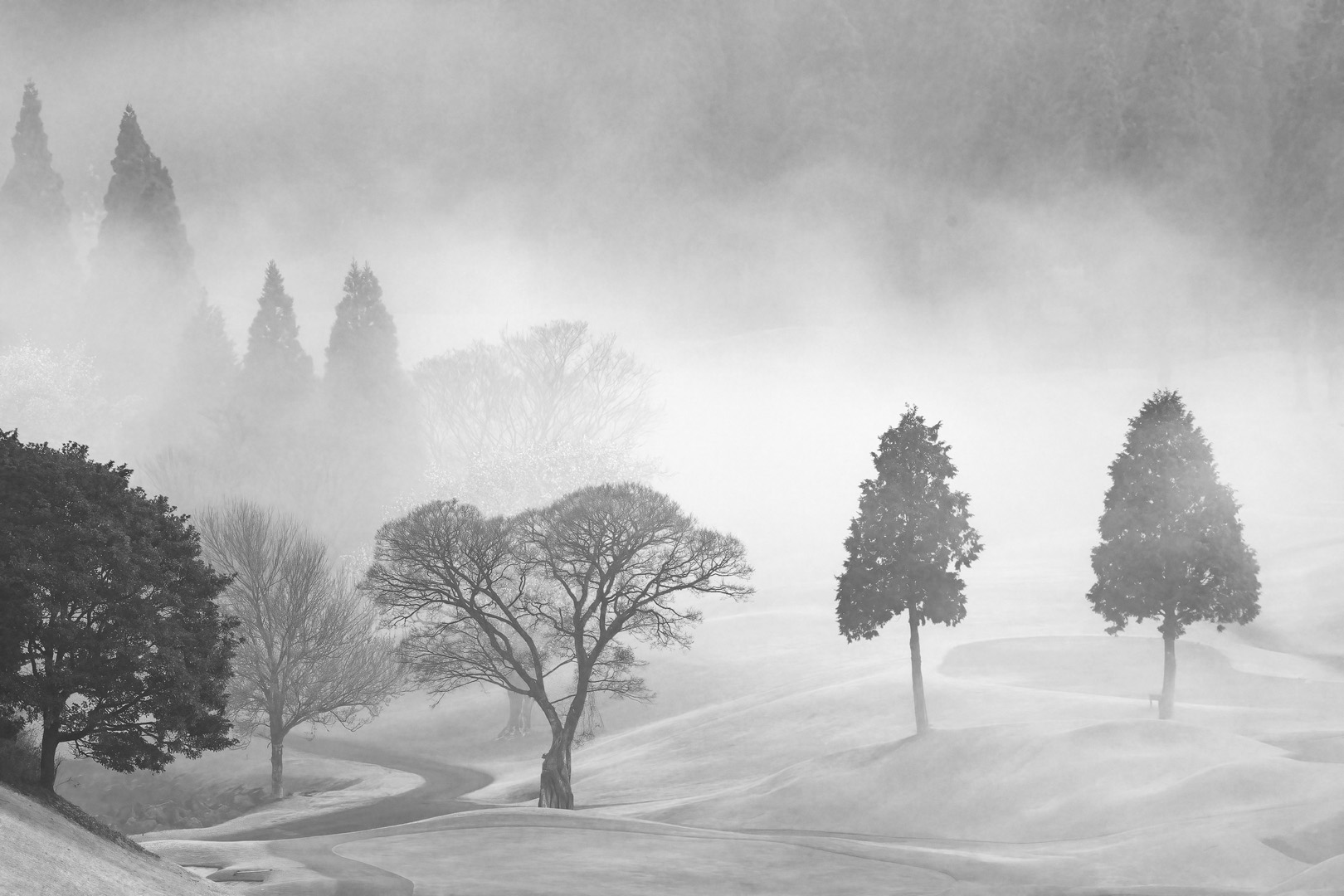
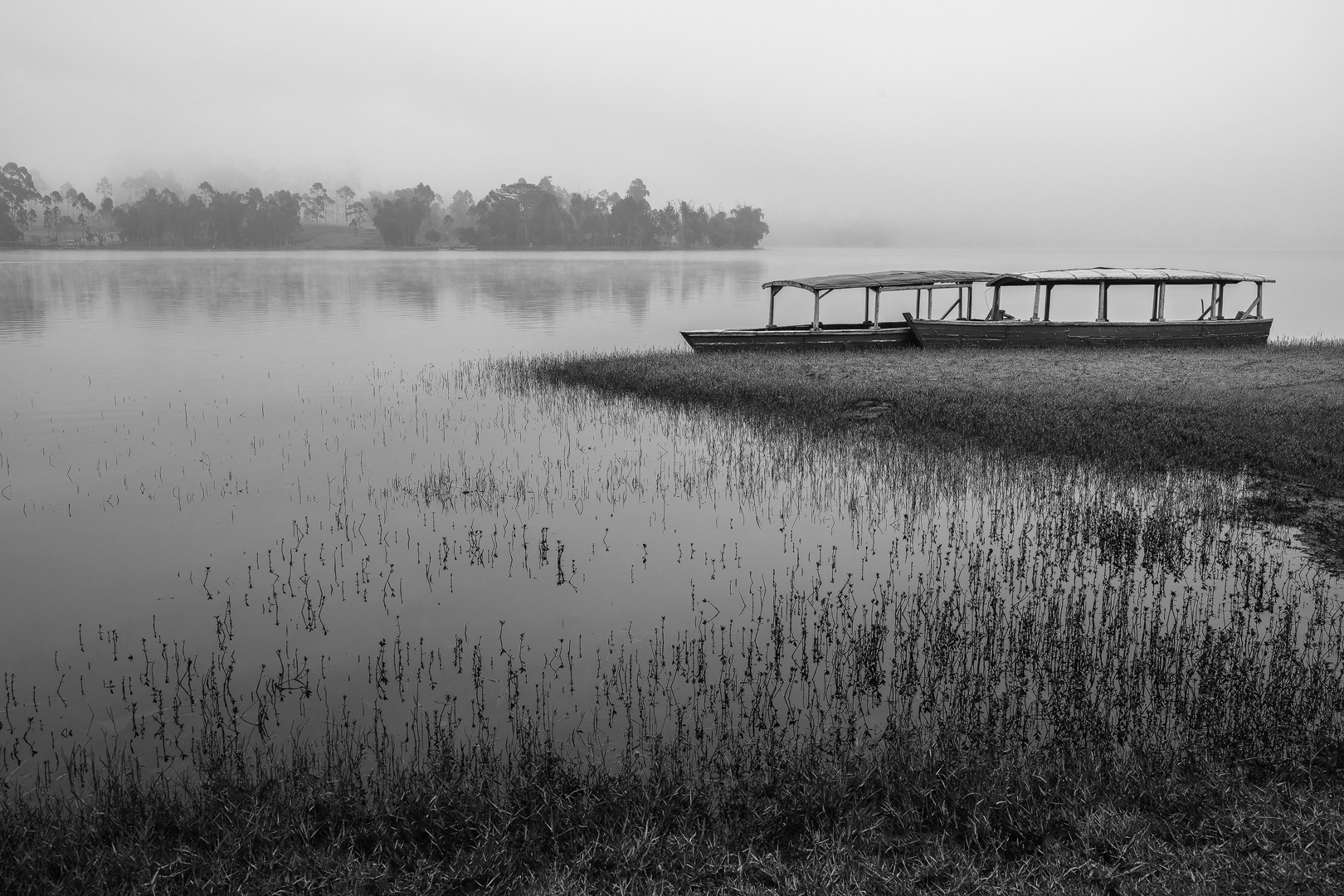
Comment |
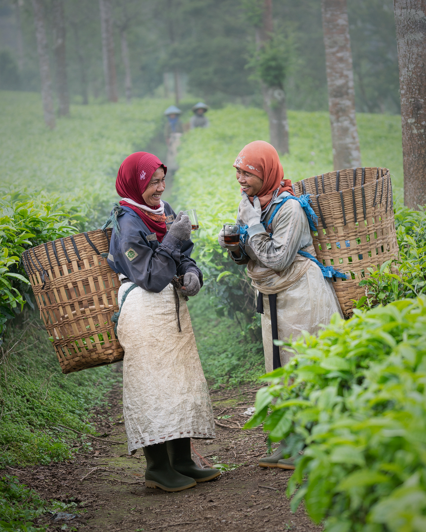
I am not much of a fan of the colours in this image, of course caused by the fog and humidity.. If this was my image I would try to correct some of the colors in LR or PS, but that said, I agree with Mervyn that the composition is a bit complicated.. I might also try to crop it to try different compositions. |
Mar 7th |
| 26 |
Mar 21 |
Comment |
A very nice close up portrait. I like the shallow depth of field of the background, but still being able to see the mother, and her smile. I don't have anything to add to the comments of the other group members I think. If this was my image, I would also clone out the hummingbird feeder, it takes to much attention because of its color I find. Well executed image! |
Mar 7th |
| 26 |
Mar 21 |
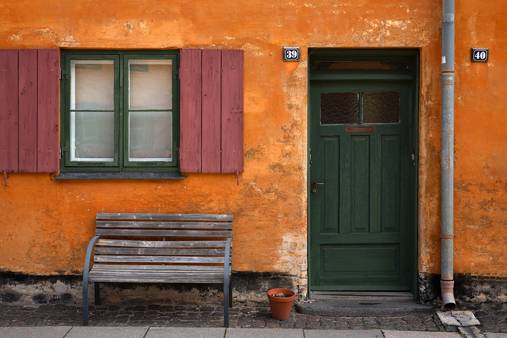
Reply |
Hi Belinda,
Yes I had your same thoughts, about the bench and flipping image. Good to hear that you also considered that.. |
Mar 7th |
6 comments - 5 replies for Group 26
|
6 comments - 5 replies Total
|