|
| Group |
Round |
C/R |
Comment |
Date |
Image |
| 26 |
Jan 21 |
Reply |
Thanks for your input. Much appreciated. |
Jan 9th |
| 26 |
Jan 21 |
Reply |
Thanks so much for your input and compliment Jose, much appreciated. |
Jan 7th |
| 26 |
Jan 21 |
Reply |
Thanks Tony, glad you like it.. |
Jan 7th |
| 26 |
Jan 21 |
Reply |
Never entered in the Nature Division, so not aware of the rules in this Division.. sorry for the confusion.. |
Jan 4th |
| 26 |
Jan 21 |
Reply |
Thanks Mervyn! |
Jan 4th |
| 26 |
Jan 21 |
Comment |
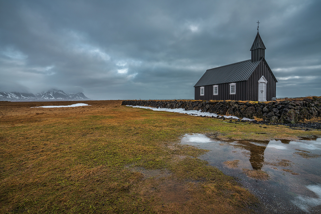
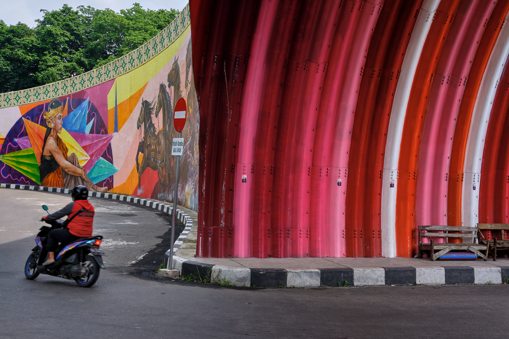
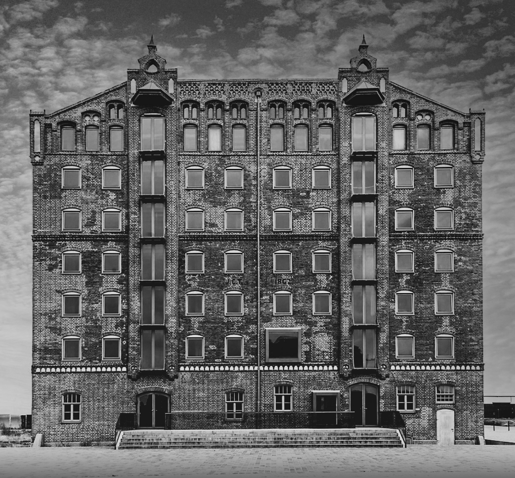
Very nice architectural image indeed. I also like that you corrected the perspective and removed the building on the left. I feel the sky could have some punch or texture, to give it an extra dimension. For me (instead of working in color like the other comments), I think this image (old architecture) might work very well in black and white too if you give it a bit more contrast. Attached just a quick edit for a feel.. |
Jan 4th |
 |
| 26 |
Jan 21 |
Comment |
Interesting effect and image. I think you could dodge the bee a bit (as I assume that is the POI here), so to let it stand out more. At first sight, I did not notice the bee that much, as it blends in with the flower because of similar colours. |
Jan 4th |
| 26 |
Jan 21 |
Comment |
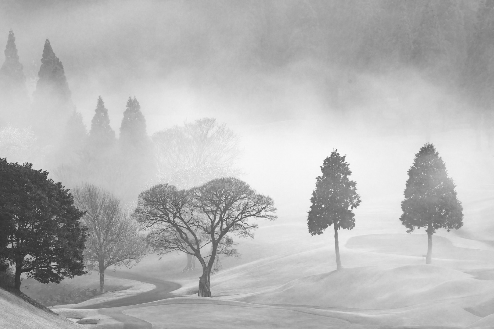
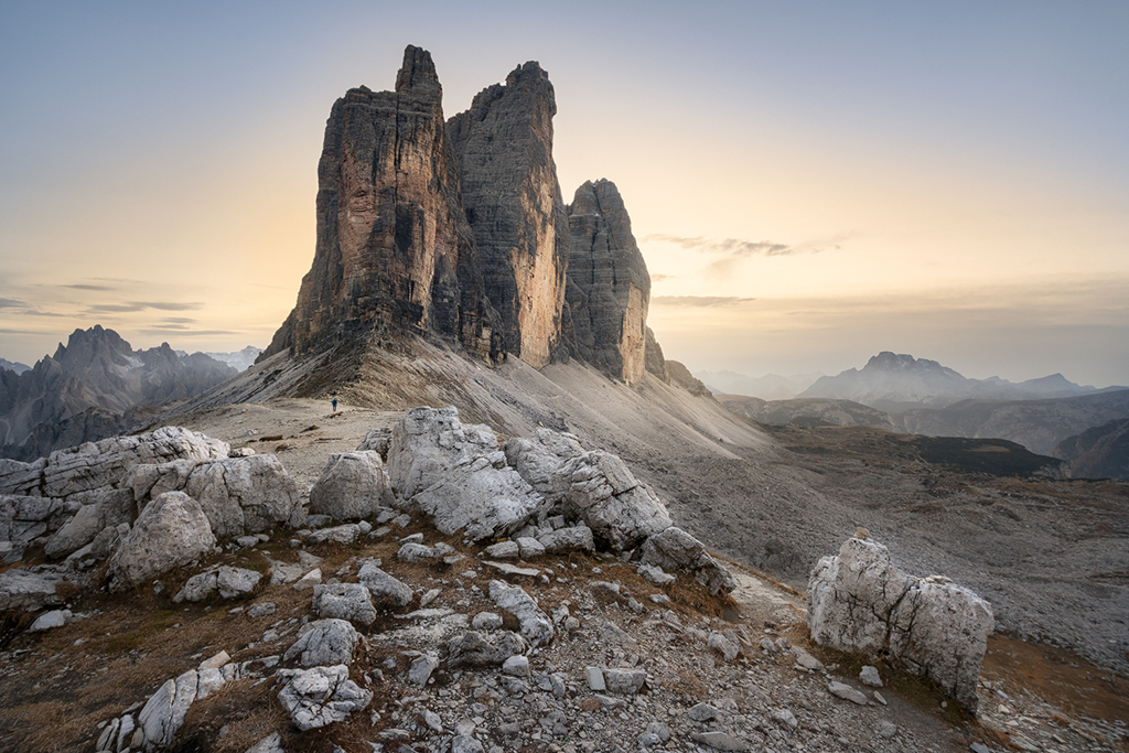
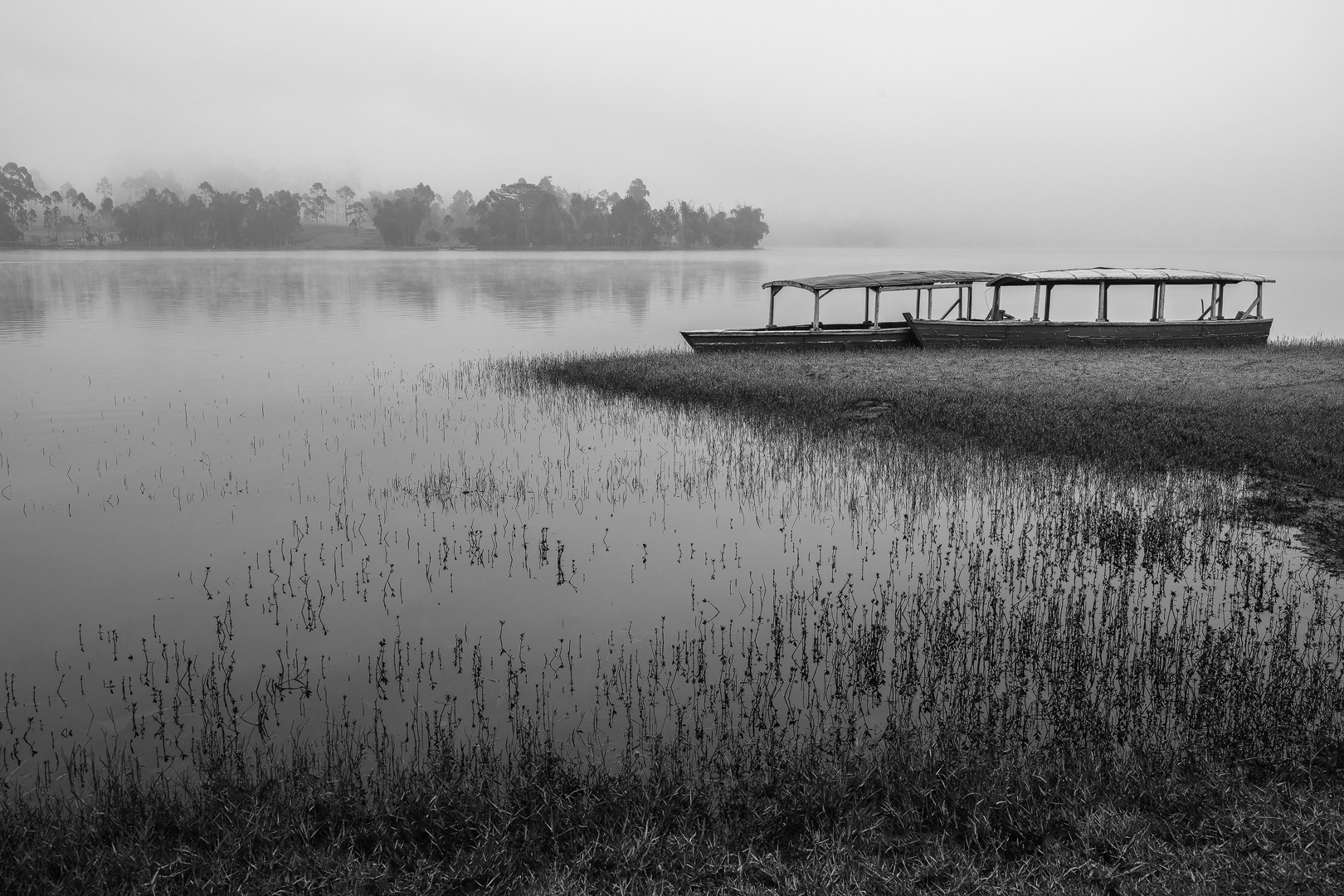
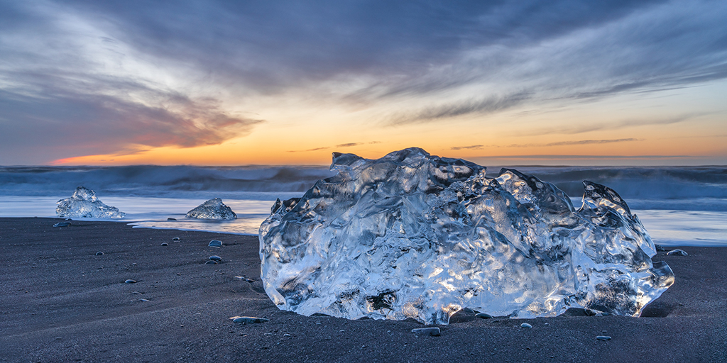
Very nice image. I like the black and white feel of it and also that it appears like snow in some areas. I agree with the other comment to either burn the FG a bit or give the whole image a slight vignette maybe. I am however not sure about the small trees on the horizon, for me they seem to distract a bit and do not add to the overall balance of the image, if they would be a bit bigger then it might work. But that might be my personal feeling. Just ignore. ;) |
Jan 4th |
| 26 |
Jan 21 |
Comment |
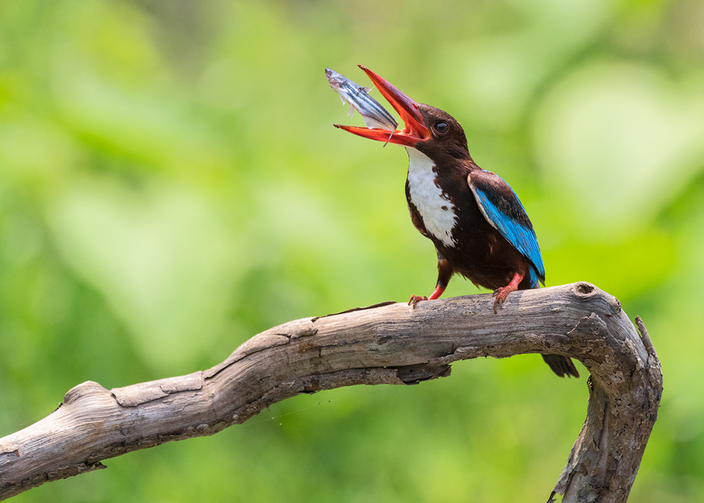
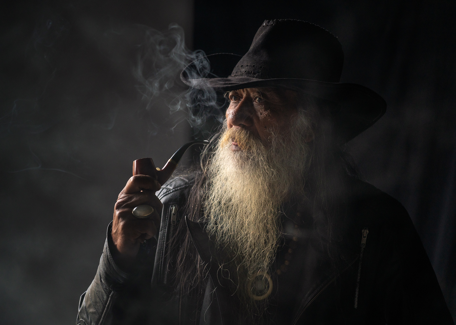
This is a beautiful bird and very nice image. Same as the others I would reduce the blues from the bird a bit. It is a great moment, catching the fish.
If you ask if there is something else to improve, I think it would be the composition for me. I would lower my lens a bit so the reflection of the bird would not almost be touching the border of the frame (bottom). But I can imagine that in the moment of the shoot, it is difficult to control composition sometimes. Maybe (if you have a good enough resolution camera) a suggestion would be to zoom just a little bit out, so you can more easily correct composition afterwards in post processing. Hope that helps. |
Jan 4th |
| 26 |
Jan 21 |
Comment |
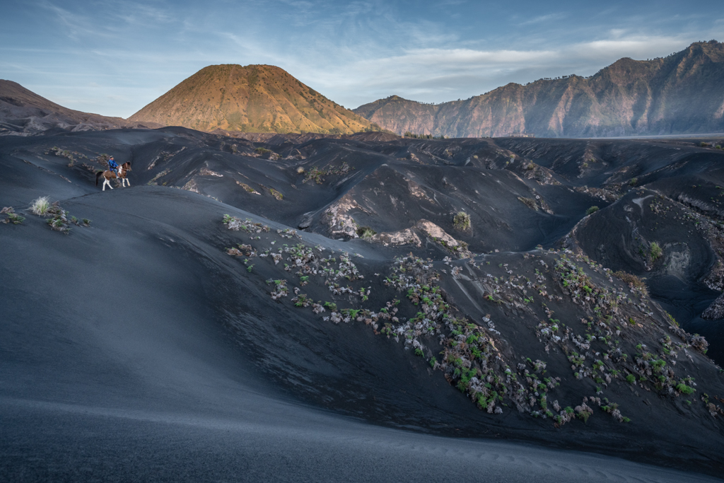
This is a great image! Good composition, point of interest and patterns. If I was asked though how to improve this image even more, I would do some edits to it, but you do not have to agree with me, because I think that is my personal taste and search for perfection ;)
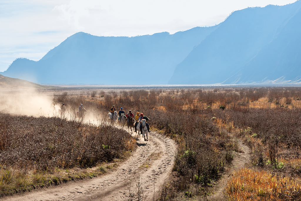
I feel that the small area of ground near the pool at the bottom of the frame is giving some tension, I would either crop it out all together or add more to this area (which probably would have to be done at time of the shoot). With that, if at all possible, if you could have gone just a bit closer to the animals, you might have been able to capture a more complete reflection of the animals in the pond (which is always nice, and in my opinion would give the image a more artistic feel as well).
Also I noticed that the most left hand side adult of the group seems to have a bit of grass on his back, which you might be able to easily clone out with the cloning tool or a heal brush in PS.
Lastly, I find that the top of the image is a bit too textured, but that can also be my screen or because of the lower res image. If you gave it more texture or sharpness, I think you would be better off by toning it down a bit, so it does not ask too much attention.
Hope you are ok with my comments above. Would love to go on a safari like this some time (after the pandemic)! Great image! |
Jan 4th |
| 26 |
Jan 21 |
Reply |
Thanks Belinda for commenting and liking my image and agreeing with the overall feel and elements in the image. Appreciated. |
Jan 3rd |
| 26 |
Jan 21 |
Reply |
Thanks Bob for the input. Yes, I think that burning (or adding a dark gradient at top and bottom) might be a good idea to further draw the eye into the image. Thanks again! |
Jan 3rd |
5 comments - 7 replies for Group 26
|
5 comments - 7 replies Total
|