|
| Group |
Round |
C/R |
Comment |
Date |
Image |
| 26 |
Dec 20 |
Reply |
Thanks Albert for your input.. I have read all the comments here and reedited the image considering all or at least most of them (when not contradicting) and came up with i think a much better version.. thanks for all your help! Merry Christmas and Happy New Year! Let's hope it will be much better next year! |
Dec 25th |
| 26 |
Dec 20 |
Reply |
Thanks Jose for your comments. Will certainly try all the advise i have got so far.. Glad you liked going to Bromo by the way ;) |
Dec 8th |
| 26 |
Dec 20 |
Reply |
Thanks Tony for your comments.. appreciated. |
Dec 8th |
| 26 |
Dec 20 |
Comment |
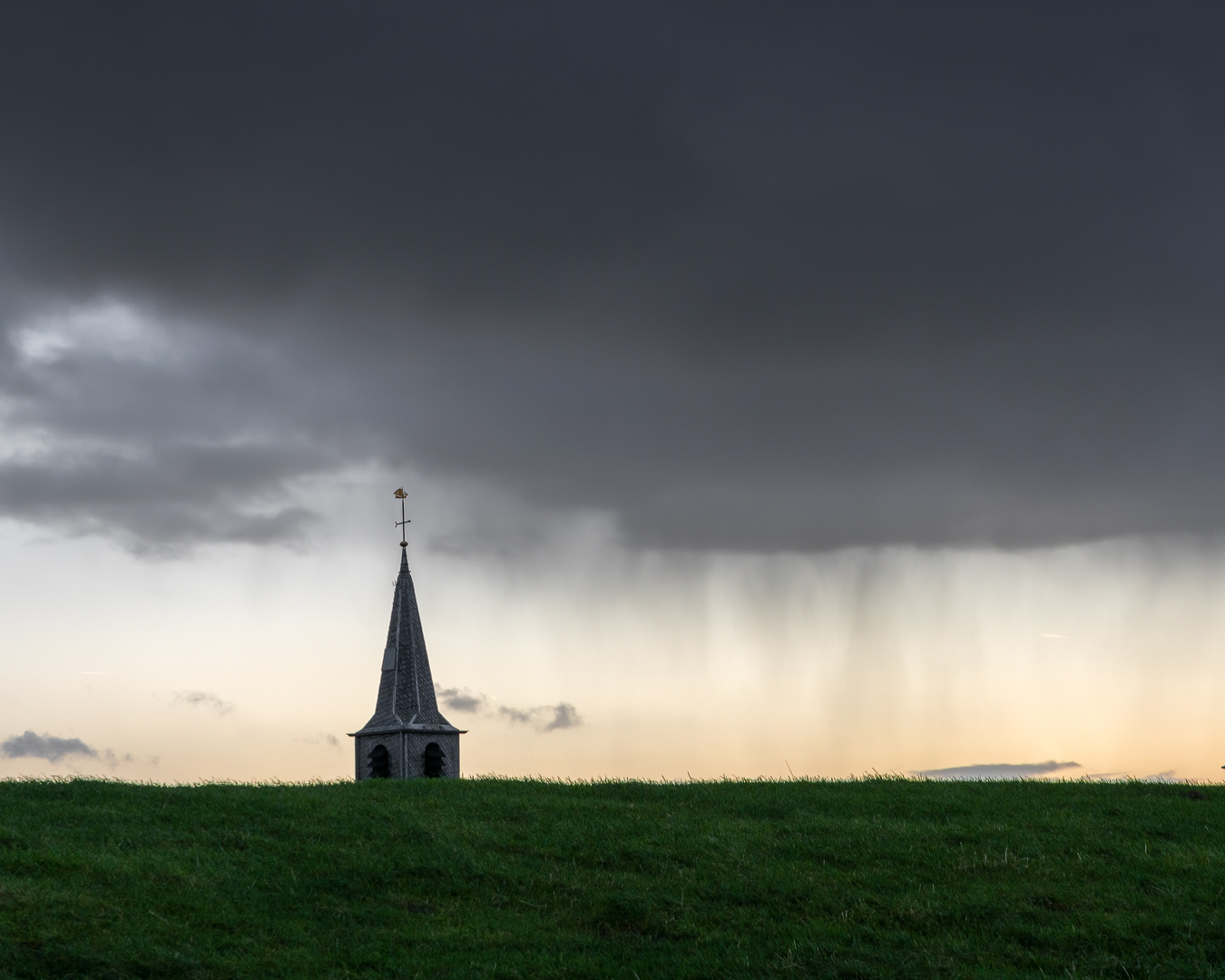
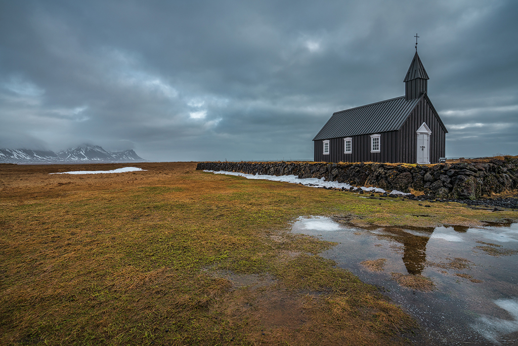
Lovely countryside image. I agree with Mervyn to darken the trees on the right hand side and the sky above the barn. For the rest it is just a beautiful scene.
|
Dec 8th |
| 26 |
Dec 20 |
Comment |
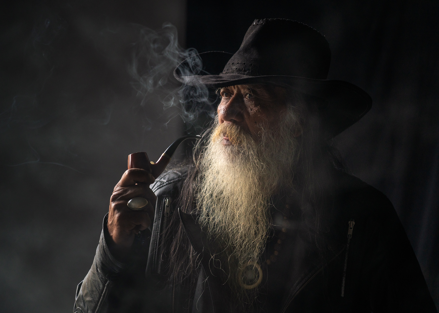
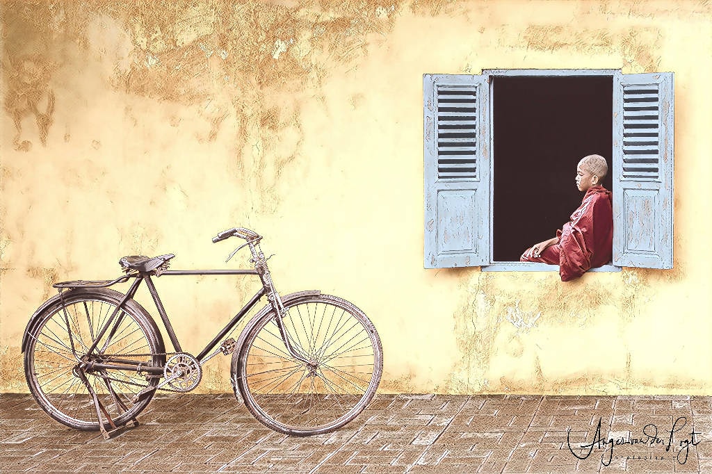
I like this image with its composition and curves! It really suits black and white. The person adds interest in the picture, without it, it might be not that interesting. It is a bit posterized on my screen, maybe a little bit too much sharpening? I like the play between darks and whites. Maybe for me the space between the curve and the border to the left of the image is a bit too tight, and I would have cropped it with a bit more space. But that is personal I believe. Very well done! |
Dec 8th |
| 26 |
Dec 20 |
Reply |
Yes good idea, definitely worth a try! |
Dec 7th |
| 26 |
Dec 20 |
Comment |
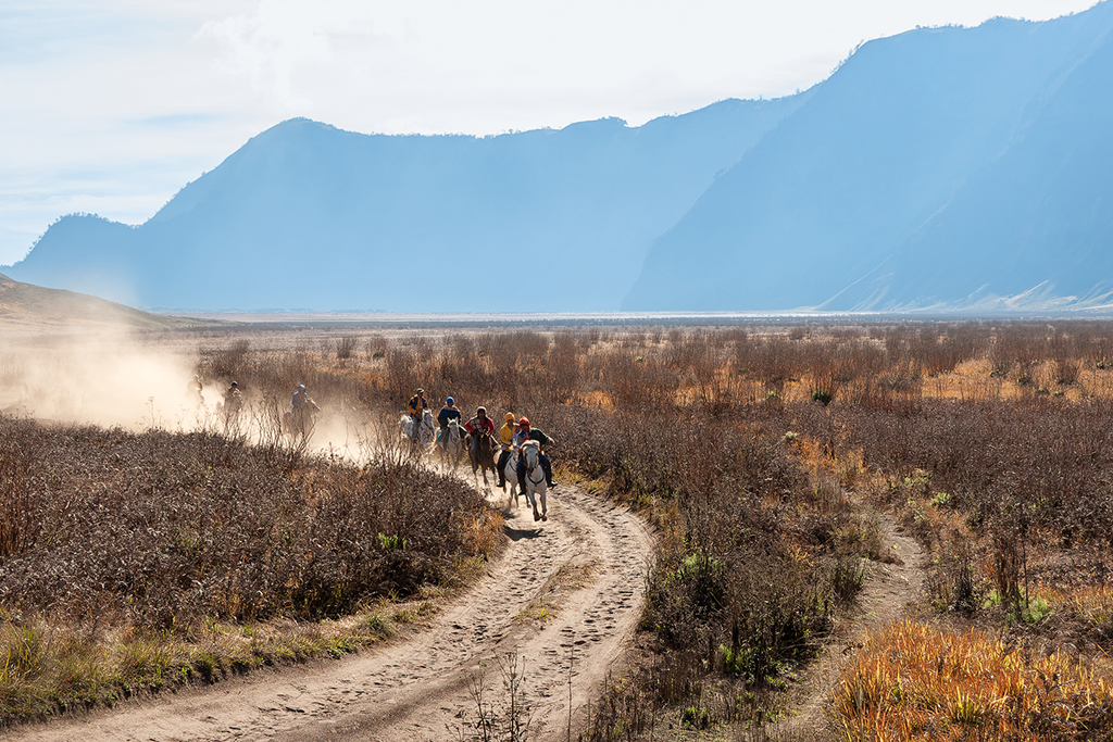
A very nice architectural image. I like the colors and the reflections of the light in the water pools on the street. I do agree with the others that maybe a little crop or else darkening the borders of the image would give more attention to the structure as the subject. Also I would darken up the people at the left hand side of the image a bit, as they are a bit distracting. Best would be to wait a bit so there are no people at the sides of the image.. but you can't go back in the near future i suppose ;)
The image does feel like it is tilted a bit, but if you look closely you see a straight fence in the background, so this is just because of the viewpoint or the wide lens distortion. Maybe you were not in the middle of the street at the moment of this shot (that would have corrected this sense of tilt i suppose)
Overall a very nice and interesting image!
|
Dec 7th |
| 26 |
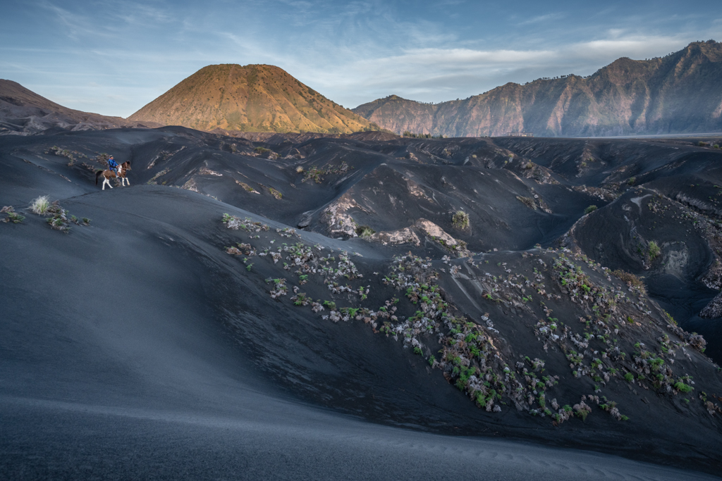
Dec 20 |
Reply |
Thanks Belinda for your comfirmation on the other comments.. I agree that you can miss the rider, so will certainly try to correct that.. |
Dec 7th |
| 26 |
Dec 20 |
Reply |
Hi Mervyn,
Appreciate your comment. I agree with you that the rider is not accentuated enough to my liking either. Will try to brighten up without it becoming unnatural. Together with Bob's comment above. |
Dec 7th |
| 26 |
Dec 20 |
Reply |
Hi Bob,
Thanks for your comments.. I will certainly try your advice and do a re-edit to see where it takes me. |
Dec 7th |
| 26 |
Dec 20 |
Comment |
Nice view and crop! The only thing that seems to draw my attention too much is the sky (well that is my opinion of course). With such a bright sky in midday I suppose you better underexpose a bit for the light, so the sky does not become that white. Or maybe that was your intention? I tried to edit your original image in Lightroom, and actually you can still extract some detail from the sky (from the original image), which is quite impressive. Of course mobile phone apps are not as powerful as Lightroom or Photoshop. But you could try to use the mobile version of Lightroom if you would like to have some more control on your images. For white balance and colours, I think that is very personal, and there is no right or wrong there. A very nice image, also composition is quite ok I think! |
Dec 7th |
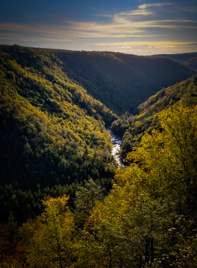 |
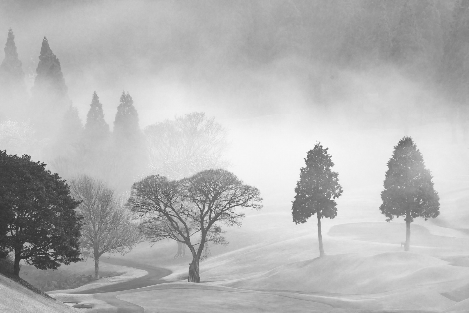
| 26 |
Dec 20 |
Comment |
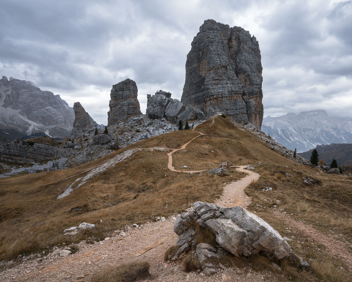
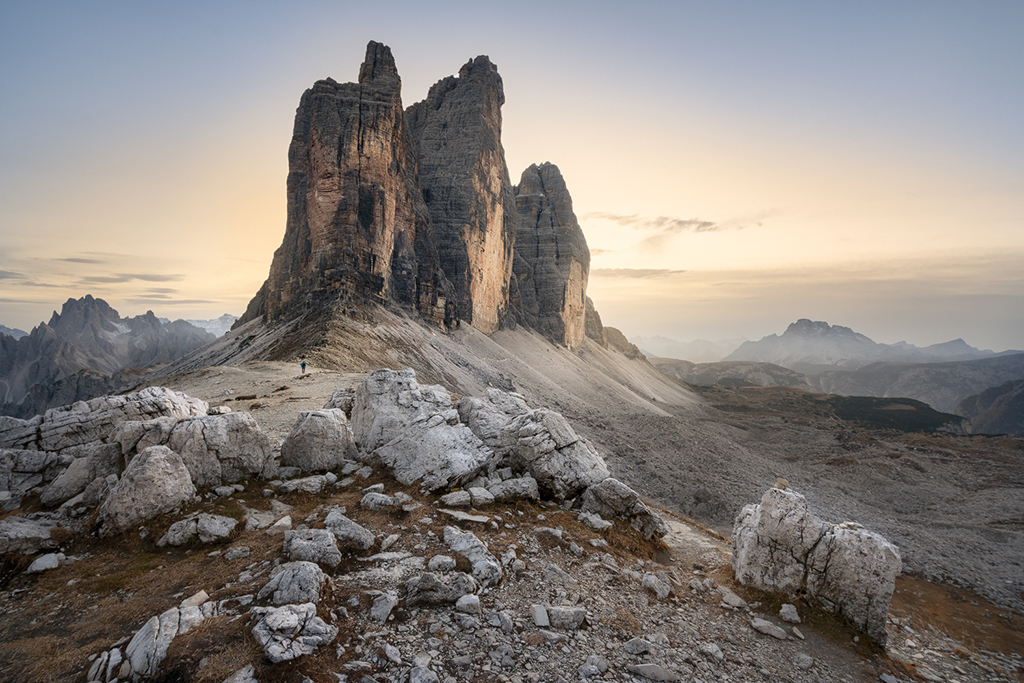
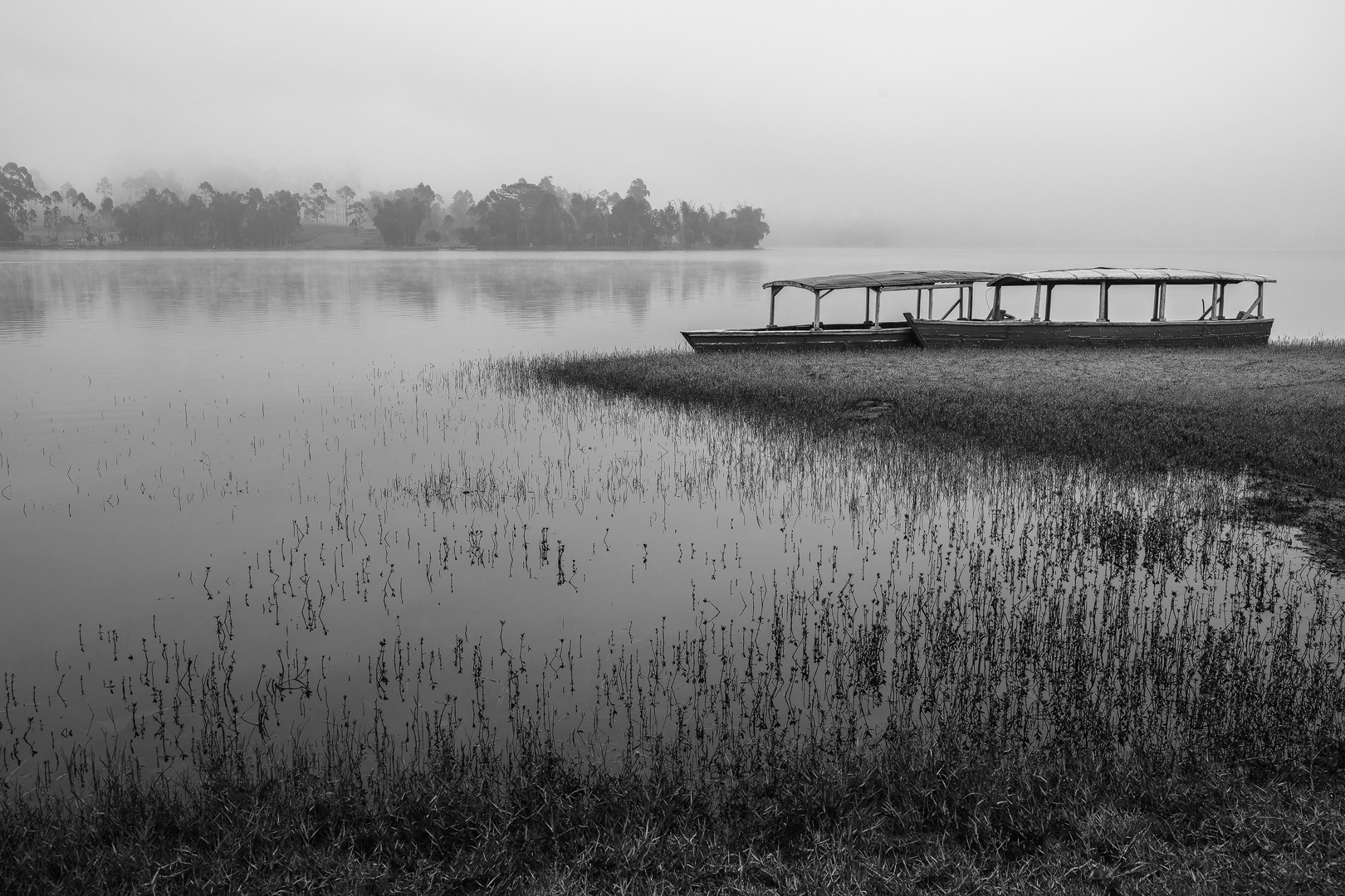
I like the layering very much, which occurs between the mountain ranges. To make the image even more 3D, I would burn the foreground somewhat with a gradient filter in LR or Camera Raw to draw more attention to the middle of the image where the mountain ranges are. (Please see my edit of the image attached).
Further I think that the white part of the sky is a bit overexposed (if this is not caused by saving the image to the web). I would give a gradient in the sky as well to bring the colours out even more.. For composition I think the image is already balanced quite well by the two trees on the left and right side of the image. A beautiful view! Wish I could be there at the moment.. ;) |
Dec 7th |
 |
5 comments - 7 replies for Group 26
|
5 comments - 7 replies Total
|