|
| Group |
Round |
C/R |
Comment |
Date |
Image |
| 36 |
Dec 20 |
Reply |
Hi Michael, Yes I'd surely process this again as per your comments provided. Larry and Arne explained it really well on what exactly is missing. |
Dec 17th |
| 36 |
Dec 20 |
Reply |
Hi Arne, Thanks a lot for your opinion. I'd try to process this image again with all the comments I have received here. Luckily everyone is suggesting the same things. |
Dec 17th |
| 36 |
Dec 20 |
Reply |
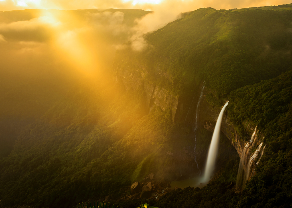
Hi Bill, Well that was my thought in the first place. If I were to shot this in portrait mode, I'd have missed out the wide vista which gives a feel of the vastness of the place. Yes I feel I'd too try to selectively burn the plant on the bottom left corner. |
Dec 17th |
| 36 |
Dec 20 |
Comment |
The tree has come out really good. But I really don't know this background is something bothering me and doesn't feel right with the tree. I know I can't provide many opinions here. Everyone has their own liking and taste. I might have tried some different angle even if that means letting go of the background sunset colours. |
Dec 17th |
| 36 |
Dec 20 |
Comment |
Well, it looks lovely to me. I really don't have much opinions/suggestions here. I'd probably have done the same if I were at your place. So I belive e I'd like to learn here from others comments. |
Dec 17th |
| 36 |
Dec 20 |
Comment |
I'm in love with this composition and hats off to your dedication. However, regarding the post-processing, I'd have personally dodge burned selectively the rocks to give the image a depth instead of what it now feels like a radial used for the glow. |
Dec 17th |
| 36 |
Dec 20 |
Comment |
I agree with Richard that the photo looks a bit flat. I like Richard's version more than Larry's version which feels a bit more overprocessed to me.
But yes, the colours and everything came out nicely. If you could just increase a tad bit more contrast and selectively dodge and burn the image I feel it'd look much better. |
Dec 17th |
| 36 |
Dec 20 |
Comment |
Wow! This feels like a painting to me. I'm loving the mood with the blue tone that you have created. The selective dodge is making this image glow. Loved it! |
Dec 17th |
| 36 |
Dec 20 |
Reply |
Hi Richard, Yes, as others also have pointed out the same mistake, I tried a portrait version of this. However, I'm missing out on the wideness of the place. Maybe I'd selectively burn the bright green plant on the bottom left. Thanks a lot for providing the sample of your thoughts.
|
Dec 17th |
| 36 |
Dec 20 |
Reply |
Hi Larry, Thanks a lot for your opinion. I'll again try to process this out as per the suggestions provided. |
Dec 17th |
5 comments - 5 replies for Group 36
|
5 comments - 5 replies Total
|