|
| Group |
Round |
C/R |
Comment |
Date |
Image |
| 12 |
Apr 25 |
Reply |
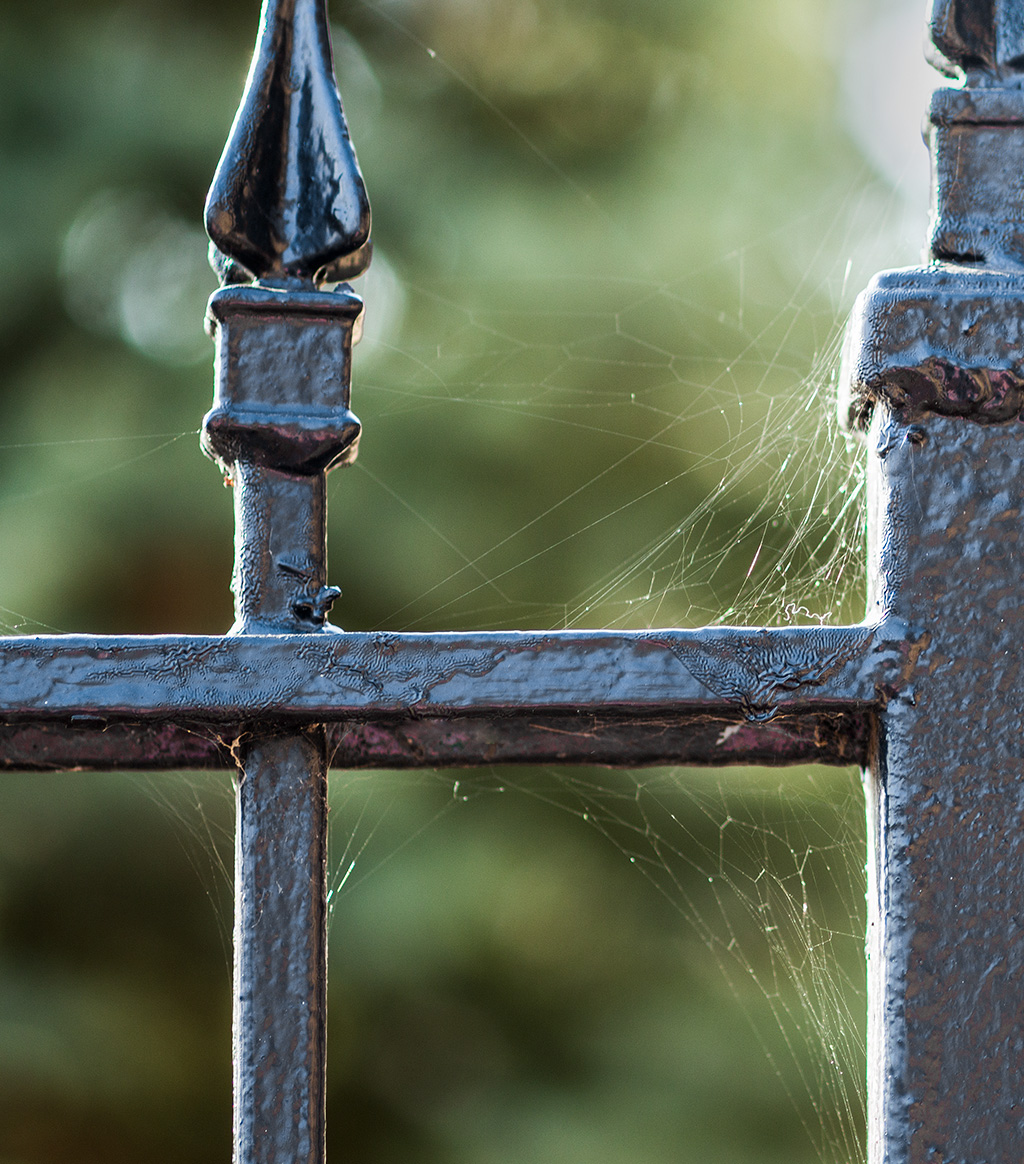
I noticed that this "officially monochrome" image makes the spider webs stand out more than in the other version. |
Apr 28th |
| 12 |
Apr 25 |
Reply |
I was sad to hear of Bryan Peterson's passing, too. I have several of his books. Here's an interesting article https://petapixel.com/2025/04/07/famed-photographer-educator-and-author-bryan-f-peterson-has-died/. |
Apr 28th |
| 12 |
Apr 25 |
Reply |
I had never done it with any color other than sepia when I restore old photos. There are several ways to do it, too. Always good to learn something new and then apply it to something old! |
Apr 21st |
| 12 |
Apr 25 |
Reply |
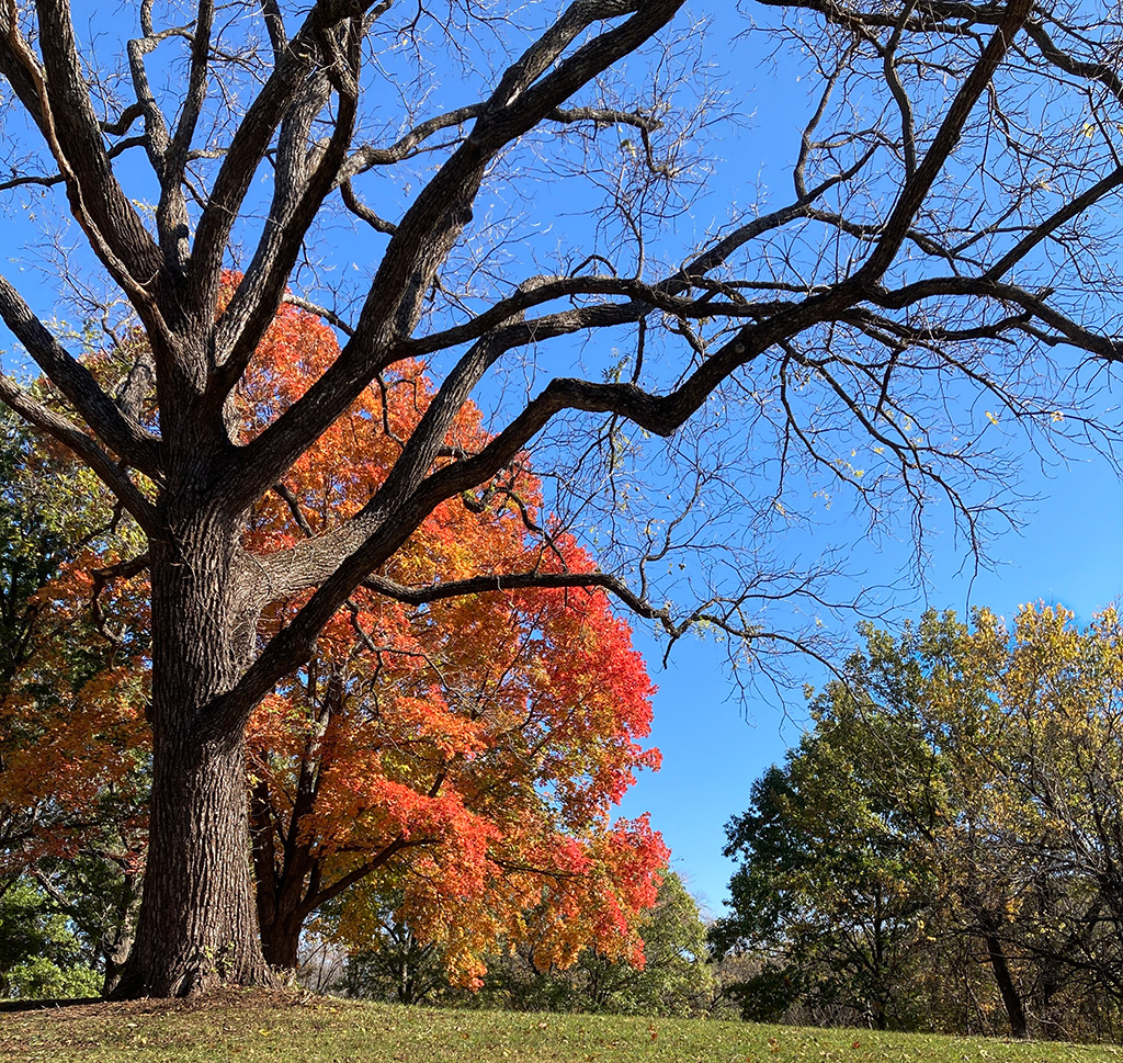
So sorry you had bad weather, because this blue mood is amazing to be "in." And I did put the branches in the foreground on purpose for the reasons you stated. But now looking at it, the branches do look like interference. I did take this basic same view without the branches. |
Apr 21st |
| 12 |
Apr 25 |
Reply |
Oh, you did a lovely job of removing the grain. I don't know why I didn't think of that. Now I know! |
Apr 21st |
| 12 |
Apr 25 |
Reply |
Yes, I have a lot of images from this general area that have this same look to them. I visited there only once, but I imagine it looks the same natural blue color every year. |
Apr 21st |
| 12 |
Apr 25 |
Comment |
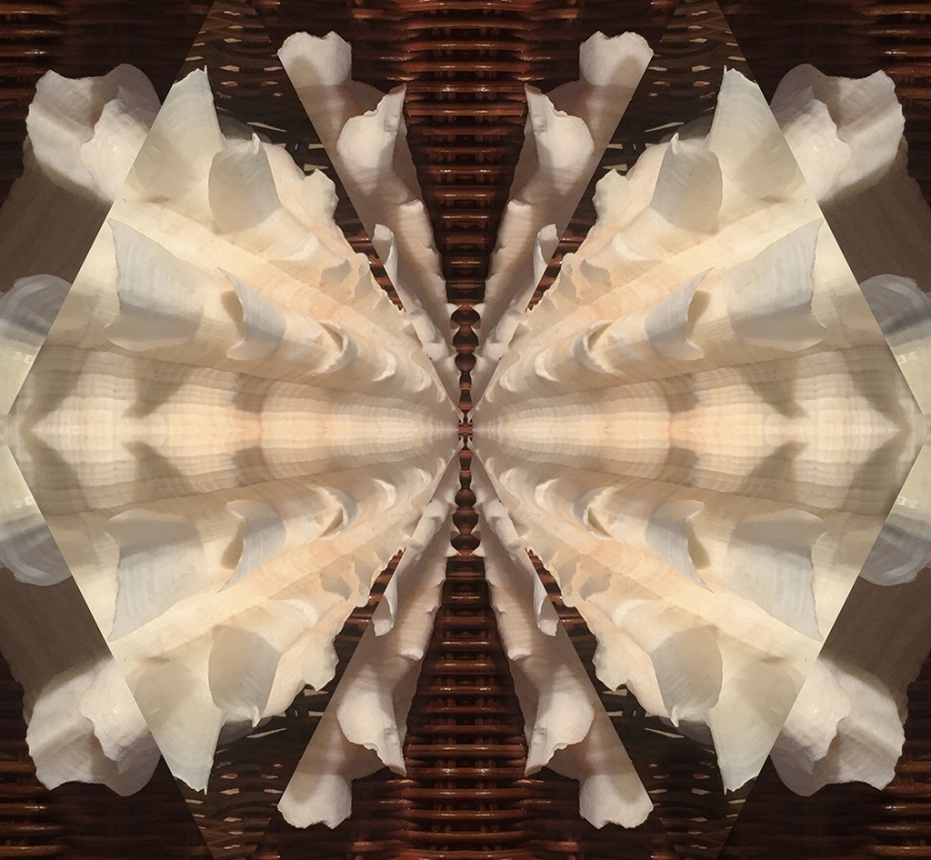
What a nice subject to apply the monochromatic look! Bold and dramatic. The middle white "blossoms" look like stars in the solar system with tiny planets going around them. And if there were distractions around the edges, you took care of them! |
Apr 21st |
| 12 |
Apr 25 |
Comment |
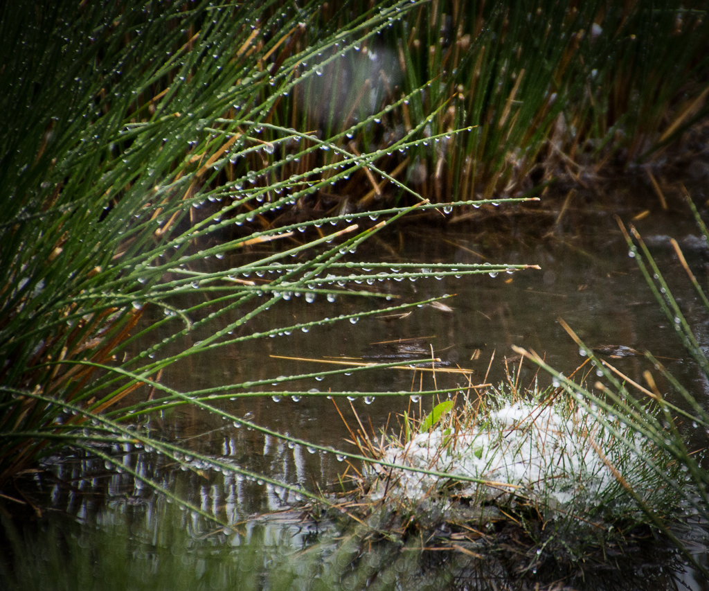
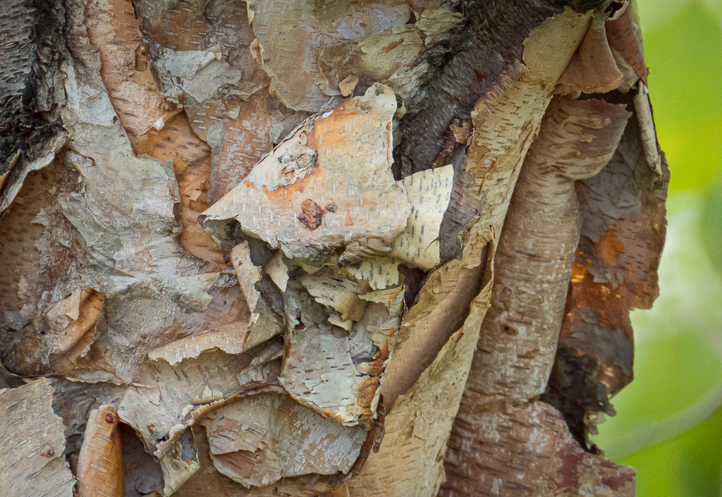
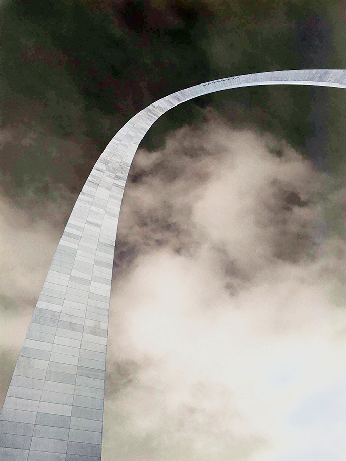
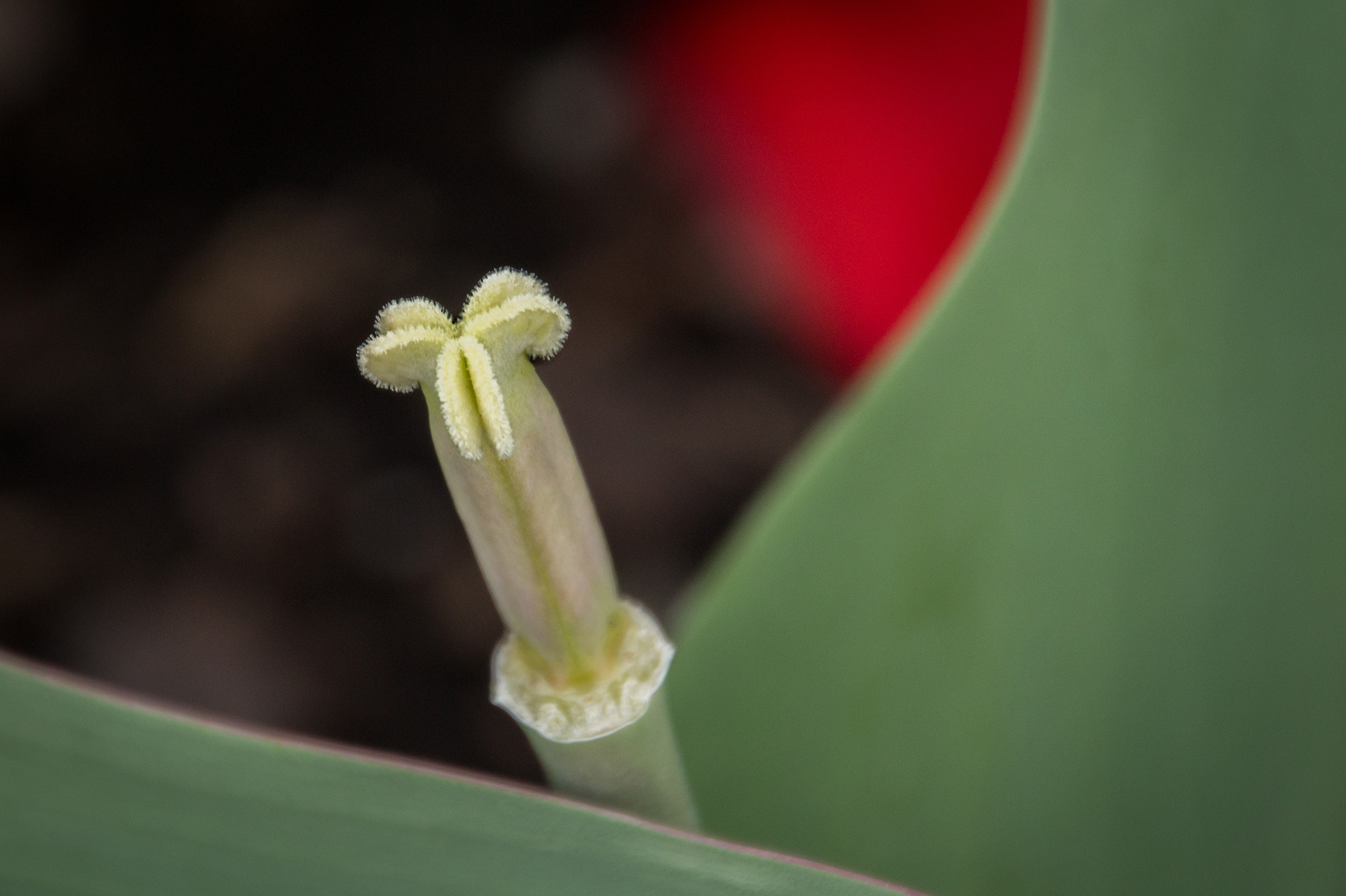
Your image is mostly green, and that's hard to find. I think for the monochromatic theme, I would have picked a green color from the image and then toned the entire image with that color. But it wouldn't be as pretty as your original! I like the two items of main interest, and my eye goes back and forth between the upright stem area and the horizontal fern look across the bottom. I'd lighten or remove the other "light" distracting areas to produce a more dramatic view of the plant. Nice to have found in nature like this. |
Apr 21st |
| 12 |
Apr 25 |
Comment |
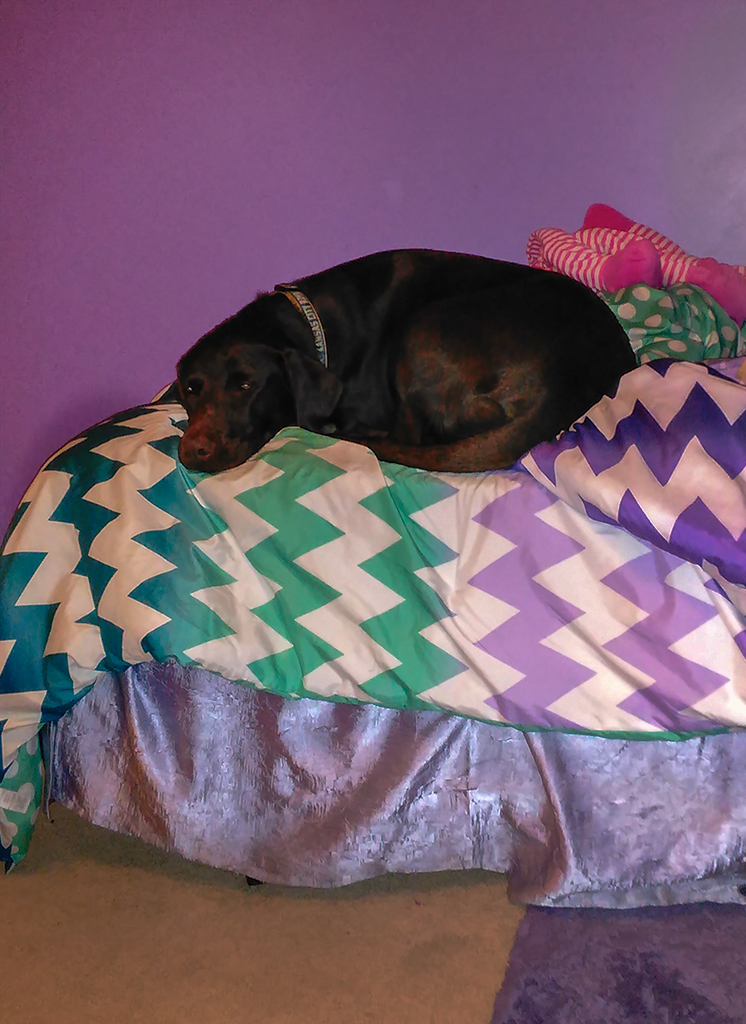
I think the monotone emphasizes his face and facial expression. The image looks more like a gray monotone than a black one. Maybe it was just not enough contrast instead of the chosen color for the monotone. Because the animal looks fierce, I prefer the darker coloring. In either case, I would recommend toning down or removing the light objects all around the animal. Sometimes I simply remove such things, whereas other times I only tone down the "whites" or the "brightness" by painting over them and adjusting the slides until they are faintly there just to indicate the environment. Nice to see that you didn't have to deal with a fence in front of his face! |
Apr 21st |
| 12 |
Apr 25 |
Comment |
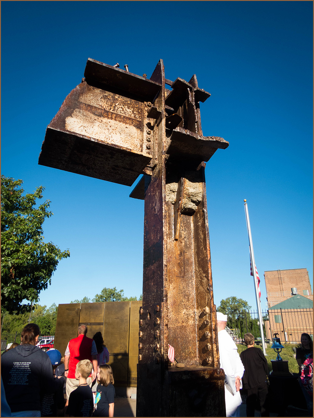
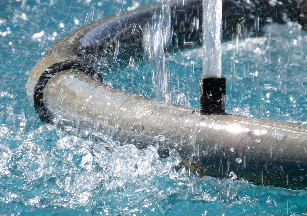
This is a most interesting lightning shot because it is basically a horizontal composition, which is unique. I love seeing it go sideways like this. Your patience paid off. I have tried this kind of photography and have given up! The overall coloring is just perfect in my opinion. The lightning shows up so well. Your idea of adding a border really helps me appreciate the scene. |
Apr 21st |
| 12 |
Apr 25 |
Comment |
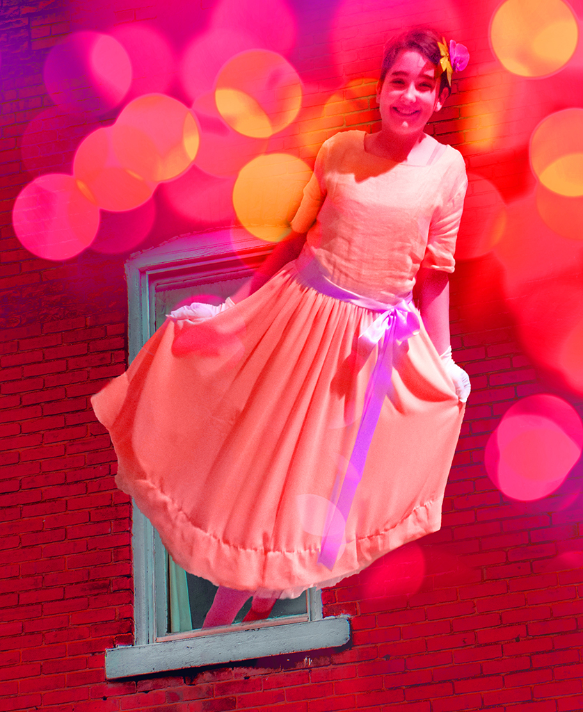
I discovered the best way to view your new image was to click on it to open it up full screen. Otherwise, your original image is too distracting. My eye stays on the man no matter what, so that is good! And I looked at the image a long time, trying to figure out how he got suspended like that! A fun image. I like the original colors but I would crop off that far right panel where the bright pink area at the top is distracting. But, our assignment was all the same color, and I think your version has a good composition for that purpose. I can see his environment is one very huge wall. I wonder if the photographer's reflection is in there somewhere, no matter how distorted?!!! There are lots of ways to make a monotone colored image in Photoshop. I googled it and learned a few more techniques. Same for copying the styles in NIK EFEX effects in bw, too. |
Apr 21st |
5 comments - 6 replies for Group 12
|
5 comments - 6 replies Total
|