|
| Group |
Round |
C/R |
Comment |
Date |
Image |
| 12 |
Sep 24 |
Reply |
Yes, it is allowed for you to put a link within your Comments. Your architecture collection is what PSA calls a portfolio. It's where you have photos with a theme and the same look. I like the "illustration" look you've applied to all these buildings I almost forget the pictures are photos. |
Sep 30th |
| 12 |
Sep 24 |
Reply |
Until you mentioned it, I hadn't seen the white squares tangent to the girder. Now I realize they are on the building behind. Funny how we don't notice something that is very obvious until someone points it out! |
Sep 30th |
| 12 |
Sep 24 |
Comment |
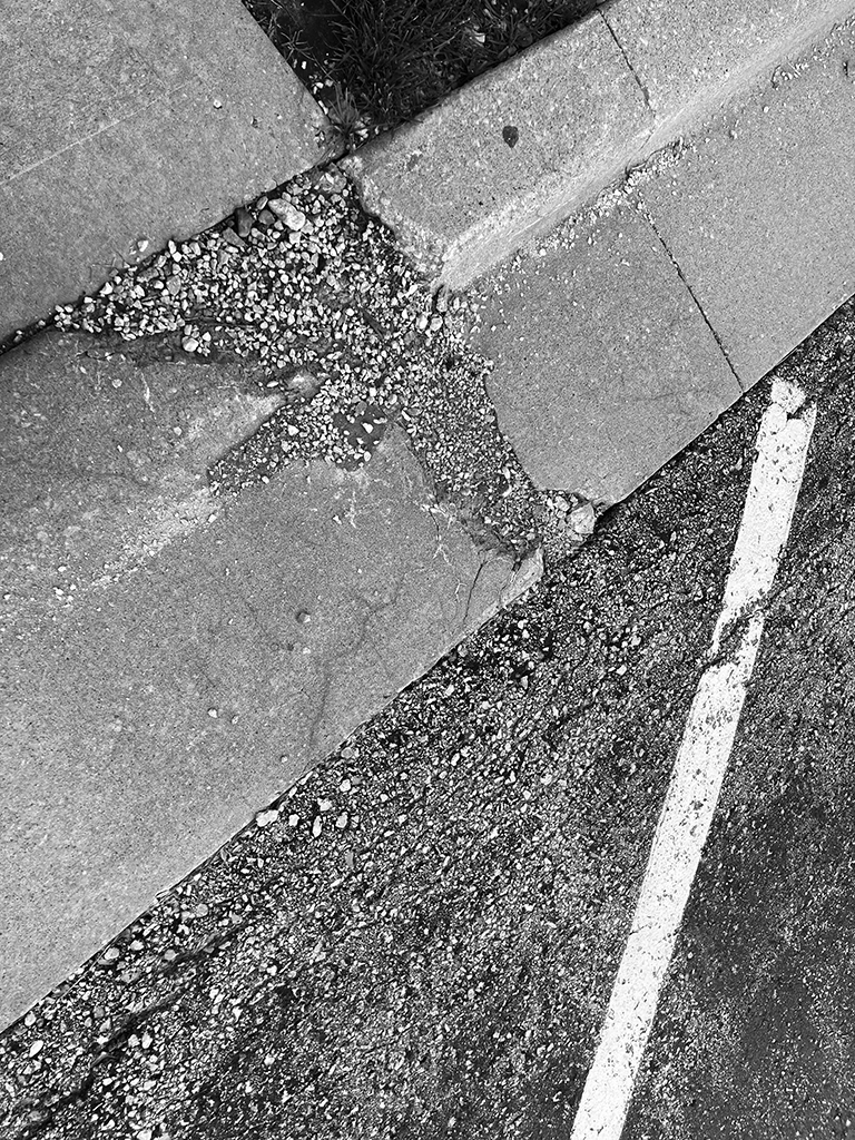
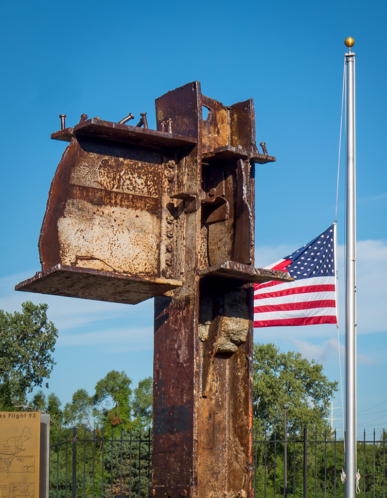
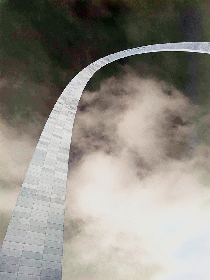
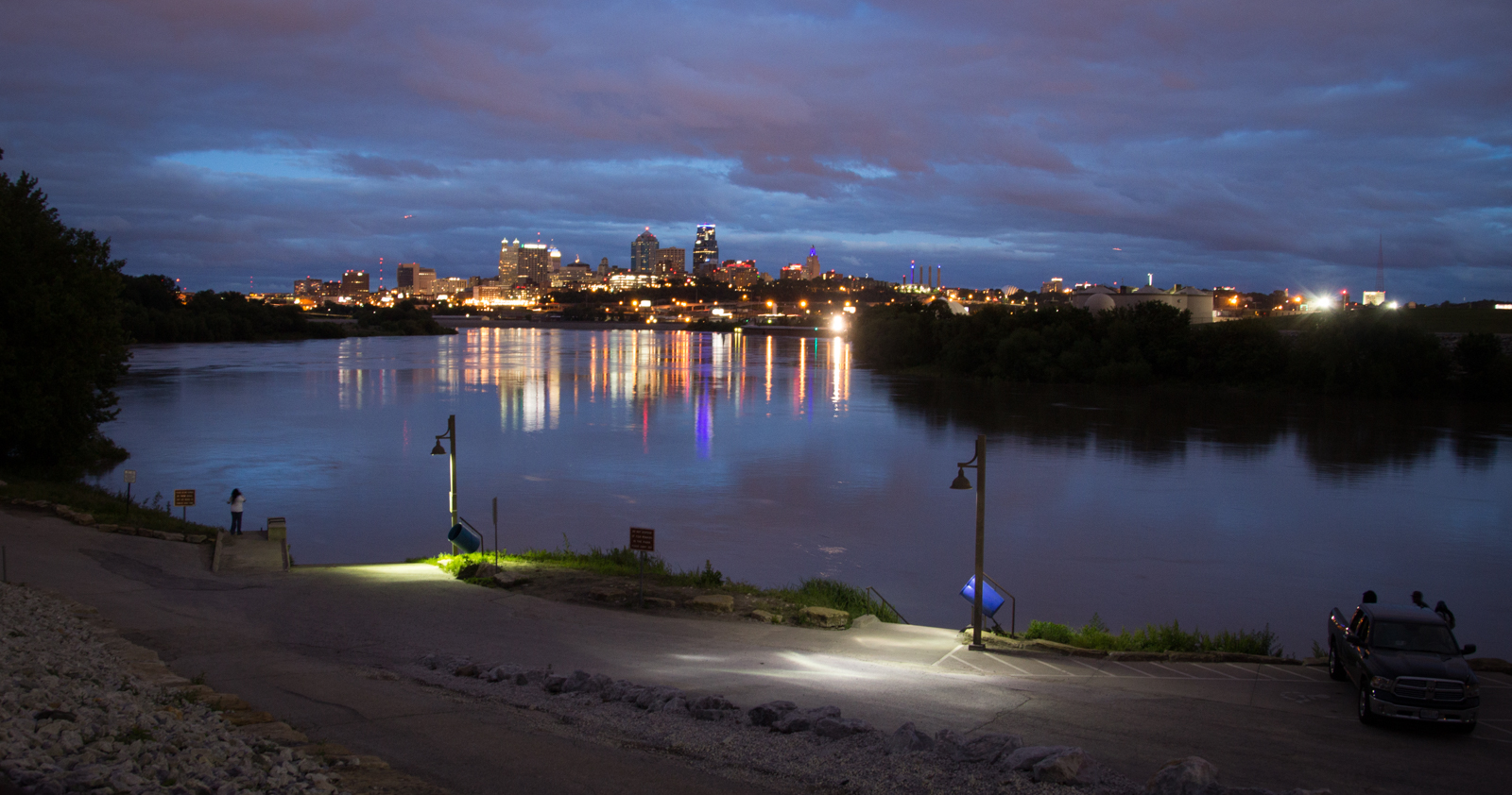
That threatening sky has given your image a unique somber look. I actually like the curb there because I was thinking you were shooting from down low. Plus, the more down low and looking up, the more keystoning there will be. I thought it was a unique image. On the other hand, my traditional thinking led me to think, fix that perspective with the sides of the building, just because I do that for all my buildings! If you do remove the curb, then the photo's mood increases dramatically from somber to really somber, because the sky dictates it. The light color of the curb is a distraction from that mood. I wonder what focal length you were using. I wonder if you were trying to emphasize the length of the path from street to building. Maybe shooting from a higher perspective with a wide angle lens would do that. |
Sep 9th |
| 12 |
Sep 24 |
Comment |
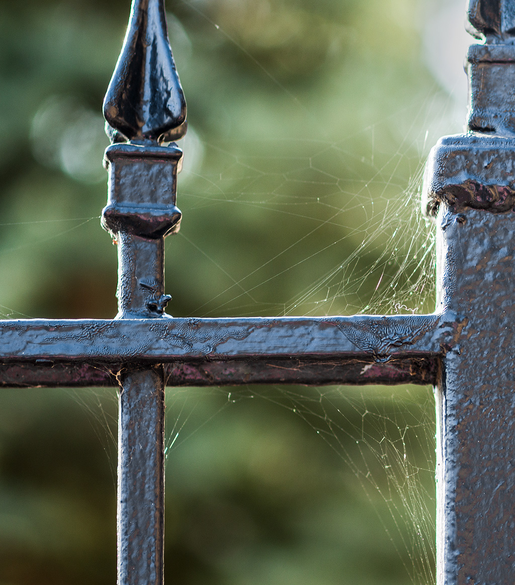
This image has wonderful impact for me! The colors impressed me first. Then the gate and its shape. I think the placement of the gate in the composition is most effective. And I admire the placement of your tripod in the middle of all that traffic! I notice there is no traffic blocking the view. The blurry vehicles add to the feeling of being in the middle of traffic without me feeling you were in danger of getting run over! |
Sep 9th |
| 12 |
Sep 24 |
Comment |
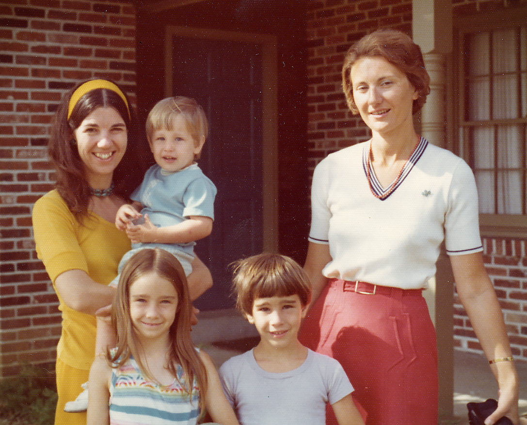
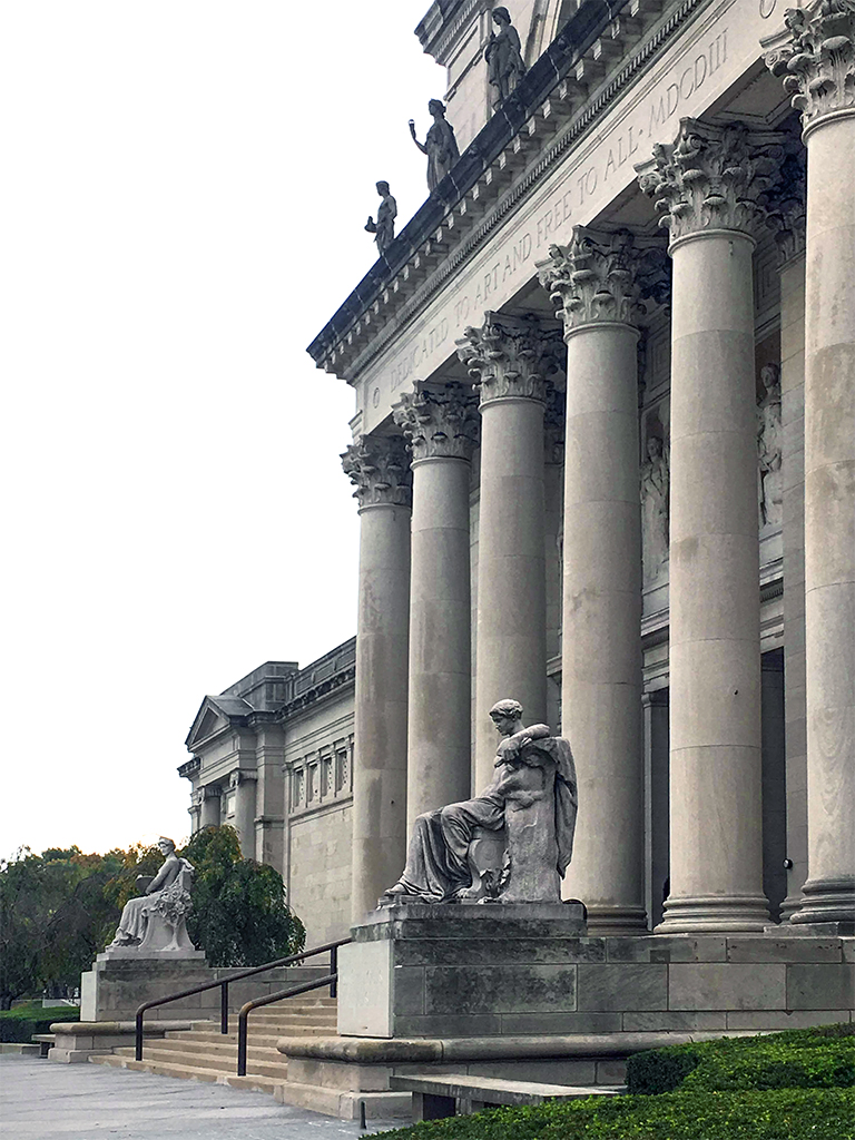
After reading the first two comments, I realize I would NOT like to see any people in your photo! Can't tell you why. Just my gut feeling. I guess I love buildings too much, because I do! Your photo emphasizes the shape of the windows, door, roof line, and such. On my monitor I get a painterly feeling to the image. I don't know how you processed the image and if you did something to the original that has nicely changed the look from a snapshot to an artful look. This is a sky that does NOT detract from the buildings. |
Sep 9th |
| 12 |
Sep 24 |
Comment |
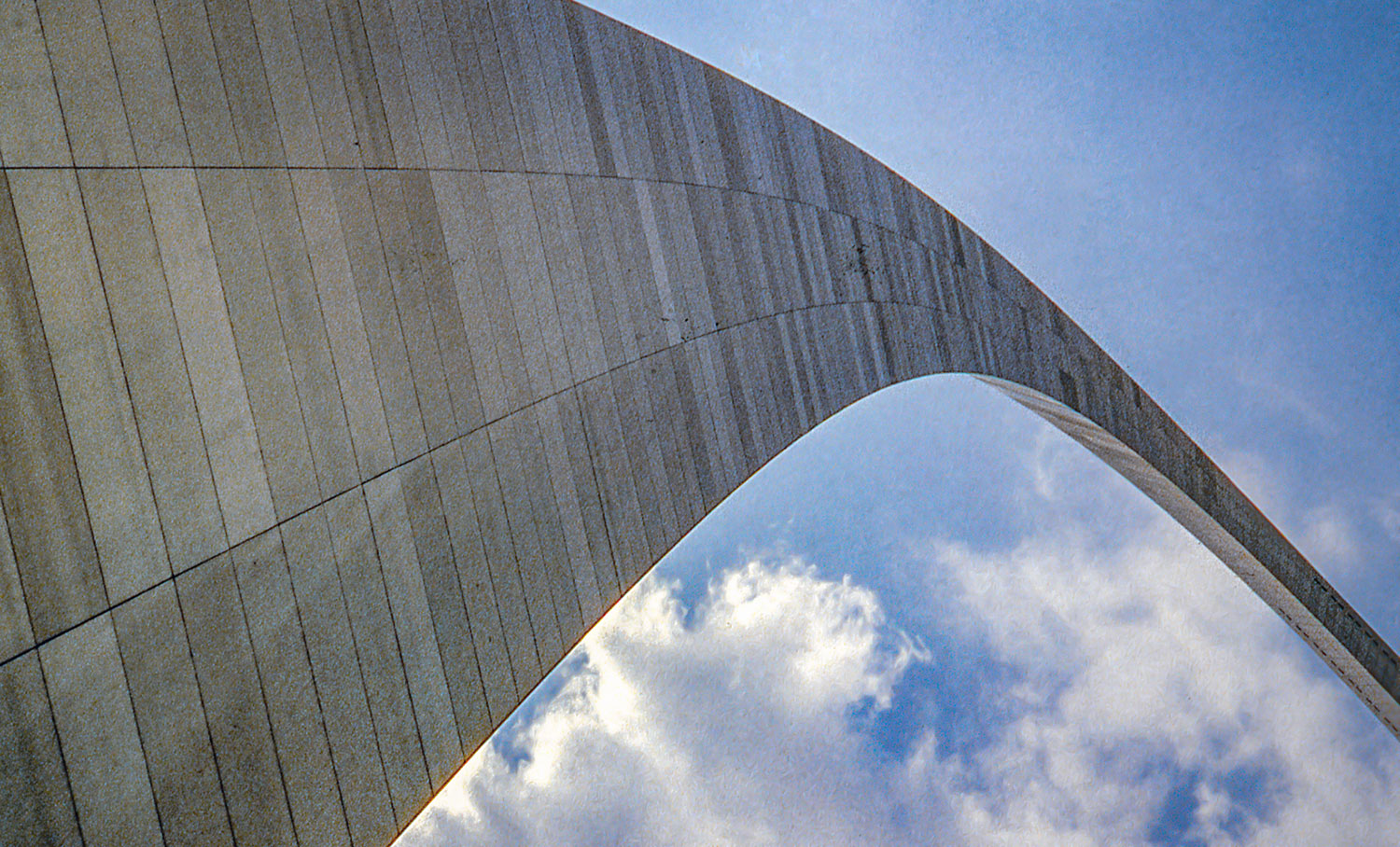
You have documented the ceiling design very beautifully. Nicely lit. I wonder if it looked this bright and cheery in person when standing underneath it. I like your image labeled Original 2 because it shows the columns attached to the ceiling. That image has more of an architecture feel to it. Doesn't matter to me if it looks distorted, because when we look up, things DO look that way! |
Sep 9th |
| 12 |
Sep 24 |
Reply |
You could put the circle into a black square, and it would show up as a circle on our website because of our black background! |
Sep 9th |
| 12 |
Sep 24 |
Comment |
The clarity of the image has made it interesting for me to study the bars on the windows. Sure looks like a spooky place to be. The lighting is lighting up all the details just right for me to see it all. The composition is a little tight for my taste. I feel the composition could be improved to give me one place that I look when I see the image before I explore it. Such as one of the windows, or a pattern of windows. A step to the right would've made that green tree not touch the window. I keep feeling I should be able to see that window in its entirety. |
Sep 9th |
| 12 |
Sep 24 |
Comment |
I have scanned all my slides with an Epson slide scanner and found that the visual quality isn't as sharp as our digital photo, and it is disappointing (especially if we went to the trouble to use a tripod). Your architecture image suffers from this slightly unsharp look. It also has high contrast that is emphasizing that look. Sometimes it helps to reduce contrast and add Texture (a Photoshop thing). The clouds of any kind compete with the buildings. Their whiteness attracts my eye and almost seem like the main subject. Of if you turned it to black and white, too many clouds would still be distracting for me. When I looked at the picture, I thought "clouds" instead of "skyline." They seem like equal points of interest, and probably that isn't what you want. A BW version would probably keep the primary impact on the skyline. The side buildings on the right don't bother me. For me, they are balanced by the little buildings at the left. This composition looks more like a documentary shot to me. |
Sep 9th |
| 12 |
Sep 24 |
Comment |
For all of this group's members - The titles for the 3 supporting images for this and any of your submissions are auto-generated by our website and are always called Original, Original 2, and Original 3 no matter how you entitle your jpg photo file. You can find the maker's actual title if you try to download the images (right click, Save Image As). Of course, the images can't all be the actual original image! So, whenever you feel it would be helpful, feel free to explain about the images within your description. |
Sep 3rd |
7 comments - 3 replies for Group 12
|
7 comments - 3 replies Total
|