|
| Group |
Round |
C/R |
Comment |
Date |
Image |
| 12 |
Jul 23 |
Reply |
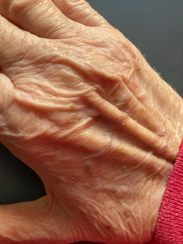
There are different kinds of vignettes that accomplish different purposes. I think your original purpose was to create a kind of frame. Your vignette looks like a dark area all around the edges. I rarely use a dark vignette for that reason. I use a dark vignette to darken all around the frame edges with just the tiniest amount to make the main subject stand out by preventing the eye from wandering over to the edge of the frame. I try to make it as subtle as possible. I don't want people to feel the darkness. You can see what I mean when experimenting with varying degrees of darkness on any of your images. As you increase the darkness, you'll see the point where it becomes truly noticeable. Then back off. Each image is different, but I even have a Lightroom setting that automatically adds a tiny dark vignette to all imported images. |
Jul 31st |
| 12 |
Jul 23 |
Reply |
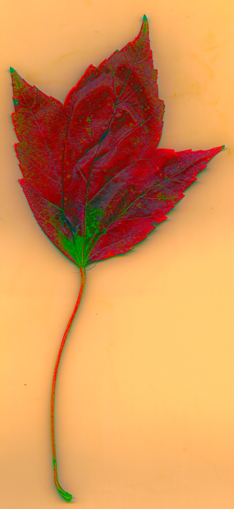
Thanks. It's always nice when Mother Nature creates it all for me! |
Jul 31st |
| 12 |
Jul 23 |
Reply |
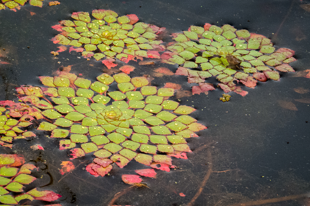
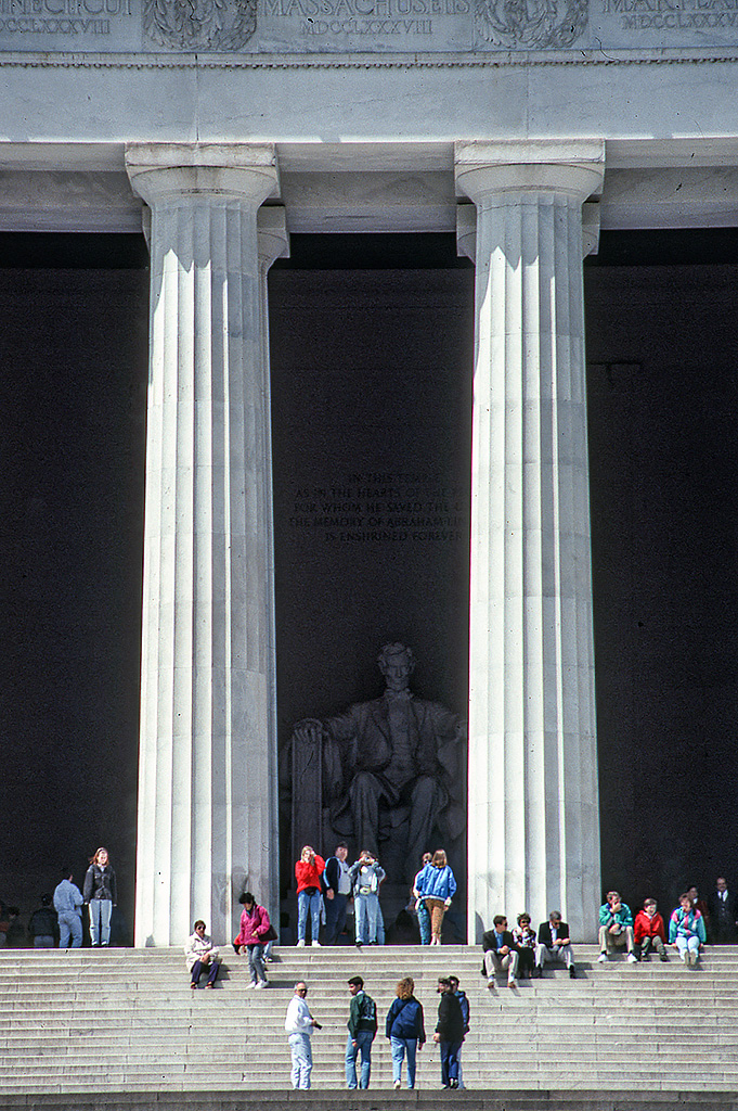
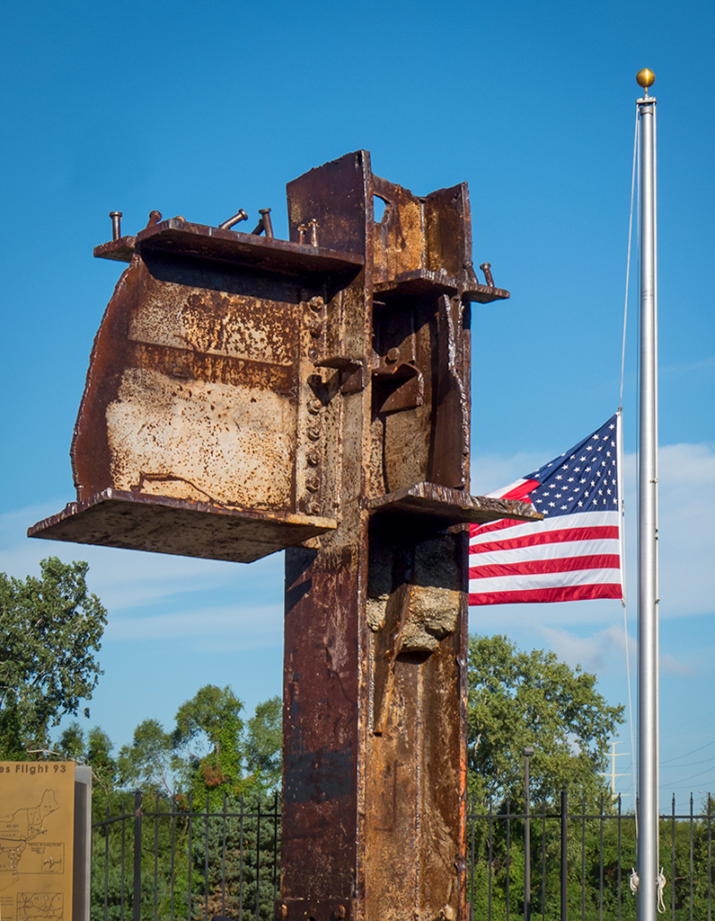
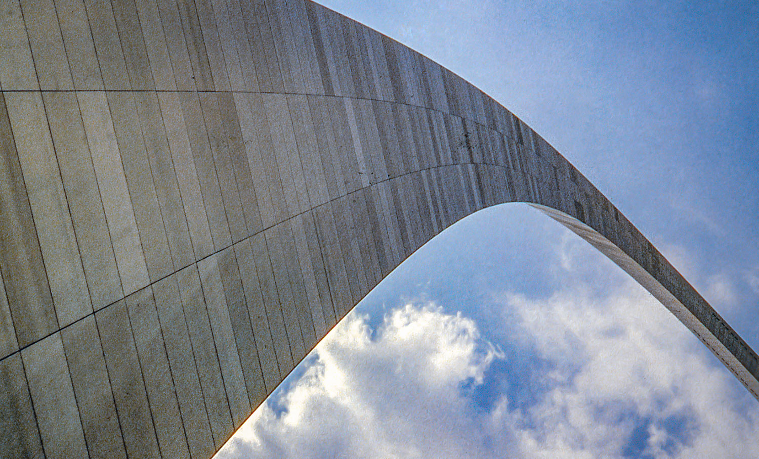
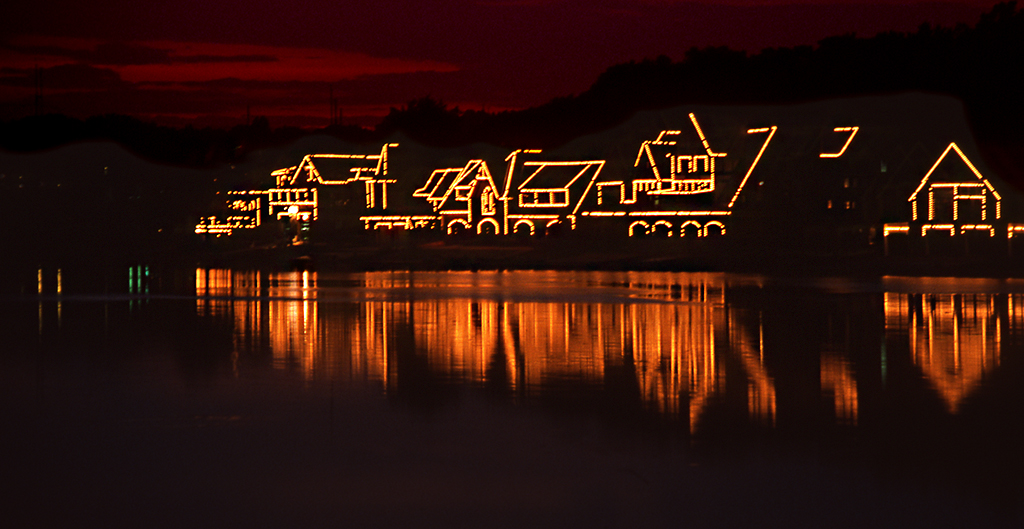
This image would fit an assigned subject of "The Old and the New"! |
Jul 28th |
| 12 |
Jul 23 |
Reply |
Sometimes just a hint of a vignette is all it takes to make the main subject stand out. A hint is when you CANNOT tell a vignette has been put on there but the maker knows it's there! |
Jul 28th |
| 12 |
Jul 23 |
Reply |
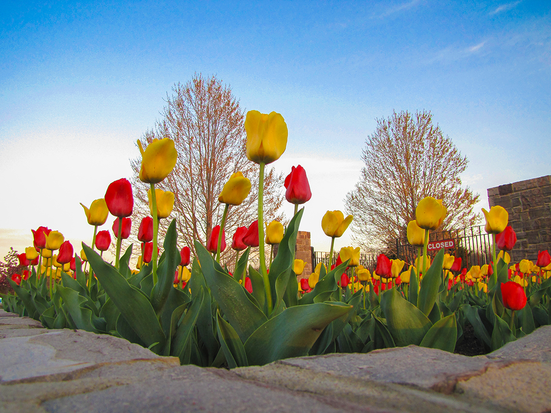
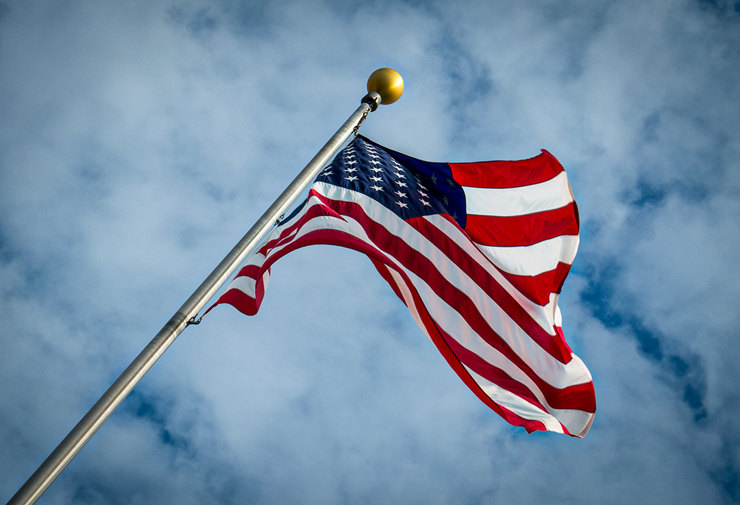
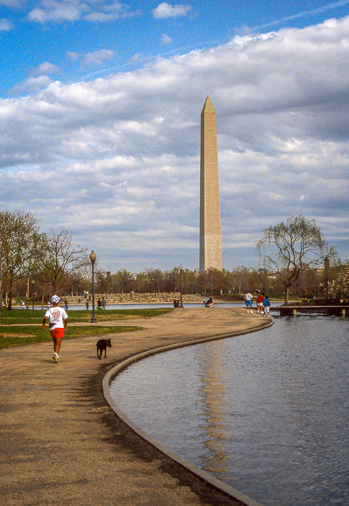
I haven't heard about the composition idea of not having the pole come out of a corner. More to learn. I will Google that!!!! I can say I did do it on purpose, though, to have the pole start there. |
Jul 28th |
| 12 |
Jul 23 |
Reply |
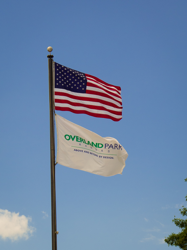
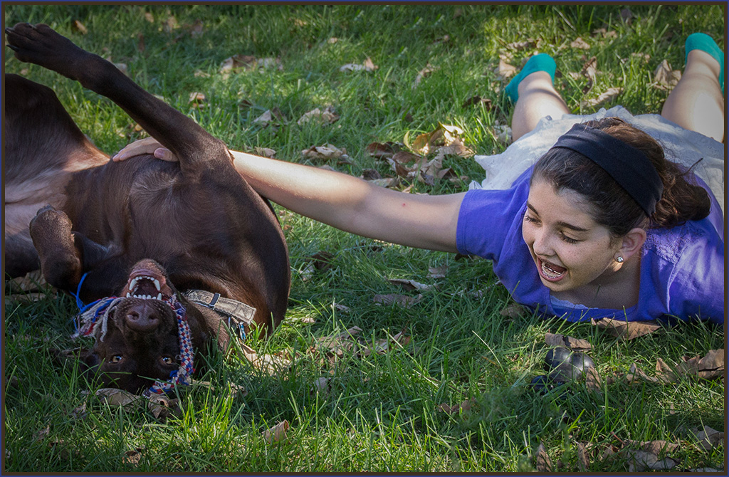
It was a lucky catch! I always forget to set my camera to take multiple images. I shoot and look, and repeat until I get what I want! I should make a point of shooting flags with the multiple-shot setting the next time I see a flag in good wind with a decent sky. Not crazy about the idea of switching out skies although it's cool to see in a picture. |
Jul 28th |
| 12 |
Jul 23 |
Reply |
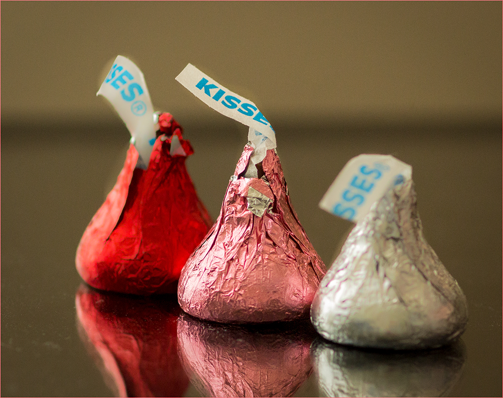
Wow, I'm impressed! I love it! Why didn't I think of those fruits?! So thoughtful of you to contribute to our learning. Now we have another set of subjects to play with! |
Jul 28th |
| 12 |
Jul 23 |
Comment |
First, let me apologize for not posting this image on time. It was sent to me before this month even started! This image really says red, white, and blue to me, obviously because of the beautiful, straight-out flag. Additionally, I think the rider's red shirt has added to that colorful initial patriotic impact. This is the first rodeo photo I've seen where the signs in the background didn't distract from the main subjects. You must have been following the rider with your camera with just the right settings! The photo is sharp enough for me where it's supposed to be sharp. |
Jul 17th |
| 12 |
Jul 23 |
Comment |
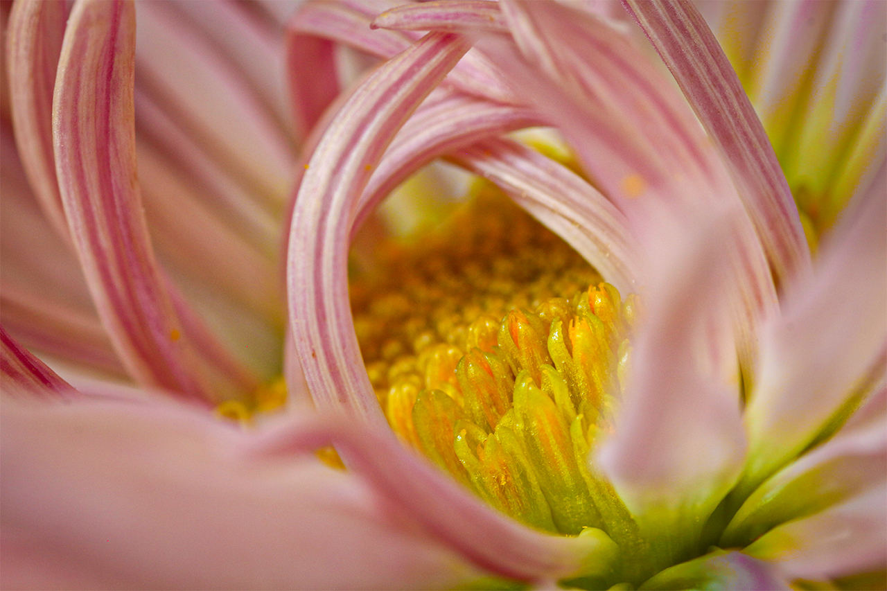
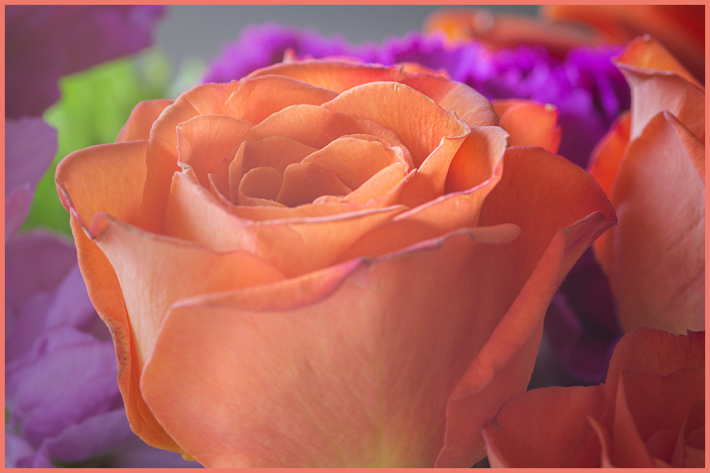
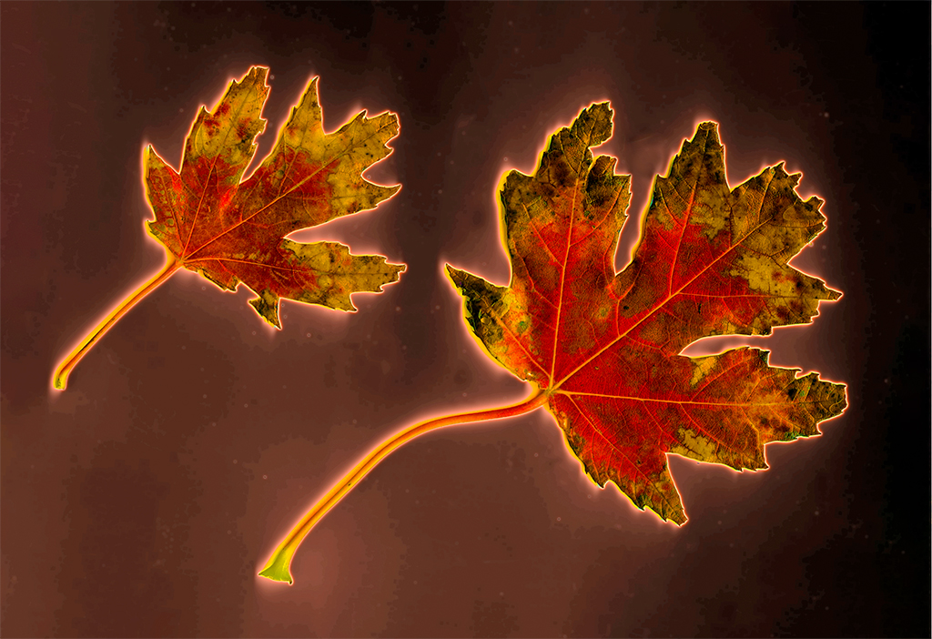
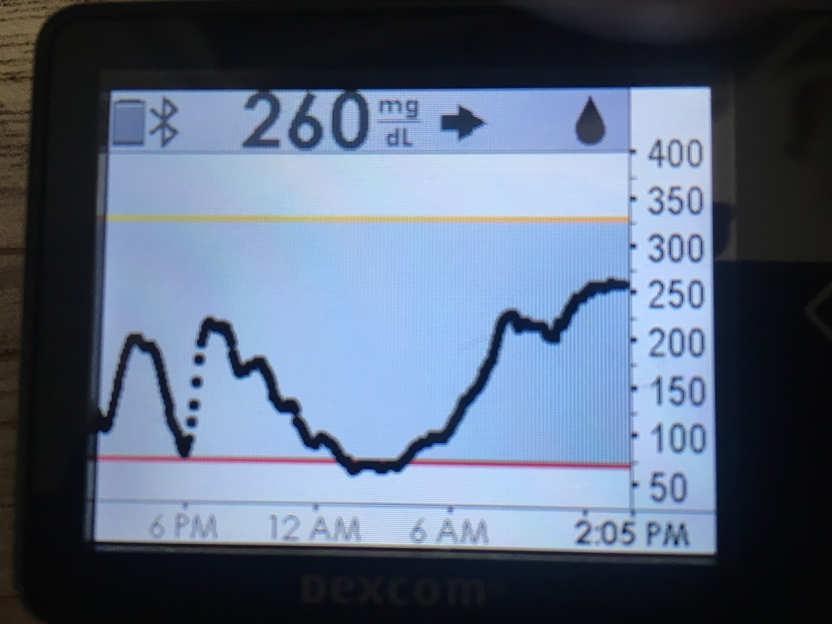
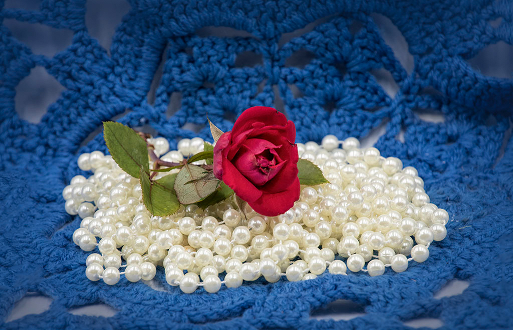
I didn't think of looking around my house for red, white, and blue objects. How creative! At first, I actually noticed the crocheted doily because I crochet daily...oops, yes, that's right, daily, but I do baby beanies, not doilies! Thanks for not using candy or cake because I don't like to see them because I'm not allowed to eat them due to Type 1 Diabetes. Or if I do, my glucose levels go up, which causes me even more diabetic complications. And I have enough complications already.
The pearls are lovely and stand out almost too much. I edited your photo to emphasize the red rose by brightening its shadows. I didn't even have to lower the highlights on the peals. I'm glad, because I like the way they shine.
I find the holes in the crocheted doily make the image too busy for me. I keep looking at the light-colored holes, obsessively (maybe because I crochet?) So, I darkened them selectively. And to keep my eye on the rose and its beautiful bed of pearls instead of wandering out the the picture's edges, I added a vignette.
I certainly like your still life image. I can see why those pearls are in your bag of tricks. I think I shall pull out my jewel box and try to get as creative as you!
|
Jul 7th |
 |
| 12 |
Jul 23 |
Comment |
Your street photography tour was successful! I think I see the technique by standing across the street and not being too close or obvious. I also learned by looking at this image that I don't have to use a telephoto lens to take my people pictures, which is what I usually do. The photographer with a long lens is definitely more visible and obvious and invasive. Your crop straightened the horizon and created an image with just the right amount of interesting elements. Love the number 7 sign. It reminds me of one of my French friends who lives in Paris with the address of 7, too, but a different street. She was a foreign exchange student at our house many years ago. |
Jul 7th |
| 12 |
Jul 23 |
Comment |
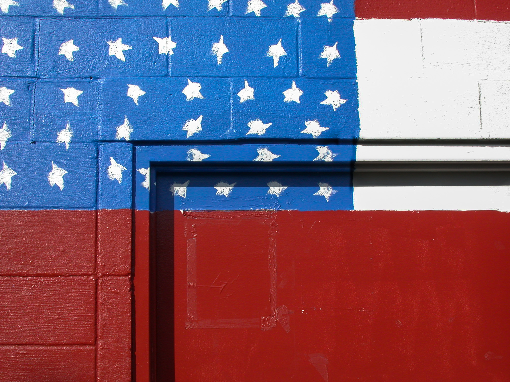
You found what I was originally thinking...go find a store display! YOU did it! To me, the stars stand out as the important element here, with the red zigzags being a more creative stripe than the horizontal ones of the flag. I tried rotating your image and cropping it, but I think your version has the best composition. If I ever see a similar display, I'll now be sure to take a picture of it, because I can see it being used in a variety of ways. I could twirl it, blur it, posterize it, etc., and use the image as a background or frame. Thanks for putting ideas into my head! |
Jul 7th |
| 12 |
Jul 23 |
Comment |
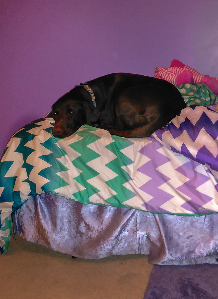
Ouch, but really cute! Woody definitely looks scared and wanting to escape! That was my first impression before I read your description! All your editing has been very successful and achieved your stated goals. I even feel that the dog is a gentle one. I like the amount of color in Woody. It makes the image especially fun to look at! |
Jul 7th |
| 12 |
Jul 23 |
Reply |
I've always purposely included an extra length of "pole" in my flag photos. Your suggestion has alerted me to not get stuck in a rut and always do the same thing and end up with the same look. Next time I'll make the flag itself take up most of the frame! It'll be a new composition challenge. |
Jul 7th |
5 comments - 8 replies for Group 12
|
| 23 |
Jul 23 |
Comment |
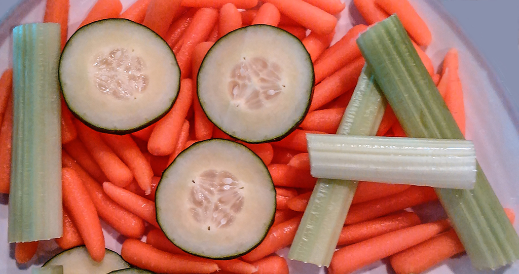
Thanks for visiting our Group 12 this month and especially posting your exquisite red, white, and blue image. So perfect for our ASSIGNED SUBJECT! It's good to remind us about tabletop photography as well as eating healthy fresh fruit. |
Jul 28th |
1 comment - 0 replies for Group 23
|
6 comments - 8 replies Total
|