|
| Group |
Round |
C/R |
Comment |
Date |
Image |
| 12 |
Mar 23 |
Reply |
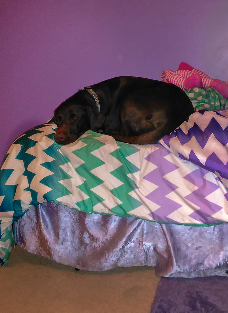
How amazing that those crumbs are being so well noticed! I laughed when Barbara said they looked so real that she felt like wiping them off! |
Mar 31st |
| 12 |
Mar 23 |
Reply |
Oh, I like the phrase, "a secret world"! What a wonderful way to describe the super-close close-up shots! It really is a secret until a person is able to see it, thanks to photography! |
Mar 31st |
| 12 |
Mar 23 |
Reply |
We hope you are feeling better each day. Best wishes for a complete recovery soon. |
Mar 31st |
| 12 |
Mar 23 |
Reply |
"Finishing his lunch" is what sets this image apart from the usual portraits. I agree with Connie! |
Mar 30th |
| 12 |
Mar 23 |
Reply |
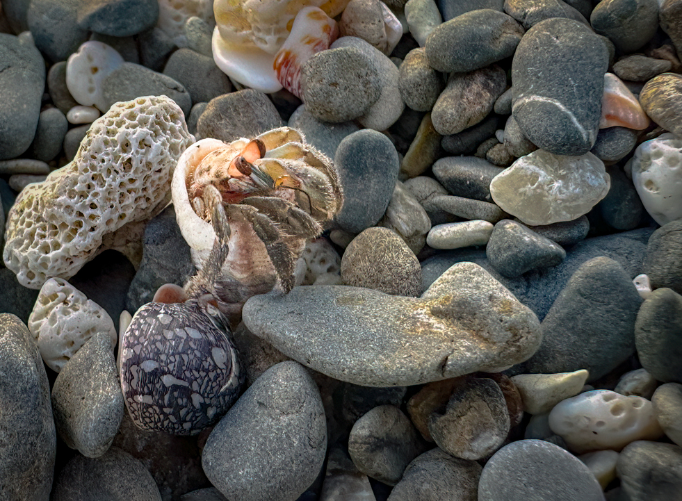
Yes, a square crop with the crab right smack dab in the middle of the image would definitely make us see the crab immediately. I like that idea. We're going to look at those interesting rocks anyway. |
Mar 30th |
| 12 |
Mar 23 |
Reply |
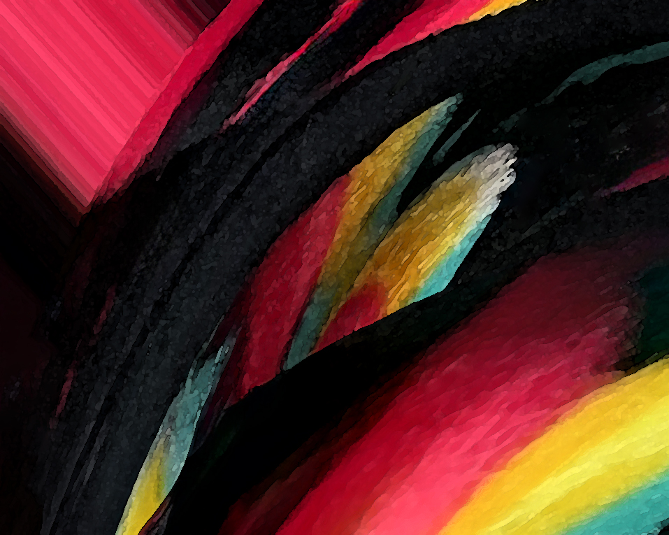
The lighting is emphasizing the fact the fabric isn't flat. I doubt a different kind of lighting would remove the darker areas on the white material. The other factor causing the darker areas on the fabric is the fact that the editing, such as contrast, was applied to the entire image, not just to the embroidery thread. The lesson to be learned here is that sometimes we need to do selective editing, just to the parts where we want it. In this specific image, I don't mind that the fabric is also contrasty. The texture effect on the embroidery is the point of the picture for me. |
Mar 30th |
| 12 |
Mar 23 |
Reply |
Love the bear shot! Your detailed explanations make your photos even more interesting for us. |
Mar 30th |
| 12 |
Mar 23 |
Reply |
Thanks for visiting our group! |
Mar 30th |
| 12 |
Mar 23 |
Reply |
I think it looks overprocessed now. Sometimes that overall soft look is the best we can do with such an original. I'm thinking the original photo cropped to remove some of the background results in the best result of this image. |
Mar 30th |
| 12 |
Mar 23 |
Reply |
That Texture works really great when using the Adjustment brush where you can paint it just where you want it. |
Mar 28th |
| 12 |
Mar 23 |
Reply |
When I'm handholding macro lens, I always shoot in shutter speed priority mode. I'd rather have one area be really sharp than end up with no area being that way. We'll never get it all in the same focus. The flower will look dreamy and nice with the softer areas around the one sharper area. |
Mar 28th |
| 12 |
Mar 23 |
Comment |
Fran,
Thank you for being part of our group for a while. We are sorry you're leaving us at the end of this month. We'll miss you! Happy photographing!
Carole |
Mar 28th |
| 12 |
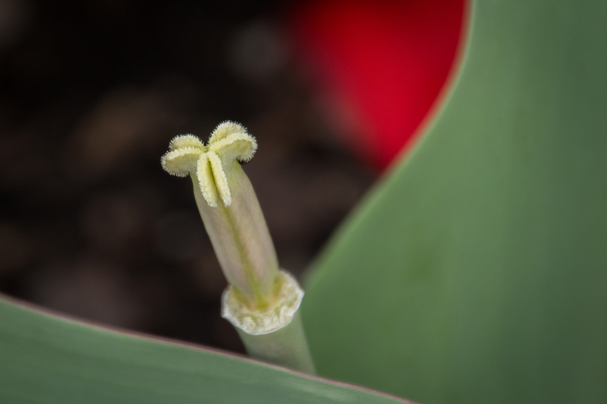
Mar 23 |
Comment |
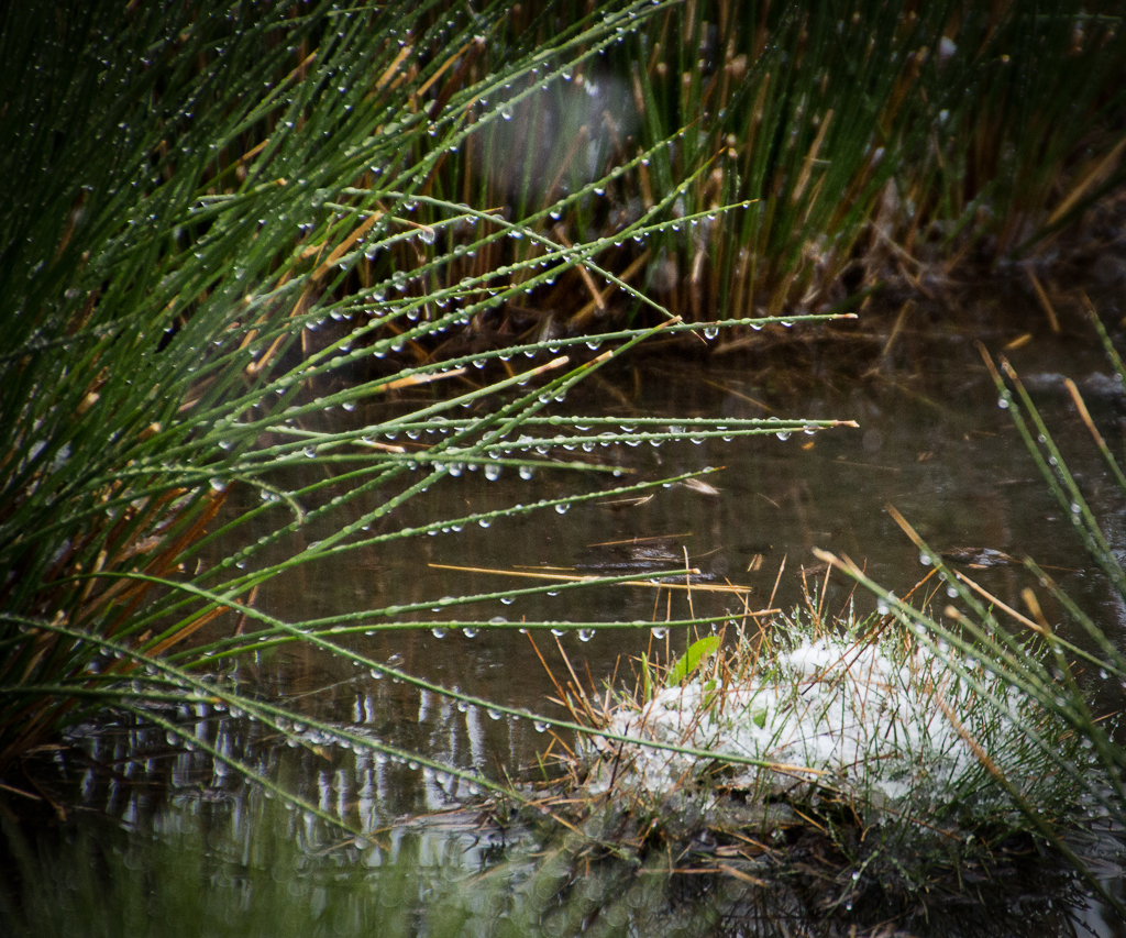
What a lovely Tasmanian Tear!!! There's a nice, soft mood created by the color of the plant being the same as the background. I'm guessing that the "soft" focus vs. tack sharp was caused by the 1/60 sec hand held as much as the wide aperture. I myself would need a tripod and f/16 at least to get something that small in focus. f/2.8 on my Canon 100 macro lens never does it for me! I often wonder if my camera is really focusing on the one very tiny area I want in focus! My only suggestion would be to sharpen (or slide the Texture slider more) in post-processing to make the bud seem sharper. |
Mar 28th |
| 12 |
Mar 23 |
Reply |
I really like the blue because it seems to make the main subject pop out at me. |
Mar 28th |
| 12 |
Mar 23 |
Comment |
I chose the assigned subject this month, and I like Fran's interpretation of it! I admit I was thinking of something smaller! But you ended up with a most interesting and unique image. My eye does go wildly back and forth instead of staying on one main subject as we're often told to do. But the shapes and contents of each object are so interesting! It's fascinating! The image would make a good mural on the wall of a hotel or hospital lobby! People would stand or sit there and stare at it!
I could re-brand the assignment to be, "Show us a new image by cropping one of your images!" |
Mar 28th |
| 12 |
Mar 23 |
Comment |
I like seeing the crab in its busy environment and lit so evenly to be able to see the details. I'd consider this more of a record shot. It is how we would see it in person. Phone cameras are great for accomplishing that. Here's what I did in the photo below. In Photoshop Camera Raw filter, I used the Selective brush tool to brighten the shadows of the crab and darken the highlights of everything else. Then added a vignette. Actually, I added the vignette first, and that alone made the crab stand out! |
Mar 28th |
 |
| 12 |
Mar 23 |
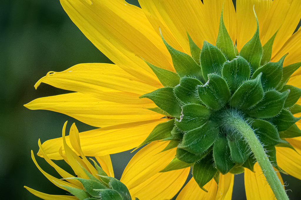
Comment |
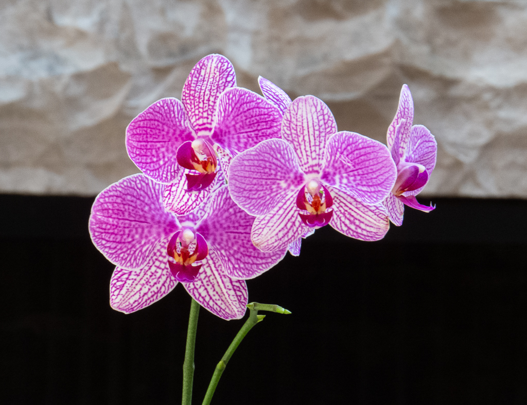
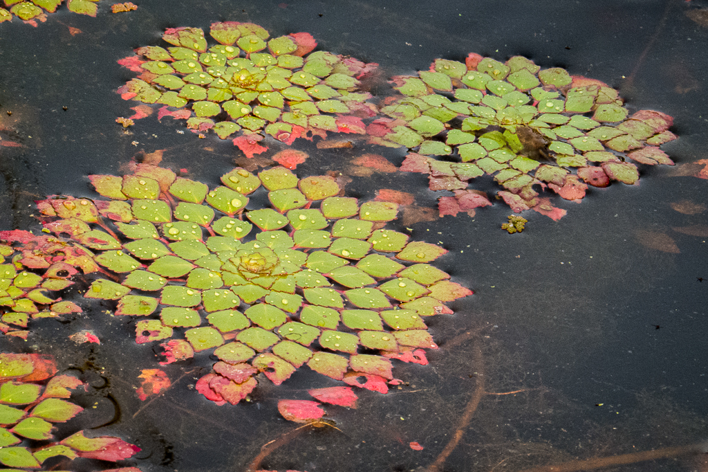
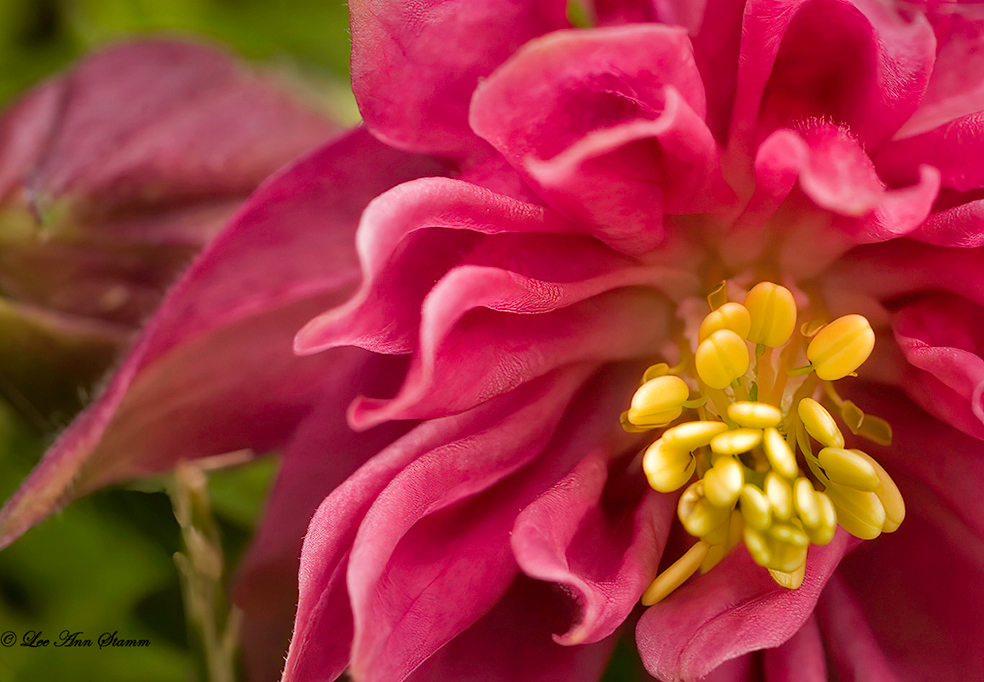
I'm thinking the color combination is what makes this picture appealing. For me, the yellow center attracts my eye first. Then the pink petals. I see why you included so much background because of the environmental colors.
When I covered a very small portion of the left side of the photo, the flower popped out in dramatic importance. Those white tips at the left draw the eye away from the overall point of the picture. I always try to eliminate anything white or even too light in this scenario. Nature doesn't give us the view that photo judges like! Always some distracting white light or foliage!
Here's my suggested image where I took a tiny bit off the left, darkened the light things in the background, vignetted, and brightened the yellow center to make it evenly bright. Do you think the eye goes more to the flower now and the rest of the image becomes supportive to set it off? |
Mar 28th |
 |
| 12 |
Mar 23 |
Reply |
Thanks for stopping by our study group! We appreciate your interest and comments. |
Mar 27th |
| 12 |
Mar 23 |
Comment |
Your close-up shot has done its job well thanks to your tripod and the cloudy-day window lighting. I see all the detail in the embroidery thread and the fabric. I especially like the 3-dimensional look because it has a 3-D "feel" to it! I feel I could reach out and touch it and feel its bumps and texture! Looks better close-up than in person! It adds to my reality of the embroidered piece. As Ally mentioned, my eye goes directly to the blue flower. That's an accomplishment when you're photographing a busy item like embroidery! |
Mar 27th |
| 12 |
Mar 23 |
Reply |
Totally agree with Lee Ann. I love seeing the stitches up so close. Even better than in person! |
Mar 27th |
| 12 |
Mar 23 |
Reply |
I agree with Chane! Took the words right out of my mouth! |
Mar 27th |
| 12 |
Mar 23 |
Comment |
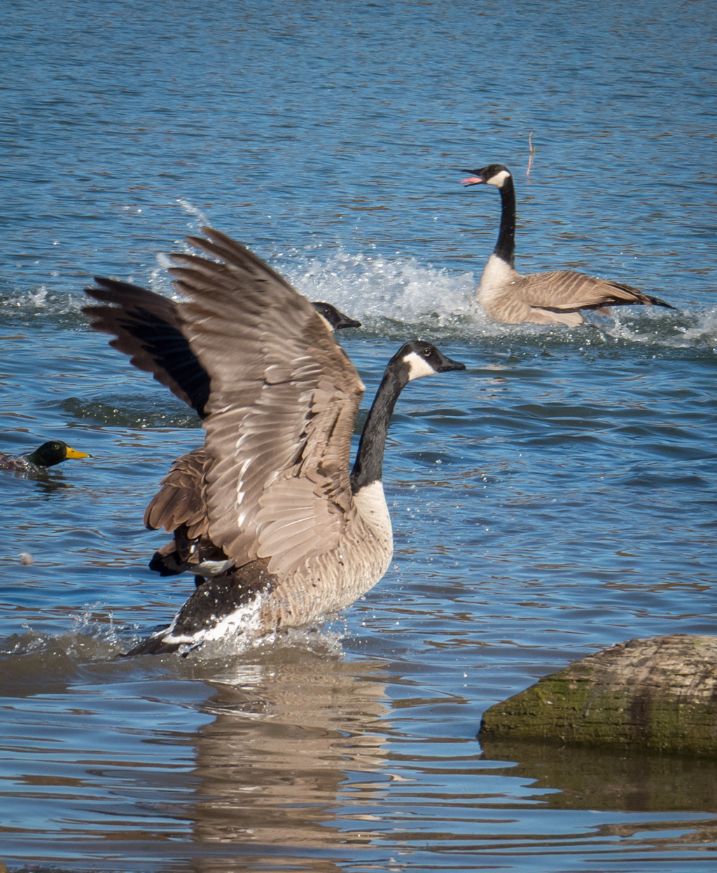
The food and the feathers make a great photo! In person, we don't get to appreciate these things. The lighting isn't good enough. But post-editing can bring out the details in the shadows, etc., and let us see what the feathers really look like if we could hold the bird still in our hands and look at it in good light. That's why I don't mind the feathers being super sharp. In your close-up photo, we have the time to take a good look and say, Wow! Thanks for your how-I-did-it description! I never thought of hanging a black sheet with a hole in it! And I like being able to see his eyelashes! |
Mar 27th |
| 12 |
Mar 23 |
Reply |
I hadn't ever thought of architecture except for buildings, but everything has an architecture to it, in a sense! It is hard to take a building architecture image and be "newly" creative with it. Every good photographer will be tying to go beyond shooting at unusual angles or a super close-up or super wide-angle. Good luck! Sounds like fun! |
Mar 27th |
| 12 |
Mar 23 |
Reply |
Oh, yes, a lovely image! Not traditional but yet not an ordinary look. Sometimes I slide those sliders that way but leave the center sharp. I use the Selection brush or do it the old-fashioned way with layer masks. |
Mar 27th |
| 12 |
Mar 23 |
Reply |
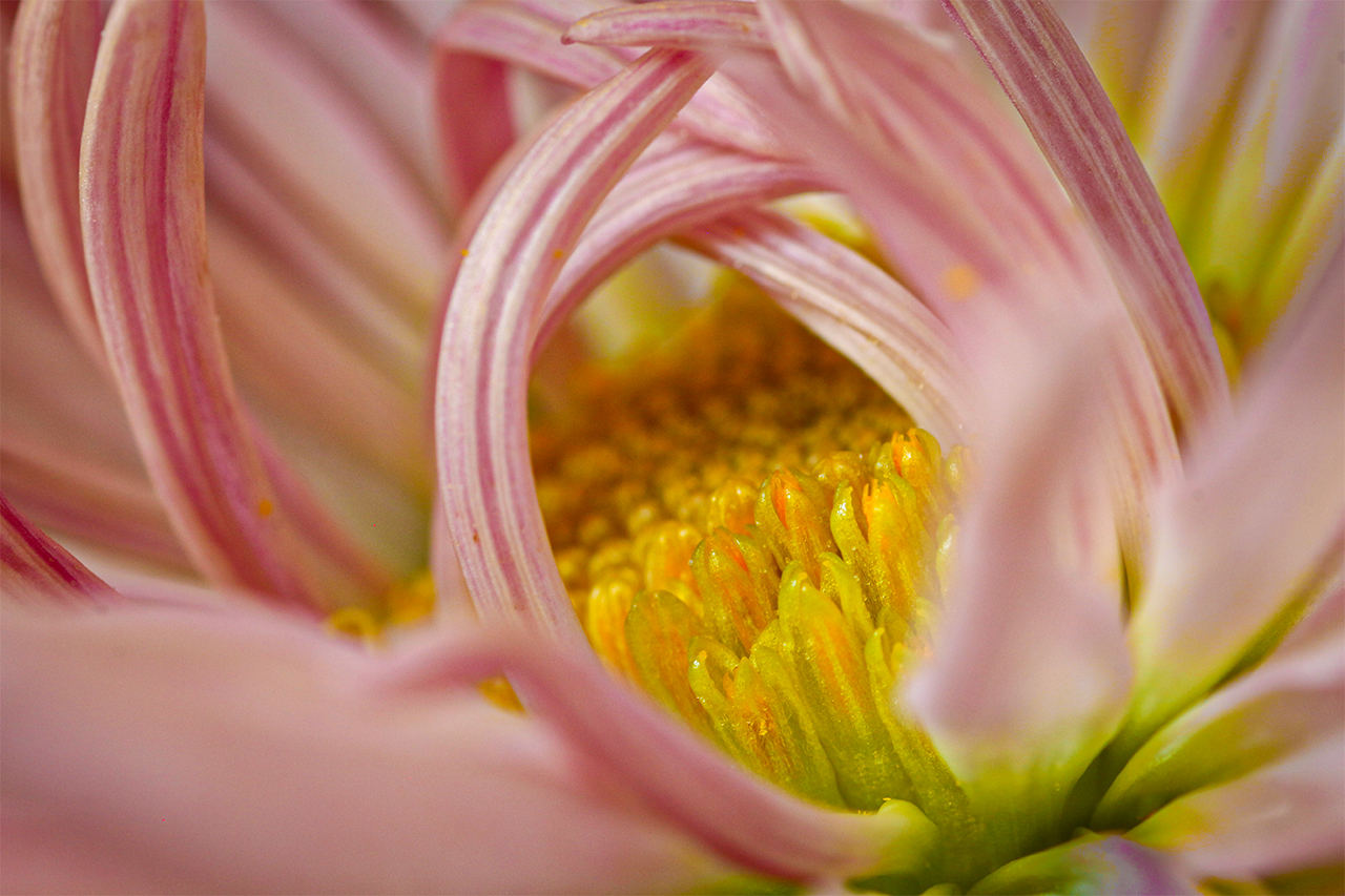
Yes, nature contains a lot of distractions when we want the eye to go to one specific area. I tried darkening the whiteness/lightness to make it blend into the background. I often photograph a flower in steps...by first shooting the entire flower and then removing one petal at a time. I'm always surprised by the good images that can result when not trying to be so traditional in my approach. Can't wait for spring flowers to bloom again... |
Mar 27th |
| 12 |
Mar 23 |
Reply |
Thank you! |
Mar 27th |
| 12 |
Mar 23 |
Reply |
That front, light blurry petal becomes more and more distracting as I cropped in. The distracting blurry happenstance happens a lot when photographing flowers up close! Next time I'll pick the petal off so that I don't have to deal with it! |
Mar 27th |
7 comments - 20 replies for Group 12
|
7 comments - 20 replies Total
|