|
| Group |
Round |
C/R |
Comment |
Date |
Image |
| 12 |
Dec 22 |
Reply |
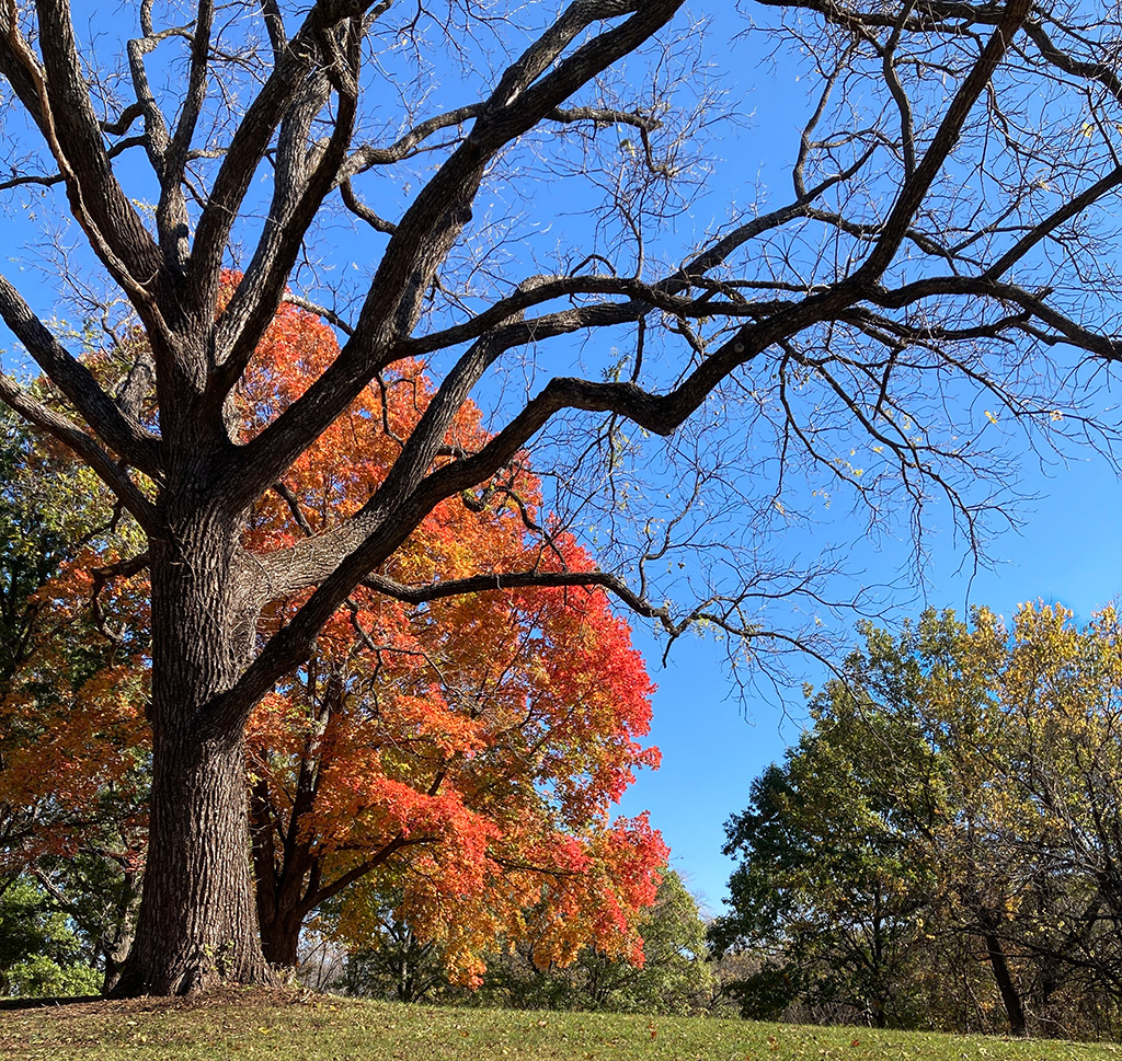
Such a complex image contains a wealth of potential compositions! |
Dec 30th |
| 12 |
Dec 22 |
Comment |
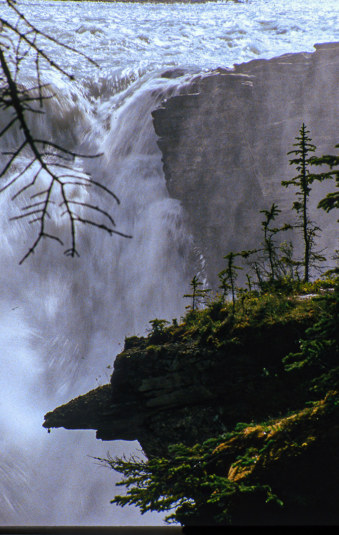
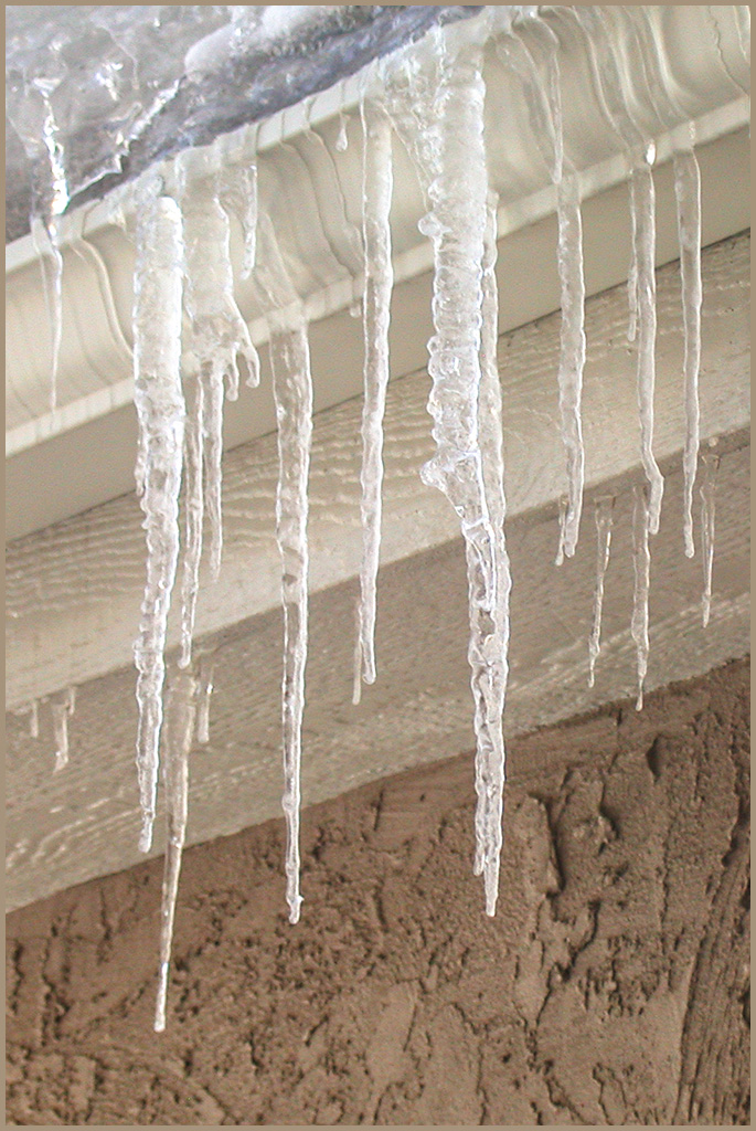
Your edited version shows off that frozen water so well. It makes me want to go see this waterfall. You're so fortunate to have found it. The image is bright and clear. My eye goes up and down the waterfall as I enjoy seeing the cold frozen-ness of the ice. I like the composition of looking from the bottom to the top, basically in the center of the image. A suggestion for the next time you see such a wonderland is to take a few different compositions, such as moving yourself a few inches to the left and right and also including more or less of the subject. In this way, you'd get more than the standard, straight-on view. There are other several ways to brighten a dark snow photo. One way to avoid the problem is to take the original using a plus 1 or plus 2 exposure compensation. Post-editing ideas abound in most any editing software nowadays. I can think of several, but you can simply google brightening snow pics and find some great tutorials on it.
|
Dec 30th |
| 12 |
Dec 22 |
Comment |
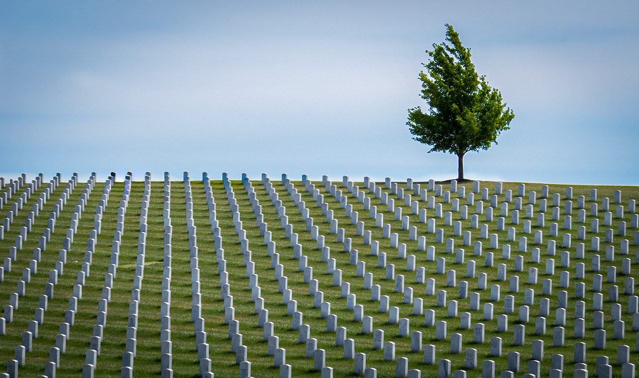
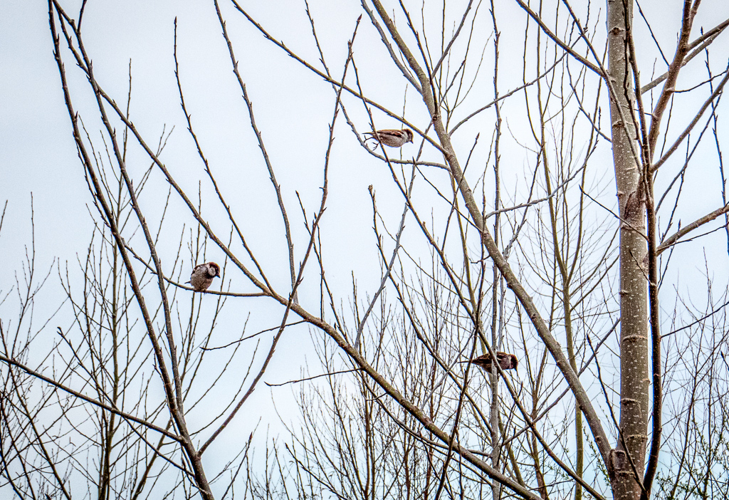
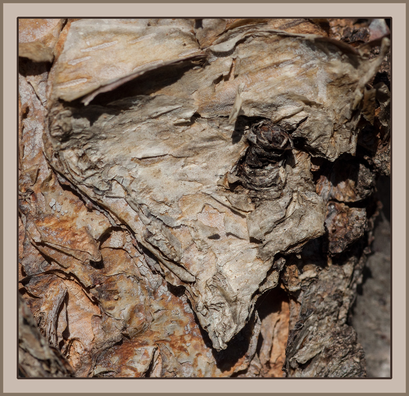
The very low perspective makes this photo interesting. Seldom does the photographer make the effort to get down low like this. Good for you for being able to shoot from this position! And the low camera angle makes the ice take up 3/4 of the image and therefore quality as an ice picture. I think the background people could be eliminated because they don't add to our assigned subject of "ice" but to a theme of ice rink. I think Connie's crop really says "ice"! |
Dec 30th |
| 12 |
Dec 22 |
Comment |
TIP FOR EVERYONE - click once on any of the "edited" versions of someone's photo, and the image will show up larger on your screen. I find it helps to see things bigger! |
Dec 9th |
| 12 |
Dec 22 |
Comment |
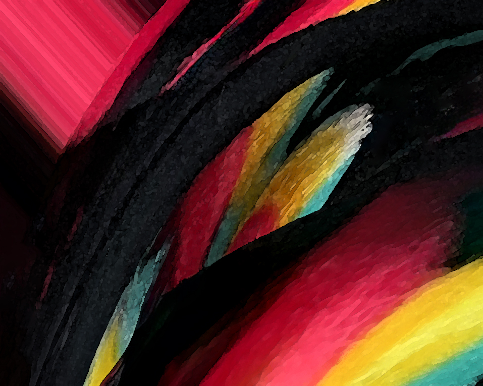
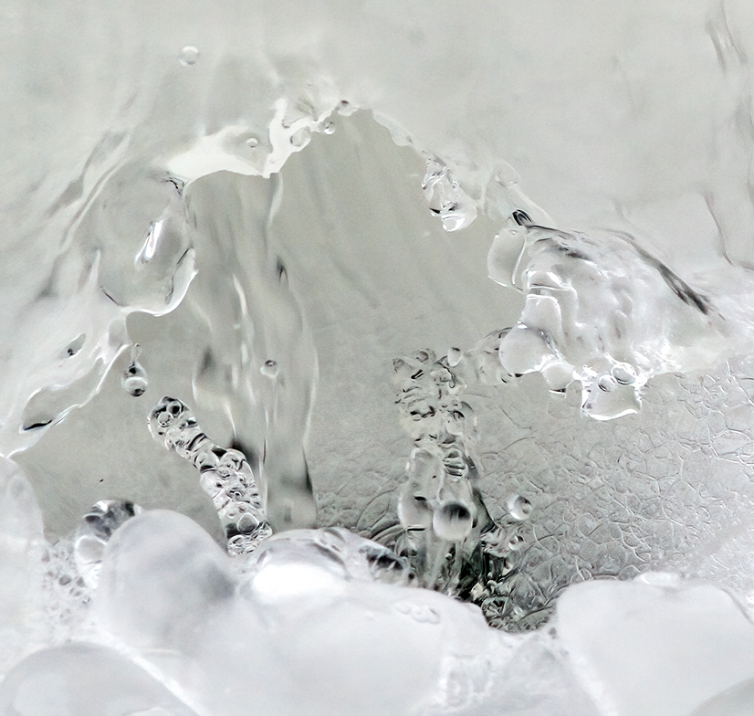
The overall design of the "ice" is intriguing. I love the idea of finding and extracting an unusual detail in this unexpected way. It's almost like doing macro photography although the final object isn't teeny tiny. I cropped off the upper right corner of the background because it seems visually distracting to me although I understand it is part of the story. And I brightened the dull tone so it didn't look slightly underexposed to me. Now I better see the shapes that originally attracted you. |
Dec 9th |
 |
| 12 |
Dec 22 |
Comment |
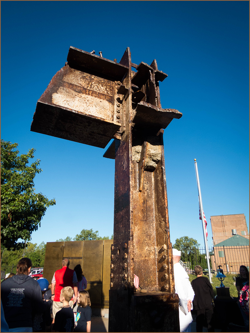
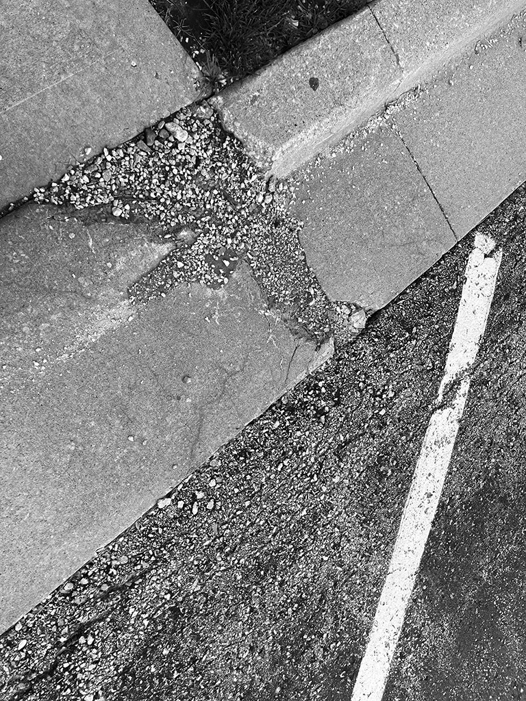
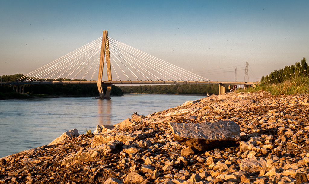
I imagine this image as a very large photo hanging somewhere like the lobby of a hotel or hospital. I think many people would stare at it and find all sorts of interesting things in it. What a great conversation piece it would be! I wonder if anyone could guess it was a river with ice on top and water underneath. I haven't seen a river in frozen weather in person. Now I'd like to do that! How interesting! I think the brightness of the white area on the left side is distracting. Instead of cropping it out, maybe darkening it would keep the more interestingly detailed right side as my main area to look at. |
Dec 9th |
| 12 |
Dec 22 |
Comment |
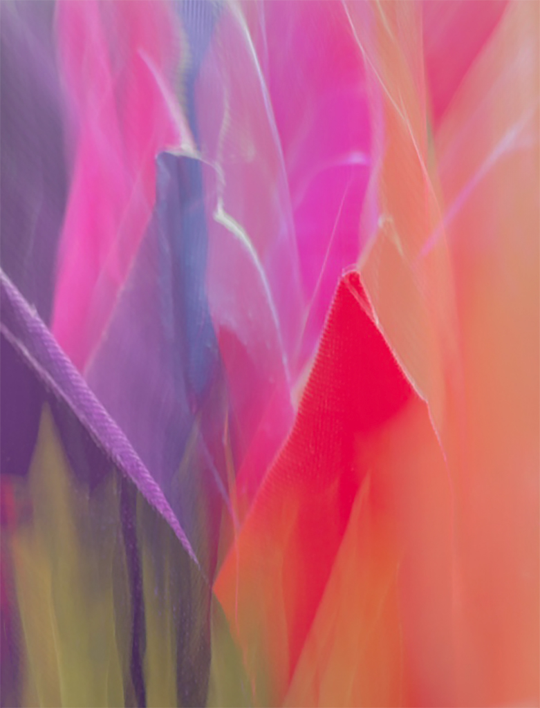
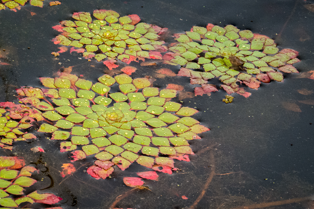
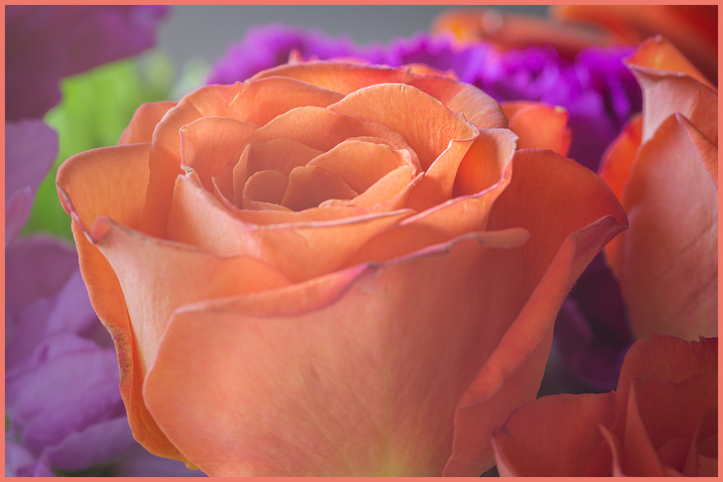
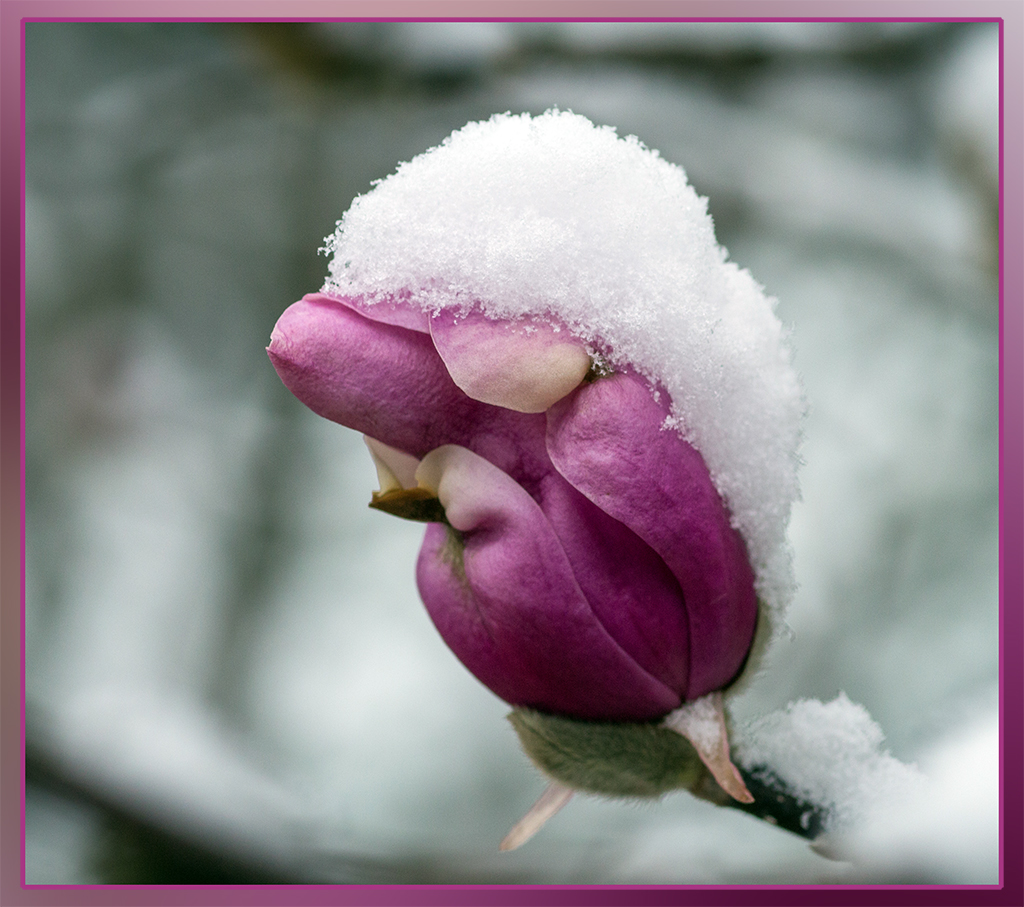
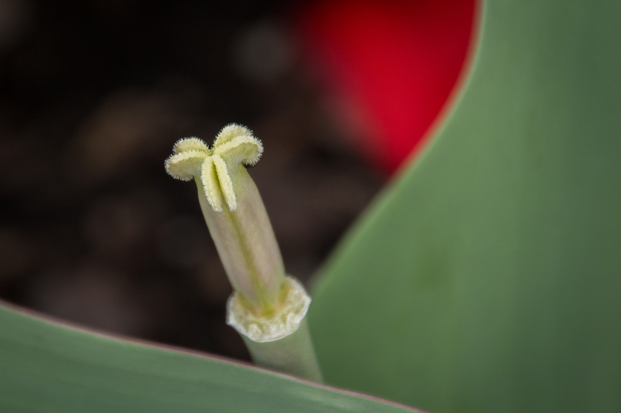
I've never heard of this technique, but I love it! Somehow, either on purpose? or wishful thinking!, you managed to get a lovely composition. The flower arrangement drives my eye from flower to flower so that I end up enjoying all the blossoms..and the ice while I do it. The purple haze around the flowers makes the image look like a watercolor painting to me. I see no hint of a lightbox. Nice smooth and even lighting. So pretty! It was worth all the time and trouble you went through making and working with ice. |
Dec 9th |
| 12 |
Dec 22 |
Reply |
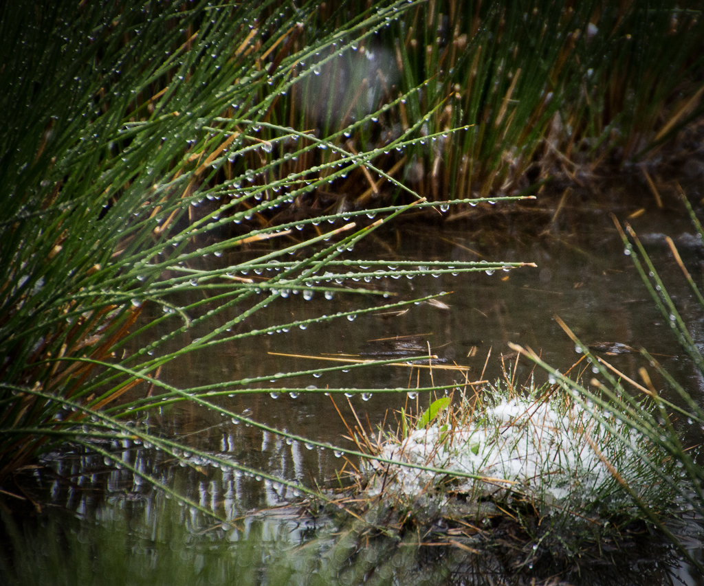
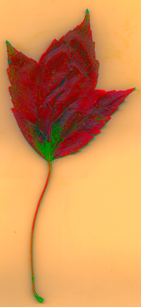
Amazing how when I cover up that inch off the right side of the image, the image takes on a new look. Not so busy. I was thinking it was "framing," but now I see those grasses as distractions. And that top white spot as to go! |
Dec 9th |
| 12 |
Dec 22 |
Reply |
I definitely agree with doing away with that big white spot. Of course, I didn't see it until someone pointed it out! |
Dec 9th |
6 comments - 3 replies for Group 12
|
6 comments - 3 replies Total
|