|
| Group |
Round |
C/R |
Comment |
Date |
Image |
| 12 |
Jan 20 |
Comment |
Happy New Year to you, too! Yes, your image definitely has "fun" vibes! And you got the J in both the foreground and background subjects! The sharpness of the well-lit Pokemon figure makes her stand out well and look like she is almost floating. I don't know how you did it! |
Jan 11th |
| 12 |
Jan 20 |
Comment |
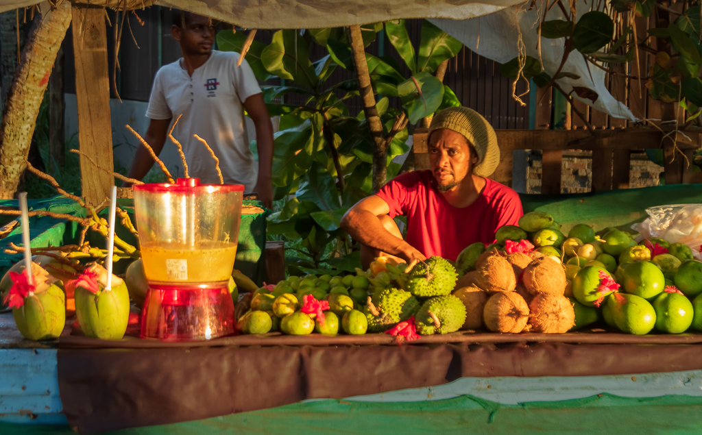
Your composition sure does say "juice"! All that fruit is in the right spot and in a big long line that leads right up to the big juice container and individual drinks. The fading light is perfect in that it lights up the fruit and the juicer man in a soft, not contrasty sunlight.
I've become super-sensitive to bright things as distractions. So I did some editing on your image as if it were my own. I lightening the highlights of the background and the area below the fruit. I'm hoping it doesn't look too artificial. Was it worth my time? Do you think it helps the main point of the image or doesn't matter? |
Jan 11th |
 |
| 12 |
Jan 20 |
Comment |
I find this image so fun to look at! My eye goes right to the middle joggers, and I like that I can see their faces so clearly and feel their hard effort to run on the beach. It is rare for me to see a beach that isn't a straight line, and so I really like your composition with all the curves and diagonal lines of the shoreline. Even the tilted horizon line adds to the feeling of motion. And last but not least, I love that you included the jogger sitting down. He adds good interest to the image. The white vignette works very well for me. |
Jan 11th |
| 12 |
Jan 20 |
Comment |
I'm loving the feeling of "adorable"! I like being able to see the expression on their faces. Your shutter speed captured their hair in a way that really helps the feeling of motion...just like the position of the torsos. Did you shoot in shutter-speed priority mode?
The blurriness of the dandelion background/foreground by the children's feet feels odd that it isn't in the same focus as the girls. I wonder if ON1 could sharpen them to be equally sharp as the legs and shoes. |
Jan 11th |
| 12 |
Jan 20 |
Comment |
Everyone: remember you can click once on an image to see it in its original size. You can click your keyboard's ESC key to close the window and get back! |
Jan 11th |
| 12 |
Jan 20 |
Comment |
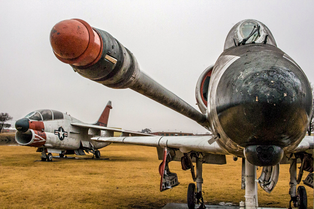
I like the way the wide-angle lens and the looking-up perspective make the planes look powerful. The antique-ness of the not really maintained surfaces is what holds my interest. I wished I could see the metal better, so I played with your image in Photoshop to bring out the shadowed areas. I used lots of Texture and Clarity. One other thing caught my eye, and that was the brightest part of the image, which to me is the top of the middle wing...it is brighter than the sky. That's a distraction for me. I want to notice the planes as a whole, not as a wing first.
My edited version may be too unrealistic. In person we probably wouldn't see the planes the way I've made them. Looking for opinions.......... |
Jan 11th |
 |
| 12 |
Jan 20 |
Comment |
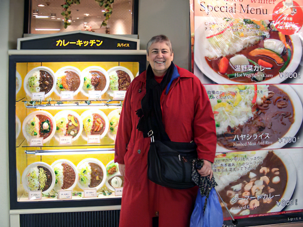
480 x 360 pixels was my original file size (I was using my cousin's camera). When I changed it to 1024px for this project, I wasn't happy with the odd look. So I just enlarged it in Topaz Gigapixel, and wow, what a difference! Now the image looks normal. Click on it to see it bigger. What do you think? |
Jan 11th |
 |
7 comments - 0 replies for Group 12
|
7 comments - 0 replies Total
|