|
| Group |
Round |
C/R |
Comment |
Date |
Image |
| 12 |
May 19 |
Comment |
It sure looks like a professional picture postcard to me. What amazes me the most is that the lighting is so good. The table is in the shade but we can see it well. The ocean and sky are in bright daylight but aren't washed out. I wonder if those 2 boats are always anchored there or if they were positioned just for the photo. I guess we'll never know for sure! A beautiful scene with plates for food! |
May 31st |
| 12 |
May 19 |
Comment |
Your collection of dishes shows "items to hold a meal" so much better than my group of plates with food already of them. And I'm guessing we each took the photos without this assignment in mind. Whoever arranged the dishes had help from whoever designed the arrangement of the nooks. Although there is a lot to see and take in, I like that the center stack of little bowls seems to be spotlighted. It seems to anchor the image. You could probably get rid of the blue cast by desaturating the blues. |
May 31st |
| 12 |
May 19 |
Comment |
What an attractive setting! The lighter dishes on the darker background really show off the main subjects. You handled the lighting so well, with no hot spots. I don't know what caused the noise, but its existence does keep my eye looking at the dishes and not wandering out of the picture. You could experiment with noise reduction in Photoshop if the problem resulted from excessive cropping or a very high ISO. Remember that such editing can be localized within the photo so as not to remove detail from every areas. |
May 31st |
| 12 |
May 19 |
Comment |
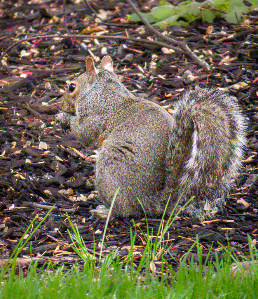
I like your interpretation of what a plate could be to eat off of! The diffused lighting really shows off the squirrel's fur in detail. I like to see him/her in full length as you captured it. The squirrel has about the same amount of space to the left and right of the picture, and for me that gives it a static look. I consider that as one of my own common composition "mistakes." So adding just a little more to the side where the animal is looking out to is usually where the extra space looks better. |
May 31st |
| 12 |
May 19 |
Comment |
I like your choice of "dishes," their variety of shapes, and their coordinated colors. My eyes go straight to the extremely bright white light areas most of the time instead of the dishes. I might suggest that if you had used that window light as side lighting, and perhaps also used a reflector opposite the windows, you could've avoided the "bright window in the background" problem. I see a reflection in the teapot, and so maybe you could've created a photo of a teapot with an interesting reflection in it. |
May 31st |
| 12 |
May 19 |
Reply |
Thanks, Walt, for the interesting assigned subject. You got a big assortment of images! |
May 31st |
| 12 |
May 19 |
Reply |
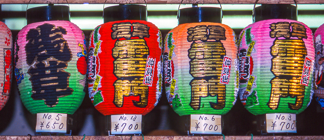
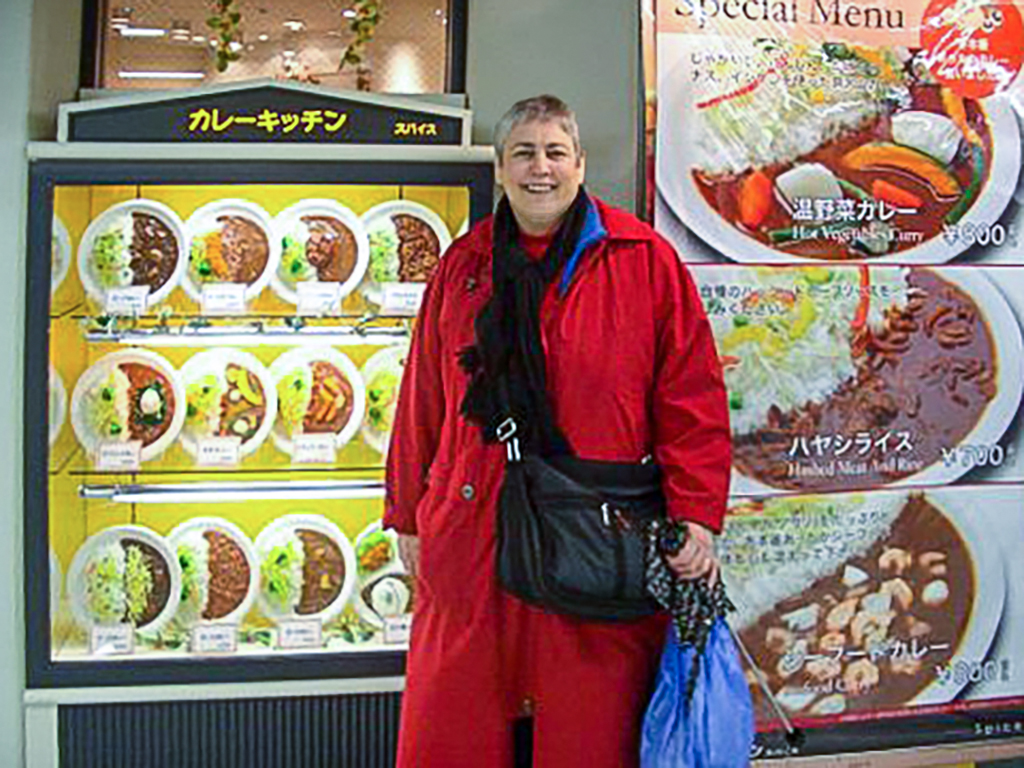
I loved the Japanese way the restaurant store windows had plates of plastic food that looked so real! |
May 31st |
| 12 |
May 19 |
Reply |
I had never thought I'd be using these photos for anything special except a memory, and so this assignment gave me something to use the photos for. I agree with you that we should take photos we like and hope that eventually we'll find a use for one or more of them! |
May 31st |
| 12 |
May 19 |
Reply |
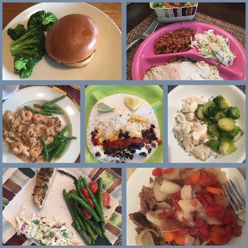
You're right, these photos are more about the food than the plates! But that's the best I could do! Besides, I've been wanting to make some use from these photos I take every week at our family dinner! |
May 31st |
5 comments - 4 replies for Group 12
|
5 comments - 4 replies Total
|