|
| Group |
Round |
C/R |
Comment |
Date |
Image |
| 12 |
Feb 17 |
Reply |
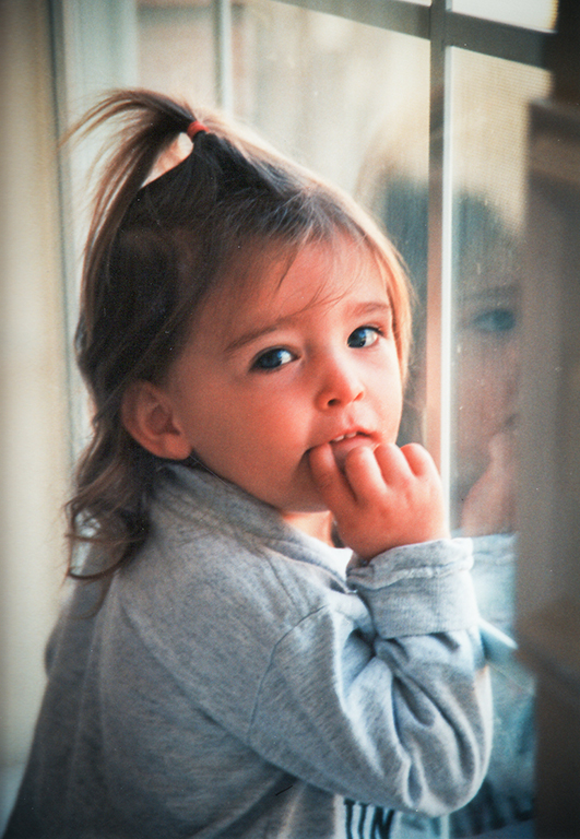
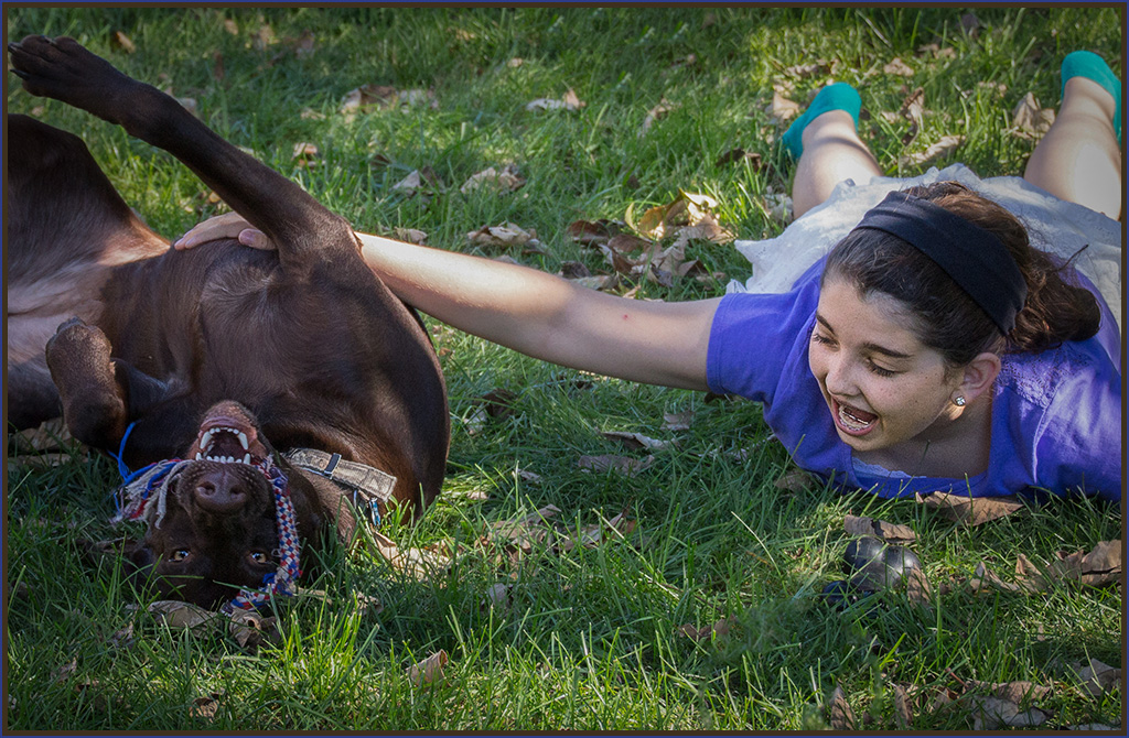
This was my first time trying for a dog-child photo shoot. They were running all over the backyard at break-neck speed. Next time I do this, I'll stand farther away and crop down to just them. |
Feb 15th |
| 12 |
Feb 17 |
Reply |
The sunlight was just perfect. It was coming in at an angle, late in the day. I can't wait for summer to be able to try this photo shoot again! |
Feb 15th |
| 12 |
Feb 17 |
Reply |
I'd like all that, too! They were moving blazingly fast! Next time I'll set the camera to shoot continuously with my finger pressing the shutter button, and maybe I'll get some better compositions. |
Feb 15th |
| 12 |
Feb 17 |
Comment |
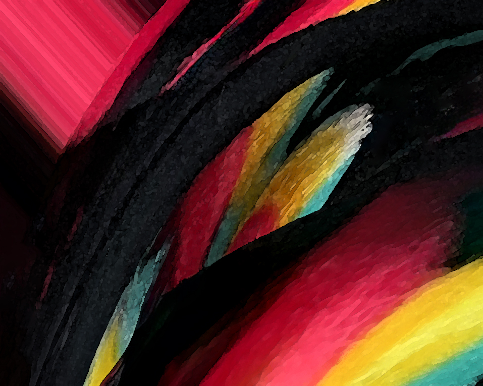
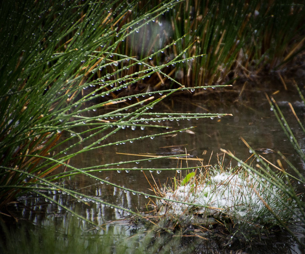
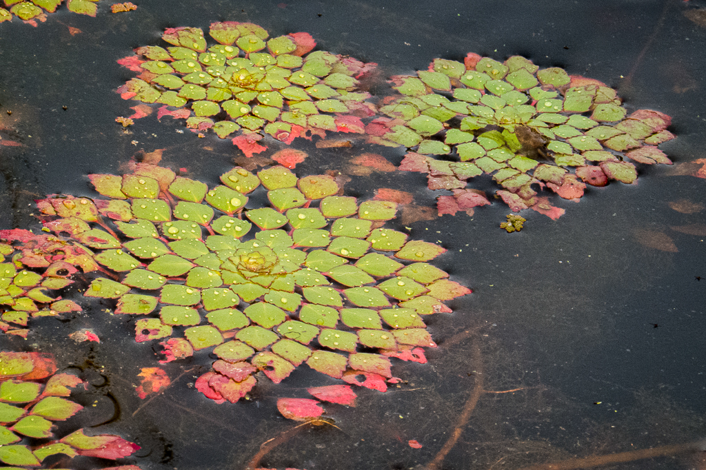
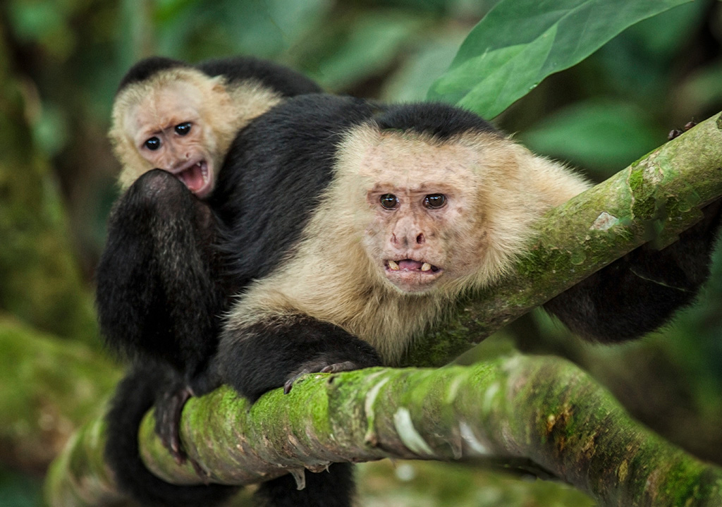
Love is also "protection" and your image shows that very well. The colors are saturated and sure look like a jungle. Wet colors are known for being nice like this. Although you didn't have a choice, a good time to go photographing is after a rain and things haven't dried out yet.
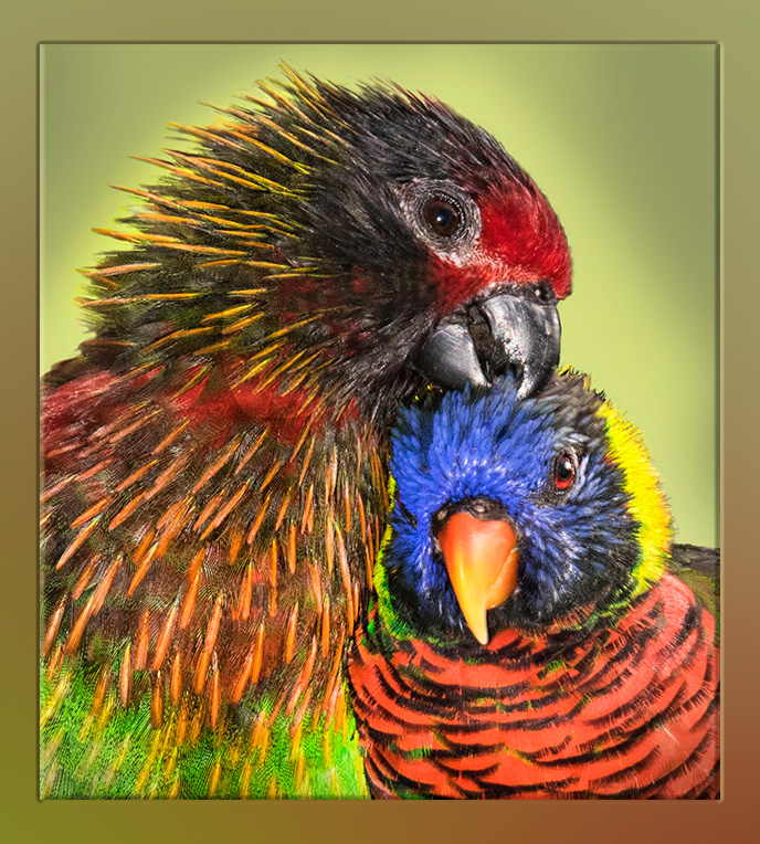
Somehow my comments' theme this month is vignetting. I've added -17 to my import settings in Lightroom. It's easy to remove or alter during post editing when it doesn't happen to work for a particular image. But I think it works most of the time, to help remove the "snapshot" look and to focus our attention on the subject.
Here it is at -16 for these monkeys. You can do it in Photoshop, Lightroom, and other image editing programs. In the old days I did it with a Curves layer that was darkened, and then I painted on the mask to get what I wanted. Selective mask painting works better when the image's content doesn't conform to the standard circular or oval shape of the automatic vignette feature. |
Feb 12th |
 |
| 12 |
Feb 17 |
Comment |
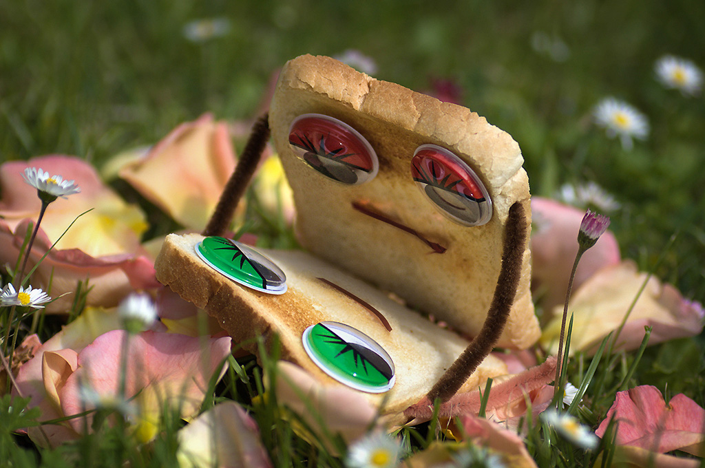
You got your inspiration from a t-shirt! Great idea! I like the set-up. I think the bread people could be more emphasized by putting a vignette of darker tones around the frame's edge. While I was doing that in Photoshop, I also brightened the top bread more. Since I was using the adjustment brush in Camera Raw, I got carried away and moved the sliders for shadows, clarity, whites, and probably some others! I am a big fan of adding just a small amount of darker vignetting around almost any image. This one uses -16 in the vignetting setting. |
Feb 12th |
 |
| 12 |
Feb 17 |
Comment |
We see the image on the web page with a black background. Does everyone know that if you click once on the photo, it will open up in a new window with a white background? And it will be displayed at the size you submitted it! This web page automatically reizes to fit this page.
This image is so sweet and evocative of love. The colors are gorgeous. And your tedious removal of the fencing is wonderful. I can see what a lot of work that was when I saw your original in Photoshop.
My suggestion is simply to give everyone some ideas about presentation and display on a website. Instead of a Photoshop "Stroke" of color, I often use a Gaussian blurred background of the same image and place the main image on top and then add any one of the many Layer Styles. My example here uses the Pillow Emboss, where I also changed the 2 colors used for it. I often forget about presentation since it is sort of an extra. |
Feb 12th |
 |
| 12 |
Feb 17 |
Comment |
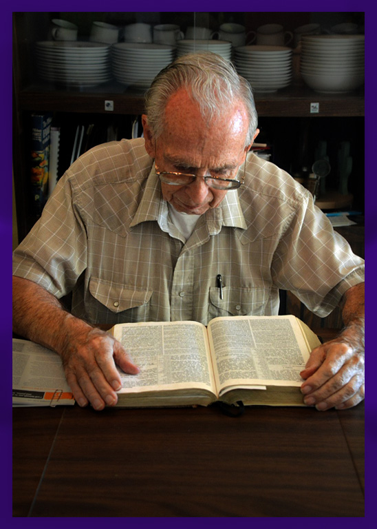
I really like your interpretation of this month's assigned subject. Very creative to think of showing the love for reading the Bible. Excellent carrying out of the self portrait. As my suggestion, I find the brightness of the background to be distracting. Same for the big area of the table at the bottom of your photo. So I used Camera Raw in Photoshop and the adjustment brush to paint in less of exposure, whites, shadows, clarity, and sharpness. You could do it with Curves or Levels, too. Here's my result, which I think puts more emphasis on you and your gaze towards the book. |
Feb 12th |
 |
| 12 |
Feb 17 |
Comment |
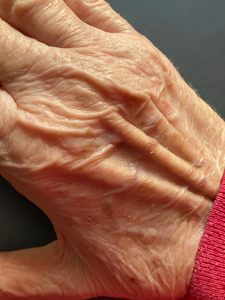
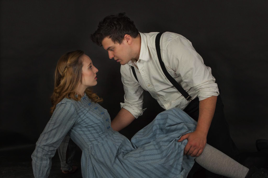
Welcome to our group, Connie! Thanks for including your goal as well as tech info. Your editing adjustments have made the skin look very natural and the same color as my hand when I hold it up in front of my monitor.
The straight-on, eye-level perspective and the flat lighting contribute to a static, not very emotional feeling. Shooting from a variety of camera positions (left, right, up, and down) would give you more choices to pick from. Even squatting down one more inch would give a different feeling looking up at them.
Since the main point of the picture is the interaction between the 2 people, my suggestions are the darken the background and the clothes, so they're not competing for the viewer's attention by being exactly the same brightness. Here's my editing example. I selectively darkened it by painting in 2 Curves layers in Photoshop, but I could've done it in Camera Raw and a brush there. The faces are same as original. |
Feb 12th |
 |
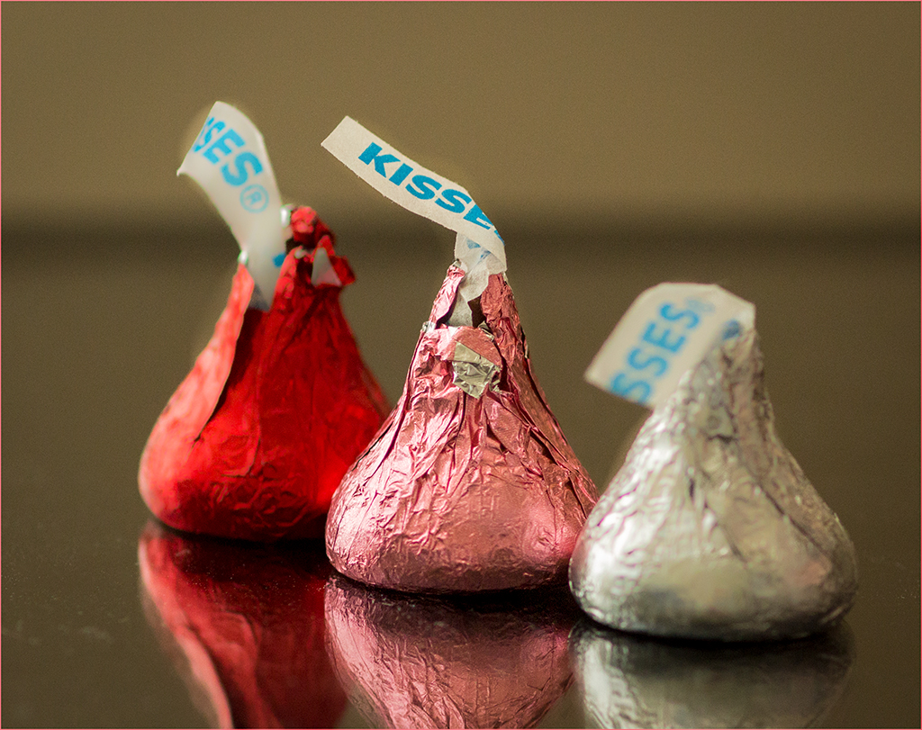
| 12 |
Feb 17 |
Comment |
I certainly do like the subject matter. Clever idea to remind of us "love" with "kisses"! I run into this same extreme shallow DOF problem in my own macro photography. I would want the edge of the main kiss to be sharp. Your DOF range now is the top front of the silver kiss.
My personal solution to this problem, when all f/stop settings and my lens incl. extension tubes fail, is to take the photo from farther away and then crop down to the part I wanted in the first place. Our cameras with large resolutions allow us to do that nowadays.
Thanks for the kiss idea. I bet some other people will be trying this as a result! |
Feb 12th |
6 comments - 3 replies for Group 12
|
6 comments - 3 replies Total
|