|
| Group |
Round |
C/R |
Comment |
Date |
Image |
| 34 |
Feb 22 |
Comment |
Well done. I'd like to see some of the background darkened so that the Aboriginal figures stood out a little more. |
Feb 16th |
| 34 |
Feb 22 |
Comment |
Love the suggestiveness of your image. I see fire. I see pine trees in the darkness, I see dancing. Wonderful. |
Feb 16th |
| 34 |
Feb 22 |
Comment |
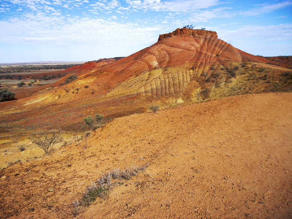
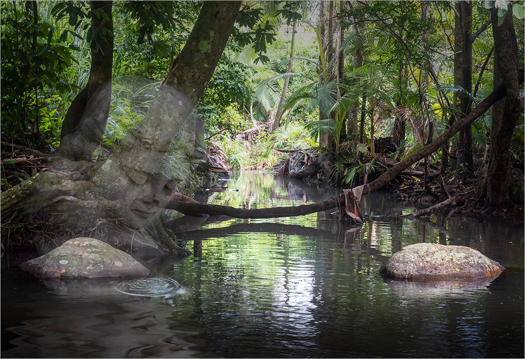
Those shadow lines in the sand are wonderful. I love the way that they point towards the abandoned truck. My only small suggestion is to strengthen the density of the truck, making it darker and more integrated into the colour of the background image. |
Feb 16th |
| 34 |
Feb 22 |
Reply |
Saddened by your plight, Georgianne. Hope you are returned to painlessness soon. |
Feb 16th |
| 34 |
Feb 22 |
Comment |
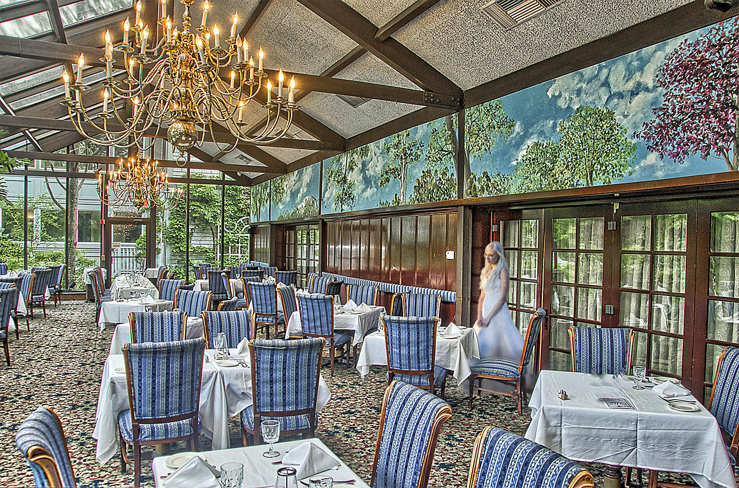
The bride is almost missing in action in your restaurant because she is so for to the right. The original photo of her shows me patience and forbearance in her posture. To me, she looks like she is waiting. Patiently.
I did a quick edit, just to try a different position. Apologies for the roughness. |
Feb 16th |
 |
| 34 |
Feb 22 |
Comment |
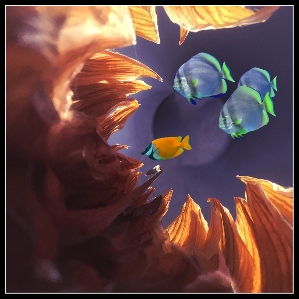
Before I looked closely at your image, I perceived your background as aluminium checkerplate. Then I saw the faces of the gulls. I do like that gull paper you made. There are several other aspects of your image that jar for me. Would the oranges of the foreground gull and the silver of the background pattern be improved by either harmonising or contrasting more? The pastel/painterly texture of the foreground gull is discordant, deliberately, I assume, but I'm thinking I would have liked it to be more realistic as that would contrast well with the abstractness of Original 3 behind it. Overall though, I appreciate that you have done such a lot of work to achieve the overall effect. |
Feb 16th |
| 34 |
Feb 22 |
Reply |
Keeping the degree of blur consistent across all those layers was the challenge. Thanks for your encouragement. |
Feb 16th |
| 34 |
Feb 22 |
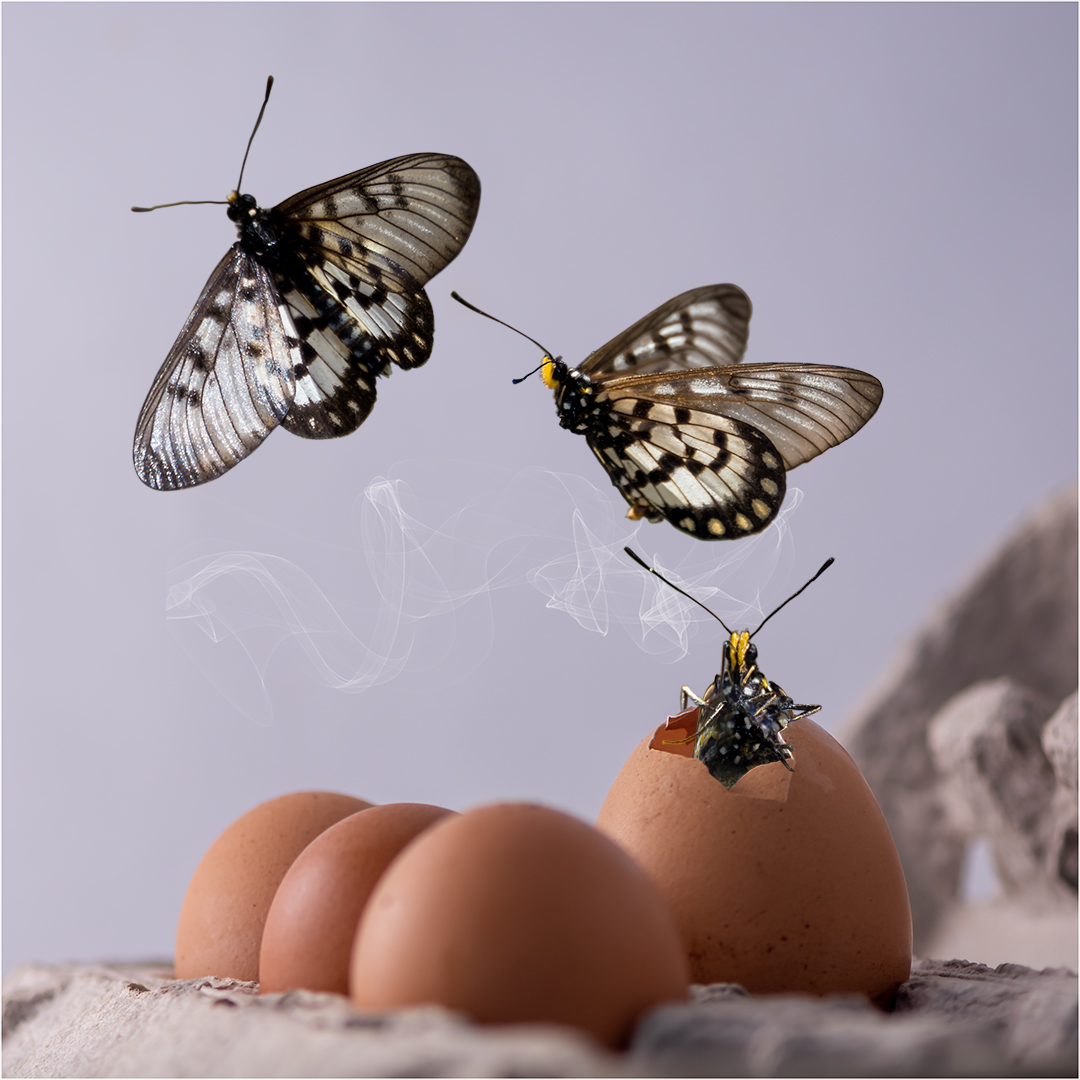
Reply |
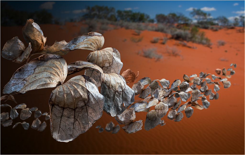
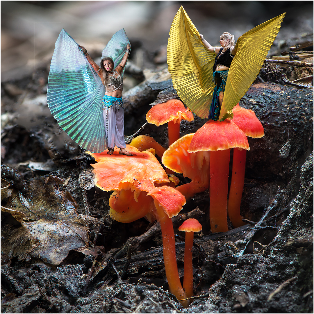
Thanks Georgianne, it was fun to do. I did try less black gradient on the left side, but the moth wings didn't stand out enough. I particularly wanted the big ones close to the 'camera' to be the first thing viewers would look at, and having them light against that dark background worked for my intention. Of interest, I tried several different backgrounds, but the dead leaf colour only stood out properly against that red ochre background. |
Feb 16th |
5 comments - 3 replies for Group 34
|
5 comments - 3 replies Total
|