|
| Group |
Round |
C/R |
Comment |
Date |
Image |
| 34 |
Jan 21 |
Reply |
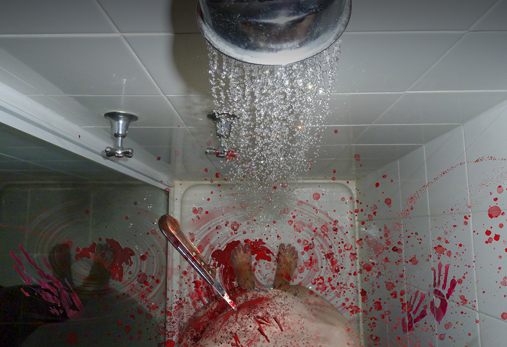
Thanks for your kind words Georgianne. There were two versions of Psycho from USA. One in 1960, and one in 1998 - with a very distinctive and frightening piece of music for the "Shower Scene from Psycho". The early version is better in my opinion. I don't watch horror movies either, but this is not really horror. Just has a couple of scary bits in it, and the shower scene looks nothing like this... |
Jan 24th |
| 34 |
Jan 21 |
Reply |
Candy, thanks for taking a closer look - despite the topic. I had some comments from a colleague judge, and he said "YIKES, this image is disturbing. Always love some disturbing. Definitely a scroll-stopper. I'm kinda glad that much of this is done with layers rather than being practical effects but yeah this is great. The red plays off of the stark white shower really nicely.
I think one of the things that is really disturbing to me is how emotionless the body is. I think I'd be doubled up in pain and whining like a big babyman if I had a knife in my gut. Standing like this is... weird. Good weird. Makes me think the subject is a stone cold killer and there's a real story to be told here."
|
Jan 13th |
| 34 |
Jan 21 |
Reply |
See my reply to Jan. It may apply to you too. Hahahahah! |
Jan 13th |
| 34 |
Jan 21 |
Reply |
I can't help laughing Jan. I'm sure there are worse images on the nightly TV news than this. But, you know this one is faked up, so you know it is not really blood. And thank you for your strong response. I am actually a photography judge, and any kind of emotional response to an image is a benefit. Horror, anger, despair and other negative emotions are always more powerful than positive ones like amusement, or admiration or happiness or even wow factor.
The art, the story and the emotions are the highest scoring aspects of images - and the technical proficiency is actually secondary, so thank you - what you said is high praise indeed to me. I'll see if I can find more kittenish images in future, though. |
Jan 13th |
| 34 |
Jan 21 |
Reply |
Thanks Witta |
Jan 13th |
| 34 |
Jan 21 |
Reply |
His work is certainly more subtle. |
Jan 4th |
| 34 |
Jan 21 |
Comment |
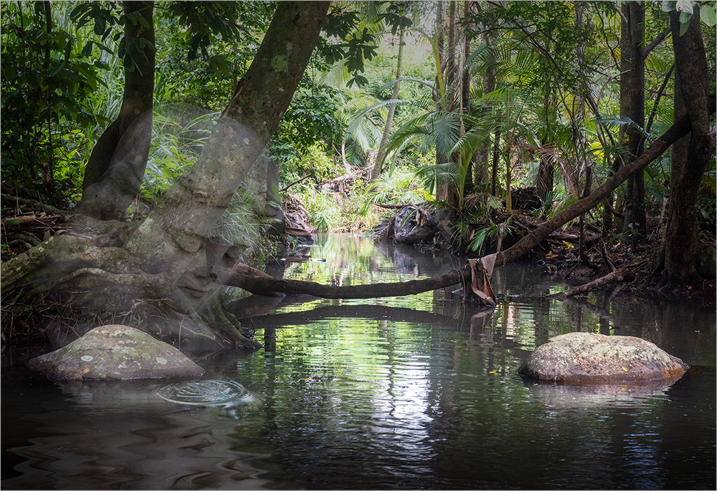
Interesting image. I am confused by the stillness of the marbles in the maelstrom of flowing moving water. Are they falling? bobbing on the water? fixed in place by a sinister spell? Hard for me to read your intent.
Technically, I would blur the marbles that are in the background to the same degree of blur as the water where they are floating. And add movement to those in the foreground, perhaps using Photoshop/Filter/Blur Gallery/Spin Blur? Well done though and using lots of tools I have never heard of, seemingly with great proficiency. |
Jan 1st |
| 34 |
Jan 21 |
Comment |
Colour tones are marvellous in your image. I like that the foreground is sharp and the background is soft and dreamy. Good composition as my eye keeps coming back to the bird and boxes in the foreground. Didn't notice the birds in the background until you mentioned them. I wonder if they might be made stronger? bigger? darker? and if they might add to the story of nest building for the foreground bird? Very nice image. |
Jan 1st |
| 34 |
Jan 21 |
Comment |
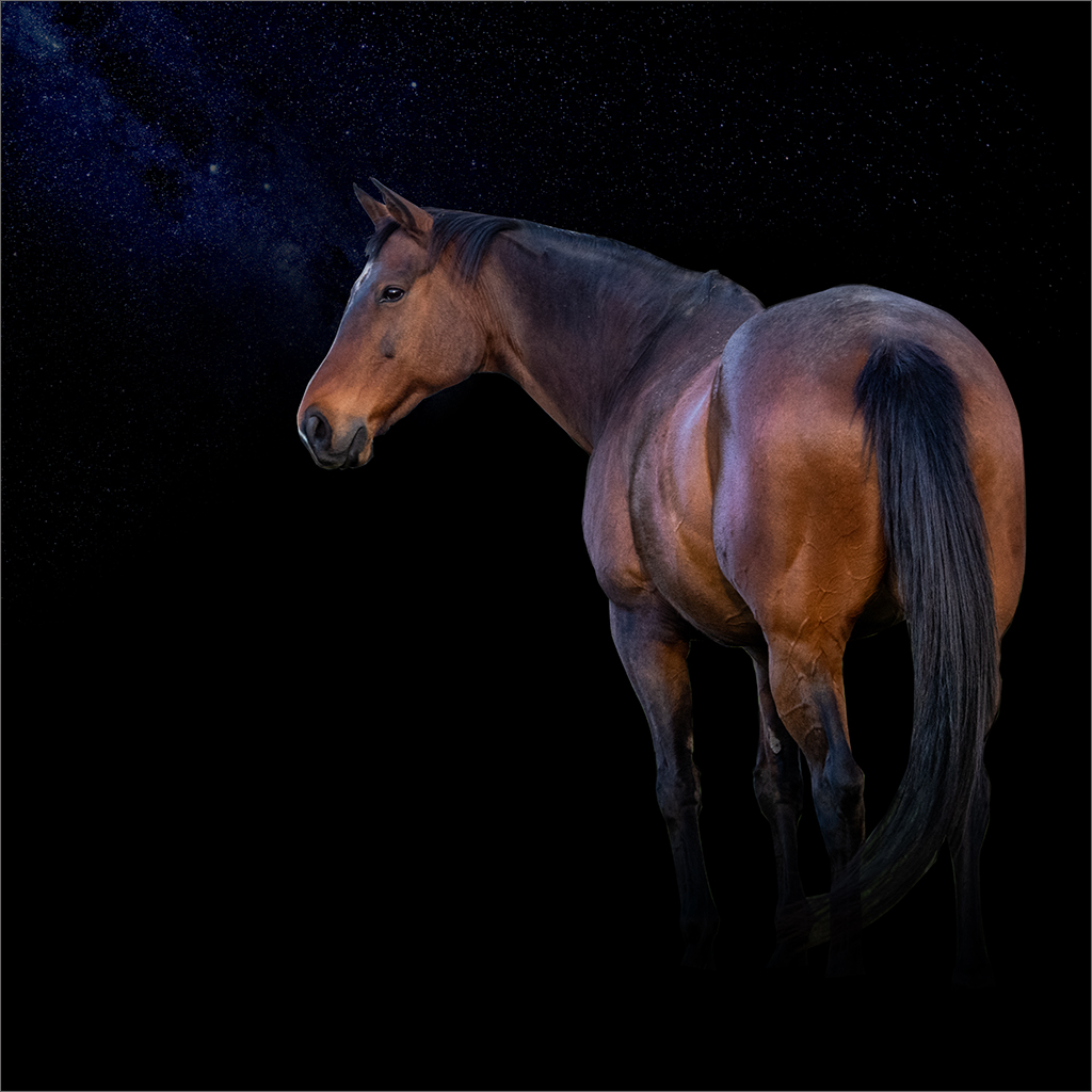
Love the snow effect, and that the sky is gloomy and dark. Didn't recognise the horse until you mentioned that it was a horse. In my opinion, it's eyes seem to be too high, and I wonder if ears would help it to appear more horsey? Great use of colour modification tools. Well done you. |
Jan 1st |
| 34 |
Jan 21 |
Comment |
Interesting that you did so much work on the images to combine them for your final version. I wonder if some perspective or gradation of blur could have been added to the background. I just looks a bit flat to me. Nice work nonetheless. |
Jan 1st |
| 34 |
Jan 21 |
Comment |
The jack-in-the-Box looks very sinister in himself, and the background you chose for him adds to the spookiness of the image overall. Good that you chose to add the figure three times - to me, it looks like the Jack is stalking the viewer, drawing closer and closer ready to pounce. Grunge treatment of the background with spot colour works well, adding otherworldlyness to the image, magnifying the threat from Jack. Very well done technically too. |
Jan 1st |
| 34 |
Jan 21 |
Comment |
Love your use of added textures. And the composition of your still life image. Boganvillea adds a nice touch. |
Jan 1st |
6 comments - 6 replies for Group 34
|
6 comments - 6 replies Total
|