|
| Group |
Round |
C/R |
Comment |
Date |
Image |
| 83 |
Jun 25 |
Reply |
Thanks, Adi. I appreciate your keen eye. |
Jun 30th |
| 83 |
Jun 25 |
Reply |
Mary Ann, SO nice to hear from you! Thank you for visiting and thank you for your kind comments. I'll drop by DD #3 when I can - if not to comment, most certainly to enjoy the images. |
Jun 30th |
| 83 |
Jun 25 |
Reply |
Thank you, Dale. I appreciate your comments. It was such an interesting contrast with people in this village doing things the way they always have….and then there's a cell phone. |
Jun 12th |
| 83 |
Jun 25 |
Reply |
Thank you Elsie. You are correct in that she was most definitely aware of me and our entire tour group traipsing through her tiny village. Almost impossible to take a candid shot. I struggle with whether a subject's awareness of the photographer in this type of situation downgrades the feeling/effect/quality of the photograph? That is to say, do you think the image would have been "better" had her eyes not been glancing slightly toward me? I'd appreciate the additional feedback. |
Jun 12th |
| 83 |
Jun 25 |
Comment |
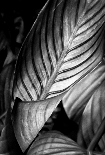
Hi Elsie
Reading your description of what attracted you to your subject (the effect of the sunlight on the color tones) left me confused why you then chose to present the image in monochrome. So…if your original image was about the color tones, what is your presented image about? Answering that question might dictate a different presentation, such as perhaps changing the composition with a tighter crop?…or a different post- processing technique?
What attracts me to your image is the contrast between the veins and the leaf's background color. I love the patterns that are formed and I love the curving forms in the leaves and if it were my image, that's what I would make it about. I would fill the frame with the part of the scene that brings that out. Your title hints at that.
I think we all would do well - myself included - by asking ourselves some quick questions before we compose the shot and trip the shutter. "What is it I want to convey to my audience?" "What is my image about?", as opposed to "What is this a picture of?".
I took the liberty of doing a reimagined presentation based on my interpretation of your title and focusing on pattern, form, texture and contrast in the realm of B&W. |
Jun 12th |
 |
| 83 |
Jun 25 |
Comment |
Hanna, you continue to amaze with your portraiture and post-processing skills. The camera angle, looking ever so slightly downward toward your subject creates an intriguing perspective that causes your subject to elevate her gaze. Very effective in my opinion. My only suggestion would be to crop in somewhat from the right. This would eliminate the dark area of which Elsie spoke, and it would take your subject out of center frame which many people, myself included, find to make a more pleasing composition. Well done, indeed! |
Jun 12th |
| 83 |
Jun 25 |
Reply |
Dale, I get what you mean about the so-called "rule" of thirds. What matters most is that you did your composition and edits with forethought and INTENTION. "Rules" be damned! |
Jun 2nd |
| 83 |
Jun 25 |
Comment |
Adi. Wonderfully creative composition. I especially appreciate your explanation of your intentional thought process that resulted in this striking and impactful image. Thank you for that! Well done, indeed! |
Jun 2nd |
| 83 |
Jun 25 |
Comment |
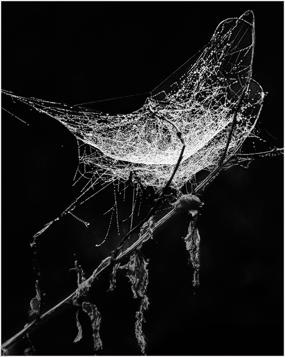
Dale, your image presents a striking contrast between the white web and black background. Excellent detail and sharpness throughout. The diagonal stem creates a leading line that directs my eye to the main point of interest which is the web. I think it is a solid composition.
Here are some things for your and the Group's consideration. I want to be clear what follows is not a criticism, but merely some of my personal thoughts which I hope will spark some discussion in the group
The first thing has to do with your title that simply identifies that which has been photographed - i.e., your photo is a picture OF a spider web on a plant. Could you think of a different title that reflects what the photo is ABOUT, instead? My image this month I titled "The Weaver's Wife" rather than "Woman Talking On Cell Phone". Subtle difference. What did you want your image to be ABOUT?
Secondly, I have brought up the idea of how we "read" an image. In Western culture, our eyes and brain are programmed to start our gaze on the left side of the page (for reading words) or image and then move to the right. Some judges would say that an image "reads" better when a leading line comes from the left rather than the right of the frame. In my visual feedback, I flipped the image to "read" left to right. There is no right or wrong here but I'm curious what you think?
Thirdly, IMO, the stem and leaves faded a bit too much into the background. I brought up the shadows and exposure slightly to give my eye something a bit more definite to follow.
Lastly, for images with all or mostly black backgrounds, on this forum where the background is also black, the image presents better with a slight stroke applied to define the frame. |
Jun 2nd |
 |
4 comments - 5 replies for Group 83
|
4 comments - 5 replies Total
|


