|
| Group |
Round |
C/R |
Comment |
Date |
Image |
| 3 |
Mar 25 |
Comment |
Hi Joan.
Very nice work. I like the end result in terms of composition, colors and effect. I had a very hard time following your narrative of the editing steps...but all that matters is the end result. |
Mar 21st |
| 3 |
Mar 25 |
Comment |
Hi Mary Ann.
Snow geese are favorite subjects for many members of my camera club. The Skagit Valley just north of Seattle is also a place where the geese winter over. Your image captures these amazing birds in nice detail. I like how the image represents multiple layers of interest, from the soft focus reeds and water in the foreground to the swimming birds and on up to the huge flying flock in front of the background trees. Well done! |
Mar 21st |
| 3 |
Mar 25 |
Comment |
Hi Kieu-Hanh.
I, too, visited the Amber Fort a year ago. Indeed a most impressive structure. Your image is well exposed and sharp. As for the crop - a matter of artistic choice. Your crop is more in keeping with your title, as it gives more context and a sense of how high up the fort is. A tighter crop focuses more on the elephants. |
Mar 21st |
| 3 |
Mar 25 |
Reply |
Thank you, Joan. Sometimes serendipity makes for great photography. |
Mar 21st |
| 3 |
Mar 25 |
Reply |
Thank you, Ruth. |
Mar 21st |
| 3 |
Mar 25 |
Reply |
Thanks and glad you enjoyed it! |
Mar 21st |
| 3 |
Mar 25 |
Comment |
Ruth, I like your composition and rendering. Very dramatic. Regarding Kieu-Hahn's suggestion of toning your image... I'm a bit of a B&W purist and generally the farthest I go is a slight selenium tone and more rarely, sepia. This is personal choice of the artist, but it can add some interest. In this case I like the pure B&W.
As to Mary Ann's experience with a judge...I, too, have had a judge criticize an image for lack of shadow detail. I, however, don't have issue with silhouette imagery. After all, those were the conditions when you snapped the shutter. I like the image just as it is. My only criticism is to me it appears over-sharpened. |
Mar 17th |
| 3 |
Mar 25 |
Comment |
Robert - a really fun image with a perfect title! Good timing on the capture. Well-exposed, composed and edited. Wouldn't change a thing! |
Mar 17th |
| 3 |
Mar 25 |
Comment |
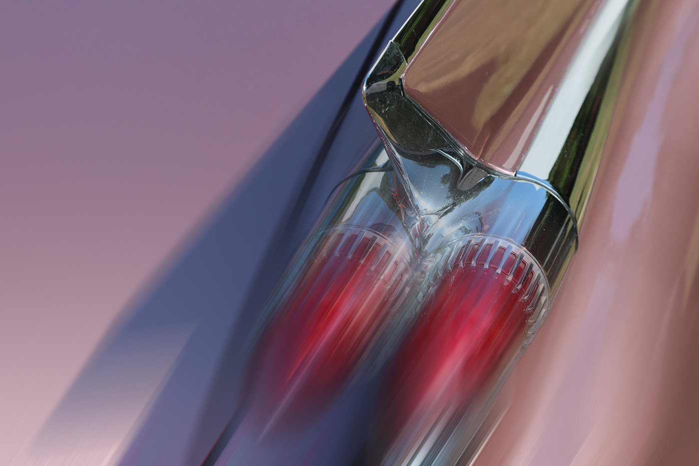
Hi Andres. What a FABULOUS and FUN image - made all the more special for me because I am moving to Palm Springs CA at the end of the month! These classic cars are everywhere there.
I like the composition and the colors. IMO you have the perfect angle and I wouldn't change anything... but since "dynamic" and "movement" were mentioned by others, I thought I'd have some fun with your image. Took it into Photoshop, duplicated the layer, applied a motion blur filter aligned with the tail lights and then masked the layer and applied a gradient over the mask.
3 - 2 - 1 LIFTOFF!!!!! |
Mar 17th |
 |
| 3 |
Mar 25 |
Comment |
Thank you, Kieu-Hanh. Yes, I see that I could have toned down the highlights in the boy's face. Thanks for the suggestion. |
Mar 6th |
| 3 |
Mar 25 |
Reply |
Andres, thank you for your comments. I'm glad you found it as funny as I did. As to your question, it was my personal choice to stick to the traditions of the genre. But, of course, unless one is entering the image into a competition with strict rules, the photographer is free to go all out with artistic expression. |
Mar 6th |
7 comments - 4 replies for Group 3
|
| 83 |
Mar 25 |
Comment |
Test Comment
Asdfjkl; |
Mar 27th |
| 83 |
Mar 25 |
Comment |
Hi Clark!
…apparently there were many good photographic opportunities in that area recently - some folks from my camera club brought back some beautiful images (and froze themselves in the process) and yours is no exception. It is a beautiful, peaceful scene and I like your high-key presentation. A panoramic crop was a good choice.
You didn't mention how you did the conversion. If using LrC, you might, for an alternate presentation, try to bring out a little more detail in the foreground snow and, as Elsie suggested, tone down the highlights ever so slightly on the trees. It would also be interesting to see what it would look like if you took down the blue slider to darken the sky somewhat to add just a wee bit more separation/contrast between the sky and snow-covered trees. Nicely presented. |
Mar 17th |
| 83 |
Mar 25 |
Comment |
Hi Elsie
I think you chose the correct angle for your composition - which was obviously well thought out. I might have tried to bring out a broader range of tones and more contrast in post…but that's just my artistic bias. While it is cool that you captured it, the crescent moon is so tiny as to be more of a distraction than an enhancement of your otherwise nice composition. Had you wanted to make the moon more prominent, backing way up and using a telephoto lens would have compressed the distance and made the moon appear larger. |
Mar 17th |
| 83 |
Mar 25 |
Reply |
Elsie, I think your edit allows the eye to focus more on the monk, as the subject. I would, however, keep the entire temple at the left of the frame, as per my initial comment above. Cutting it off as you did removes context (as per Don's title) and the "half temple" creates, IMO, a distraction at the edge of the frame. …but you had the right idea. |
Mar 17th |
| 83 |
Mar 25 |
Comment |
Hi Hanna
You've presented us with a lovely portrait of this young woman. The subject is beautifully lit; has soft facial features, yet the eyes and hair are perfectly sharp. Your image has nice tonality that spans the entire gamut. Setting her against a black backdrop, adds a sense of mystery and drama. Very well done!
Your post processing is expertly done but I have one suggestion for presentation on this forum: Because the background on the site is black, any image that is dark at the edges blends into the background and thus looses the frame. A simple, light colored stroke around the frame will present better here. |
Mar 11th |
| 83 |
Mar 25 |
Comment |
Don, what I appreciate most about your images is how you expose and post process to get the broadest range of tones. This image exemplifies my point. The image is sharp and tells a good story.
I agree with Adi that a different crop would yield some improvement...but I disagree with where the crop should be. If I understand his suggestion, he would have you crop out the "monastery" (which, I assume, he means the structure at the far left of the frame). I think this is an important part of the story and is, indeed, in your title for the image. I would have you consider cropping in from the right to eliminate the tree entirely. By placing the monk on the third, it keeps the viewer's eye on the subject rather than allowing the eye to follow the wall out of the frame on the left. All things considered, nicely done. |
Mar 11th |
| 83 |
Mar 25 |
Reply |
Adi and Hanna,
I think the reason this group hasn't generally seen portraiture probably has more to do with the past members' interests rather than some unspoken "rule".
My feeling is that all genres of photography are welcome in this group. |
Mar 9th |
| 83 |
Mar 25 |
Reply |
Thank you, Adi, for your kind words. Your keen eye always amazes me. I missed that detail entirely. I played with the image extensively in post to get the effect I was after. I can only surmise it was one of two things. Many of the trees had a lot of moss growing on them and perhaps when I tweaked the green luminosity slider in LrC, combined with the lighting conditions, it made the moss edges stand out.
That, or just plain old sloppy editing. (Probably the latter ?). Thanks for pointing it out. I shall go back and fix it. |
Mar 9th |
| 83 |
Mar 25 |
Comment |
Hi Adi
I find this to be an absolutely stunning fine art image that is certainly worthy of printing and hanging on your wall. IMO you have handled the composition, exposure and post processing in a most masterful way. The only thing I would like to suggest is a subtle stroke line to better define the frame on this forum. |
Mar 5th |
6 comments - 3 replies for Group 83
|
13 comments - 7 replies Total
|


