|
| Group |
Round |
C/R |
Comment |
Date |
Image |
| 3 |
Aug 24 |
Comment |
Robert, thank you for re-uploading the full size image. EXCELLENT! What strikes me most is the perfect symmetry which is even more impressive knowing you snapped it from a moving boat! The straight lines and curving arches play well against one another. And the light reflection on the water in the center pull my eye into the arch(es) that have an almost infinity perspective to them.
If I enlarge the image it appears there are some people and part of a boat at the far end. Since they are soooo small, I don't know if they add much to the composition. Did you consider removing them? ��but then, again, they are so small that a viewer may not notice or be distracted by them. Either way, it's a well done image. Since the colors are rather subdued, I think it would make a nice monochrome as well. You could play around with the B&W color sliders in Lightroom Classic or Camera Raw and you'd have yourself a really punchy B&W rendition. |
Aug 15th |
| 3 |
Aug 24 |
Reply |
Robert, up to now I haven't had a dedicated macro lens, so my focus stacking has been relatively simple with 4 or 5 images. Easy to do in either Lightroom Classic or Photoshop. If you want to really get into macro photography, you'll need a focus rail and be prepared to take as many as 200 individual images. Then you would definitely need something like Helicon. |
Aug 15th |
| 3 |
Aug 24 |
Reply |
Robert, I also use a Mac but I don't use Apple Mail to send images to Ruth. I use Gmail instead. Gmail sends the images as a true attachment whereas Apple Mail embeds the image into the body of the email. If you only have Apple Mail, you might try making sure you have checked the dropdown box where you can choose to send the image "Actual Size" (Choices are Small, Medium, Large and Actual Size). Hope this helps. |
Aug 15th |
| 3 |
Aug 24 |
Comment |
Stephen, thank you for your comments and for alerting me to both Stock and Feininger. I am not familiar with either of them. I shall have to study up on both of their works. |
Aug 12th |
| 3 |
Aug 24 |
Comment |
Mary Ann, your explanation helps the viewer appreciate the overall story your image portrays. I like the composition and the fact the chimp is not looking directly at the camera. When I view the image regular size it looks sharp��but slight magnification reveals some overall softness - perhaps because you shot through glass? Nice documentary shot, memorializing this majestic creature. Thank you for sharing! |
Aug 8th |
| 3 |
Aug 24 |
Comment |
Hi Ruth, you've captured a lovely composition of your state's flower. The black background makes the soft pastel colors really stand out. I do agree with Kieu-Hanh that a slight stroke would have helped the image better stand out on this forum. Regarding the image orientation�� artist's prerogative!
The fact that the one flower is slightly soft doesn't bother me and IMO, I don't feel it is a detriment to the success of your image. Using an f/11 or f/16 aperture may have helped to get that little bit extra DOF. Of course, focus stacking would have also been an option. However, in my experience, focus stacking can be very tricky when in the field - even the slightest puff of wind can derail a stacking sequence.
Lastly, you might try Topaz Photo AI. One of its algorithms can sometimes do an amazing job with restoring a slightly soft image��but I stress the word "sometimes". Photo AI can do some weird things like grossly over-sharpening and strange artifacts. But when it works, it can be remarkable. |
Aug 8th |
| 3 |
Aug 24 |
Comment |
Robert, your image this month appears so small on both of my monitors (and my iPad) that I don't feel it would be fair to you for me to comment.
Might you go back to your image file and re-submit it to Ruth with the correct size? |
Aug 8th |
| 3 |
Aug 24 |
Comment |
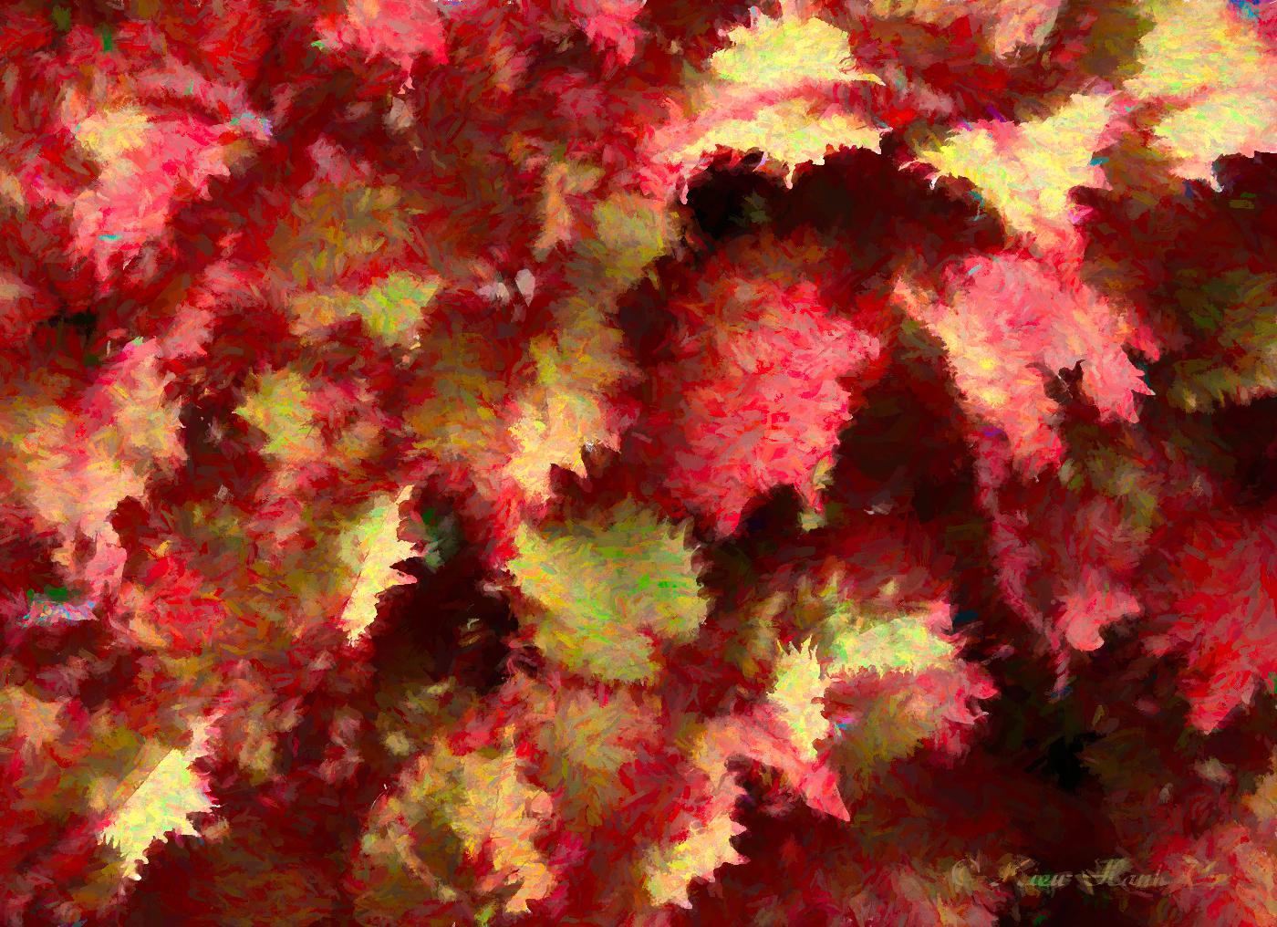
Kieu-Hanh,
To answer your question, try thinking about it more metaphorically rather than literally. It is meant to emphasize that metaphor. Thank you for your comments. |
Aug 6th |
| 3 |
Aug 24 |
Comment |
Kieu-Hanh, you've given us a nice study of color and texture. The image is sharp, well exposed and exhibits a lot of depth.
When I saw your subject / composition I thought it had some abstract elements. Just for fun, I attempted to give an alternate presentation that magnified those abstract features.
(Certainly not suggesting mine is a "better" interpretation of the subject. Your image is nice as-is!) |
Aug 5th |
 |
| 3 |
Aug 24 |
Comment |
Andres, I agree with Kieu-Hanh that your original image is much stronger (and I really like it!). It has so many good compositional elements: Strong leading lines that take the eye to the main subject(s); There are 9 planes ("rule" of odds); The planes form a triangle (a strong compositional element); Ample negative space gives the planes room to fly.
The tight crop on your featured image also reveals some softness, most likely due to the 1/1600 shutter speed. I have found that fast moving objects require a shutter speed of at least 1/2000 and sometimes even higher. Had you stuck with your original, the softness would be far less noticeable. |
Aug 5th |
| 3 |
Aug 24 |
Comment |
Thank you, Ruth! |
Aug 3rd |
9 comments - 2 replies for Group 3
|
| 83 |
Aug 24 |
Reply |
Thanks, Adi. Appreciate the comments. |
Aug 25th |
| 83 |
Aug 24 |
Reply |
Thanks, Don. As I am wont to do, this was a pretty extreme crop. The original included most of the man's body and a substantial amount of the surrounds. I felt that his face was the most interesting to tell the story I wanted to tell. |
Aug 18th |
| 83 |
Aug 24 |
Reply |
Elsie, thanks for your comments. Because this was a quick, one-off street shot I wasn't able to control the lighting and this made for a difficult edit��that and the man actually had some unusual blotchy facial skin. But I agree, the facial highlights still are a bit too bright. |
Aug 18th |
| 83 |
Aug 24 |
Comment |
Lance, I have to say this is one of your images I don't quite "get". Unlike the image you posted on DD-87, this one seems very busy to me without a clear subject. Additionally, some of the foliage - especially that in the lower right corner - appears to me to be over-exposed and lacking of detail. The camera angle (from below looking up) combined with the wide angle field of view give a perspective that is a visually unsettling to me. The image marked "Original" is, for me, a more pleasing composition with more interest and a broader range of tones. I also quite like your image in DD-87. |
Aug 5th |
| 83 |
Aug 24 |
Reply |
Don, thanks for the info! |
Aug 5th |
| 83 |
Aug 24 |
Comment |
Hi Elsie. Old cars and trucks are a favorite subject of mine. Lance ("Lewin" is his last name) does, indeed, bring up some valid points to ponder regarding composition and camera technique.
I have found that when the environment does not lend itself to registering a subject in an ideal composition, moving to "Plan B" can sometimes result in a more compelling photograph. In this case, plan B might have been to create some close-up compositions of details on the truck -- although this would be a different story from the one you were attempting to tell with your image as presented. |
Aug 5th |
| 83 |
Aug 24 |
Comment |
Don, it's a lovely composition and, indeed, your patience paid off. Beautifully sharp with nice depth and tonal range.
What, pray tell, is a "photo gathering trip"? |
Aug 5th |
| 83 |
Aug 24 |
Comment |
P.S. I much prefer the mono version! Absolutely love the hand prints on the back of the chair - they enhance the composition. |
Aug 5th |
| 83 |
Aug 24 |
Comment |
Adi, I concur with Lance. Expertly conceived and executed. I like it very much. |
Aug 5th |
| 83 |
Aug 24 |
Comment |
Michel, your image moved me deeply. Nothing more to say except "Well done". |
Aug 5th |
6 comments - 4 replies for Group 83
|
15 comments - 6 replies Total
|


