|
| Group |
Round |
C/R |
Comment |
Date |
Image |
| 3 |
May 24 |
Reply |
Hmmm�� to my eye it registers more as a logo / geometric design rather than print. That said, yes, it would be very easy to disguise it further with cloning or blurring to heighten the sense of abstract. Thanks for pointing that out. |
May 7th |
| 3 |
May 24 |
Reply |
Hmmm�� to my eye it registers more as a logo / geometric design rather than print. That said, yes, it would be very easy to disguise it further with cloning or blurring to heighten the sense of abstract. Thanks for pointing that out. |
May 7th |
| 3 |
May 24 |
Reply |
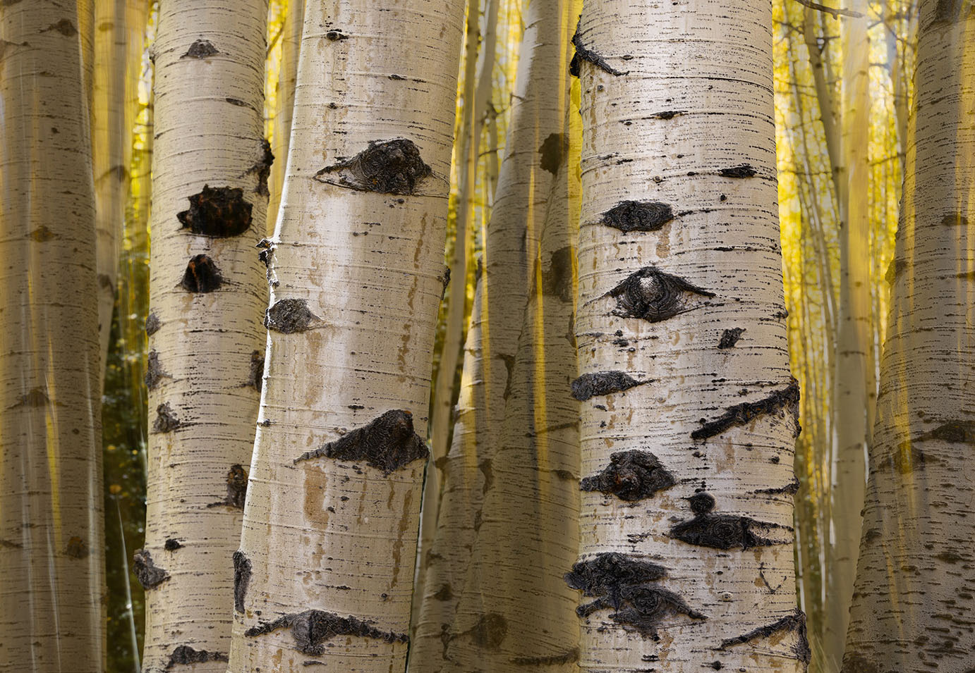
Ruth, to answer your question, it is a Ps technique that involves making careful selections and saving them. With the selection highlighted, create a curves layer. Then pull up the curve on the right side to over-brighten the selection. Now re-select and drag a gradient within the selection. Takes some practice to get it right. There are several YouTube vids that show it being done. I will try to find the video and post the link in our group's bulletin board.
Your re-edit I think is an improvement and gives more life and depth to the main trunk. Allow me to make an additional observation: In your original image, the light appears to be coming from the left and slightly behind the tree trunks. With the technique I used, it preserved and emphasized the directionality of the light and thus emphasized the convexness (is that a word?) of the trunks. Whereas in your re-edit, the light doesn't have quite the same directionality to it. |
May 7th |
| 3 |
May 24 |
Comment |
Hi Andres,
I think your idea of creating a still life out of the items on the counter was good...but I'm sorry to say that I, too, don't feel the end product really works well for me. A couple of observations: 1. The various items certainly do have some interest individually and they are related to one another as a group -which is good, but thrown together in a heap is not a pleasing arrangement to my eye. 2. At f/4 with that lens, only the immediate foreground is in focus and I find myself wanting to see the other items more clearly. A smaller aperture would have been a better choice. 3. All that said, the image is well-exposed and in your post-processing, I think you got as much out of the file as you could. 4. Perhaps you could challenge yourself to recreate a still life with similar items under more ideal conditions and share your result with the group? |
May 4th |
| 3 |
May 24 |
Comment |
Hi Joan. I've never been to Death Valley but I have seen many photos from that specific location - no two of which are the same. The image as presented is beautiful and I'm amazed at how you were able to bring out the detail, color and depth given that the "original" appears rather flat and maybe even a bit over-exposed. No suggestions. Beautiful as-is. Nice job indeed! |
May 4th |
| 3 |
May 24 |
Comment |
Robert, AWESOME capture. Yes...perhaps not the your best photography, but thank you for sharing this image with us regardless. The image will always remind you of the amazing experience. I'm envious you were able to witness the event in person. |
May 4th |
| 3 |
May 24 |
Comment |
|
May 4th |
 |
| 3 |
May 24 |
Comment |
Hi Mary Ann.
I like your composition and how you were able to freeze the bird as it was coming in for a landing (and I know what you mean about having to take many frames in order to get one "keeper"!). Your subject is nicely in focus and well placed in the frame and the background is beautifully soft. I also like the triangles in the image: Foreground foliage against the beach in the background - strong compositional elements.
Here are some picky things I am noticing: 1. When I look closely, the background between the upright foliage is brighter than the rest of the background. Looks like when you masked the foliage in order to bring up the shadows, there was some spill over. 2. The bright stripe at the top and the piling at the right side of the frame tend to draw my eye away from the subject. 3. The lighting is such that the main part of the bird's body is in shadow.
In my visual feedback, I cropped from the top and the right. Then I used "select subject" and brought up the shadows and the exposure just a hair. Lastly, I used an inverted radial gradient to darken slightly the rest of the frame which has the effect of directing the eye to the subject. Let me know what you think. |
May 4th |
| 3 |
May 24 |
Comment |
Hi Kieu-Hanh. Nice composition of this Spring garden scene. I like how the tulips form an S-curve for my eye to follow and the contrast between them and the light-colored daffodils gives your image an almost 3D appearance. Good camera angle and perspective too. Overall, a well composed exposed and edited image. No suggestions. |
May 3rd |
| 3 |
May 24 |
Comment |
Hi Ruth. What a well-crafted composite! The thing that strikes me first is the beautiful warm, glowing color set off by the contrasty B & W of the tree trunks. Lovely, sharp detail in the patterns of the bark against the ICM blur of the background layer. I think it is a very creative composition. Curious if you had a composite in mind when you took both images? Nicely visualized!
To my eye, the image looks somewhat flat due to the trees being mostly in shade. I took the liberty of taking the file into PS (somewhat selfishly, as I wanted to practice a technique I just learned!) to see if I could give it a little more depth. I also eliminated the border. Curious what you think. |
May 3rd |
 |
7 comments - 3 replies for Group 3
|
| 83 |
May 24 |
Reply |
Hi Adi. Thanks for your comment. Do I understand you correctly from your last sentence, that you see the image(s) as having low contrast? ...so interesting how different people see our images (that's why I'm here!). To my eye, and by intention, I made the images with medium to high contrast, especially the ones on the left and right. Certainly not the entire image(s) exhibit overall high contrast...but there are definitely elements of each image that do. Thanks again for engaging with me. |
May 29th |
| 83 |
May 24 |
Reply |
Thanks, Don. Glad you liked it. Lots to see and do in this corner of WA State. Olympic National Park; Port Townsend (can take the ferry to Whidbey Island and the third fort, Fort Casey), Port Angeles (can take a ferry across to Victoria B.C.). Definitely worth a visit. |
May 18th |
| 83 |
May 24 |
Reply |
Michel, thanks for your comments. When it was an active fort it was probably less scary. Now, in its state of abandonment, it does indeed have an eerie, torture chamber feel to it. Glad you like the story. |
May 18th |
| 83 |
May 24 |
Reply |
Thank you, Lance! |
May 18th |
| 83 |
May 24 |
Reply |
Yes, Adi. Thank you for that and sorry I didn't respond earlier. It's all good. I appreciate having you in the group and I'm frequently inspired by your work. |
May 15th |
| 83 |
May 24 |
Comment |
Hi Michel
I've seen many pictures of the Oculus but never one from this perspective. It is a great study of lines and light. It has an almost hypnotic feel to it that draws my eye into the image. Curious...were you lying on the floor to capture the shot? Nicely done. |
May 15th |
| 83 |
May 24 |
Comment |
Hi Don
I think you've achieved your goal of communicating the thoughtful design and tranquil feeling of the space. I particularly like the floor-level camera angle that helps to emphasize those qualities and makes the space look larger than it probably is. The "sun star" is a nice touch and I'm surprised you were able to get that effect from f/8. Good on you! Exposure, tonality, focus and detail are all spot on.
As with all wide angle shots your image has converging verticals and they are extreme. For me this induces a slight feeling of vertigo that I wish were not there. But short of investing in an expensive tilt-shift lens, I'm at a loss as to how the warped perspective could be reduced (I've not had a great deal of luck with software-based solutions). Thanks for sharing. |
May 5th |
| 83 |
May 24 |
Comment |
Hi Adi
A nicely composed image and a good location to make a long exposure. Your camera angle creates a nice triangular foreground which leads my eye to the bridge, then to the mill and finally back down through the cascade. Excellent tonality and detail.
Your 25 sec exposure has completely smoothed the flowing water, eliminating most detail - a result, one assumes, was your artistic intent. With water falls and cascades, I tend to prefer exposure times of 3-5 seconds which still smooths the water but retains some detail. This, of course, is an artistic decision and my personal preference which is not in any way meant as a criticism of your beautiful image. Nicely done! |
May 5th |
| 83 |
May 24 |
Comment |
Hi Lance
I think this is a lovely study in contrast, light and shadow. Seems to me to have more contrast than what you usually present - I like it! The foreground light catches my eye first and the tipped trees on either side of the frame direct my gaze into the image where I appreciate the delicate cloud formations. The converging verticals of the trees do not look out of place to me (as in most wide angle shots), as I can imagine them being tilted in real life. All in all, a very pleasing and dramatic image. Would you tell us whether this was film or digitally registered? |
May 5th |
4 comments - 5 replies for Group 83
|
11 comments - 8 replies Total
|


