|
| Group |
Round |
C/R |
Comment |
Date |
Image |
| 3 |
Feb 24 |
Reply |
Hi Kieu-Hanh. Thank you for your kind words. Please see my response to Ruth regarding the intersecting lines.
|
Feb 16th |
| 3 |
Feb 24 |
Reply |
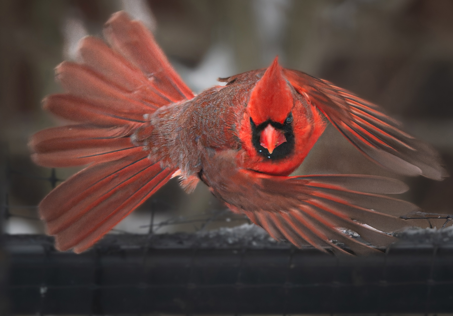
Thank you for your comments, Ruth. Regarding the intersection of the bird house and hill... when a moment presents itself one does not always have the luxury to make careful compositions. I absolutely agree it would be ideal if the lines didn't cross, but in this case, it was trip the shutter or lose the shot of the birds in flight. |
Feb 16th |
| 3 |
Feb 24 |
Reply |
Good point you bring up about fidelity! It only matters in certain competition situations where the rules require it - i.e., international wildlife competitions. In all other cases the artist is free to go wherever his/her vision leads without apology.
I think we could all benefit if we were to include a few sentences in our image description about our intent. Understanding the artist's intent leads to a deeper understanding and (hopefully) deeper appreciation of the piece.
I understand now what your intent was and in that regard your image has conveyed it successfully! Thank you for sharing your thought process.
|
Feb 6th |
| 3 |
Feb 24 |
Comment |
Hi Robert. What a great "decisive moment" capture! You got the bird's head perfectly in focus while allowing the wings and tail to give a sense of slightly blurred motion. I like that your (obviously) high resolution sensor allowed for a tight crop to utilize the compositional concept of "fill the frame" with the subject without losing detail. Well done!
My only observation is that the image looks a bit flat to me - no doubt due to the overcast sky. I provided some visual feedback below. In Ps I used a large radial gradient over the bird's body, lower wing and head to increase the highlights and exposure plus a dab of clarity and increased texture. It gave some directional lighting that, IMO, adds some pop to the image. I also applied a radial gradient to the eye to simulate a catchlight. Curious what you think of my edit? |
Feb 5th |
 |
| 3 |
Feb 24 |
Comment |
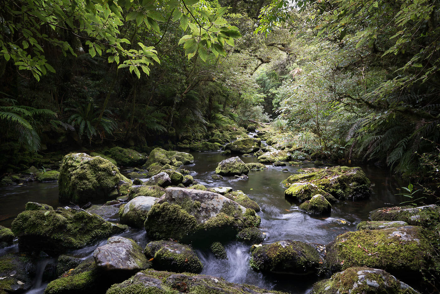
Hello David. What a beautiful composition of this tranquil location! Every time I see one of your images from NZ, it makes me long to return. Your country is truly a special place and your photographs tell me you think so too.
First off, let me say that I love the composition. Your decision to use the ND filter to blur the water was a good one. The resulting SS was just enough to yield a sense of motion without that "slow-shutter-speed" look one so often sees in these types of images. Really nicely exposed and well thought out capture!
Some observations: To my eye, your original image seems more true-to-life and natural. During my walks through the lush NZ forests, I remember how green everything was. So I'm curious about your thought process around your decision to desaturate the greens as an artistic choice. Does your featured image more closely represent what you saw and felt when you were there?...or was your intent something different?
I'm guessing you may have wanted to add a little warmth to the light. Going with that, I did a different rendition. In Ps I brought up the shadows in the darkest areas. Then I applied a reflected gradient and backed that up with a warm color layer at low opacity. It brought some warmth to the central, brightest part of the image without desaturating the beautiful greens in the shadows. |
Feb 5th |
 |
2 comments - 3 replies for Group 3
|
| 83 |
Feb 24 |
Reply |
Lance, I started a reply but it got very long-winded, so kindly see my BB post. |
Feb 7th |
| 83 |
Feb 24 |
Reply |
Don, thank you for your comments. I'm glad you had an emotional response to my image, even if it wasn't the same as mine! So many images can be lacking in emotion-eliciting elements, and I struggle sometimes to create images with emotion. I'm glad you like it. |
Feb 7th |
| 83 |
Feb 24 |
Comment |
Lance, once again you present us with an intricate and beautifully crafted woodland study. If I were to choose, I would go with your (digitally registered) image as presented. It seems to me to be more detailed and more evenly exposed. When I compare the two images on my large desktop screen, the film version appears somewhat over-exposed with some blown out highlights in the background. I do, however, prefer the film version's composition that shows more of the foreground water with the floating leaves.
Both images speak to your love of nature and they invite us to contemplate and share in the serenity that you no doubt experienced when the images were captured. Bravo! |
Feb 5th |
| 83 |
Feb 24 |
Comment |
Hi Mark!
What an amazing panorama! I've never attempted stitching so many shots together. I'm wondering if you could tell us more details about your technique?
As for the image itself, you have certainly captured a stunning vista. The eye moves from left to right, lingering now and then to inspect the multitude of undulations in the dunes.
The image has lovely tonality and I think you handled the post processing well. My only wish is that we could see the entire mountain at the far right - in your shot the top is cut off. |
Feb 5th |
| 83 |
Feb 24 |
Reply |
The "original" shown is actually a different frame with a wider view. No bird in that shot. |
Feb 5th |
| 83 |
Feb 24 |
Reply |
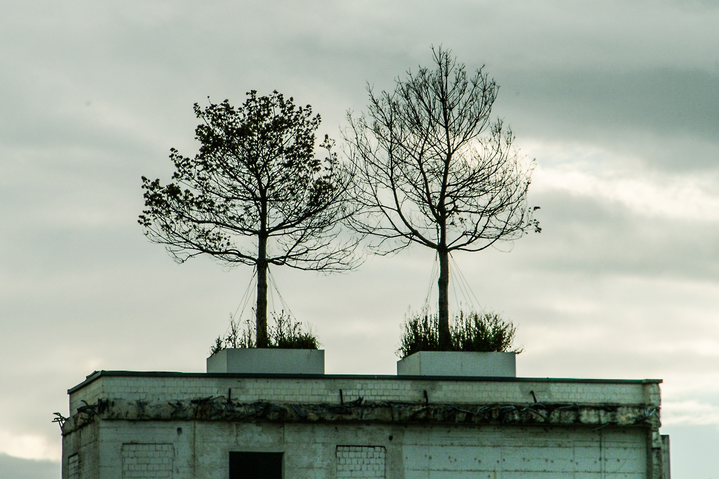
Michel, thank you for your comments. Very much appreciated. Regarding the bird...for me, the inclusion of it enhances the mood I want to portray. While I don't know exactly what species it is, I imagine it to be a raven and its presence as a harbinger of darkness.
As for you wanting to see more of the building, please see below. It is a wider composition, only slightly edited and no bird in the frame. It does provide more context for sure. Do you find this more appealing? Because of the macro photography I did on a daily basis in my professional life, I do tend to go for tight crops and I often struggle to decide how much context to include and how much to eliminate. I only started studying and practicing the artistic side of photography in earnest since my retirement in 2019. I can imagine if I were to revisit the site, I would see it differently now and produce some entirely different compositions. |
Feb 5th |
 |
| 83 |
Feb 24 |
Comment |
Lieber Michael, HERZLICH WILKOMMEN in unserer Gruppe!
What a stunning image of this beautiful flower! It is sharp, with lovely light and tonality. Exquisite in every detail. My only suggestion has to do with presentation on this forum. Due to the black background of the website, images with dark or black background tend to lose their crop/frame. A subtle lighter colored stroke often helps. See attached. Other than that, I wouldn't change a thing. Excellent work!
P.S. Many of us in the group appreciate knowing details about your camera, lens used and settings. |
Feb 5th |
 |
| 83 |
Feb 24 |
Comment |
Hi Don
With your B&W conversion, you've given us a different take of this iconic location. We are so used to seeing the scene bathed in bright, glowing early morning golden hour light. How refreshing to see it via your interpretation! The image is well-composed and exhibits a lovely tonal range. My eye is free to appreciate all of the shapes and textures that can otherwise be easily overlooked when an assault of color is the first thing that registers on the viewer. Very nicely done! |
Feb 4th |
| 83 |
Feb 24 |
Comment |
Hi Adi
This month you've given us a busy image of a busy street - and I don't mean that as a critique. I've heard critics use the word "busy" in a negative connotation to describe an image with too much going on - one that lacks a clear subject. I disagree.
Your image screams "busyness", just as I imagine only a New York City street can. How can one capture an image of a busy place without the image itself being seen as "busy"? The scene was captured at the perfect moment to yield an interesting and intriguing and well-composed shot. I like it a lot! |
Feb 4th |
5 comments - 4 replies for Group 83
|
7 comments - 7 replies Total
|


