|
| Group |
Round |
C/R |
Comment |
Date |
Image |
| 3 |
Jan 24 |
Reply |
Thank you, Joan for your valid comments. All comments taken to heart. |
Jan 25th |
| 3 |
Jan 24 |
Reply |
Joan, don't you just love it when your dictation goes awry because you inadvertently switched your keyboard to another language? I'd love to here what you had to say in English (wink, 😉) |
Jan 25th |
| 3 |
Jan 24 |
Comment |
Robert, CONGRATS ON YOUR SHOWCASE IMAGE. AWESOME CAPTURE! |
Jan 15th |
| 3 |
Jan 24 |
Reply |
(David is a nice name... but I'm Michael 😉) |
Jan 11th |
| 3 |
Jan 24 |
Reply |
��seems to be the consensus. Thanks for the comments. |
Jan 11th |
| 3 |
Jan 24 |
Reply |
Thanks. Very much appreciated! |
Jan 8th |
| 3 |
Jan 24 |
Reply |
Kieu-Hanh, you are a true detective! You sleuthed the car's identity just as you sleuthed the location of my image from last month. The information makes one appreciate the image more.
|
Jan 8th |
| 3 |
Jan 24 |
Reply |
David, thanks for your input. Heavy-handed texture fully noted. As to your questions: I thought I had sent in my camera settings, but apparently not. I have a new camera and new lens and I was out practicing. It was morning natural light filtered through the trees. The light was coming from the left (not backlit) and it was a single exposure, hand held. I did process the RAW file through Topaz Photo AI before basic edits in Lightroom Classic & Photoshop��probably should've stopped there. Thanks again for your comments. |
Jan 8th |
| 3 |
Jan 24 |
Reply |
Thanks, Kieu-Hanh
The artsy-fartsy version is definitely more subdued and meant to give a bit of a fairy tale look. From your comments it sounds as if you prefer the original version? This information is helpful. Thanks again. |
Jan 7th |
| 3 |
Jan 24 |
Comment |
Hi Joan and Happy New Year!
I like the image and how you managed the details. I especially like how you enhanced the purple tones in the background as I think they contrast and compliment nicely the orange of the flowers. "Rules" are artistically constraining and ought to often be ignored and I see no issue with there being only two vs three flowers. It is a lovely image. |
Jan 4th |
| 3 |
Jan 24 |
Comment |
Hi Mary Ann and Happy New Year!
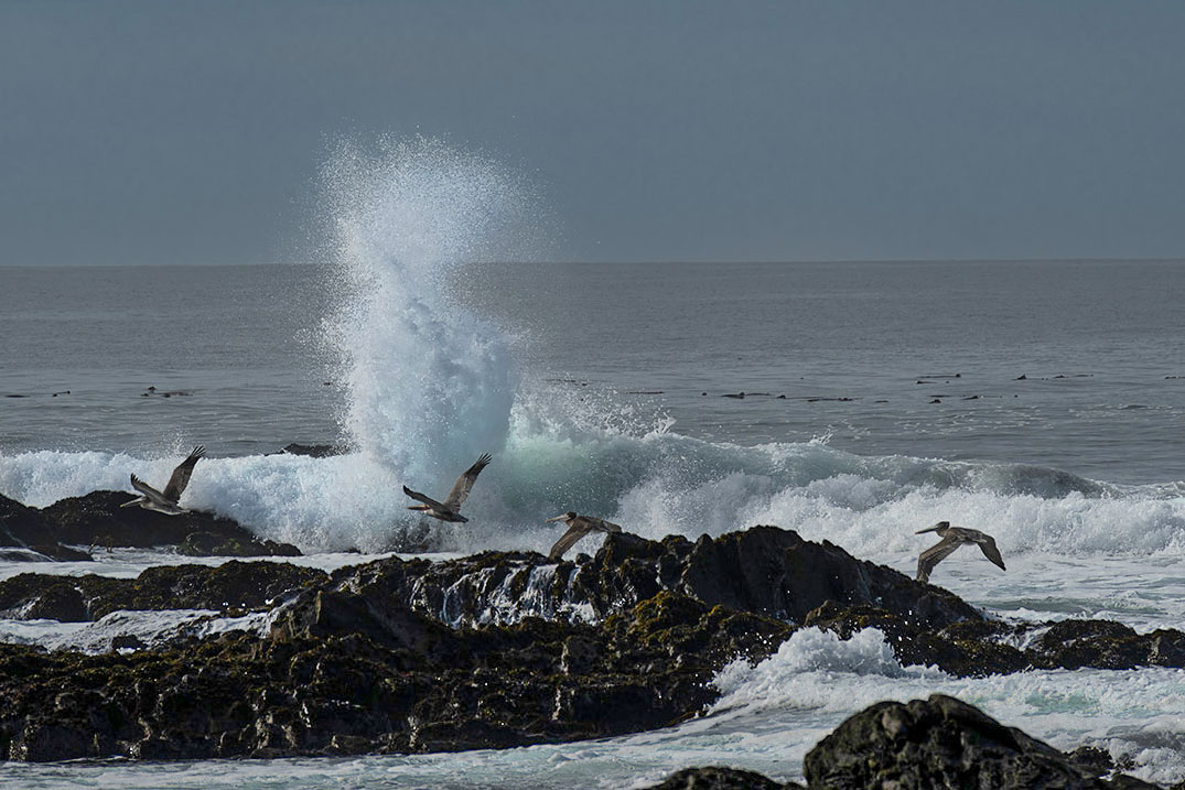
The CA coast certainly has an abundance of photogenic scenery. Good job of catching the pelicans in flight at the exact moment of that dramatic wave crashing against the rocks.
Overall I think you have a technically good image vis-a-vis exposure, sharpness and post processing. No complaints there! My only observation is that there seems to be an excess of sky and water that takes away some attention from the main event. So, I offer an alternate crop that brings the wave and birds more to the forefront. Let me know what you think. |
Jan 4th |
 |
| 3 |
Jan 24 |
Comment |
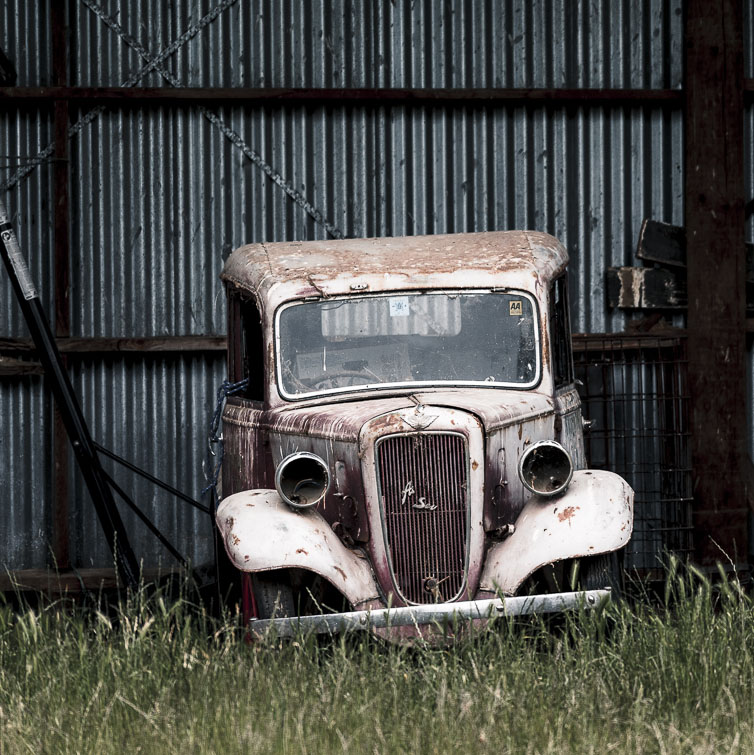
Hi David, and Happy New Year
I'm a big fan of decrepit vehicles and you've captured this one very nicely. I particularly like the color grading in the finished image as it lends a vintage "film look" and enhances the sense of age of the old vehicle. As far as I can see, everything else was handled in a technically excellent manner.
I'm curious as to what you see as being the subject? Is it the overall composition, or is it the truck? For me, I find the truck to have the most interest and I would therefore argue it is the subject. While the scene, as presented, adds some context, I find the prominent beam divides the image and diverts my attention away from the truck as I try to figure out what the heck that rusty box-like thing is.
So, my suggestion is to use the compositional element of "Fill The Frame" as I have presented below in my visual feedback. Please let me know if you think my crop enhances the narrative, or am I off base with what your vision is for this image. |
Jan 4th |
 |
| 3 |
Jan 24 |
Comment |
Hi Ruth and Happy New Year.
What a beautiful scene! You are so fortunate to live in an area with so much natural beauty. It is a nice composition and technically well done in-camera as well as in post. I particularly like how my eye flows through the image - first to the lake, then to the illuminated foothills and on to the mountains in the distance.
As far as suggestions, I notice the light in the foreground is quite flat and of even tonality. Also, most of the trees that are in shadow don't show much detail. I took the liberty of doing a bit more editing in Ps that included a linear gradient in the immediate foreground to darken and deemphasize it. Next I brightened the cloud reflections in the lake, the snow at the right and the sunlit areas in the distance. I finished it off with bringing up the shadows in the trees and hills to recover detail and then added a slight vignette.
|
Jan 3rd |
 |
| 3 |
Jan 24 |
Comment |
Hi Robert. Happy New Year!
Zion is such an amazing place with so many photographic possibilities. You've captured a wide perspective - even at 72mm! The image is well exposed and sharp and I like how you recovered the shadow detail in the cliffs on the right of the frame. The cloudless blue sky contrasts nicely with the yellow flowers in the foreground, creating a nice balance (although it would have added interest had there been some clouds. I wonder if you had considered doing a sky replacement?). The distinctly different colors of the foreground, mid- and background create a nice sense of depth. Well done. |
Jan 3rd |
| 3 |
Jan 24 |
Comment |
Hi Kieu-Hanh
There is so much wonderful architecture to see in Spain. Prior to seeing your image, I was not familiar with this building nor the architect. Good job on the perspective correction and nice exposure. It works well as a documentary-style architectural image. Thanks for sharing. |
Jan 3rd |
7 comments - 8 replies for Group 3
|
| 83 |
Jan 24 |
Reply |
Don, thank you for your comments and question. Answer is two-fold: Firstly, I was experimenting with the lens/camera combination to see how much DOF I could get with various focal length and aperture combinations. Secondly, for this composition, I didn't feel it necessary to have all the stalks in sharp focus and most importantly I wanted the background to be completely out of focus. I believe my focal point was the short stalk in the middle of the frame. Learning new gear can be a bit of a challenge that sometimes requires a fair amount of trial and error. I have a big trip coming up in Feb/Mar (India, Nepal, Vietnam and Singapore) and I want to be at least somewhat comfortable with my camera settings so as not to be fumbling around and missing "the shot". |
Jan 23rd |
| 83 |
Jan 24 |
Comment |
Mark, thank you for your kind comments, both regarding my photograph and regarding the conversation I started. I think it is important to have these sorts of dialogs. It is also nice that we have this forum to be able to exchange ideas and opinions. Differing opinions are valuable, especially when said opinions can be expressed rationally and respectfully, as we have done here. (Clearly that concept has all but disappeared in our politics!)
I have had lots of mentors over the years, many with whom I have not always agreed. But agreement / disagreement aside, I have ALWAYS learned something from them. I think the key is to keep an open mind and to think critically while always staying true to oneself. Alas, it is easier said than done��but I keep trying. Thanks for being a part of the group and sharing your thoughts. It is very much appreciated! |
Jan 21st |
| 83 |
Jan 24 |
Comment |
Hi Mark. Indeed, a lovely composition. The image has amazing depth and the many rock formations provide interest and give the eye much to explore. On my iPad, the image looks a bit soft, but I can't imagine your RAW file is anything but tack sharp. I attribute the softness I see to the low resolution requirements of this forum and the fact I'm viewing on an iPad. Very nicely done |
Jan 20th |
| 83 |
Jan 24 |
Reply |
Margaret, thank you for your comments. I can't say the pure blacks in my image are a result of Silver EFEX, per se. I think pure blacks and whites can be achieved using pretty much any post processing app. Due to the back-lighting and my chosen exposure,it was automatically rendered as a silhouette. Adjustments with the black slider,white slider and contrast completed the look. I find it easier to obtain that look in digital than in print. Printing is a whole other animal and an art unto itself. What app(s) do you use for processing your images? |
Jan 20th |
| 83 |
Jan 24 |
Reply |
Yes - good point. There are so many different ways to edit an image, all of which are fully dependent on the maker's intent and what story the maker wants to tell. |
Jan 17th |
| 83 |
Jan 24 |
Comment |
Here is my visual suggestion. |
Jan 8th |
 |
| 83 |
Jan 24 |
Comment |
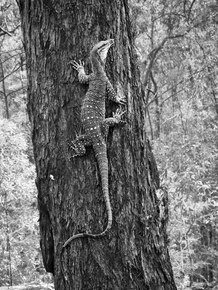
Hi Margaret
What an awesome capture! The light background sets the stage for the incredibly detailed tree trunk and lizard. Texture and contrast shine in this image. My only suggestion: Some judicious dodging of the lizard would help it stand out from the tree trunk. Otherwise, it is a lovely composition. Well done. |
Jan 8th |
| 83 |
Jan 24 |
Reply |
Lance, I appreciate the visual feedback offered. Creating the dark-to-light transition of the ceiling does make a huge difference! My eye was fooled by the stark contrast between the bright sky and black ceiling. |
Jan 8th |
| 83 |
Jan 24 |
Comment |
Hi Adi. I respect your opinion but I disagree wholeheartedly. My image was carefully composed to include the elements at the bottom of the frame. I feel strongly that those elements are needed to ground the image. In my opinion the branch forms a leading line and it balances with the dark reflection at the top. To me, your version is akin to cutting off the feet of people posing for a portrait. |
Jan 7th |
| 83 |
Jan 24 |
Reply |
Lance, thanks for the information. Although you didn't explicitly say so, I'm assuming all of the edits that happened after having scanned the negative were digital? If so, what distinction do you make between your adding a custom silver-copper tone vs. the addition of a film simulation filter?
This morning I came across this article that speaks to your recent essay. Very timely for you and the other group members:
https://fstoppers.com/opinion/crossroads-will-photography-diminish-or-evolve-652255 |
Jan 5th |
| 83 |
Jan 24 |
Comment |
Hi Lance, and Happy New Year!
You have presented us with a serene jungle scene. The striking tree with its wavy branches commands the viewer's immediate attention and holds interest. The form of the tree is enhanced by its contrast with the indistinct mass of the surrounding foliage and the curve of the trail brings the eye back to the tree for further contemplation. It is a lovely image with that certain je ne sais quoi that only an image shot with film can portray.
For me, the brightness at the top of the frame is a bit distracting....which brings me to a curiosity: Since you shot this with film, I assume you created the digital version by first scanning the negative...or did you print it first and scan the print? Is the image pretty much true to out-of-camera? If not, to what extent did you edit in post?Curious minds want to know! |
Jan 4th |
| 83 |
Jan 24 |
Comment |
Hi Don, and Happy New Year!
Reading into your description, I assume that the judges' low scores were NOT accompanied by a reason for said low scores. This is a frustrating problem for those of us who want to improve our photography. My camera club, for example, divides the tasks of commentary and judging between two different people and it's quite common to have the commentator sing an image's praises only to have the judge score it low. MADDENING! - not to mention unhelpful!
Regarding your image, I offer my humble, non-professional opinion:
WHAT I THINK WORKS WELL
1. The wonky camera angle works well for many street images
2. Triangles, creative framing, leading lines galore - good compositional elements
3. Good use of art elements: lines, shapes, tones
4. Appropriate exposure and range of tones of the "inside" portion of the image
5. Clear point-of-interest: The Ferris Wheel
6. Well presented here with a slight stroke to define the image boundaries.
AREAS OF POSSIBLE WEAKNESS
1. Your bias and emotional attachment to the place that a casual viewer can't know or understand
2. The wheel spokes appear to me to be ill-defined, overly bright with very little contrast between them and the sky
3. Cloudless sky too bright(?)... too much negative space(?)
4. What is the story and what is it that your viewer would find interesting?
5. Lack of a human element - catching a person ascending the stairs would add interest and strengthen the overall composition.
Two parting thoughts:
1. If YOU like the image, that's the only thing that matters!
2. I'd highly recommend the PSA Image Evaluation Course. It helped me a great deal and I'd like to think my images are better for having taken it. |
Jan 4th |
| 83 |
Jan 24 |
Reply |
Lance, thank you for your comments about my image and also for delving into my discussion topic. I'd like to play devil's advocate for a moment and challenge some of your points with a few questions (No disrespect for your opinions implied):
What would you say to an artist who paints in the "Photo-realistic" style? Would you say "Go get a camera"? Would it be "unfair" in a gallery setting to have one wall of photographs presented opposite a wall of photo-realistic paintings?
At what point does the digital photographic artist have a responsibility to disclose the digital techniques used to create the final artistic result? At what point in post processing does a "digital photograph" become rather a piece of "digital photographic art"? For all intents and purposes (vis a vis the end result), how does the application of a digital [fill in the blank] filter differ from an in-camera multiple exposure, or an in-darkroom composite image? Finally, why should an artist even be obliged to disclose his/her process?
��just more questions to inspire even more discussion��
|
Jan 3rd |
| 83 |
Jan 24 |
Comment |
Hi Adi, and Happy New Year! I am a big fan of reflections and your image is a wonderful capture. I think the composition works really well and leaving the upper windows was definitely the right decision. Excellent job with the perspective correction! I'm curious, though, about the asymmetrical crop that leaves the brick on the right of the frame compared to the left where the crop is tight to the window - was that intentional?
I am confused by your assertion that the point of interest is on the left corner... I'm not seeing it. But rather, I find the reflection of the Empire State Building (?) in the RIGHT corner to be of much greater interest than the left corner. Overall, the entire image is sharp with nice tonal balance. The wavy abstractions formed by the reflected buildings plays well against the static brick and window frames. Nicely done, indeed! |
Jan 1st |
8 comments - 6 replies for Group 83
|
15 comments - 14 replies Total
|


