|
| Group |
Round |
C/R |
Comment |
Date |
Image |
| 3 |
Dec 23 |
Comment |
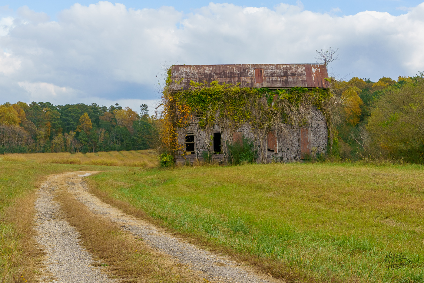
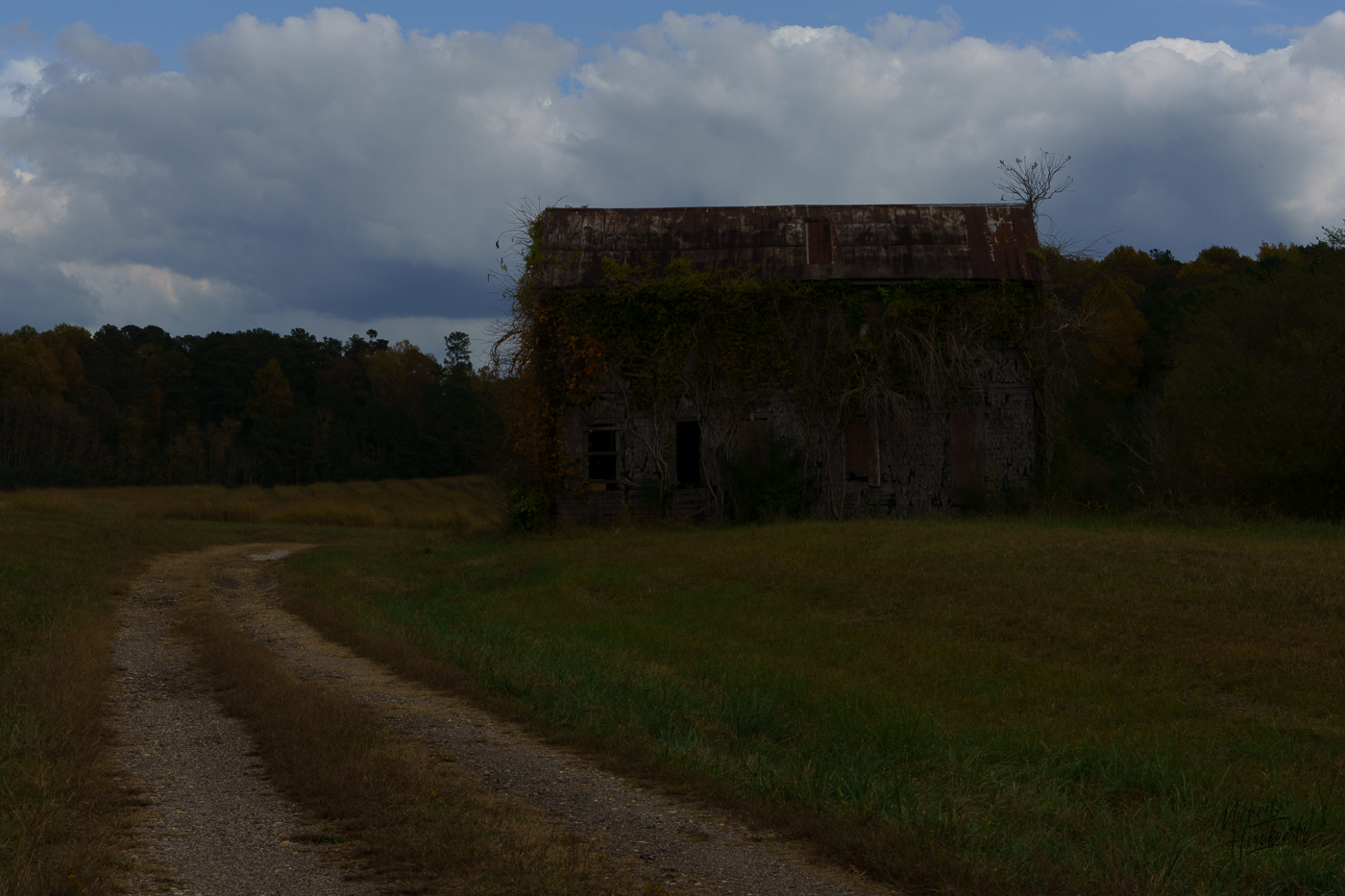
Butch, I was shooting with my APSC 18-135 lens on my full frame body. Focus point was the intersection of the grass and the house. I set my exposure bracket function to -1 - 0 - +1 and then combined the three RAW images in LrC. |
Dec 19th |
| 3 |
Dec 23 |
Comment |
Butch, I was shooting with my APSC 18-135 lens on my full frame body. Focus point was the intersection of the grass and the house. I set my exposure bracket function to -1 - 0 - +1 and then combined the three RAW images in LrC. |
Dec 19th |
| 3 |
Dec 23 |
Reply |
|
Dec 17th |
 |
| 3 |
Dec 23 |
Reply |
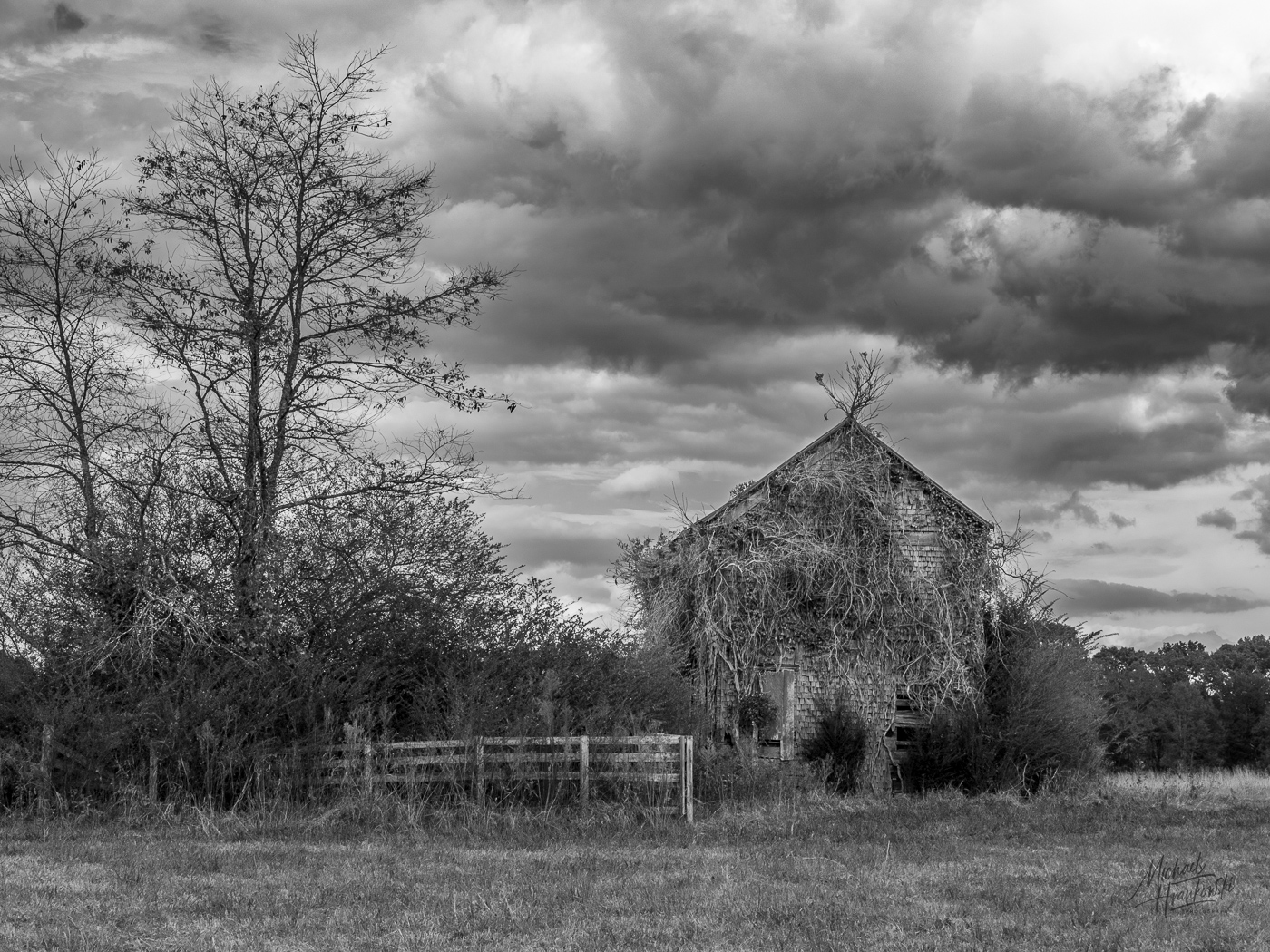
Robert, attached are two additional images - the middle shot of the series and the color HDR one. The color HDR looks garish and unnatural but it translates well into monochrome. Thanks for your comments. |
Dec 17th |
 |
| 3 |
Dec 23 |
Reply |
Thanks, Mary Ann. I appreciate your comments! |
Dec 17th |
| 3 |
Dec 23 |
Reply |
Yes, me too! I went so far as to put a tiny label on the back of my new camera that says SLOW to remind me. |
Dec 17th |
| 3 |
Dec 23 |
Reply |
Kieu-Hanh. Wow! I had no idea. How is it that you know of this building and its history? The property is currently called Gold and Grass Farm and is owned by a man in my friend's Rotary Club. Apparently my friend was unfamiliar with the property's history. Fascinating to read on Wikipedia.
Thank you for your comments. Some additional information: My image was carefully composed in-camera to capture the leading line of the road and give a pleasing balance between foreground, subject and sky. The presence of the substantial fence precludes the freedom to move about and capture alternative framing (unless one had the resources to rent out the property for a photo shoot).
Can't do much about the fact that the owner keeps the area mowed. In my opinion there is no incongruity. If anything I feel it strengthens the story with the contrast between the building preserved in its decay and the surrounding area being more or less well-maintained. |
Dec 12th |
| 3 |
Dec 23 |
Reply |
Kieu-Hanh, I've attached a different shot of the same house taken from the side perspective. Although one can still see some mowed grass, the chaotic foliage at the left of the frame might be more in keeping with the theme of "old and abandoned". What are your thoughts on this composition? |
Dec 11th |
 |
| 3 |
Dec 23 |
Reply |
Kieu-Hanh. Wow! I had no idea. How is it that you know of this building and its history? The property is currently called Gold and Grass Farm and is owned by a man in my friend's Rotary Club. Apparently my friend was unfamiliar with the property's history. Fascinating to read on Wikipedia.
Thank you for your comments. Some additional information: My image was carefully composed in-camera to capture the leading line of the road and give a pleasing balance between foreground, subject and sky. The presence of the substantial fence precludes the freedom to move about and capture alternative framing (unless one had the resources to rent out the property for a photo shoot).
Can't do much about the fact that the owner keeps the area mowed. In my opinion there is no incongruity. If anything I feel it strengthens the story with the contrast between the building preserved in its decay and the surrounding area being more or less well-maintained. |
Dec 11th |
| 3 |
Dec 23 |
Reply |
Fair enough critique of my edit - I did it quickly. I think the unnatural appearance comes from how bright I made the subject. I remember now that in addition to darkening the background, I also increased the exposure on the woman and bike - clearly by too much. With a little more time spent, I bet you could do a much better job than I did in my example. |
Dec 3rd |
| 3 |
Dec 23 |
Reply |
I love it! |
Dec 2nd |
| 3 |
Dec 23 |
Comment |
Kieu-Hanh, Your response is fair enough. For a different perspective on architectural photography, check out the work of Sharon Tennenbaum from Vancouver, BC. Her work is truly inspiring (to me). She as well as other photographers who specialize in the architectural genre often do extensive post processing, including perspective correction, to achieve their signature "look". Not right nor wrong - just another way of looking at it.
It's clear from your response that you went through a thought process to achieve your result, so you are to be commended for that! |
Dec 2nd |
| 3 |
Dec 23 |
Comment |
Hi Mary Ann
I am really enjoying your image and I think you have done a really nice job in the capture and edit. I particularly like how you brought out and separated the colors in the foliage - it really makes your image pop.
With respect to your original composition and your as-presented crop, I find it too tight. The tree tops seem too close to the frame and, to my eye, your crop eliminates some needed foreground to give the composition some balance.
FOR ILLUSTRATIVE PURPOSES ONLY, I used the Generative AI function in Ps to add some sky to simulate how you might have recomposed the image on-site (either by use of a wider focal length or a different camera position. Curious what you think? |
Dec 1st |
 |
| 3 |
Dec 23 |
Comment |
Hi Robert
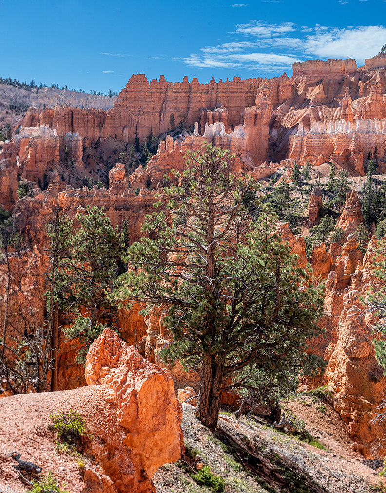
Your image certainly captures the beauty of Bryce Canyon. It seems well exposed for the time of day and it is sharp from foreground to background.
I'm curious, though, what you see as the subject of the photograph? The tree & rock? The hoodoos in the distance? What are you trying to convey to the viewer? These are great questions to ask oneself while contemplating a composition (and questions I often forget to ask myself!!).
To my eye, I see the tree and rock as the point of interest in this image with the hoodoos and sky as secondary elements. As such, I find myself wanting to see much more foreground and much less sky. Choosing a much lower camera angle (you might have to sit on the ground) would have allowed you to include more foreground and therefore more interest.
For ILLUSTRATIVE PURPOSES ONLY*, I used the AI Generative Fill function in Ps to offer an alternative composition. Curious what you think?
*NOTE: I do NOT advocate the use of AI for the purposes of "fixing" a photograph or to add things that did not exist at the time of capture. Such images, if shown, should be clearly labeled as having been AI-altered. |
Dec 1st |
 |
| 3 |
Dec 23 |
Comment |
Hi David. I'd say your panning skills are pretty darn good. I like the composition and how you got your subject sharp and achieved the (camera)motion blur in the background.
To my eye the background illumination seems a bit bright and doesn't allow your subject to stand out. I took the liberty of providing some visual feedback. In Ps ACR I selected the subject and then copied and inverted the mask. I decreased the highlights and exposure slightly. Next I used the linear gradient at the bottom of the image to darken the foreground to direct the viewer's eye to the subject. Lastly, I used the brush tool to further decrease the remaining overly bright areas. Please let me know what you think. |
Dec 1st |
 |
| 3 |
Dec 23 |
Comment |
Hi Kieu-Hanh
To be frank, and at the risk of sounding overly critical, I have to say I'm disappointed in your image this month, as I don't think it reflects your best work. You are capable of so much more! Your camera positioning and in-camera composition are so far off that it is impossible to correct the wide angle distortion in post processing. I brought the image into Ps and attempted a perspective fix, but nothing I could do would equalize the horizontal with the vertical.
I have certainly taken my share of poor photographs and I've learned that trying to resurrect a poorly composed and/or captured image in post processing is most often an exercise in futility. When that happens, it is often best to give up and select a different image and I think this is one of those situations. |
Dec 1st |
| 3 |
Dec 23 |
Comment |
Stunning image, Ruth!
Ideal conditions - fantastic light; lovely composition and skillful editing. Only one picky suggestion: Cabin seems a little dark so you might consider a slight + bump in the shadows and/or exposure. Other than that, a beautiful image to view! |
Dec 1st |
8 comments - 9 replies for Group 3
|
| 8 |
Dec 23 |
Comment |
Beautifully done ICM image! I'm not very experienced with night/low light photography, so your image inspires me! |
Dec 17th |
1 comment - 0 replies for Group 8
|
| 10 |
Dec 23 |
Comment |
Hi Rich. Thanks for posting this image. As far as critique goes, I will just say the other group members have made some good observations / suggestions.
Beyond those comments, I just wanted to say your image brings back vivid memories for me. When I was 19 yrs old in 1974 I and a buddy had the opportunity to live and work in (West) Germany for an entire summer. The factory where we worked closed for a three-week "Betriebsurlaub" so we hopped a train and went to Berlin. We crossed through Checkpoint Charlie into East Berlin and one of the first things we saw was the bombed out skeleton of the Berliner Dom. We sneaked through a hole in the chain link fence and went inside and I cried upon seeing the ruins. (Unfortunately my photos from there were lost). Then, in 2010 I had the opportunity to return to Berlin and view the newly-restored Dom. Thanks again for sharing your image. |
Dec 17th |
1 comment - 0 replies for Group 10
|
| 49 |
Dec 23 |
Comment |
Hi Stephen. What a beautifully crafted image. It indeed does look like an impressionist painting and your post-processing is spot on. Can you give some details about how you did post-process it? I particularly like the simple palate of soft golden and blue tones that go well with the simple composition. Very nicely done! |
Dec 18th |
1 comment - 0 replies for Group 49
|
| 55 |
Dec 23 |
Reply |
Come visit me in Groups 3 & 83. I'd welcome your comments! |
Dec 19th |
| 55 |
Dec 23 |
Comment |
Hi Butch. Awesome capture! Love the composition and monochrome was definitely the right choice. Excellent tonal range; beautiful contrast and nicely post-processed. Congratulations on a very well crafted image! |
Dec 18th |
1 comment - 1 reply for Group 55
|
| 83 |
Dec 23 |
Comment |
Butch, thanks for your perspective on my image. Any and all feedback totally welcome! I often struggle with how much context to include. In my professional career I shot macro daily for thirty some odd years and I've gotten feedback that I ought consider including more context in my images when doing so would enhance the story.
Your version certainly works - and I had considered a tighter crop while editing. In the tight crop version, the story is focused entirely on the two people. In the wider version, the story becomes not only about the two people but also about their relationship to the larger, empty space as a whole - which is the story I ultimately wanted to tell. Thanks again for your commentary and visual feedback. |
Dec 19th |
| 83 |
Dec 23 |
Reply |
Yes��it is, unfortunately, one of those "you-win-some-and-you-lose-some" kind of images of which I have had so many. Of course, what's most important, is that the image means something to you. And, if you had fun taking the image and learned something as a result��well, that's really all that matters. I enjoy your work and look forward to seeing what you come up with each month. |
Dec 13th |
| 83 |
Dec 23 |
Comment |
Lance, I find this to be an intriguing study of form, texture, light and shadow. I particularly like how the branches of the main tree seem to morph into the wispy clouds as the eye moves from right to left. Silly question: was that in the back of your mind whilst composing the image? It is a lovely, balanced composition. |
Dec 8th |
| 83 |
Dec 23 |
Comment |
Hi Margaret. You've created a technically well done image. I like the abstract background formed by the reflections and shadows of the ripples and I think the subject is well placed in the frame. Beyond that, however, for me it's just a picture of a woman floating in the water and I don't really get a story out of it. |
Dec 8th |
| 83 |
Dec 23 |
Comment |
Adi, what a lovey study of lines, light and shadow! Thanks for mentioning TAKING YOUR TIME with the composition. You have captured the perfect perspective and have reminded me that slow and thoughtful takes the day. After a recent presentation by one of my mentors, I made a tiny label that I adhered to the back of my camera. It says: "SLOW" |
Dec 8th |
| 83 |
Dec 23 |
Reply |
Thanks! |
Dec 8th |
| 83 |
Dec 23 |
Comment |
Debasish, I, too, love the texture and form as well as the simple composition. Nice job with the focus stacking. There can indeed be beauty in decay. I agree with Adi that it does come across as a bit two-dimensional��.but I'm no expert at lighting and I'd be hard pressed to know what to do to differently. My only suggestion has to do with presentation on PSA-DD: The black background isn't conducive to showcase images with dark or black backgrounds, as the framing tends to disappear. In this case a thin, medium gray stroke would help frame your image on the page. |
Dec 8th |
| 83 |
Dec 23 |
Comment |
Hi Don. Ditto on the other two comments. Cropping down from the top to make more of a panoramic presentation would be a good thing. Except, I most certainly would not add any dehaze. The fogginess in the background adds mood and helps direct the eye to the main point of interest. Beautiful image and very nicely done! |
Dec 8th |
| 83 |
Dec 23 |
Comment |
Mark, I find this to be an intriguing image. I looked at it for quite some time trying to figure out what I was actually looking at in the foreground especially. That is to say It held my interest. And my brain still can't reconcile it even after reading your description. It forms an abstract landscape with the overall lack of sharpness (was that on purpose or accidental??) and grain contributing to the moody, almost-other-worldly presentation. |
Dec 8th |
| 83 |
Dec 23 |
Reply |
Hi Mark. No worries. I appreciate your honesty.
Since this forum is about getting feedback about how others view our work, more helpful would be for you to expound a bit more with your comments. What about it doesn't work for you? Is it the genre? Subject matter? Style? Composition? If you had been there with camera in-hand, is the scene something you would photograph? If not, why not?
Equally important would be for me to understand what it DOES take for an image to resonate with you? Mind you, I'm not asking these questions to challenge you because I'm offended by your comment - I'm most certainly not. But rather knowing the answers will help me better understand your thought processes as they pertain to YOUR work. I look forward to your additional commentary. |
Dec 8th |
| 83 |
Dec 23 |
Reply |
Stephen, I think cropping from the top did improve the composition. Regarding the bottom, my original had a negative linear (diagonal) gradient to darken the wedge. In this image I did the reverse, and I like it better. |
Dec 4th |
 |
| 83 |
Dec 23 |
Reply |
Thanks, Stephen. Appreciate the comments. And yes, as I look at it again I think I ought to have eliminated entirely the soffit at the top of the frame. Initially I chose to simply darken it with a gradient, but it didn't serve to completely eliminate the distraction. As to the bottom, I cropped it so the ramp would emerge from exactly the corner of the frame, but the wedge below the ramp I see now doesn't add much of anything to the composition. Based on your recommendations, I'm going to have another go at it. Thanks again. |
Dec 3rd |
7 comments - 5 replies for Group 83
|
19 comments - 15 replies Total
|