|
| Group |
Round |
C/R |
Comment |
Date |
Image |
| 3 |
Oct 23 |
Comment |
Thank you, Joan. I appreciate your comments. I wish your husband a speedy recovery. -all the best |
Oct 24th |
| 3 |
Oct 23 |
Comment |
Thank you, Joan. I appreciate your comments. I wish your husband a speedy recovery. -all the best |
Oct 24th |
| 3 |
Oct 23 |
Reply |
Hi Mary Ann and thank you for your comments. I feel lucky to have been able to pull this image out of the underexposed RAW file. In an ideal world I would have used a tripod and taken multiple exposures and blended them��but sometimes one has to work with the equipment at hand. |
Oct 22nd |
| 3 |
Oct 23 |
Reply |
Hi Mary Ann and thank you for your comments. I feel lucky to have been able to pull this image out of the underexposed RAW file. In an ideal world I would have used a tripod and taken multiple exposures and blended them��but sometimes one has to work with the equipment at hand. |
Oct 21st |
| 3 |
Oct 23 |
Reply |
Ruth, thank you for your comments. Editing for me has certainly been a big learning curve. Unlike many other photographers, I rather like the editing process. I can spend an hour or more with just one image I'm trying to perfect and many times I still don't get it the way I want it. In any event, editing keeps me busy and out of trouble LOL! |
Oct 21st |
| 3 |
Oct 23 |
Reply |
Robert, I am wondering what you think about this rendition? I took it into Photoshop and increased the canvas size and filled the blank areas with the background color (select > content aware fill) That gave me room to crop and rotate the image. I think the square crop allows the flower to more fully fill the frame and allows the viewer to more fully appreciate your beautiful image.
|
Oct 12th |
 |
| 3 |
Oct 23 |
Reply |
Ruth, thank you for your comments. Here's what I can tell you about the edit and what I learned in the process:
First off, my initial mistake was thinking I could take this dark image and use mostly global edits to accomplish the intended result. That absolutely didn't work. I had exposed for the window and the exposure disparity between it and the rest of the scene was too great. Trashed that attempt and started over.
The trick was to do a series of local adjustments. All told, I had a series of 16 different masks, each with multiple adjustments. I started out with a 100% mask and then subtracted out the window using the "object" tool in Lr. This enabled me to bring up the shadows and exposure to be more balanced in relation to the window. From there I masked individual regions of the image to further balance exposure and bring light to specific areas to enhance the feeling of depth. |
Oct 12th |
| 3 |
Oct 23 |
Reply |
Hi Robert and thank you for your comments. Yes, you are absolutely right. I'm not sure why I didn't do as you suggested, but having a series of bracketed exposures for merging would have definitely made my editing job much easier.
Regarding the lack of noise... there was actually a LOT of noise, especially in the shadows (which was almost the entire image!). After all my edits were complete, a run through Topaz DeNoise AI did the trick. |
Oct 12th |
| 3 |
Oct 23 |
Comment |
Hi Joan.
You've captured a lovely seascape that exhibits several compositional / artistic elements: You have texture, contrast, and color. The image is sharp throughout (on my tablet I cant discern if the foreground is slightly soft?). There is nice separation between the fore-, mid- and background elements that creates a sense of depth in your image.
My only other observation is the crop seems a bit tight and I would have liked to have seen a little more room on the left and top of the frame. Nicely done. |
Oct 11th |
| 3 |
Oct 23 |
Reply |
Robert, the concept of flipping an image for "ease of viewing" has been an oft-discussed topic - here and in camera club. It has to do with the fact that for western eyes we read from left to right. It follows that a leading line that starts at the lower left of the frame and leads the eye to the point of interest is easier to view.
The concept does have its limitations, such as well known subjects (most often landscapes or other landmarks). We also tend to think flipping our own photos looks "off"��but that's simply because we remember the orientation as we shot it. I agree that Kieu-Hanh's flip does make the image easier to read.
Please don't be discouraged! We've all had to learn these lessons and you are doing well! |
Oct 11th |
| 3 |
Oct 23 |
Reply |
Thank you, Kieu-Hanh. To answer your question, I took the image on as a challenge to test my skills. After working on the image a while I wound up trashing my first edit and started over from scratch. I took an online course that taught a very different way of editing in Lr from what most other "experts" teach and I wanted to see what could be done. I'm glad you like it. |
Oct 8th |
| 3 |
Oct 23 |
Comment |
Hi Mary Ann,
Your image made me smile��.talk about capturing "the decisive moment"! The exposure and focus on the animal's face is spot-on. Nicely done!
I'm curious about the appearance of the background. In your final image it looks like there are a lot of artifacts�� but in your original it looks like maybe a fence in the background giving that effect?
Since the animal's face is the point of interest, you might consider an alternate crop using the compositional element of "fill-the-frame". A square, tight crop on the animal's head would really call attention to that amazing tongue!
Crop ratio aside, you've captured a delightful animal portrait. |
Oct 8th |
| 3 |
Oct 23 |
Comment |
Hi Kieu-Hanh. I like what you've done with this architectural image. I've always been a fan of Calatrava's architecture - architecture which really lends itself to photographing. In your rendition, you have created a high-key abstract of sorts. Lovely leading lines and nice use of repetition as compositional/art elements. Nicely done. |
Oct 8th |
| 3 |
Oct 23 |
Comment |
Ruth, what a beautiful, dramatic image! You have used several compositional and art elements to your advantage: The rule of odds (I'm including the snag on the right as part of the 3rd tree), placement of the horizon line, use of texture and contrast - all combine to make this a successful image.
I agree with your choice of monochrome for this image and I particularly like the beautiful, strong contrast in the tonal range. Nicely done! |
Oct 8th |
| 3 |
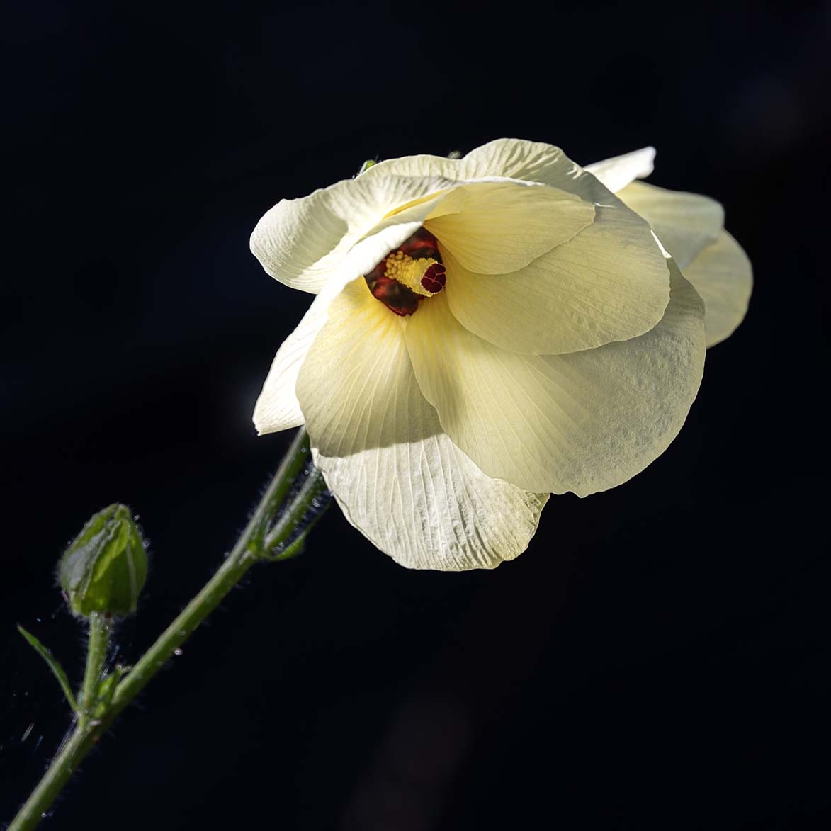
Oct 23 |
Comment |
Hi Robert. Thank you for sharing your photograph of this lovely flower. I had never before seen an okra flower and thought at first it was a hibiscus. What strikes me most about your image is how you captured the beautiful, natural light. The colors are soft and creamy and there is nice detail in the petals.
Some observations for your consideration: I notice there are two areas on the flower where the highlights appear blown out. Exposing for the highlights is generally recommended and using the Zebra function on your camera can assist in choosing the correct exposure. The rest of the flower is nicely exposed.
I also notice that the very center of the flower is slightly soft - most likely due to the f/6.3 aperture. Using a smaller aperture such as f/11 can help with that.
I really like the black background in your image, as it really makes the subject stand out. For better or worse, the PSA Digital forum also has a black background which completely eliminates the framing of images that also have black backgrounds. For presentation here, it helps to put a subtle stroke on your frame. |
Oct 8th |
8 comments - 8 replies for Group 3
|
| 83 |
Oct 23 |
Comment |
G'day, Margaret! You have captured a wonderful documentary-style photograph - a genre I don't recall seeing much of on the DD forum. How refreshing! I am particularly impressed with your exposure, as it appears the scene may have had some challenging lighting conditions. Equally impressive is the broad tonal range, depth of focus and the detail you have captured.
Your composition is particularly strong and engaging. The children and their chaperones form a line for my eye to follow and the group holds my attention and interest. Nicely captured, edited and presented! |
Oct 13th |
| 83 |
Oct 23 |
Reply |
Hi Margaret and thank you for your kind words. To answer your question(s):
Sony a7RIV, 1/500 sec at f/4.0, ISO 100; Sony FE 24-105mm F4 G OSS shot at 105mm
I shot the image with 100% natural light as the filtered sun fell on the cluster of leaves and flowers. I did, however, enhance the appearance of light with some judicious local adjustments. In the color original after an initial global adjustment, I applied eleven additional local masks to bring out the light and depth. I also flipped the image, as I thought it read better. All these adjustments were done in Lr. I briefly took the image into Ps for a few more tweaks.
The B & W conversion was done back in Lr after the Ps adjustments. Final B & W was achieved with an additional three local masks. |
Oct 12th |
| 83 |
Oct 23 |
Comment |
Hi Mark. WOOF!
What a nice portrait of this happy dog! I like how you've creatively framed him between the trees - a technique that helps draw the eye to the subject. The sharpness of the face contrasts nicely to the softness of the periphery and background.
As far as things that may serve to enhance your image, I notice a couple of things: To me, some of the highlights seem overly bright and the dog's eyes seem dark. You might consider some slight burning of selected highlights and dodging of the eyes. Picky things to be sure. Either way, it is nicely done. |
Oct 10th |
| 83 |
Oct 23 |
Comment |
Hi Debashish.
Visiting Jasper and Banff are on my travel list and your image this month has encouraged me to make that happen!
I particularly appreciate the exposure that has rendered a totally natural appearance to the snow without blown-out highlights. Likewise, the contrast and broad tonal range enhance your composition. It is truly a beautiful scene.
As I look at your image I notice a couple things: Firstly, to me, the sky seems - for lack of a better word - indistinct. You might consider some additional editing here to bring out more detail and contrast in the sky/clouds as I think it would enhance the composition.
Secondly, the upper left seems overly dark to me. The mostly black mountain flows into the deep shadows of the forest creating a lack of separation. You might consider lightening the mountain somewhat to enhance the sense of depth of that portion of your image.
These things aside, it is a sharp, well exposed and well composed image. Thank you for sharing. |
Oct 10th |
| 83 |
Oct 23 |
Comment |
Hi Don
I'm really enjoying your image this month. It exhibits excellent sharpness and a pleasing, wide tonal range. Although you didn't list it, it would appear you used a fairly wide angle lens which gives an interesting perspective that emphasizes the front of the subject. You have also done a nice job of balancing the exposure and tones of the foreground, subject and background. The dramatic sky with its looming dark clouds serve to enhance the story of the wreck. Nicely done (especially in the removal of those pesky tourists!) |
Oct 10th |
| 83 |
Oct 23 |
Comment |
Lance, this is exquisite! Moody, contrasty, (real) film grain. Although the highlights on the left side are completely blown out, it is simply another example of how going against the conventional (so-called) "wisdom" can really work. My only wish about your composition would be this: I notice the reflections of the two central trees are cut off and I might have liked to see the full reflection. A minor personal preference detail that does not really affect the impact of this beautiful image. Very nicely done. Did you do the darkroom work yourself?
It seems to me judges are often overly concerned with bright spots (i.e., "blown out highlights") in an image. Many times as we seek to capture a scene in nature, we are faced with naturally occurring bright areas, as in your image here. That's what you saw and that's what you captured... so I fail to see why it's usually cited as a problem. Clearly, I'm not speaking to technical errors in exposure or post-production. Your thoughts? |
Oct 2nd |
5 comments - 1 reply for Group 83
|
13 comments - 9 replies Total
|


