|
| Group |
Round |
C/R |
Comment |
Date |
Image |
| 3 |
Sep 23 |
Reply |
Not my favorite either�� |
Sep 25th |
| 3 |
Sep 23 |
Reply |
Thanks, Joan. Good idea about removing the pillars. |
Sep 25th |
| 3 |
Sep 23 |
Reply |
No clue either. It's not the camera - not had that issue and the original RAW file is clean. Most likely an artifact from something I did while editing. |
Sep 25th |
| 3 |
Sep 23 |
Comment |
Joan, what a great portrait! Exposure, focus, color and edit simply spot-on. Really nicely done. (But since you were at a Pride Parade, is it really a STRAIGHT shot??? LOL) |
Sep 18th |
| 3 |
Sep 23 |
Reply |
And here is the mono version |
Sep 18th |
 |
| 3 |
Sep 23 |
Reply |
Here is a reworked color version (not sure what is causing the funky stripes on the left of the frame. ...any ideas?) |
Sep 18th |
 |
| 3 |
Sep 23 |
Reply |
Mary Ann, I just learned how to use a Lightroom feature that I had not understood and therefore simply ignored. It is the "intersect" feature in masking. YouTuber, Anthony Morganti just did a short video on it and it can do some interesting things when trying to separate foreground from background and make it look natural. You might want to check it out. |
Sep 17th |
| 3 |
Sep 23 |
Comment |
Hi Mary Ann
Good on you for capturing this little guy - he's in perfect focus. The goldfinches in my neck of the woods are flighty little things that don't stay in one place but for a few seconds.
I like your composition and the 1:1 crop. Everything except the bird is in soft focus or blurred, allowing my eye to land immediately on the subject. It is a nicely captured image.
My only suggestion is to increase the exposure on the bird as LuAnn has done in her visual feedback. |
Sep 10th |
| 3 |
Sep 23 |
Comment |
Hi Kieu-Hanh
This building makes for an interesting architectural study. The repeating arches and the courtyard patterns are strong artistic elements in your image. The photo is sharp and you've done a good job of equalizing the exposure in the building and courtyard, especially given that the original image was a bit over-exposed. You have also done a good job of correcting the perspective from the original.
I do have some additional observations. Firstly, I notice the sky seems bright to me and the central white cloud is verging on being blown out. I'm also noticing a couple of dust spots and a small black spot (a bird?). Secondly, the loudspeakers(?) seem out of place and they create for me a distraction that lessens my ability to appreciate the beauty of the scene. Lastly, I notice the lighting overall is very flat.
I know that you like to portray your images as close as possible to what your eyes saw, so in that respect I think you accomplished your intent. In my visual feedback I took your image in the opposite direction in an attempt to add some light and depth to the building and courtyard by reimagining it as an evening scene. If you were to do a different edit, how would you reimagine it?
|
Sep 9th |
 |
| 3 |
Sep 23 |
Comment |
Hi Ruth,
A very nice shot of an unusual and interesting bird. It is a pleasing composition with lovely colors. The bird is in sharp focus and the background is just soft enough as to not be distracting.
I echo Robert's and LuAnn's suggestion of bringing up the exposure a bit. Other than that, very nicely done. |
Sep 9th |
| 3 |
Sep 23 |
Comment |
Robert, fresh figs are one of my favorite fruits. Before moving to our current home, I had a tree of the variety called Nordland. The figs grew so large that one would fill the palm of my hand. They tasted like honey. I took a cutting and now have a large tree but alas the difference in micro climate from our old house to the new one is such that they don't ripen well.
As far as a discussion about your image, there is nothing more I can add that LuAnn hasn't already said. She is a master when it comes to still life composition and lighting. I would love to see you do another fig composition following some of LuAnn's suggestions. Keep at it and most importantly, have fun! |
Sep 9th |
| 3 |
Sep 23 |
Comment |
Hello LuAnn
The first thing I notice is how clear and crisp your image is and how natural the colors are. While the original is underexposed, your minimal Lr adjustments have resulted in a beautiful, balanced exposure. The composition has multiple layers - all of which are in sharp focus. This has the effect of drawing my attention into the image and keeping it there.
To be honest, your choice of crop doesn't work for me. I kept going back and forth between the camera's ratio and your cropped version but I couldn't figure out what was bugging me��then it hit me. The 16:9 crop has cut off the feet, as it were, of the gate posts. Since the gate is a big part of the story, seeing it in its entirety seems to work better for me. Additionally, keeping the full frame as registered, adds the leading lines of the walkway's border stones which, for me, gives my eye a place to enter the frame and "walk" through the gate.
Crop notwithstanding, it's a lovely, peaceful image. Maybe there IS something about a Leica camera in the hands of an artist who know how to use it!. Well done. |
Sep 9th |
| 3 |
Sep 23 |
Comment |
Hi LuAnn. Thanks for your comments and observations. As mentioned, this was taken in the last few minutes of Golden Hour. I will have to go back to see if I can't add some richness to the tones. With regard to the sun reflection - I captured it just as "too bright and too large" as it was in person. The reflection, in my view, is the story.
I do happen to have a B & W version. It is interesting and I'll post it when I get back to my desktop computer. I chose the color version as it better represents to me the "Twilight of the Gods". |
Sep 8th |
7 comments - 7 replies for Group 3
|
| 83 |
Sep 23 |
Reply |
Thank you Lance. I think those are, indeed, points for me to ponder. I admit that my evolving "style" seems to be toward imagery with higher contrast. |
Sep 24th |
| 83 |
Sep 23 |
Reply |
Thank you, Debasish. I took several shots of the staircase and played around with orientation in post. This one seemed to work the best. |
Sep 22nd |
| 83 |
Sep 23 |
Reply |
Margaret, thank you for your comments. I've always been intrigued by images depicting stairs - spiral stairs in particular. This was the first time I had an opportunity to photograph one. Editing was a bit of a challenge and it took me a long time in Photoshop to remove the distracting stack of modern chairs at the bottom of the staircase. |
Sep 22nd |
| 83 |
Sep 23 |
Comment |
Lance, it is a lovely image. The multitude of twisting branches create endless paths for my eye to explore. Your image has good contrast without losing detail due to the back lighting. It is very contemplative and nicely done.
The compositional element of left vs right comes up frequently in camera club and most recently during my PSA Image Evaluation Course I just completed. As Westerners who read from left to right, it is often suggested that an image with a leading line that starts at the lower left of the image is easier for the eye to follow than if the line starts at the lower right. I took the liberty of flipping your image and would love to hear your thoughts on left vs right. |
Sep 10th |
 |
| 83 |
Sep 23 |
Comment |
|
Sep 10th |
 |
| 83 |
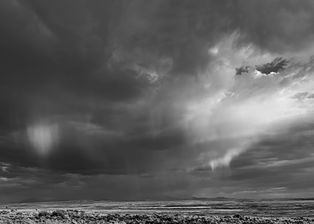
Sep 23 |
Comment |
Hello Mark,
I'm often caught on the horns of a dilemma when viewing a given scene in color along side the monochrome counterpart. As Lance so often points out, we ought not be comparing one to the other as to which is "better", because they are two separate animals, each with their own merits. That said, I still find it difficult to refrain from making the comparison. So, I confess that I prefer the original color version.
In your monochrome version, the beautiful golden hour light on the plain seems to get lost. While I see and appreciate lots of texture, the impact of that golden light doesn't translate for me. In the absence of the foreground color, my eye is drawn immediately instead to the brightest portion of the sky in the upper right. The monochrome version then becomes for me more about the sky than the land.
In my visual feedback, I cropped such that the sky becomes the subject and the land plays the supporting role. It must have been amazing to witness the scene in person.
|
Sep 10th |
| 83 |
Sep 23 |
Comment |
Hi Debashish.
You've captured a really nice travel / street image that is poignant in light of the recent devastating earthquake in Morocco.
Your composition is very pleasing and your patience to wait and include the woman sweeping the entrance is a decisive moment. I also like how well you balanced the exposure from inside to outside.
I do find the other two people in the frame to be slightly distracting and if it were me, I would have attempted their removal. But...one could certainly argue their inclusion is part of the story. And, if I am not mistaken, according to PSA rules, if you were to enter this into competition, the people need to stay. In any event, I respect your decision to leave them in. Regardless, it is a successful image. |
Sep 10th |
4 comments - 3 replies for Group 83
|
11 comments - 10 replies Total
|


