|
| Group |
Round |
C/R |
Comment |
Date |
Image |
| 3 |
Aug 23 |
Comment |
Hi Kieu-Hanh. Spain is one of my all time favorite countries to visit - I could easily live there. You have captured a quaint scene of this village and I am impressed with the color, detail / focus and tonal range - all from your iPhone!
Your image has nice leading lines - the boats and the roadway all converge and take the eye up to the town. The converging lines and the shape of the town itself form multiple triangles that enhance the composition.
While I respect (and agree with) your appreciation for the beauty of the trees in the upper right corner, I have to ask: Is this where you want the viewer to focus their attention? And, is it really an essential element of the composition? Like the others, I agree that cropping to 16:9 would enhance the overall composition. As is, you've placed the horizon mid frame which in this case results in my eye being drawn out of the frame by the extent and brightness of the sky-component. Cropping down, in my opinion, allows me to focus on the main compositional elements (harbor, boats and town) while still appreciating the beautiful, dramatic sky. The crop keeps my eye in the frame. |
Aug 28th |
| 3 |
Aug 23 |
Comment |
Hi Ruth, I always look forward to your beautiful landscapes. You are so fortunate to have so many photo ops right in your back yard! Judging from the scene, I could imagine spending hours shooting unlimited compositions. The first thing I notice is how well you were able to balance the exposure given that your original RAW image was over-exposed. Bravo. To my eye, the composition exhibits good balance - the rock pile in the foreground against the mountain peak in the background. Also, the yellow flowers in the foreground balance out against the (yellowish-green) of the sunlit meadow. Absolutely everything is in sharp focus.
You have all the elements of a good landscape image: foreground interest, beautiful light in the mid ground and dramatic sky (although I do agree the sky is a bit too saturated). The beautiful mid ground light adds depth to the image but to my eye, the foreground looks somewhat flat. I'm wondering if some judicious dodging and burning of the foreground elements might enhance the appearance of depth in the image?
Nonetheless, it is a lovely, well-executed photograph of a beautiful location. Nicely done! |
Aug 28th |
| 3 |
Aug 23 |
Reply |
And it's all about the fun! Keep on truckin' |
Aug 19th |
| 3 |
Aug 23 |
Reply |
Ah, yes��.the bane of post processing! When I retired from dentistry 4 years ago, I had zero knowledge of how to edit a RAW image besides pushing the "Auto" button. Even though I used photography daily in my practice for 30+ years for case documentation and presentation, as you know, it is strictly verboten to modify photographs that are used for such purposes. So I had to teach myself post processing��and I'm still learning. YouTube is a great way to start, but there are also in-depth courses you can buy that are not terribly expensive. If you go the in-depth course route, just make sure the author has updated it to reflect the most recent features of Lr and Ps. Things change so rapidly these days and it can be a challenge to keep up. Take it slow and most importantly have fun! |
Aug 12th |
| 3 |
Aug 23 |
Reply |
Good morning, LuAnn
I would never describe anything you produce as being anywhere near "bad taste" and my apologies if my comment lead you to believe that is what I thought. I don't believe I have a bias toward images presented with strokes and/or borders - I utilize strokes and borders when I think doing so would enhance my message or, as you have done quite appropriately here, when presenting a mostly dark image on a black background. The thin grey stroke line in this case is clearly needed for presentation on this site. Perhaps what I was getting at was my lack of understanding (and appreciation) of your thought process for placing a black border on a mostly black image. I haven't seen that done before, hence my comment about it being weird. I did not mean to use "weird" in a derogatory sense. ��so talk to me about black borders on dark images. Again, my apologies if my comment offended. |
Aug 12th |
| 3 |
Aug 23 |
Comment |
Thank you for your comments, Kieu-Hanh.
I think you are correct about the viewer not expecting to see the same scene twice��and that unexpectedness, in my opinion, is exactly what lends impact and interest to my image. It was done quite intentionally. My additional intent was for the viewer to do a double-take and thereby engaging the eye and causing the viewer to linger in the image while they contemplated what the heck was going on. I had fun creating it. |
Aug 12th |
| 3 |
Aug 23 |
Comment |
Robert, I took the liberty of giving some visual feedback. It's a very quick edit. Curious what you think. |
Aug 9th |
 |
| 3 |
Aug 23 |
Comment |
Robert, hello and WELCOME to Group #3!
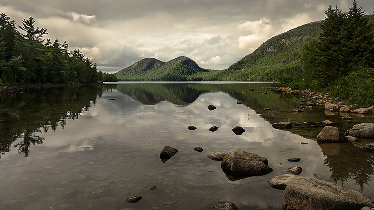
What I notice first is how well you managed to pull the detail out of the shadows from your underexposed RAW original. Exposing for the highlights was definitely the right choice, as your RAW image retains good detail in the brightest areas.
With your camera position you have maximized the foreground interest with both the submerged stones and the rocks. And the "stepping stone" rocks mid-frame form a pathway for my eye to follow into the scene to the hills in the background. It is a lovely image that is sharp throughout. Thank you, by the way, for leveling your horizon! You clearly have a good eye and I'm confident you will get a lot out of this group. I do have some observations and suggestions for your consideration:
1. On my calibrated monitor, the bright green of the background hills looks somewhat artificial and over-saturated. Consider leaving the Saturation slider alone and use the Vibrance slider sparingly instead. Also, the Calibration module can help tweak and balance the colors of an image.
2. In your original, the sky was brighter than the sky reflection (natural looking) but your edit has reversed that, leaving multiple distracting "hot spots". The pile of logs at the left of the frame have the same issue. Fortunately, because your original exposure was spot on, these issues are easy to fix.
3. One of the "rules" (I prefer to think of them as "suggestions") of good composition states that the horizon is generally best not placed in the middle of the frame. While I dislike restrictive "rules", I think it does apply to your composition. Consider cropping down from the top for a panoramic ratio and see what you think. While the sky is dramatic, it seems to me the "subject" is the lovely and interesting foreground and the hills in the distance.
As Ansel Adams said: "You don't take a photograph, you make it." You clearly have the "taking" part down and a little more time on the "making" will pay off in spades. Nice work and I look forward to seeing more of your images. |
Aug 9th |
| 3 |
Aug 23 |
Comment |
Hi LuAnn.
The more I see monochrome renderings of flowers, the more enthralled with them I become. And this rendition doesn't disappoint. Your 1:1 presentation is perfect for this subject and you have used the Golden Spiral to position the blossom nicely in the frame. The ultra thin gray stroke sets off the image against the black background without being distracting��.But as I look at the stroke more closely, it seems you have added a much thicker inner stroke��in black. This seems weird to me and I don't find the effect pleasing. I suspect, however, many people may not even notice.
The image is technically well done with subject sharp and background varying degrees of softness. Your edit is well done but I do have one suggestion: To my eye the leaf at the left of the frame is of similar luminosity to your subject and it tends to draw my eye away from the flower. Perhaps toning down the highlights would even out the background luminosity. Nicely done! |
Aug 6th |
| 3 |
Aug 23 |
Reply |
Thank you, LuAnn. I very much appreciate your comments, observations and suggestions. ��but sometimes you give me too much credit! While 98% of my image is intentional, the coincidental darker blue sky behind the yellow building was not - at least not consciously so. It is a result of the way the evening light was refracting in the sky combined with my editing choices. But now I will keep that technique in mind for use in the future!
As for the "duck"�� good eye, but I'm pretty certain it is just a piece of flotsam that I ought to have noticed and removed. The scale is wrong for a duck and because the water was glass-calm, a bigger wake would have been expected. ��one of these days I'm going to intentionally insert an "Easter Egg" in one of my images just to see if you catch it! LOL! |
Aug 3rd |
6 comments - 4 replies for Group 3
|
| 83 |
Aug 23 |
Reply |
Thanks, Lance. I'll check it out!
Seeing as your image this month has generated quite a discussion regarding reflections, please check out my Group 3 image. It's off-the-wall and intended to be quirky and amusing. I'll be interested to hear what you, as a "serious" photographer, think! |
Aug 14th |
| 83 |
Aug 23 |
Reply |
Thanks for the clarification. Makes sense. |
Aug 13th |
| 83 |
Aug 23 |
Reply |
Lance, how does one access past postings? Didn't know that was possible. |
Aug 13th |
| 83 |
Aug 23 |
Comment |
Lance, you always are surprising me. At first, I didn't quite understand what I was looking at��which caused me to look even harder (pulling the viewer in and causing the gaze to linger and study the image). I especially didn't understand the title until my third viewing and then I went "Ahhhhh!". All but the very bottom of the image is a reflection of the buildings in extremely calm water��correct?
Clever and nicely done. |
Aug 13th |
| 83 |
Aug 23 |
Comment |
Hi Mark
You captured a nice "travel" image with this scene from Italy. While I see Adi's point(s), when traveling one must often choose between "get the shot while you're there" vs "forego capturing the scene altogether".
The image is sharp and I like the composition. Given the difficult lighting, you managed to achieve a broad range of tones in your edit. Nicely done. |
Aug 13th |
| 83 |
Aug 23 |
Comment |
Hi Adi.
I find your image interesting in so many ways. You had many different ways you could have titled this image, but I can't imagine they would be as effective as the one you did choose. Very clever! Not exactly a "Where's Waldo" , but it did cause me to look deeper into the scene to find the girl. Besides the well-done technical aspects of the image, it tells a really good story. The blurred people hurrying past the girl, ignoring her completely juxtaposed to the others standing perfectly still paying rapt attention to the music. Simply brilliant! |
Aug 13th |
| 83 |
Aug 23 |
Reply |
Lance, I wonder if you might expound upon what you see as the differences between "conceptualized", "conceptual" and "abstract" photography? When I searched "conceptualized photography", Google showed images of a distinctly different genre from what Debasish has presented. His image is more in keeping with what Google defines as "abstract photography". So I'm interested in your thinking on the matter. |
Aug 13th |
| 83 |
Aug 23 |
Comment |
Hello, Debasish.
Good on you for your ability to "see" potential art where most would simply see a mess on the sidewalk! I also commend your decision to include the entire paint splash in your composition by way of the unusual crop ratio. It works! I'm also happy to see what Lance has referred to as "conceptualized photography" presented here and equally happy to read Lance's positive thoughts on it.
This is the perfect forum for presenting "outside-the-box" photography, as abstract images at Camera Club are most often met with blank stares and low scores. Congrats on a well done image! |
Aug 13th |
4 comments - 4 replies for Group 83
|
10 comments - 8 replies Total
|


