|
| Group |
Round |
C/R |
Comment |
Date |
Image |
| 3 |
Jun 23 |
Reply |
Who knows�� after all, the theme was WINDOWS ;) |
Jun 15th |
| 3 |
Jun 23 |
Comment |
Joan, this is a lovely image. I've never tried to stitch a panorama together and your image has me wanting to give it a try. I really like the definition in the hills that is created by the beautiful light falling on all those contours. I think your composition is well done, this image is sharp and well exposed and it gives me a peaceful feeling. Really a joy to behold.
As the others have commented, there are dust spots and it does look a bit over saturated to me. Also, the sky looks somewhat unnatural - perhaps too much clarity and/or de haze? Lastly, I see a streak of light dead center in the sky - perhaps an artifact of the stitching?
In any event, it's a lovely image. I would love to see you rework it to see if it can become even better. |
Jun 14th |
| 3 |
Jun 23 |
Reply |
Thank you, Ruth��and OF COURSE it's a Mac! ;) |
Jun 14th |
| 3 |
Jun 23 |
Reply |
Thank you for your comments, Joan. Regarding the laptop��.kinda looks like a MacBook Air to me! (Dyed in the wool Apple user here). |
Jun 14th |
| 3 |
Jun 23 |
Comment |
|
Jun 8th |
 |
| 3 |
Jun 23 |
Comment |
|
Jun 8th |
 |
| 3 |
Jun 23 |
Comment |
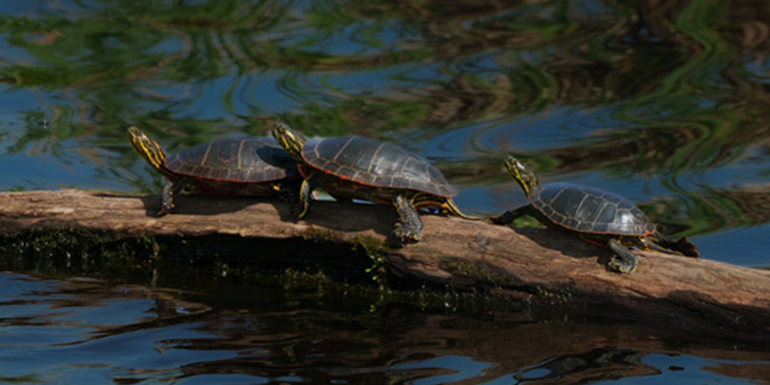
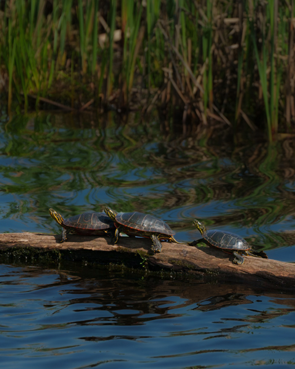
Hi LuAnn
In general, you have captured a nice image of these three turtles. Everything in your image is tack sharp, has rich, balanced color and is perfectly exposed. I appreciate your explanation of your intent with this image and I respect your artistic choices.
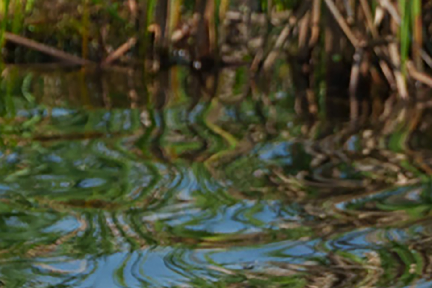
As I view your image my attention is torn between the lovely abstract nature of the water and the decidedly non-abstract nature of the turtles. For me, it's almost as if there are two separate compositions that are competing with one another.
If your intent was for the turtles to be the subject, I offer two different versions. In the portrait version, I included some of the reeds to add some additional context. In the 2:1 version, I've honed in on just the turtles. In both instances, I decreased the exposure of the background and added some negative clarity, negative detail and negative texture. In the third iteration, I did a tight crop on the water abstraction as an entirely different composition. |
Jun 8th |
 |
| 3 |
Jun 23 |
Comment |
Hi Mary Ann. Your image for me has the feeling of a candid street scene. I can imagine these gentlemen meeting here every week for a couple of rounds of checkers.
As good as our iPhone cameras are, there are just not as versatile as our "real" cameras (LOL). To point are two issues: First, is DOF. Ideally with your "real" camera, you could have used a wide aperture to blur the background to make your subjects stand out. The second issue is glare and no camera "real" or otherwise can do much about that without a CP filter.
All things considered, you did a nice job with this, although I prefer your original image. Without being able to fully straighten it, the partial correction doesn't quite hit the mark and, as you noted, makes the crop too tight. Given this is a street scene, the quirky angles don't really bother me (see my image this month). |
Jun 7th |
| 3 |
Jun 23 |
Comment |
Hi Ruth. I think I rather prefer a title that represents what the image is about as opposed to what it is of. So given your narrative, I get "A Meditative Walk" or "Walking With Her Best Friend" or some such. Title notwithstanding, you've captured a nice portrait. Your subjects and foreground are well exposed and in sharp focus and I like the composition. I am bothered, however, by the bright highlights in the sky and I'm wondering if toning them down somewhat might better balance the overall exposure.
|
Jun 7th |
| 3 |
Jun 23 |
Comment |
Kieu-Hanh, you've captured an action-packed scene with fantastic colors and visual interest. Good exposure and nice edit. I don't typically shoot sports and haven't had a chance to practice the technique of panning. It is my understanding that one uses a relatively slow shutter speed while panning and keeping focus on the primary subject. So I'm curious what shutter speed you used for this shot?
I understand the goal is to get the primary subject in good focus while the background (in this case "background" being the other cyclists)is "speed-blurred". While you didn't nail the focus on the primary subject, it is sufficiently sharper than the rest so that it holds my eye. Nice capture! |
Jun 7th |
| 3 |
Jun 23 |
Comment |
Hi Ruth. I really like what you did with this month's image. The textures come through beautifully, and adjusting the WB was definitely more in keeping with the cool-ness of the ice. That leads me to a curiosity: It looks as if your light panel has an innate warm color temperature��or is it something else that is causing the severe yellow cast in your original?
I have only two small suggestions. First, you might consider bringing up the shadow detail in the far-right flower. Next would be to use the crop tool in Ps at the same ratio to move the image down slightly. Then do a content-aware-fill to add more ice to the top, thereby giving the left tulip a little more head room. In any event, it is a lovely image. |
Jun 7th |
| 3 |
Jun 23 |
Reply |
Thanks for your comments, Ruth. The trip was, indeed, a photographic delight. |
Jun 7th |
| 3 |
Jun 23 |
Reply |
Thanks, Kieu-Hahn, but correcting the perspective of the foreground window would ruin my intent for the image. Please see my response to LuAnn. |
Jun 6th |
| 3 |
Jun 23 |
Comment |
Thank you for your comments, LuAnn. I guess I would call this Street-ish Photography or, maybe better, candid photography. When I saw the woman sitting there, I knew I wanted to get the image��but I felt a little self conscious being in a museum and did not want to draw attention to myself.
I think the off-angle of the shot communicates that this was done quickly in order to seize the moment. If one looks at classic and contemporary street photography, odd camera angles abound. In this case I wouldn't dream of correcting the perspective, as it would be counter to my intent. |
Jun 5th |
9 comments - 5 replies for Group 3
|
| 5 |
Jun 23 |
Comment |
Mark, I was perusing this month's gallery and you image caught my eye. Lovely composition with triangles and leading lines galor��.and then there's the LIGHT! Stunning and beautifully captured and edited. |
Jun 23rd |
1 comment - 0 replies for Group 5
|
| 11 |
Jun 23 |
Comment |
Hi Henry.
Great composition. The camera angle crates a very pleasing perspective. Particularly nice job on the sky. Also, given how dark your original image is, your transformation is remarkable!
One could imagine other editing iterations. I tend to like to see a bit more black tones (contrast?) - but that's just personal preference and not a critique of your beautiful image, which is superbly done as is. |
Jun 16th |
1 comment - 0 replies for Group 11
|
| 39 |
Jun 23 |
Comment |
Hi Kathryn. While perusing this month's gallery, your image caught my eye. What a stunning transformation from your original to the final mono version! You appear to be quite adept at the various editing apps (CEP?? Did you mean SEP - Silver EFEX Pro?). I'm also impressed with the detail you captured with your Q2. I've been drooling over the new Q3 but just can't bring myself to drop $6K��yet! Anyway, congrats on this lovely rendering. Only suggestion is to add a slight white stroke to set it off on the black background. |
Jun 23rd |
1 comment - 0 replies for Group 39
|
| 47 |
Jun 23 |
Comment |
Hi Jeff. As I was looking at this month's images, yours caught my eye. I love it! I love the minimalist composition and the addition of some slight ICM really creates an incredible mood. Subtle and strong at the same time. Well done! |
Jun 23rd |
1 comment - 0 replies for Group 47
|
| 83 |
Jun 23 |
Reply |
Seems our comments crossed in the mail, as it were. I see you have answered some of my questions in your additional comments on my image. Thank you. |
Jun 24th |
| 83 |
Jun 23 |
Reply |
Of course, but the histogram is only one way to ascertain a "correct" exposure. Your high key image this month would show a skewed histogram to the right. |
Jun 24th |
| 83 |
Jun 23 |
Reply |
Adi, yes, it is clear your intent was to produce a high key image and you've done that well. About the crop, though�� I'm not being critical of your choice to adhere to your "rule" of only presenting your work in 2:3 ratio, but rather, I'm trying to understand why you have decided to limit yourself in that way? Do you see that "rule" as a way to define your artistic style? Or, is the self-imposed boundary meant to challenge yourself to create compositions that fit that ratio to the exclusion of other possibilities? By asking you these questions, I'm trying to also understand what "rules", conscious or unconscious, that I have around my own photography. Thanks for any insight you can provide. |
Jun 24th |
| 83 |
Jun 23 |
Reply |
Debasish, thank you for your comments and visual feedback. Very much appreciated. Yes, I think toning down the brightness of the wall does, indeed, accentuate the balloons as compared to my edit. |
Jun 13th |
| 83 |
Jun 23 |
Reply |
Debasish, thank you for your comments and visual feedback. Very much appreciated. Yes, I think toning down the brightness of the wall does, indeed, accentuate the balloons as compared to my edit. |
Jun 13th |
| 83 |
Jun 23 |
Comment |
Hi Adi!
You have created an intriguing and beautiful architectural study with your image this month. Your choice to shoot into the sun accentuates for me the feeling of light and space - something that, obviously, must have been the intent of the architect. The fact that the highlights are blown out, while in other situations is frowned upon, actually enhances the theme of LIGHT that your image conveys.
Some observations and questions: I notice you included the railing at the bottom of your frame. Besides being overly bright to my eye, it seems to detract from the rest of the composition. I'm curious as to your thought process for its inclusion vs cropping up to eliminate it.
The image works well in high-key. I'm curious if you played around with other iterations in post such as adding contrast and boosting the blacks to bring more attention to the structure? (This would, of course, change the theme from one of light to be more a focus on the structure itself). ��or, did you know right away when you registered the image that you would be rendering it in high-key?
Lastly, if I had access to this, I could see where I would want to come back again and again to photograph it. An interesting variation would be to shoot a very long exposure to either eliminate the people altogether or to ghost them for an interesting effect. |
Jun 13th |
| 83 |
Jun 23 |
Comment |
I like your image for several reasons. You have positioned the gargoyle in the frame in a way that gives the impression he is lord of all he surveys. Your extra wide angle view enhances that feeling - the gargoyle looms large and the rest of the city, small. It is an excellent perspective. Additionally, whatever you did in post has given the image a classic look and feel of film which, IMO, enhances the presentation. Nicely done. |
Jun 8th |
| 83 |
Jun 23 |
Reply |
Mark, thanks for the "professional" advice regarding psych tests. But my INTJ profile was so accurate as to be spooky and it certainly explained a lot of my "issues"!
White halos are a bane! I get them most often when there is a dark foreground / subject (mountains most often) against a brighter background / sky. Problem is enhanced when using Dehaze and/or when attempting to adjust the sky/background separately from the rest of the image. There is a relatively easy fix in Photoshop:
1. Magnify the image to make the halo more visible
2. Set the Clone Stamp blend mode to "Darker Color"
3. Select a soft brush for the clone stamp with the brush size slightly larger than the width of the halo
4. Sample the area just outside the halo (Option click on a Mac), then paint along the halo. Periodically resample as you continue. |
Jun 8th |
| 83 |
Jun 23 |
Comment |
Hi Margaret
I must confess that I am not drawn to portrait photography and am frequently at a loss to comment on the genre - especially when the subjects are posed. But your image really impressed me. Besides being technically well done, I think you really captured this guy's essence. I like the tight crop and the detail is amazing. Awesome job! |
Jun 8th |
| 83 |
Jun 23 |
Reply |
Mark, thank you for sharing your perspective. First off, no apologies necessary! At the risk of divulging TMI, I've always felt I have a bit of a handicap. Years ago I took the Myers-Briggs instrument. It revealed that I share a profile with only 2% of the population. As such, I see the world differently from 98% of everyone else.
With this in mind, I am still often surprised when an image of mine receives comments that are contrary to my perception. Sometimes images are just personal (and perhaps better kept personal and not shared?). I can see now it may have been a stretch to expect a viewer would relate without having experienced the moment. This, of course, is the key to a great photograph: the photographer's ability to communicate the essence and feeling of the moment to a wide viewership. Perhaps some types of images are just better suited than others...
As to the halo, good question. I went back to my RAW file to see if it might have been caused by one of my edits but I could not determine that was the cause. Seems that's how it registered on my sensor. I was using a new camera/lens combination that I have just recently acquired from a photographer's estate. It is a Sony a7Riv with an adapted Canon lens. Apparently the lens was not designed to work optimally with a 61MP sensor. If I had a mind, it would be a relatively easy fix in Photoshop. |
Jun 8th |
| 83 |
Jun 23 |
Comment |
Good morning, Lance.
Thank you for all your comments. I'd like to understand more about why the contrast between the subject and background is unsettling to you and what you mean by inorganic in this context. These are things I must learn to distinguish.
In my (admittedly very limited) experience with Street Photography, things often happen quickly and one doesn't always have time for lengthy contemplation of a composition in order to capture the moment. That was mostly true in this case. I purposely chose an open aperture, as I wanted the balloons to stand out maximally from the wall. The background was "as-shot" with no post-processing trickery.
The wind was buffeting the balloons from one direction and they were moving in an erratic manner. I knew I wanted to freeze them when they were in between the two dark verticals, so I was constantly changing positions. The stump was in front of the lens, for better or worse, when my shutter captured the moment. I did consider removing it in post, but then thought the better of it (the "Lance angle" sitting on my shoulder won out).
I know you typically don't shoot Street��but I'd be curious how you would go about capturing the scene. Higher f/stop? Wait for the wind to change direction? Forego the shot because the elements were not right? Thanks in advance for your additional thoughts. |
Jun 2nd |
| 83 |
Jun 23 |
Comment |
Lance, your image this month is an intriguing, organic abstract that draws my eye up and in. The central "shadow" calls to mind a dancer in a flowing garment. As I follow the various shapes of light and shadow, my brain struggles to create the imagined figure as solid in front of the palmetto fronds or is that mere illusion?
The light fronds appear to me as fabric - a tent maybe? - and the smaller shadow leaves appear as people on the other side of the tent, vying to gain admission to watch the performance. It is reminiscing of a serigraph by Erté titled The Duel. Nicely captured and composed.
|
Jun 2nd |
| 83 |
Jun 23 |
Reply |
Adi, thanks for your comment. By "original crop" I'm assuming you are referring to the image ratio as captured by my camera's sensor? I probably crop most of my images. In some I keep the original "as captured" ratio but I will often use different ratios depending on the subject and what it is I'm wanting to communicate. That leads me to wonder what are your thoughts on cropping? |
Jun 1st |
| 83 |
Jun 23 |
Comment |
Hi Debasish. A very apt title for this image. I love how seals always seem to be smiling��and that made me smile too. The subject exhibits nice tonal variation and helps it stand out against the ice. Your DOF is appropriate with the foreground-to-subject nicely in focus and the water in the background nicely soft. I also like how you placed the subject in the upper left third, as I feel the inclusion of the foreground ice adds needed context.
One thing, however, bothers my eye: the inclusion of the angular bit of almost-black water in the lower right. Up against the black backdrop on which we view images here, it gives me the impression that a piece of the image was ripped away somehow. You might consider a thin white border / stroke to (re)establish a definite frame, or simply crop out that portion of the image.
Thanks for sharing this fun wildlife image. |
Jun 1st |
6 comments - 8 replies for Group 83
|
19 comments - 13 replies Total
|


