|
| Group |
Round |
C/R |
Comment |
Date |
Image |
| 3 |
Mar 23 |
Reply |
Thank you, Linda. The tree makes such an interesting subject and I had such fun experimenting with the hundreds of images I managed to acquire along with the multitude of ways to post-process them. |
Mar 30th |
| 3 |
Mar 23 |
Reply |
Thanks, Ruth. I appreciate your comments. |
Mar 20th |
| 3 |
Mar 23 |
Reply |
Thanks, Mary Ann. Our camera club is having an exhibition at our local community center and I'm considering this one as one of my allotted two images to present. |
Mar 20th |
| 3 |
Mar 23 |
Reply |
Thank you, Kieu-Hanh for your kind words. |
Mar 20th |
| 3 |
Mar 23 |
Reply |
Thanks Bob, and thanks for visiting |
Mar 20th |
| 3 |
Mar 23 |
Comment |
Hi Joan, and thank you for your comments and visual feedback. I am pleased to say you are misinformed about the tree!!!! My images were taken only just last month! There was, however, an instance (how long ago, I don't know) where some vandal cut off a large branch, possibly in protest of the tourism the tree brought in to Wanaka. Sadly, the perp was never caught and the tree continues to call people to Wanaka.
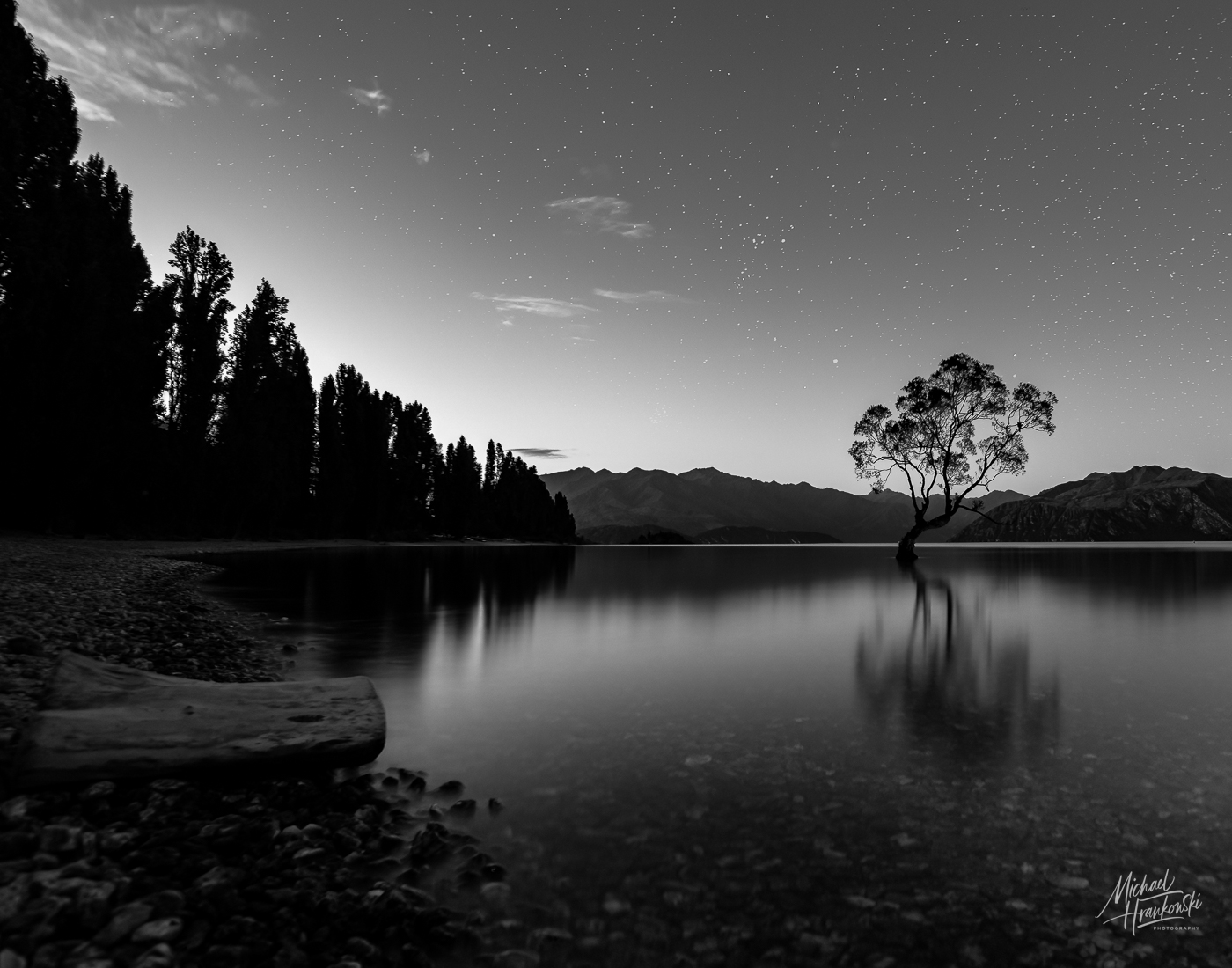
As to my crop choice, I chose it for several different reasons. The tree is often portrayed with a tight crop and I wanted to include more context. Also, I liked the effect of my torch beam in the foreground with the light reflecting and illuminating the stones. Lastly, the sky was so incredibly vast that I wanted to show as much of it as possible to (hopefully!) give the viewer a greater sense of awe. Please check out my image in Group 99. It's titled Lake Wanaka At Dusk, to emphasize the scene as a whole, rather than just the tree. |
Mar 6th |
| 3 |
Mar 23 |
Comment |
Hi LuAnn
I, too, was captivated by the sharp focus and detail you achieved. Your skill and the exceptional resolution of your new camera has really come through with this beautiful photograph. As beautiful as the full blossoms are, I found myself wanting to focus all of my attention on the three buds...but my eye kept wandering up to the flowers which felt like a distraction. For me, the buds hold the most interest so I took the liberty of creating an alternate composition. After cropping in close, I duplicated the layer in Ps and applied a fairly heavy Gaussian blur and set the opacity at 60%. A layer mask and some (not so) careful painting revealed the detail of the buds. Curious what you think? |
Mar 3rd |
 |
2 comments - 5 replies for Group 3
|
| 99 |
Mar 23 |
Reply |
Thank you, Linda, for your comments and visual feedback. There are so many ways to portray this iconic tree and I was looking for a way to do it such that that is different from the most commonly seen images. It is uncommon to see the tree in context and I wanted to show that perspective with the tree as a feature of the overall landscape and not necessarily as the subject (hence the title). It is also uncommon to see it rendered in monochrome. As to your visual feedback - I like it very much. Thank you for taking the time to do it. |
Mar 30th |
| 99 |
Mar 23 |
Comment |
Hi Tom and welcome to the group! A beautiful image that, IMO, works better in B&W. I love the contrast between the grouping of trees and the surrounds. The "messy", blur of the background and of the foreground branches add a sense of mystery - almost as if the viewer is peering through a veil. The sharp detail on the tree trunks contrast nicely with the softness of the rest of the image. Lovely range of tones. Nicely done. Would you be so kind as to share your metadata with the group - lens used, f/stop and shutter speed? Thanks. |
Mar 20th |
| 99 |
Mar 23 |
Reply |
Thank you, LuAnn, for your comments. The sun was setting behind the trees and there was very little detail to be seen to begin with. I chose to depict them as silhouettes. I wanted the viewer's eye to start at the log and move around the curve of the shore and on to the Wanaka Tree and beyond without stopping in an attempt to discern detail in the trees in question. |
Mar 17th |
| 99 |
Mar 23 |
Comment |
Hi Gerard. Thanks for your take and visual feedback. I purposely darkened the lower left corner of the image because of the foreground softness you observed. That, and my up-res of the image made the log look a little weird, so I darkened it so as not to call attention to those two issues. I might go back and see if I can selectively sharpen the foreground to improve the image. |
Mar 10th |
| 99 |
Mar 23 |
Reply |
Peter, after much fussing, this is what I was able to do with regard to adding more stars. What do you think? |
Mar 3rd |
 |
| 99 |
Mar 23 |
Comment |
Hi Gerard. The standout for me is the symmetry of the image and all the detail that you captured in the building. The sense of age is clearly demonstrated but in the sense of endurance rather than decrepitude. I think you've done a good job of balancing out the tones and bringing out detail despite the harsh back lighting and I echo Peter's question about how you achieved the perspective. As far as suggestions go��only one thing: To me, the clouds appear too bright in some areas and lacking of detail / definition. |
Mar 3rd |
| 99 |
Mar 23 |
Comment |
Hi Barbara. Your image this month has caused me to want to know more about your thought process that went into its creation. Am I correct in assuming your "original" is the final blended HDR image that you brought into SEFEX? The color version has lovely gradations of color and a nice balance of darks and lights (the HDR effect?) and despite the obvious dryness of the flower head, it does have a certain softness to it that the mono version lacks. Conversely, the mono version appears very harsh to me (high structure in SEFEX terminology) and it has lost the subtle tonal variations that you created with the original HDR image. Was this your intent? I'm also wondering if you considered alternate lighting? Directional light from one side or the other might have given more of a 3D appearance to the subject and enhanced the composition. Lastly, I'm wondering if you would consider going back to the drawing board and presenting for us a different mono version with a lighter hand in the edit? I think the potential is there for it to be more successful. |
Mar 3rd |
| 99 |
Mar 23 |
Comment |
Hi Kathleen. I love it mostly because you've broken nearly every "rule" in the book and in doing so produced a compelling street shot. The buildings are falling over; the guy on the scooter is half cut off; the camera angle is wonky; the crazy diagonal lines cause my gaze to dart all over the frame without a comfortable place to land. What could be more perfect to represent the chaos of LV??? A perfectly wonderful "out-of-the-box" composition and well done. |
Mar 3rd |
| 99 |
Mar 23 |
Comment |
Hi Peter. Yet another example of your ability to capture mood and emotion with your portraiture. You captured here gaze at just the right moment and she is seemingly looking right through me. The cut off head doesn't bother me, as it serves to emphasize her remarkable facial features. Overall, it is a well done, striking portrait.
As I've said many times, I'm not really qualified to critique portraiture, so take this not as that, but rather as a curiosity: You've chosen lighting that illuminates her face quite evenly. I'm wondering how the mood of the image might change had you positioned the light source more to her left to create a slight shadow on that side of her face and combine that with making the background black? |
Mar 3rd |
| 99 |
Mar 23 |
Comment |
Hi Linda. Your image is very striking and has the look of a long exposure with those wispy clouds. Your wide angle perspective together with the lines formed by the rocks leads my eye to the chapel as does your treatment of the chapel itself with the dark windows and nicely highlighted cross. Something to consider would be to do a graduated filter at the bottom of the frame - the foreground, while holding some interest, is a bit bright IMO, and that causes my eye to hesitate there momentarily before moving to appreciate the remainder of your beautiful composition. Nicely captured and presented. |
Mar 3rd |
| 99 |
Mar 23 |
Reply |
Hi Peter and thanks for your comments and suggestions. A couple things: First, the image was taken at dusk when only the brightest couple of stars were becoming visible. I played with the sky adjustments but to bring out the stars darkened the sky so much as to lose the silhouette of the tree and create a huge imbalance with the twilight coming from the left of the frame. BUT, that is a very good suggestion nonetheless, and now I'm eager to "borrow" some stars from one of my other shots and see if I can use my meager Ps skills to blend them into the scene.
Secondly, as you noted, my intent was not to highlight the tree (as most photographers do) but rather to include it as just one element in a larger composition of the lake and surrounds. I do see the brightness of that upper left cloud, but I decided to leave it because that's how it appeared to me that evening. Also, I intentionally composed the shot so the tree line would descend from the upper left corner of the frame and a crop would disrupt that symmetry I was going for. |
Mar 3rd |
8 comments - 4 replies for Group 99
|
10 comments - 9 replies Total
|