|
| Group |
Round |
C/R |
Comment |
Date |
Image |
| 3 |
Dec 22 |
Comment |
Hi Kieu-Hanh. This is a lovely, inviting image. The colors are beautiful and your almost-square crop together with your almost-centered pathway work well to draw my eye into the scene. I think both your Original and your Modified images have merit and are beautiful in their own right.
As to whether the painterly effect is too strong - that is entirely subjective and the artist's prerogative. My only suggestion would be to bring up the highlights on the path and give the vanishing point some additional luminance. All in all, nicely done. |
Dec 23rd |
| 3 |
Dec 22 |
Comment |
Yes, I can see that the one brightest cloud could stand to have the highlights brought down a bit. Thanks for pointing that out. |
Dec 17th |
| 3 |
Dec 22 |
Reply |
Thank you Joan. I appreciate your comments very much. |
Dec 17th |
| 3 |
Dec 22 |
Reply |
Thank you, Ruth. I'm thinking this might make a nice print. |
Dec 17th |
| 3 |
Dec 22 |
Reply |
Thanks, Mary Ann. I appreciate your comments. |
Dec 17th |
| 3 |
Dec 22 |
Comment |
Hi Joan. Well, to put it bluntly: I disagree completely with the CC judge! I love your image and I appreciate your creative process, as I often do the same. I like your camera angle - it gives a pleasing perspective and the square crop is perfect. I love the duo-tonality you've created and IMO, it is perfect as is - a lovely architectural image. I wouldn't change a thing. I did think it might work equally as well in monochrome... but after doing the conversion, I think your color version is better. |
Dec 5th |
 |
| 3 |
Dec 22 |
Comment |
Hi Mary Ann. Breathtaking! I'm impressed how you pulled this beautiful, final image out of the dark, barely visible original. Curious to know for what part of the image did you expose? No suggestions! Well done indeed. |
Dec 5th |
| 3 |
Dec 22 |
Comment |
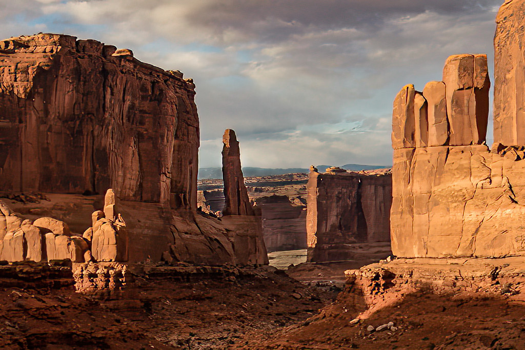
Hi Ruth. There's nothing quite like the beauty of Golden Hour in the Utah parks and you've captured it without question. Seeing your image brought back the feeling I experienced when I visited Arches last year. I like the color you pulled out of the rock formations and the detail in the shadows. It is, IMO, a lovely, impactful composition.
I took the liberty to provide an alternative edit. I brushed in some additional highlights/shadows / raised/lowered exposures to bring in a little more depth to the image. I added some clarity, dehaze and a warmer temperature to the sky while also bringing down the brightness. Lastly I decreased the exposure of the background (not sure that works, however). |
Dec 5th |
 |
| 3 |
Dec 22 |
Reply |
Thank you LuAnn. Yes, the grain does add more of the vintage film look I was after and I don't know why I hesitate to use it. Maybe it's a holdover from my high school photography classes where we mostly used Tri-X and I remember how much I hated the graininess of it. |
Dec 5th |
| 3 |
Dec 22 |
Reply |
Thanks for your comments, Ruth. Yes, it was my intent to give the image a retro vibe with the color rendering that I thought would enhance the feeling of age and decay. As to your question��I really hadn't thought about it but now that you mention it, that might be a really good idea. |
Dec 1st |
| 3 |
Dec 22 |
Comment |
Ruth, what a lovely image! I am a fan of the High Key / Minimalist genre and you have nailed it on both accounts. Your processing and choice of canvas size is spot on in my opinion. Nicely done. I do have a curiosity about your creative process: Most "expert" advice states one should have the final image in mind before the shutter is released. While that is true for me sometimes��, in many instances my final image results from a "let-me-see-what-I-can-do-with-this" process. Which was it for you? |
Dec 1st |
| 3 |
Dec 22 |
Comment |
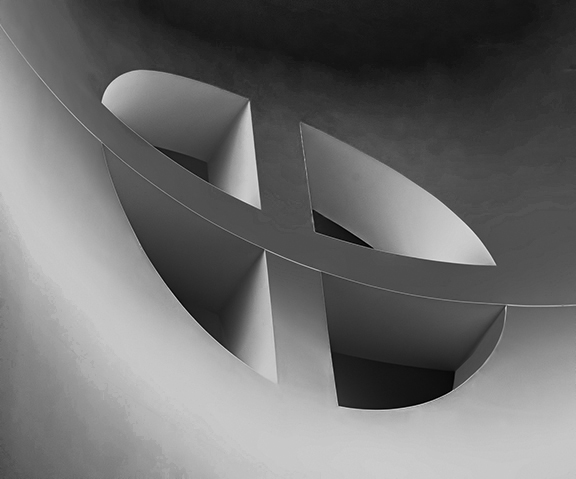
Oh LuAnn!!! "Stumbled upon something" is an understatement! I think your rendering is stunning. Where to start? The thing about abstract photography or abstract art in general is how difficult it is to quantify. One either likes it or doesn't like it. Unlike a "conventional" photograph where one can expound on the merits of exposure, composition, white balance etc., etc., the beauty of an abstract is more ethereal. For me the bold colors and patterns come off the screen and hit me in the face. The 1/3: 2/3 composition is well balanced and proportional to the crop. I'm drawn to the swirling lines and how the image transitions gradually from darker at the bottom to lighter at the top. Is that the photographer's reflection in the window��or am I imagining things? Had you not mentioned the subject was a snippet of an old, decaying car, I would have thought the final image to be a rendering of a seascape. Definitely print-worthy for wall display in a prominent place for all to enjoy! Exceptionally well done!!!
I am curious if you had this end result firmly in mind when you took the photo? |
Dec 1st |
7 comments - 5 replies for Group 3
|
| 12 |
Dec 22 |
Comment |
Hi Barbara. I have seen many a flowers-frozen-in-ice pictures but none as nice as yours. Simply beautiful. |
Dec 5th |
1 comment - 0 replies for Group 12
|
| 24 |
Dec 22 |
Comment |
Hi Carol. I'm enjoying your image very much and I appreciate your explanation of your workflow from capture to final edit. Very nicely done. |
Dec 5th |
1 comment - 0 replies for Group 24
|
| 33 |
Dec 22 |
Comment |
Paul, what a lovely composition. It's remarkable how the light allowed the background and foreground to naturally appear monochromatic while the pontoon jumps out in full color. Nicely captured and edited. I've seen many beautiful images of Scotland that make me want to visit and your's only enhances that desire. |
Dec 5th |
1 comment - 0 replies for Group 33
|
| 36 |
Dec 22 |
Comment |
Hi Larry. What a stunning image! It appears you have really honed your night sky photography skills - something I am only just beginning to explore. Very nicely composed and edited. I think the fact there are clouds gives your image added interest from the "clear sky" images we are used to seeing. |
Dec 5th |
1 comment - 0 replies for Group 36
|
| 62 |
Dec 22 |
Reply |
Stunning in both color and mono! |
Dec 7th |
| 62 |
Dec 22 |
Comment |
Hi LuAnn. I love the depth and tonality you've extracted from the mono conversion. For me, the color version is too "loud" and prohibits me from seeing the other interesting aspects of the flower. I'm also astonished that your DOF is consistent throughout especially in light of your use of a macro lens and all without any focus stacking. The image is sharp, and placed pleasingly in the frame. A lovely image to behold. |
Dec 6th |
| 62 |
Dec 22 |
Comment |
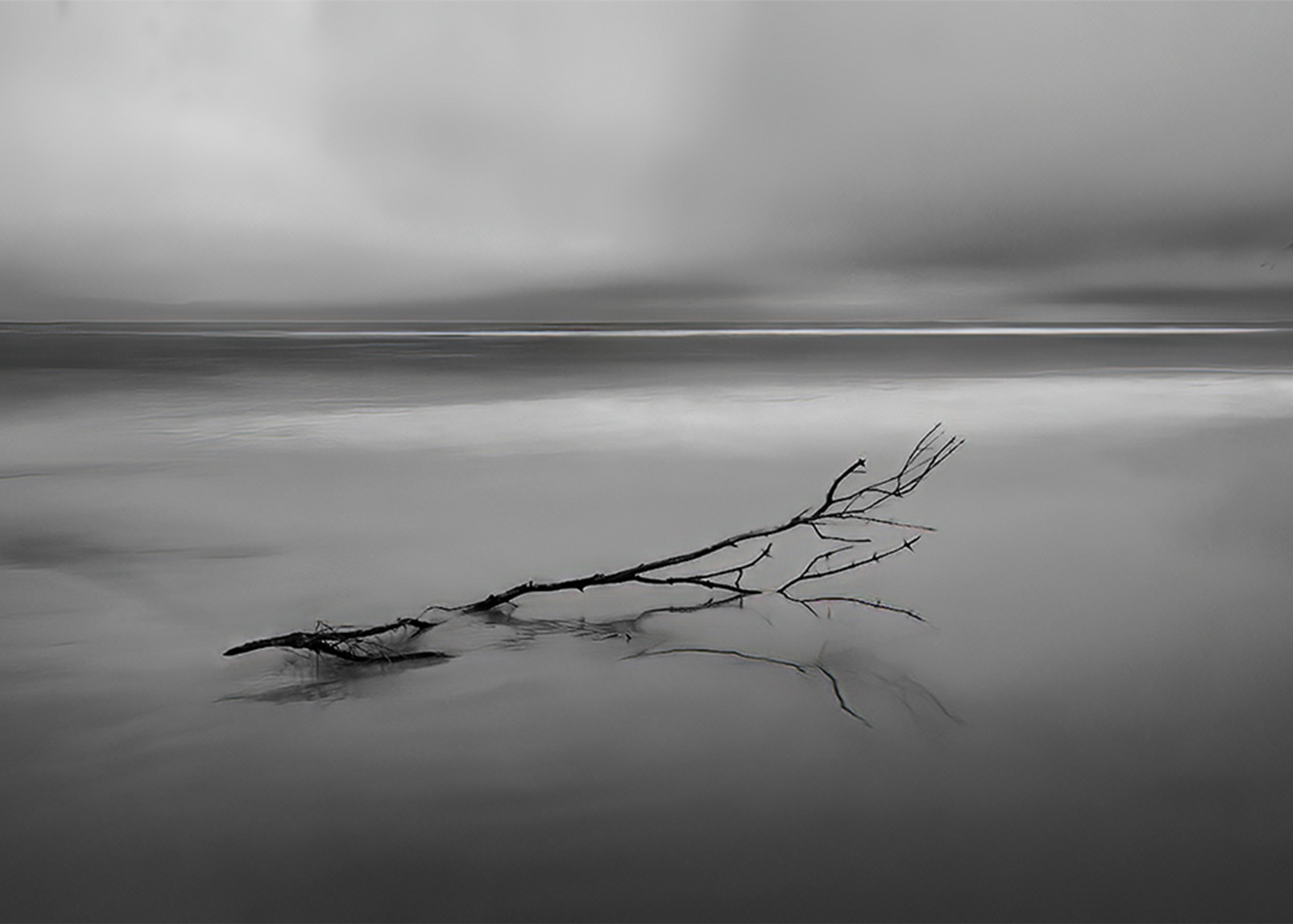
Hi Oliver. I'm a huge fan of this genre of long exposure, Fine Art Photography and your image is very impressive. I love the moody, minimalist feel of it. The composition with the perfectly placed branch and the long exposure combined with your post processing have, in my opinion, made this a successful image. My only critique has to do with the addition of the pelican - I think it detracts from your otherwise strong image. For me, the stop-motion, sharp focus of the bird creates visual and mental dissonance opposite the softness and beauty of your long exposure. I offer an alternative composition as visual feedback. |
Dec 6th |
 |
2 comments - 1 reply for Group 62
|
| 99 |
Dec 22 |
Comment |
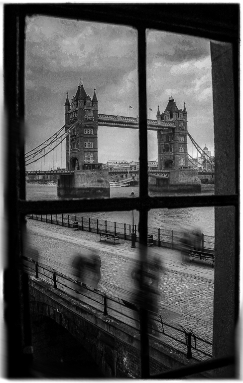
Randy, I really love your image! It is a lovely capture, creatively framed through the window and beautifully edited. Save for the people in contemporary dress, it has the look of an old-time glass negative image from the 1800's. After reading your commentary, I got to wondering what it might have looked like had you been able to take a long exposure to blur the pedestrians as if they were real ghosts of those who were tortured and died in the Tower. I took the image into Ps and did a motion blur layer with a mask. A reasonable facsimile of an in-camera slow shutter speed. |
Dec 24th |
 |
| 99 |
Dec 22 |
Reply |
Thank you, LuAnn. Comments much appreciated. |
Dec 23rd |
| 99 |
Dec 22 |
Reply |
Hi Gerard. As a "recovering Catholic" I didn't think too deeply about the religious meaning of my piece, but rather intended it as a comment on the passage of time with its associated decay. A large number of mausoleums in Recoleta have been long abandoned by the families and the names of the people interred there, long forgotten. The cynical side of me named the Christ image: "Salvator aranearum" with apologies to Leonardo. |
Dec 23rd |
| 99 |
Dec 22 |
Reply |
Thank you, Barbara and Happy Holidays. |
Dec 23rd |
| 99 |
Dec 22 |
Reply |
Hi Peter. Thanks for your perspective. As I think about my image it occurred to me that perhaps subconsciously I intended the subjects to be spider webs and not necessarily faces. Does that change your thinking? |
Dec 23rd |
| 99 |
Dec 22 |
Comment |
Gerard, the seeds bursting from the pod gives me the illusion of fireworks. Your open aperture allows the subject to be completely isolated from the background and my eye to appreciate the details. Nicely exposed and edited. For me, the right hand seed pod has the detail, movement and interest but I find the left hand one to be a bit of a distraction. I'm wondering if cloning it out and creating a square crop would improve the overall composition? Just a thought. |
Dec 1st |
| 99 |
Dec 22 |
Comment |
Linda, you've created a beautiful composition artfully rendered in black and white. My eye goes directly to the white lotus flower then clockwise to each of the lily pads before returning to the flower. I appreciate the exceptional detail and tonal variation in your image. If I had a suggestion, it would be to brush in some additional highlights along the perimeters of the pads which would give a bit more directionality to the lighting of the scene. Very nicely done! |
Dec 1st |
| 99 |
Dec 22 |
Comment |
Peter, your skills at portraiture continue to improve. I really like everything about the image. Excellent technically all around. Sharp focus. Great detail and emotion. Your choice of a sepia tone works particularly well for this image. I like the color version equally as well. Very nicely done! |
Dec 1st |
| 99 |
Dec 22 |
Comment |
Barbara, you've captured a really nice candid Street image. You've placed your subject well with your crop and the verticals and horizontals form a secondary frame that sets the man and his shadow off exceptionally well. |
Dec 1st |
| 99 |
Dec 22 |
Reply |
Thank you, Linda. Good point about the faces. I'll have to go back through my cemetery sequence and see what I have. |
Dec 1st |
5 comments - 5 replies for Group 99
|
18 comments - 11 replies Total
|


