|
| Group |
Round |
C/R |
Comment |
Date |
Image |
| 3 |
Nov 22 |
Reply |
Thank you, Joan, for your kind comments. |
Nov 30th |
| 3 |
Nov 22 |
Reply |
Thanks, Bob. Think of the Milky Way as a giant flower in the sky! |
Nov 30th |
| 3 |
Nov 22 |
Reply |
Thanks for your comments! Photo AI is a work in progress. They've been parsing out updates on average of once per week. It works best when used as a RAW pre-processor. That is to say, you put your RAW file through the app before you do any post-processing. In Lr, there are two ways to use the app - one is as a plug-in (not recommended!) and the other is by going through File>Plug-in Extras>Process in Photo AI. This spits out a .dng file on which you do the necessary post-processing. There are still situations where using the stand-alone apps of Sharpen AI and DeNoise AI work better. |
Nov 30th |
| 3 |
Nov 22 |
Reply |
My camera focused quite well on the moon, but yes, other articles I have read do suggest the pre-focusing method you describe. Whatever gets the results! Yes, f/4 is probably not the best but the 2.8 / 3200 / 25 sec worked well for this shot. Ideally I ought to have opened it up to the lens' max of f/2 and lowered the ISO. But in the end, this turned out okay. |
Nov 30th |
| 3 |
Nov 22 |
Reply |
Thanks so much Kieu-Hanh. Your comments are appreciated and encouraging. I am a total novice at Astro Photography and I look forward to expanding my knowledge in this area of photography. |
Nov 30th |
| 3 |
Nov 22 |
Comment |
Hi Joan. I tend to make my comments early in the month and when I did, you hadn't posted yet. I'm so glad I checked today otherwise I would have missed this beautiful image. I like your composition - so many leading lines. I enjoyed spending time looking at the detail and nuance in the geologic formations. Your golden light capture creates beautiful tones and shadows and it makes me want to go there to experience it in person! No suggestions. Very nicely done. |
Nov 30th |
| 3 |
Nov 22 |
Comment |
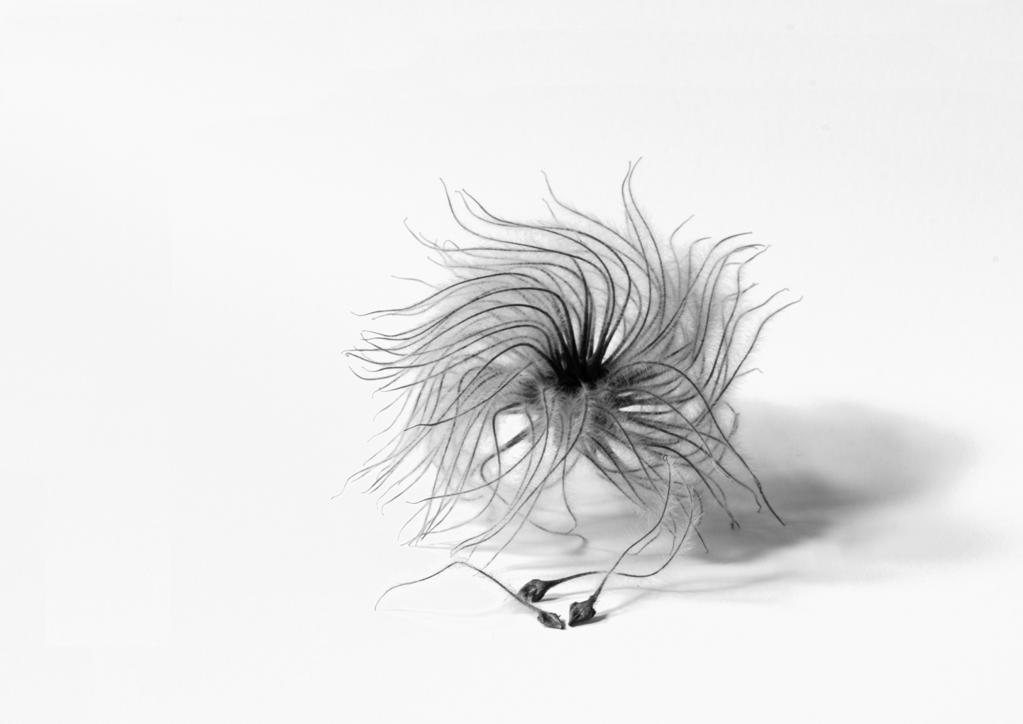
Hi Kie-Hanh. When done right, flower images rendered in B&W can be stunning and you nailed it. Taking away the "distraction" of color, one can concentrate on the shapes, forms, tonal variation and composition. The sharpness and detail of your rendering make it look almost like an illustration. The petals form hundreds of leading lines right to the center of the flower. I did have the same thought as Joan regarding the lack of definition in the center part of the flower��but perhaps it was your intention to have it that way? Regarding the crop��I think the square crop here is most appropriate. In my square-crop flower portraits, I tend to put the center of the flower off-center and in this case I would have placed it more toward the upper right corner. But of course the crop decision is an artistic choice and there is no right or wrong. I find your image is beautiful as-is and nicely done indeed. |
Nov 30th |
| 3 |
Nov 22 |
Reply |
Mary Ann, your comment about the rented lens leads me to believe it was a fixed f/stop lens? It's often frustrating enough just using our own equipment, let alone a piece of borrowed equipment with which we are not familiar. While the image might not have turned out 100% the way you had envisioned, it is still a lovely shot and a beautiful reminder of that time and place! |
Nov 12th |
| 3 |
Nov 22 |
Reply |
Ruth, thanks for your kind words. We had a lot of fun trying various compositions with different foreground elements. |
Nov 10th |
| 3 |
Nov 22 |
Reply |
Thank you for your comments, Ruth. Great that you pulled the metaphor from my image! The Milky Way is amazing to see, especially in one of the few and disappearing certified Dark Sky locations on the planet - 1 on the Bortle Scale. The North Kohala area of the Big Island is rated 2 on the scale. Where I live - Edmonds, WA is a class 6 ��. Unfortunately, our eyes are not digital sensors, so to the naked eye, the Milkey way looks��.well��.milkey, albeit none the less awe inspiring! Our camera sensors and film pick up all the colors, however, which I've brought out through my edit. Glad you enjoyed the image. |
Nov 2nd |
| 3 |
Nov 22 |
Comment |
Hi Mary Ann. I love how you captured this beautiful sunset. The color layers are amazing. I think the proportion of foreground, mid and sky make for a nice composition and your crop works well. Overall it is a lovely shot. My only suggestion would be to have used a much higher f/stop, as your foreground is not in focus. Alternatively, you could have taken three images, each with a different focus point and focus-stacked them in Ps. |
Nov 1st |
| 3 |
Nov 22 |
Reply |
Thanks for your comments, LuAnn. I was struggling with Astro, especially with regard to focus on the stars. Trying to focus in the dark with my relatively low res EVF with focus magnification on was an exercise in futility. So I tried a different approach. During the first week of my visit, the moon was out and I was able to focus on that. When the Sony is in MF mode, a range bar appears in the VF and I took careful note as to the position of the bar relative to the infinity icon when the moon was tack sharp. So in he set-up, I simply used MF and set the focus bar to that same position.
After having read an article on Astro, I used the author's advice and set my camera to f/2.8 (my lens is an f/2.0) for 25 seconds at ISO 3200. Prior to the sun setting completely, I was able to ascertain via focus peaking with my focus locked-in that the truck would be in focus. Had the "foreground" been more distant, I could have used a wider aperture and lowered the ISO. What I didn't mention was that I also had my camera set for Hi ISO Noise Reduction. That did lower the noise somewhat, but the RAW file still was VERY noisy. Putting the image through the new Topaz Photo AI COMPLETELY eliminated the noise and sharpened the stars. Nothing short of AMAZING. So I never worry about noise any more, as Topaz has me covered. |
Nov 1st |
| 3 |
Nov 22 |
Comment |
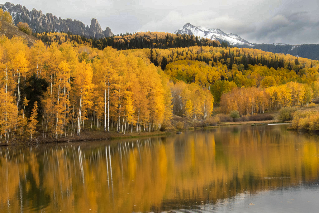
Hi Ruth. You are so fortunate to live in an area of the country with such amazing fall color! It's kinda boring here in Washington by comparison! First off, I love your composition. I think you have a nice balance of water/reflection, trees and mountains/sky and your sky edit adds drama. You've captured well the majesty of the Rockies in Autumn and the image gives me a feeling of both calm and awe. It's very beautiful and I enjoyed it very much.
Regarding your edit: To my eye, the colors are a bit too saturated and I prefer the color as captured. In my visual feedback, I kept the original saturation and, in fact, desaturated slightly parts of the image. I used multiple radial filters in ACR to accentuate some highlights and increase contrast on the trees and reflection. Some texture was added and some slight curves adjustments as well. Lastly, I used a brush to decrease slightly the exposure on the second, third and fourth layer of background trees to add a sense of depth. I'm not sure it's better than your edit...just my alternative suggestion. Regardless, you can be proud of this image! |
Nov 1st |
 |
| 3 |
Nov 22 |
Comment |
Hi Ruth. Even without your explanation, the story is crystal clear! Your image proves the adage that a picture is worth a thousand words. I think your image is successful for so many reasons: moment of capture; oozing with emotion; balance of perfect subject focus and soft background; subject positioned well in the frame. Excellent capture!
Regarding your edit, I definitely agree that desaturation of the yellow was taking the image in the right direction, but I don't think you went far enough. For me, the yellow is still too much and it creates a distraction to my eye. In my visual feedback, I took your image into ACR: Subject exposure +.20; Clarity +10; tweaked tone curve. Background exposure -.05; Highlights -80; Saturation -37. Let me know what you think. |
Nov 1st |
 |
| 3 |
Nov 22 |
Comment |
Hi LuAnn. My first reaction to your image this month is: LuAnn + Abstract = ??!! (LOL), especially given your propensity for perfectly arranged, composed, exposed images in tack-sharp focus. This is quite a departure and I applaud your experimentation! What I notice first are the colors. I'm drawn to blues, greens and oranges above other colors, so your image "feels" comfortable to me. I enjoyed spending time (quite a bit, actually), inspecting the patterns of light and textures as my brain tried to figure out what it was looking at. A panel of glass? Am I looking through the glass at the neighbor's house all decorated for Halloween? Are those ghosts I see at the top middle? And what about the "specter" in the lower left? ...so many questions... For me, your image ticks all the abstract boxes. Nicely done!
But, then again, I could be looking at one of your famous carefully-laid-out studio shots... ...and that's the thing about abstracts - they engage the viewer's brain. They make the viewer think. And isn't that what a good photograph, irrespective of genre, supposed to do?
|
Nov 1st |
6 comments - 10 replies for Group 3
|
| 5 |
Nov 22 |
Comment |
Hi Oliver. Simply stunning. I'm particularly fond of this genre of photography and you have a great eye for it. I like the third iteration best. I think this image would be equally stunning in monochrome. Well done indeed!! |
Nov 4th |
1 comment - 0 replies for Group 5
|
| 99 |
Nov 22 |
Comment |
Hi Linda. I almost missed your image this month but I'm glad I didn't. A really great capture and so appropriate in mono. Very well done! I do prefer your crop to Gerard's, as it gives the bird more room and the negative space doesn't bother me.I think this would make a very nice print. |
Dec 1st |
| 99 |
Nov 22 |
Comment |
Hi Linda. I almost missed your image this month but I'm glad I didn't. A really great capture and so appropriate in mono. Very well done! I do prefer your crop to Gerard's, as it gives the bird more room and the negative space doesn't bother me.I think this would make a very nice print. |
Nov 30th |
| 99 |
Nov 22 |
Reply |
Kathleen, I know what you mean by "getting used to" an image. Sometimes I spend hours or even days editing an image to "perfection"... then someone points out the obvious flaw(s) and I'm left wondering how the heck did I miss that?!? Not only is composition all about learning to see. It also applies to editing. |
Nov 6th |
| 99 |
Nov 22 |
Comment |
Thanks, Barbara. So many ways to present! |
Nov 6th |
| 99 |
Nov 22 |
Reply |
Gerard, I think you made a valiant attempt. The crop, along with the darkening of the trees does call more attention to the gate and improves the image somewhat �� but you are correct in your conclusion. Another thought I had was regarding use of a CPF. I carry one with my kit but often forget to use it. In scenes such as this, there is a lot of light reflecting off the leaves and stone work which may have contributed to the harsh appearance of them.
I hope you won't view this as a "failure". I would challenge you to return to the site, if possible, in the dead (no pun intended) of winter and have another go at it with a different season, different light and the opportunity to experiment with composition - maybe at night with a full moon? - and come up with an image that is worthy of the high caliber of photographer that you are. Keep on truckin'! |
Nov 5th |
| 99 |
Nov 22 |
Reply |
LuAnn, thanks for your comments. The crop choice was a dilemma. The uncropped RAW image has some additional space at the left of the image, but it also places the subject dab smack in the center of the frame. I opted, instead to place the subject closer to the left third in order to keep from cutting off the shadow, which I think is an important aspect of the image. On your suggestion, I took the original into Ps for a very quick re-edit. I expanded the canvas so as to give the extra room on the left side. To my eye, it just seems like excess negative space. That said, the negative space does work to a degree to enhance the minimalist vibe to the composition. I did not spend the time to re-do the border but that is a good suggestion.
I'd be interested to hear what others in the group might say about the two compositions. |
Nov 3rd |
 |
| 99 |
Nov 22 |
Comment |
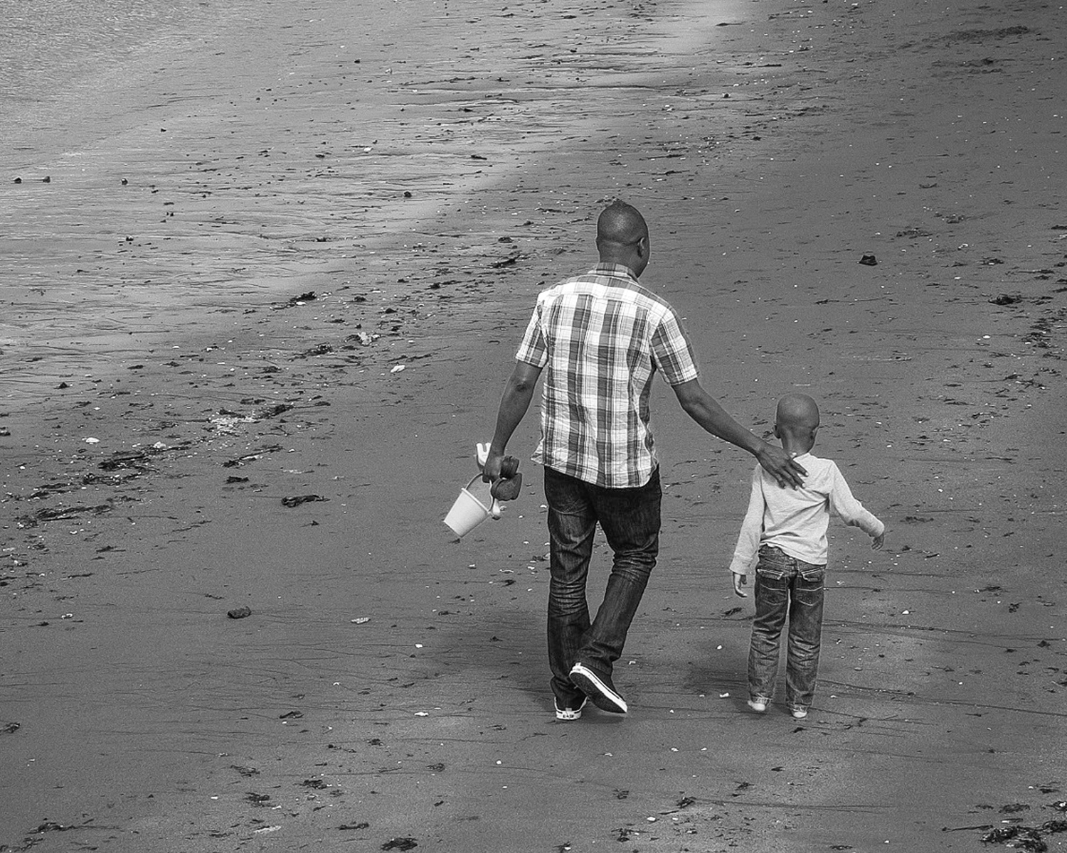
Hi Kathleen. It's amazing how one little thing can turn an ordinary picture into something special! Your image tells a great story with a strong message and it is a fantastic composition. To be honest, though, I'm not sure your edit is working for me. I'm not liking the sepia/graininess and to my eye there are some blown-out highlights especially on the pant legs, shirt and top of their heads. Your original image has really nice separation and contrast between your subjects and the surrounding sand but in your edit that seems to have been diminished. I have provided an alternative edit for some visual feedback. Of course, all of this is subjective and I respect your artistic choices. Regardless of editing choice, the image itself is very strong and well captured. Thank you for sharing this precious moment with us. |
Nov 3rd |
 |
| 99 |
Nov 22 |
Comment |
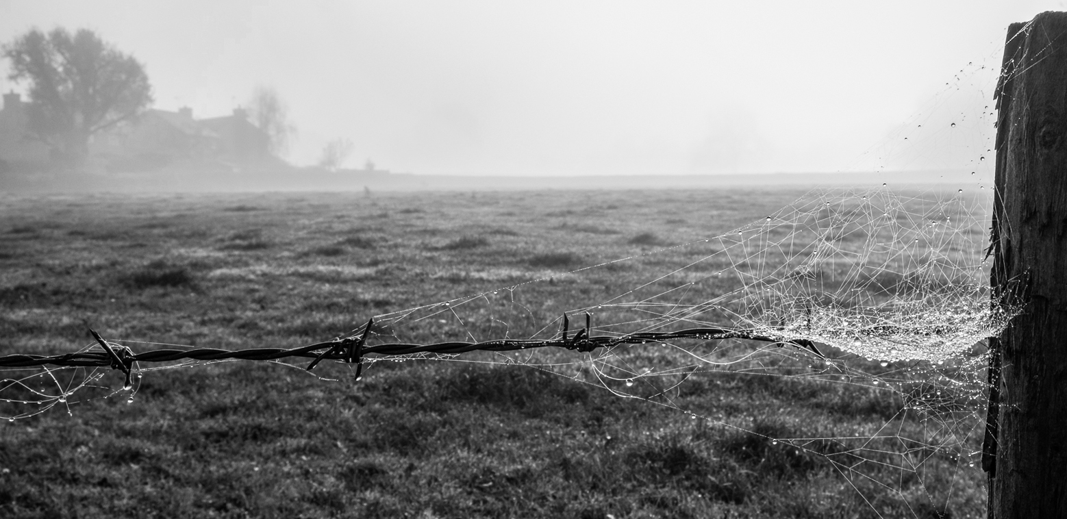
Hi Peter. You surprised us this month with your not-a-portrait image! You've done an excellent job of bringing out the details in the web that is contrasted perfectly with the darker background. The intricacies of the web pattern caused my eye to linger as it took in the details. You have controlled the highlights quite well and IMO, the image is a success. As a challenge to myself, I took your original image and tried to get it to look right as a landscape with the spider web being an interesting foreground element to the field, farm house and sky. Not sure it was successful, but I offer it up as an alternative and I rather think your tight crop was probably the correct choice. Nicely done! |
Nov 2nd |
 |
| 99 |
Nov 22 |
Comment |
Hi Gerard. My monochrome mentor says asking whether you like the color version or the mono version better is like asking whether you prefer snails or giraffes. Point being, they are different animals. ...but since you asked, not all images are suitable for a monochrome presentation, and IMHO, this is one of them. I think the reason for me is it would appear that many of the varied colors in the original image have similar tonal ranges, that, when converted, tend to run together. Whereas the color version gives me an impression of depth and separation of elements that for me, the mono version lacks. |
Nov 2nd |
| 99 |
Nov 22 |
Comment |
Hi Barbara. Very nice, sharp capture of the full moon. Your crop, mono conversion and edit really give this image a spooky moodiness, perfect for moving into Autumn. The birds add an element of interest, although I find myself imagining they are bats! I am kind of thinking the foliage poking up from the bottom of the frame is a bit of a distraction. Had you included more of the foliage or a tree, I think it would have served to give some perspective, but as is, I'm not sure it enhances your image. That said, it is well done. |
Nov 2nd |
8 comments - 3 replies for Group 99
|
15 comments - 13 replies Total
|


