|
| Group |
Round |
C/R |
Comment |
Date |
Image |
| 2 |
Oct 22 |
Comment |
Shirley, what a LOVELY portrait of this hummingbird! Excellent in every aspect. Great composition; tack sharp; wonderful bokeh. Very well done, indeed. |
Oct 4th |
1 comment - 0 replies for Group 2
|
| 3 |
Oct 22 |
Comment |
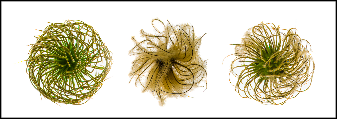
Thank you, Lance. Your comments mean a lot to me. I've been having great fun with these seed heads - from serious compositions to whimsical ones. I'm looking forward to continuing this theme in order to make a collection. |
Oct 25th |
| 3 |
Oct 22 |
Reply |
Thank you for your kind words, Mary Ann! |
Oct 12th |
| 3 |
Oct 22 |
Reply |
Thanks so much, Ruth. I appreciate your comments. |
Oct 12th |
| 3 |
Oct 22 |
Comment |
Hi Kieu-Hanh. I don't know that I've ever seen one of these birds in real life, as they are not native to the PNW. Thanks for sharing this photo. Your image has such interesting gold tones from the reflection of the Autumn leaves on the pond and it contrasts with the shaded white bird. It's almost a monochrome image - Gold and white instead of black and white. Because of this, I think Ruth's suggestion to convert to B&W might make an interesting alternate presentation. And, with the bird being so beautiful, I also agree that a tighter crop might be the way to go. |
Oct 10th |
| 3 |
Oct 22 |
Comment |
Thank you, Kieu-Hanh, for your kind words. Yes, there are so many different ways to capture and display these interesting seed heads. No two of them are the same. I keep playing around with them and who knows what I'll come up with next. |
Oct 10th |
| 3 |
Oct 22 |
Comment |
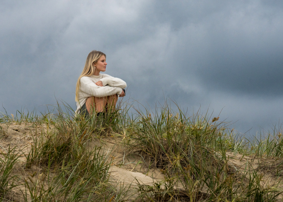
Hi Ruth and welcome to Group 3. Portraiture is not a genre I practice nor know much about, so take my words with a grain of salt! What I can say is you have captured a lovely moment and a really nice composition. Good choice on the crop as well. Personally, I don't think there is anything wrong with your camera settings. The 800 ISO caused the image to be somewhat grainy, but that is easily fixed with one of the many DeNoise apps that are available - I like Topaz DeNoise AI or now, the new Topaz Photo AI which combines DeNoise, Sharpen and the ability to up-res your image in one fell swoop.
To my eye, I prefer the tones in your original image. Your presented image appears to me to be somewhat over-edited (something I'm frequently guilty of!). The woman's skin tones are off and in my opinion, the brightness of the foreground competes with your subject. LuAnn has already mentioned the dust spots and how to deal with them. For my visual feedback I took your image back into Ps and ACR where I selected the subject and brought up the exposure by 0.20. I used the brush in ACR to accentuate the shadows and contrast in the sweater. Rather than brightening up the entire foreground, I used the brush again to brush +highlights in only the exposed sand. I also brought up the saturation and luminance on the grass. Lastly, I added a bit more clarity and dehaze to the sky. I think the the sky is very important to the feeling I get when I look at your image. It makes a nice backdrop and enhances the moodiness of the scene. Thanks for sharing this beautiful candid moment. |
Oct 9th |
 |
| 3 |
Oct 22 |
Comment |
Joan, I find this to be a very impressive image. The duo-tone of the rust-colored sand against the blue background creates a lovely color balance. Your capture of light and shadow forms geometrical lines that enhance this wonderful composition. I'm one who normally does not like people in my photos (unless I'm shooting on the street) but your inclusion of the person adds the extra dimension to make this a really great photograph IMO. I would be proud to hang this on my wall! Very well done indeed!
P.S. Welcome to the group! |
Oct 9th |
| 3 |
Oct 22 |
Reply |
Ruth, thank you for your kind words. Please see my response to Joan, above and the accompanying image. |
Oct 9th |
| 3 |
Oct 22 |
Reply |
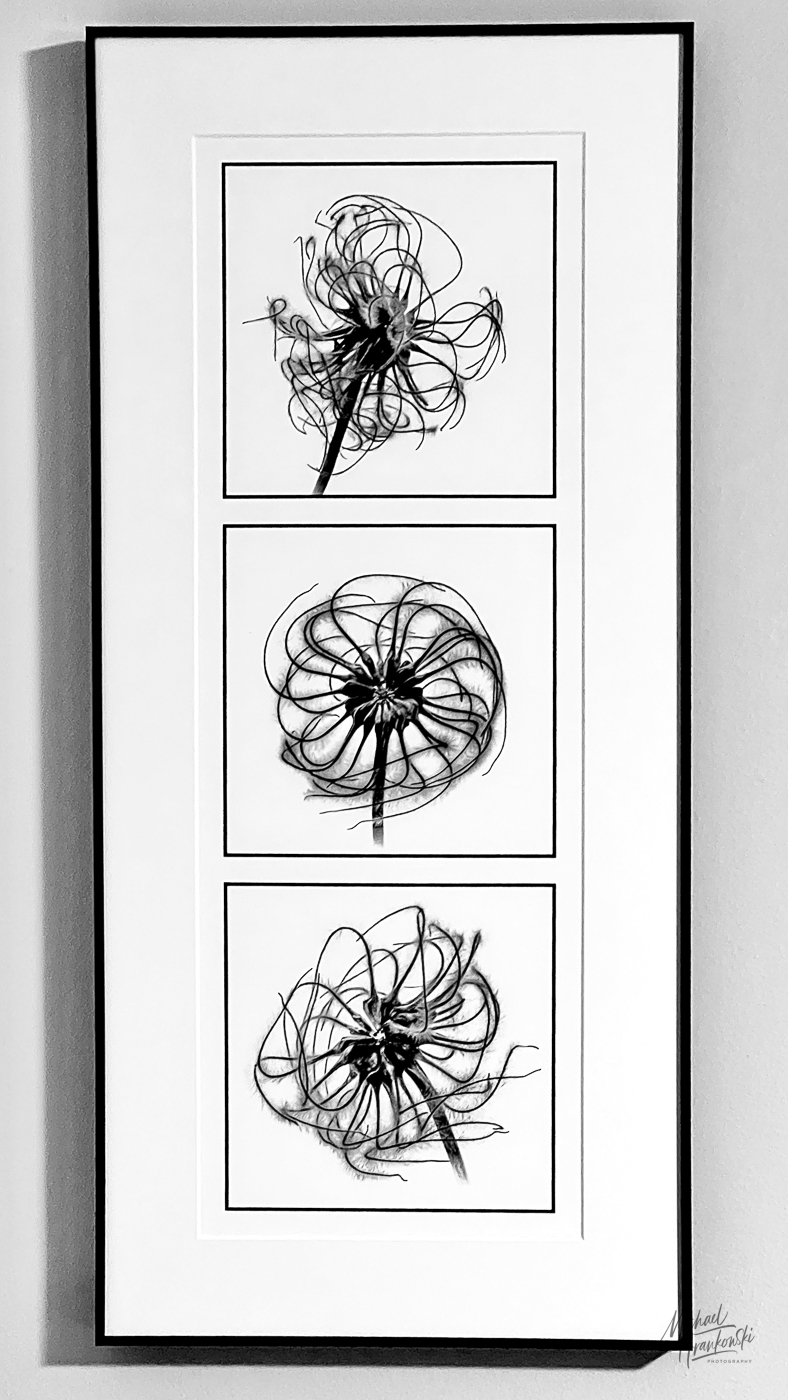
Hi Joan. Thank you for your kind comments and suggestions! I've taken many images of clematis seed pods from the many varieties I grow. Earlier this year I did a monochrome triptych. I presented a horizontal format for print night at my camera club and I printed a vertical version that I framed and hangs on my wall (see attached). |
Oct 9th |
 |
| 3 |
Oct 22 |
Reply |
LuAnn, you might find Lance Lewin's post on the bulletin board for group 77 of interest. He talks about the trend for photographic artists to create for competition and judging rather than for the sheer joy of following their artistic vision. I do, however, think an artist can do both, as long as it is intentional. |
Oct 7th |
| 3 |
Oct 22 |
Reply |
Witta, thank you for your comments and suggestion. There are so many ways one can arrange a trio and I'm enjoying hearing everyone's take on my composition. If you haven't already done so, please read my exchange with LuAnn above where I explain my intent and reason why I arranged them as I did. On your suggestion I went into Group 77's bulletin board and read the discussion thread where Lance Lewin's dissertation stood out for me. Lance is my Monochrome mentor and his critiques and musings are always deep and thought-provoking. He wrote about the differences between creating for competitions - that is to say, creating for what judges are looking for, vs. creating for one's own artistic vision.
To me, I thought my ordering along with the title made perfect sense and I thought my viewers would "get" the time progression from an immature seed pod to the dried one - a botanical metaphor for the aging process to which all living things are subject. ....but I guess it wasn't so obvious after all.
Art is so interesting! Some people "get" what the artist is trying to say and others not. I remember seeing a presentation of five very large canvases in the Guggenheim in Bilbao. The audio of the artist explaining the meaning of the piece took ten minutes! I remember thinking if it took that long to explain, perhaps the work wasn't completely successful.
In one of the Group 77 bulletin board posts, the author included a link to an article about fine art. One of the recommendations was to create collections of work, all displayed in a similar manner accompanied by an Artist's Statement. I can see where I might create a series of botanical metaphors on the concept of aging and group them together with my statement. Seems to me that would better put the individual images into better context. Once again thank you for engaging with me. |
Oct 7th |
| 3 |
Oct 22 |
Reply |
Thanks Isaac. That's essentially what I did but slightly modified. Because all three were arranged and taken as one image, I had to duplicate the original twice, creating three layers. Then I cropped each seed head out and rearranged them using Free Transform tool. In the future, it does seem to make sense to photograph them individually to allow for greater creative control. |
Oct 6th |
| 3 |
Oct 22 |
Comment |
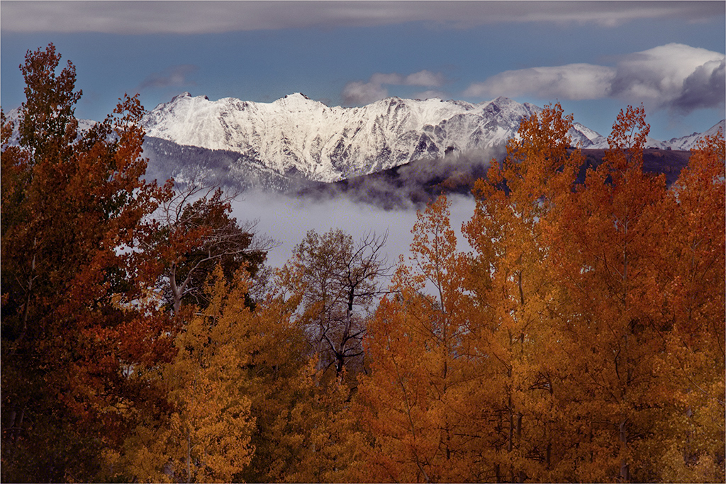
Hi Ruth. I like everything about it!: My eye goes first to the foreground trees where I appreciate the nuances of color and texture that creates a beautiful frame for the distant mountains. I linger there and let my eye move to the fog in the valley which creates a lovely separation and transition between foreground and background. Next my gaze goes to the "colorado" (I'm sure you know that means "snow covered" in Spanish) peaks then on to the sky with its white, fluffy clouds. I think you've done an admirable job with the dodging and burning in the trees which creates a subtle separation of the layers of trees and gives the image depth. I provided some visual feedback...which isn't really as much a suggestion for improvement as it is merely a different rendition. I tend to like very vibrant colors that are not to everyone's liking. In my version I added multiple radial gradients in the trees to try to bring out even more depth. I added some clarity and gave a slightly warmer tone to the snow and added a little magenta to the shadows.
Bottom line: Your image is spectacular. Very well done indeed! |
Oct 3rd |
 |
| 3 |
Oct 22 |
Reply |
I did it. Took me a while to figure it out. What do you think? |
Oct 3rd |
 |
| 3 |
Oct 22 |
Comment |
No worries at all. But I'll probably still try to rearrangement. I need the Ps practice! |
Oct 3rd |
| 3 |
Oct 22 |
Reply |
Good points to consider, LuAnn. While I dislike immensely pandering to judges - especially judges who are not accustomed to certain genres - I do realize if one is serious about competition, one has to take the politics about what you are saying into consideration.
These seed pods were arranged together on my light box and photographed as one image. You have challenged me to see if I can digitally rearrange them using some photoshop trickery. I'll try to find time to play around with it and share it with the group. |
Oct 3rd |
| 3 |
Oct 22 |
Comment |
Thanks for your comments, LuAnn. The order of placement was intentional going from youngest to oldest. While I get your point about visual balance, placing #3 at the center would disrupt the progression vis a vis the concept of aging I was going for. |
Oct 3rd |
| 3 |
Oct 22 |
Comment |
Hi Mary Ann. I want to congratulate you for your interest in long exposure photography! I have been working on improving my technique for almost two years now. There are a lot of details that have to be observed and the technique can be quite fussy, not to mention frustrating. Here are my observations:
Composition & Exposure- I rather prefer the Original composition that includes the sky. I think it adds balance. This would be a lovely composition in its own right if shot with a "normal" shutter speed. Your image was well exposed. I would, however, clone out the three grass stalks in the foreground, as I find them a distraction.
Suitability for LE - Sometimes Mother Nature just doesn't want to cooperate. While the effect on the water is lovely, the blurred birds don't work for me. One technique to get around this is to take two images. One at a normal shutter speed to freeze the birds and the other with LE. Blend the images in Ps and brush in the soft water and clouds and leave the rest of the image sharp.
Overall Sharpness - to my eye, the entire image is quite blurry. I have thrown away countless LE images due to this. The cause is camera movement. Your large, heavy camera requires a very sturdy tripod. When using a tripod for LE, current advice is to make sure your IBS is turned OFF (although there is some controversy here). Next, it's vital that you either use a shutter delay of at least 2 seconds, or trigger the shutter remotely. If there's any wind at all and the tripod isn't sturdy, there can be some camera movement.
LE is a learning process. I'd love to see you go back to this location and take some more LE shots. Make more mistakes and figure out what went wrong. Don't give up. You're on the right track! |
Oct 1st |
| 3 |
Oct 22 |
Comment |
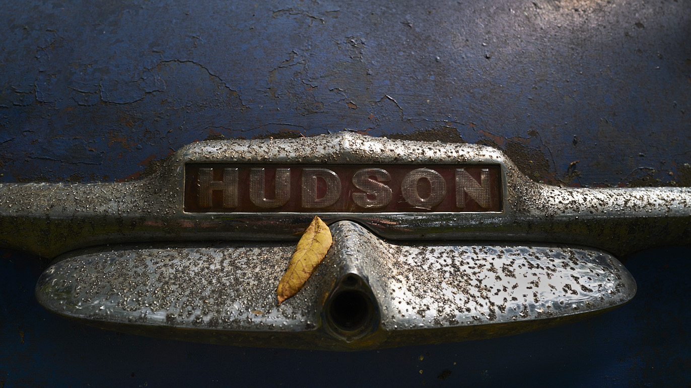
Hi LuAnn. This month you've made a departure from your recent theme of still life photography. The natural lighting on the subject is just right and your choice of crop focuses my eye on the logo and allows me to study the sad-but-interesting deterioration of what once was a prominent and proud premium automobile. The subtle blue, red and rust tones play nicely with one another and are contrasted by the remaining metallic areas. I enjoyed spending time looking at the details in the peeling paint and rusted chrome...but I found myself wanting to see a little more of the peeling paint. In my visual feedback, I chose a 16:9 crop ratio; cloned out the twig; decreased the highlights in the upper right corner and the right side chrome; brought up the shadows at the bottom of the frame and sharpened the image. Curious what you think.
I spent some time contemplating the inclusion of the leaf and I'm still on the fence as to whether it should be included as part of the story....or whether it is simply a distraction that would have been better removed prior to taking the shot. On one hand, given the bright spot of complimentary color, it draws my eye immediately and could be considered a distraction from the main subject. But on the other hand, it can also be viewed as a metaphor and part of the story: The aging and decomposing leaf reflecting that of the car. It sends the message that everything eventually returns to the earth in the cycle of life. I honor your choice to include it, as I rather think it enhances the story. Nicely done. |
Oct 1st |
 |
11 comments - 9 replies for Group 3
|
| 32 |
Oct 22 |
Comment |
Kym, I'm becoming a big fan of shooting flowers and rendering them in B&W. You have created a very dramatic portrait of these beauties. Nice lighting and tonal range. Very well done. My only suggestion has to do with displaying your beautiful image in our digital forum: The black background of your image blends imperceptibly with the black background of the website. When this is the case, the framing of the image is lost. I suggest a subtle white border to set your image apart from the website background and to show off your chosen crop. |
Oct 4th |
1 comment - 0 replies for Group 32
|
| 39 |
Oct 22 |
Comment |
Hi David. I enjoyed looking at your image! For me your mono conversion really adds drama and is most certainly the right choice for this image. Whereas the color version hits the eye with GREEN, your monochrome edit shows lovely contrast and subtle tonal variations that make the image really stand out. Very nicely done! |
Oct 6th |
1 comment - 0 replies for Group 39
|
| 43 |
Oct 22 |
Comment |
Hi Linda. I very much like what you've done here! I've been experimenting with back-lit subjects myself, so this caught my eye while perusing this month's images. I think the golden color combined with the subtle coloration of the flowers contribute to this striking image. Very well done! |
Oct 6th |
1 comment - 0 replies for Group 43
|
| 52 |
Oct 22 |
Comment |
Hi Pamela. Your image caught my eye as I was perusing this month's images. You've managed to capture a spectacular portrait of this elusive and magnificent bird. Beautiful capture; tack sharp; perfect crop choice; masterful edit. Bravo! |
Oct 6th |
1 comment - 0 replies for Group 52
|
| 65 |
Oct 22 |
Comment |
Hola, Maria! Me gusta mucho tu foto! I love the tones in your image and how only the main flower is in sharp focus. You've done a lovely job of editing and your presentation with both black and a white borders really finish it off nicely. Muy impresionante! Bravo! |
Oct 6th |
1 comment - 0 replies for Group 65
|
| 67 |
Oct 22 |
Comment |
Michael, what a lovely image! I really like the composition. Great foreground elements that frame the falls perfectly. Choice of shutter speed gives just the right amount of softness and motion blur in the water that contrasts nicely against the sharp details in the rocks and surrounding elements. Beautiful tones from pure black to pure white. An award winner for sure! |
Oct 6th |
1 comment - 0 replies for Group 67
|
| 70 |
Oct 22 |
Comment |
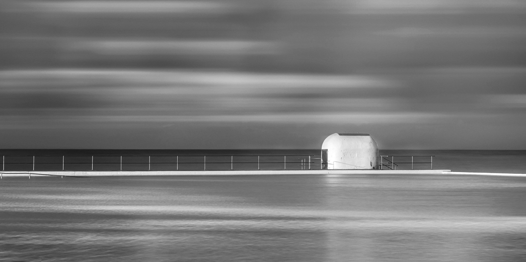
Hi Terina. Your image caught my eye as I was perusing this month's images. I, too, am a fan of seascapes, especially when captured in a minimalist composition. I really like the double leading lines in your image that take the eye to the nicely offset pump house. I particularly like your artistic edit - I've never believed that photography has to be about "reality". I often edit my images extensively to create my artistic vision and I don't think we should apologize for doing so!
The lighting in your image is beautiful and your edits have only enhanced the scene (I would love to have seen your unedited file!). Additionally, the three hue color palette works very well - white, pink and blue. Well done, indeed!
If I were to make any suggestions at all, it would be to clone out the ladder rungs(?) in the lower left of the frame and you might consider a panoramic crop as an alternative. I also think the image would look stunning in B&W. I took the liberty of seeing what that would look like. Let me know your thoughts. |
Oct 6th |
 |
1 comment - 0 replies for Group 70
|
| 72 |
Oct 22 |
Comment |
Maria, another stunning image! You have a great eye for composition and a knack for capturing the shot at just the right moment. And your technical skills are superb! Buenísima! |
Oct 6th |
| 72 |
Oct 22 |
Comment |
Hey Bruce. Kudos on this marvelous image! Unique viewpoint...and that pose! Sheer perfection! Curious how you managed the eye-level camera angle... were you in a float tube? Awesome job! |
Oct 6th |
2 comments - 0 replies for Group 72
|
| 77 |
Oct 22 |
Comment |
Dear Witta, first I want to say I LOVE your bio portrait. Unique, imaginative and, no doubt speaks to your personality (in a good way!). Now, with regard to your image - superbly done in all aspects. I think you successfully channeled the ghost of Ansel Adams. I am a big fan of "fine art" photography...and I've tried my hand at it, but I've never been able to fully wrap my head around what differentiates a Fine Art image from one that is...well, not one? I look at yours and it screams Fine Art, yet other images in this category don't always hit me the same way. I would be interested in your thoughts on this. |
Oct 6th |
1 comment - 0 replies for Group 77
|
| 96 |
Oct 22 |
Comment |
Hi Dan. What a stunning image! I am a huge fan of seascapes and you really nailed this one: The color balance; the exposure; the perfect shutter speed and, of course the compelling composition. I generally render my seascapes in monochrome due to the lack of interesting colors often found at the shore. The fact that you were able to capture these beautiful colors makes this image all the more special. Undoubtedly it would look good in mono as well��but color for this one was IMO the best choice. Simply inspirational! |
Oct 11th |
1 comment - 0 replies for Group 96
|
| 99 |
Oct 22 |
Reply |
Thanks, Randy. About a quarter of the way into the snow shed at the east entrance there is a viewing platform where you can look down to the river below. If you look closely, you can see some twisted steel remnants of the train wreckage. Very sobering! |
Oct 20th |
| 99 |
Oct 22 |
Reply |
Thanks, Kathleen, for your comments. At least for me, anyway, seeing a photographic interpretation of somewhere i have been, gives more meaning to the image. |
Oct 20th |
| 99 |
Oct 22 |
Comment |
Hi Randy. I think you have done a admirable job with your mono conversion. Exposure, tones and other edits all nicely done. I think you achieved the mood and effect you were after. I also think the color version has merit, as I feel the color in the alley is part of the "real" story. Your mono conversion tells a different story - the story YOU wanted to tell and I think you succeeded. |
Oct 5th |
| 99 |
Oct 22 |
Reply |
LOL!!! |
Oct 5th |
| 99 |
Oct 22 |
Comment |
Thanks for your comments, Peter. As I've replied above, I agree that flipping the image is an improvement. I'm not sure about the square crop, however, as I think it would diminish the appearance of height that one feels when inside. |
Oct 5th |
| 99 |
Oct 22 |
Reply |
Barbara, thanks for your comments. I can see if one hadn't been there in person and only viewed the distorted image, the distortion could be interpreted as a sign of collapse or age rather than lens distortion. In person, however, the structure is still very much perpendicular, so the distorted image doesn't match what I saw. I wanted in this case to portray it as it actually is. |
Oct 5th |
| 99 |
Oct 22 |
Reply |
Linda, thank you for your comments and suggestion. I think you are absolutely correct that flipping it does make it work better with our Western left-to-right eye movements. It's like I just turned around and took the shot in the opposite direction! |
Oct 5th |
| 99 |
Oct 22 |
Comment |
Linda, I think the B&W conversion works well for this image. I especially like how you brought out the drama in the clouds. You've positioned the hillside well in the frame to form a nice diagonal leading line. Great tonal range and I like how you've accentuated the terrain with dodging/burning in your edit. Your trip sounded amazing and I look forward to seeing more images from your travels. |
Oct 4th |
| 99 |
Oct 22 |
Comment |
Peter, simply put, another one of your striking portraits. Well exposed and composed. I think your crop choice is appropriate, although I would like to see a touch more room above the dog's head. Very striking and well done! |
Oct 4th |
| 99 |
Oct 22 |
Reply |
Spawn of Cujo? ��maybe a little too much highlighting in the dog's eyes? LOL |
Oct 4th |
| 99 |
Oct 22 |
Comment |
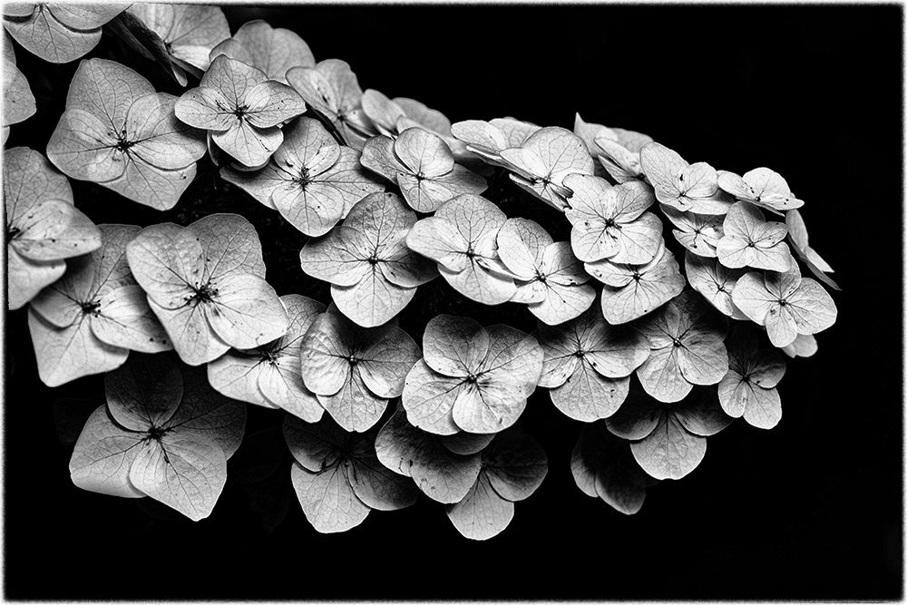
Gerard, what a lovely image! The more I see work like yours of flowers rendered in monochrome, the more I like it. You have a nice composition and I like the fact that you didn't pull up the shadows, but left them dark. The image is sharp with lots of details to enjoy. Black background was definitely a good choice, but on this forum, your image boundaries get lost. In my visual feedback I did two things: In Silver EFX I chose the Fine Art preset and bumped up the clarity to +20 to ever so slightly emphasize the veining on the petals and I added a border to set it off when viewing on a black background. It's a beautiful image and well done, indeed! |
Oct 3rd |
 |
| 99 |
Oct 22 |
Comment |
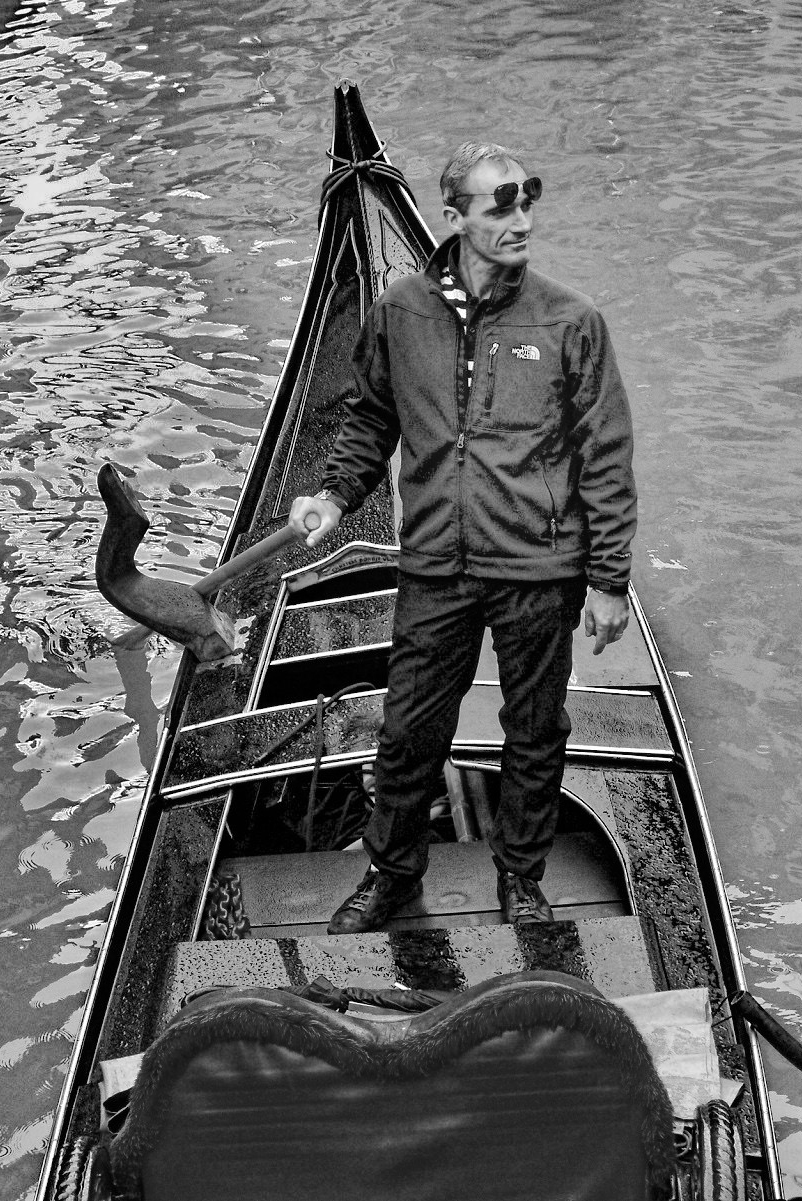
Hi Kathleen. Thank you for sharing your gondolier photo with us. They certainly do make great subjects. I agree with your choice to render this in mono, as the two splashes of color in your original are indeed distracting. Your image is in sharp focus and I enjoyed looking at all the details of the boat. In all honesty, I have to say that your crop and sepia toning don't work well for me. Because your subject is the gondolier, the inclusion of the moored boat on the left, in my view, takes attention away from the main subject. Because his gondola is a deep, rich, shiny black, I feel the sepia toning diminishes the wonderful contrast in the scene and also accentuates the over-exposed highlights. Please consider my attached visual feedback as an alternative way to present your gondolier. For my edit, I cropped out the moored boat entirely and allowed the sun reflection to become a nice leading line. I rendered the conversion in neutral tones, reduced overall highlights, increased blacks, increased exposure on the gondola and gondolier while decreasing the exposure on the water for more separation. |
Oct 3rd |
 |
| 99 |
Oct 22 |
Comment |
Hi Barbara....I dunno...looks like the camera (and, of course, the photographer) did a fine job of freezing the action. I can see, however, that you might have wanted to do a pan shot with a slower shutter speed to emphasize the motion and streak/blur the background a bit. I think the image as presented is well exposed. You have done a nice composition and have a really nice tonal range from deep black to white. If anything I might have liked the depth of focus to be shallower so as to emphasize the subject. Also, the near fence is very white and it intersects the jockey's head. With the white fence and the black and white jockey, this area for me lacks visual separation. I wonder if this is an image where color is perhaps a better choice? |
Oct 2nd |
7 comments - 6 replies for Group 99
|
30 comments - 15 replies Total
|


