|
| Group |
Round |
C/R |
Comment |
Date |
Image |
| 3 |
Sep 22 |
Reply |
Thank you, Kieu-Hanh. I appreciate your comments and suggestions. I often forget about .png format - thanks for reminding me! |
Sep 21st |
| 3 |
Sep 22 |
Comment |
Ruth, thank you for your comments. ��just trying to think outside the box and not do what everyone else is doing. I have printed it and have entered it the upcoming Northwest Council of Camera Clubs annual meeting and competition. ��fingers crossed�� |
Sep 14th |
| 3 |
Sep 22 |
Reply |
Joan, thank you for your kind words. If I printed them actual size, they would be very small prints, indeed! |
Sep 11th |
| 3 |
Sep 22 |
Comment |
Hi Kieu-Hanh. Normally perspective-warped architectural photos bug me��but NOT this one. I really like how the suspension cables converge, creating leading lines to the top of the tower. With this perspective, it looks as if the couple in the foreground could continue walking up the center column, which is a great optical illusion. |
Sep 11th |
| 3 |
Sep 22 |
Reply |
Hi Bob. The dandelion puff was done in Ps. The original had a black background so I used the Invert function that turned the image into a negative and did the finishing of the colors in Lr. The other two were done on a natural light box - a frosted translucent white piece of acrylic as the backdrop with natural back-lit sunlight. These images were edited in Lr. I have used Topaz Studio 2 for producing effects on some of my images, but not in this case. Regarding your sunflower, I found this short YouTube vid showing how to turn a photo into a sketch: https://www.youtube.com/watch?v=hVJG3-j0G6I I just tried it myself and it is super easy!
If you wanted to add back some color to the image, do this: Once you had the sketch done, you could merge the monochrome and sketch layers by selecting them both (but not the color layer) and use the "Merge Layers" command in the Layers menu. This will leave you with the sketch top layer and the original color as the bottom layer. Then play with the opacity slider on the top layer until you get the amount of color you want. Try it on your sunflower image and let me know how it works.
Regarding IMPACT - I agree that a large print of any one of the images would be impactful... AND so would a large print of the triptych. I did print it and I must say the image is better suited to viewing as a print rather than projected. You have been very successful in creating impact with your images. |
Sep 6th |
| 3 |
Sep 22 |
Reply |
Oliver, thank you for visiting and for your kind words! Yes, I've been following Bob's work and we've had a few conversations about flower photography. |
Sep 6th |
| 3 |
Sep 22 |
Reply |
LuAnn, I do mat and frame some of my favorite photos. I would like to frame more of them but my home is very short on wall space for display and storing framed prints for a rotational display is also problematic due to space concerns. I am really enjoying getting into the nitty-gritty of printing - an art and a science! I am one of only a handful of camera club members who participate in our monthly print night. Currently I store my prints in a large portfolio. |
Sep 6th |
| 3 |
Sep 22 |
Reply |
Thank you, Mary Ann, for your comments. As far as I can tell, in Photoshop, when you use the INVERT function, it essentially turns your positive image into a negative (remember those??). From there, you can play around with all the other functions and effects in PS and ACR for unlimited creative effect. |
Sep 5th |
| 3 |
Sep 22 |
Reply |
LuAnn, thank you for your kind words! To answer your question:
Dandelion seed puff = weed!
Sea Holly - definitely NOT edible...unless you're a goat, maybe. But...I looked it up and found this: Medicinal use of Sea Holly
The root is to be aphrodisiac, aromatic, diaphoretic, diuretic, expectorant, stimulant and tonic. The root promotes free expectoration and is very useful in the treatment of debility attendant on coughs of chronic standing in the advanced stages of pulmonary consumption.
Clematis seed pod - not edible but flower, leaves and bark are medicinal:
Traditionally, Clematis medicine is used orally to treat syphilis, gout, rheumatism, bone disorders, and chronic skin conditions and as a diuretic. In folk medicine, Clematis is used topically for blisters and as a poultice to treat purulent wounds and ulcers.
I didn't know any of this so I'm glad you prompted the question. |
Sep 5th |
| 3 |
Sep 22 |
Comment |
Hi Mary Ann.
I'm pleased to see you've stepped outside your "usual" box to come up with this intriguing abstract image. There is definitely a sense of motion and the abstraction is not so much that I can't glean what the stationary scene was (did you take a static image of the scene? If so, may we see it?). I am curious how you managed to move your camera in such a perfect circle...or did you use the spiral filter in Photoshop? Nicely done.
On seeing your image I wondered what it would look like even more abstract so, just for fun, I took it into Topaz Studio 2 and applied additional abstraction. |
Sep 4th |
 |
| 3 |
Sep 22 |
Comment |
Here is the second HDR version |
Sep 4th |
 |
| 3 |
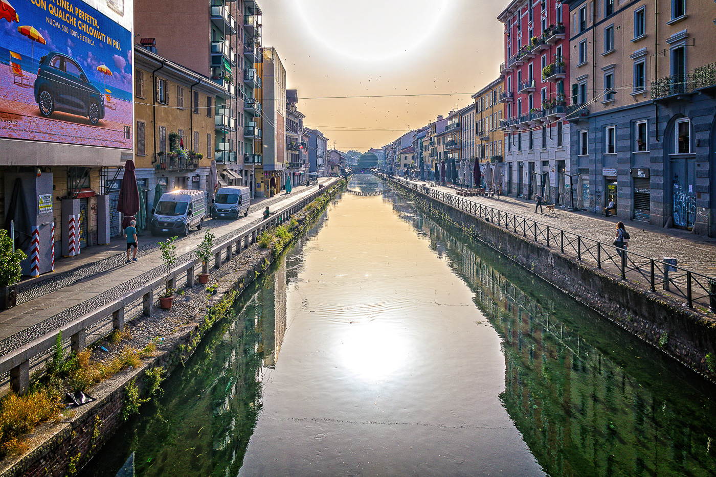
Sep 22 |
Comment |
I have, but have never used HDR EFEX Pro2, so I thought this might be a good image to play around with the app. I did two versions. Here is the first one. |
Sep 4th |
 |
| 3 |
Sep 22 |
Comment |
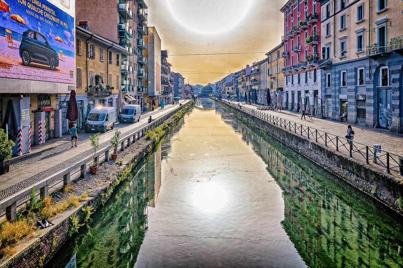
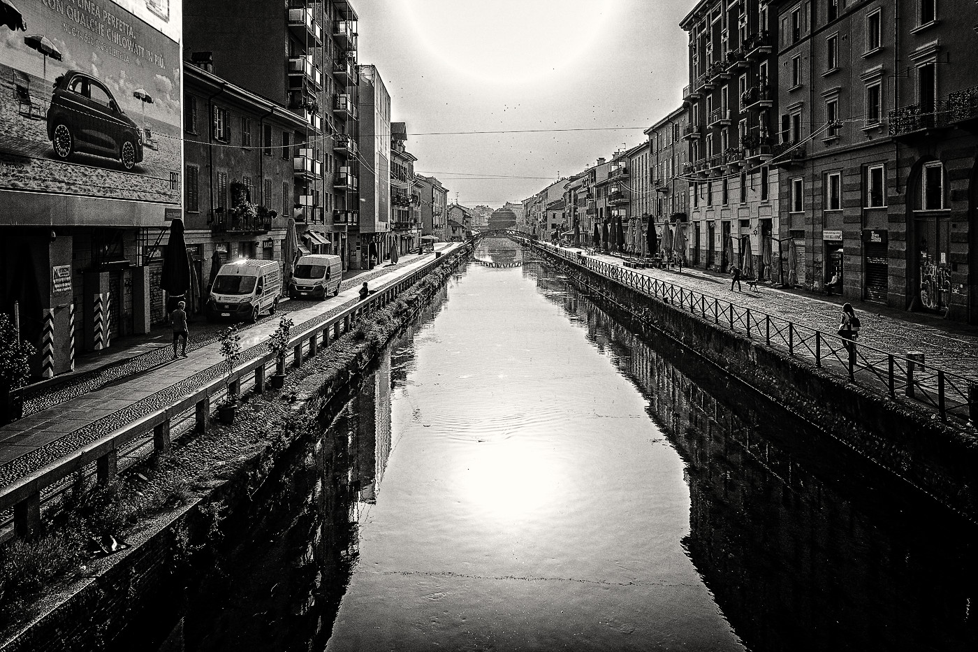
Hi Christine.
It pays to get up early because you've captured a beautiful scene. Your composition and wide angle lens choice give a very nice perspective that draws my eye deep into the scene. And yes, the reflections are wonderful. I can imagine the sounds and smells of this time and place. I also love the multitude of subdued colors in the warm glow of morning light. Are those dots in the sky birds?
I offer up three other versions - just for fun and NOT because I think your image needs "improvement" - it doesn't. I first tried this monochrome version edited in Silver EFEX Pro3.... but I think I prefer your color version. |
Sep 4th |
 |
| 3 |
Sep 22 |
Comment |
Hi Ruth.
Portraiture is not one of my genres and I admit to knowing virtually nothing about. Given that, I don't feel I am in any position to offer a critique. What I can say is this: First off, your grandson is a natural! Great pose. Great smile and you've captured sharp focus on his bright eyes. You've done an exceptional job of editing. Very nicely done. |
Sep 4th |
| 3 |
Sep 22 |
Comment |
Hi LuAnn. I appreciate monochrome flower photography because it forces the viewer to appreciate subtle tonality differences and structural details that often otherwise get lost in a splash of color. You've taken "just another sunflower" photo and turned it into something unique that is, in my opinion, more beautiful than the original in every way. I particularly like the toning of the image and the solitary droplet of water adds a nice touch. Quite lovely and well done! |
Sep 4th |
8 comments - 7 replies for Group 3
|
| 5 |
Sep 22 |
Comment |
Hi Mark. Your image caught my eye whilst I was perusing this month's images. I am a huge fan of monochrome, long exposure sea scapes and yours is quite lovely. One could discuss the merits of crop vs no crop for days��but it boils down to the artist's intent, which I very much respect. Regarding those pesky halos, I, too, am plagued by them in my B&W conversions and I do just as David Price advised.
The other thing that caught my eye was the name of the beach. It sounded Polynesian and I suspected New Zealand��.and sure enough! It got me even more excited for my upcoming month-long visit there in February. So many photo opportunities! Thank. You for sharing this beautiful image. |
Sep 11th |
1 comment - 0 replies for Group 5
|
| 18 |
Sep 22 |
Comment |
Hi Ian. Your image caught my eye whilst I was perusing this month's images. I am fascinated by doors, windows and balconies and they are frequent subjects of my own photography. I like your rendition and am happy you shared it and even happier that it won in competition! I may be wrong, but sometimes I get the impression that this type of artistic rendering is often looked down upon as somehow not being "real" photography. So that makes me all the more glad that your image was recognized. Very well done! |
Sep 11th |
1 comment - 0 replies for Group 18
|
| 27 |
Sep 22 |
Comment |
Jon, what a lovely image rendered perfectly in B & W. Great composition and nicely edited. |
Sep 11th |
1 comment - 0 replies for Group 27
|
| 62 |
Sep 22 |
Comment |
Bob, OUTSTANDING! I love what you are doing with your flower portraits. |
Sep 6th |
1 comment - 0 replies for Group 62
|
| 74 |
Sep 22 |
Comment |
Hello Arne. What a stunning architectural Fine Art image you have made! Your composition is outstanding as is your mono conversion. I particularly like how you handled the "frame" with the gradual transition from bright on the rim to dark toward the glass. The others have given some good feedback and I particularly like the suggestion to increase the prominence of the reflection in the windows. You might also consider removing the extraneous items (cars, house, people, etc.) from the lower left of the frame. Picky suggestions for an image that stands proudly on its own merit. Well done! |
Sep 12th |
1 comment - 0 replies for Group 74
|
| 79 |
Sep 22 |
Comment |
Hi Judith. Your image caught my eye as I was perusing this month's images. I like how you took this image of something mundane and turned it into this creative, abstract. Most people (probably myself included) would have simply walked by the branch on their way to photograph something else. You demonstrate quite clearly how good photographers "see". Well done!
And, to answer your question, Groot is an animated tree-like "man" from the tongue-in-cheek Guardians Of The Galaxy movies. |
Sep 12th |
1 comment - 0 replies for Group 79
|
| 99 |
Sep 22 |
Reply |
Peter, I think this version works very well. I like it! |
Sep 21st |
| 99 |
Sep 22 |
Reply |
Peter, I think this version works very well. I like it! |
Sep 21st |
| 99 |
Sep 22 |
Comment |
Thanks, Linda. YES! The high key works well. So many options with this image. |
Sep 13th |
| 99 |
Sep 22 |
Comment |
Randy, thanks for your candid opinion. I get what you're saying. Truth to tell, I was not able to pull everything out of this image that I had hoped and envisioned. Decided to present it anyway just to get comments. I appreciate yours. |
Sep 13th |
| 99 |
Sep 22 |
Comment |
Thanks for your perspective, Kathleen. I debated about cropping out the left hand branch, but ultimately decided the "rule of threes" worked best for this composition. |
Sep 7th |
| 99 |
Sep 22 |
Reply |
Peter, thank you for your visual feedback. I think your edit works very well and is an improvement of my original presentation. |
Sep 6th |
| 99 |
Sep 22 |
Reply |
Peter, thank you for your visual feedback. I think your edit works very well and is an improvement of my original presentation. |
Sep 6th |
| 99 |
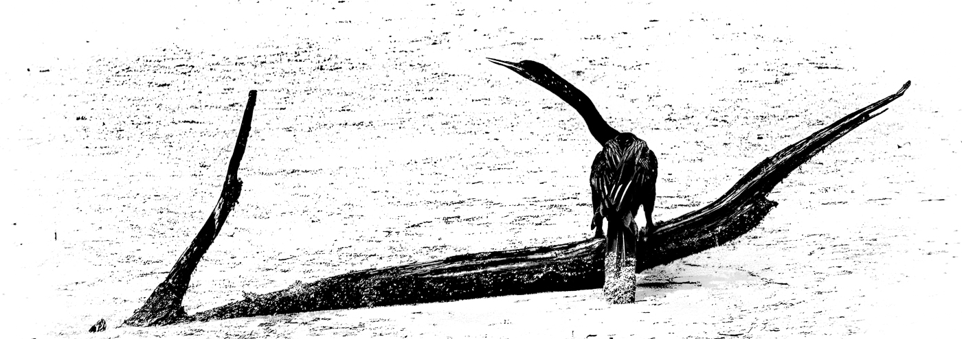
Sep 22 |
Reply |
Thanks, Barbara. Yes, I think the increased contrast is better! I took it a step further and increased the blacks and shadows; decreased clarity and increased DeHaze. It's almost a silhouette and could be re-titled as: BIRD? WHAT BIRD? |
Sep 5th |
 |
| 99 |
Sep 22 |
Comment |
This is a Film Noir rendition courtesy of Silver EFEX Pro3 with some tweaks. |
Sep 4th |
 |
| 99 |
Sep 22 |
Comment |
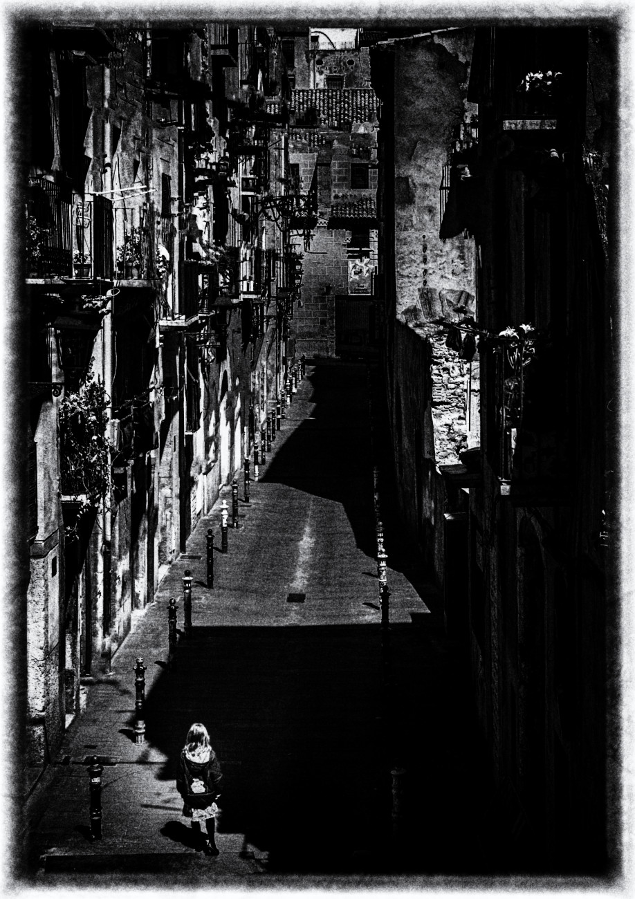
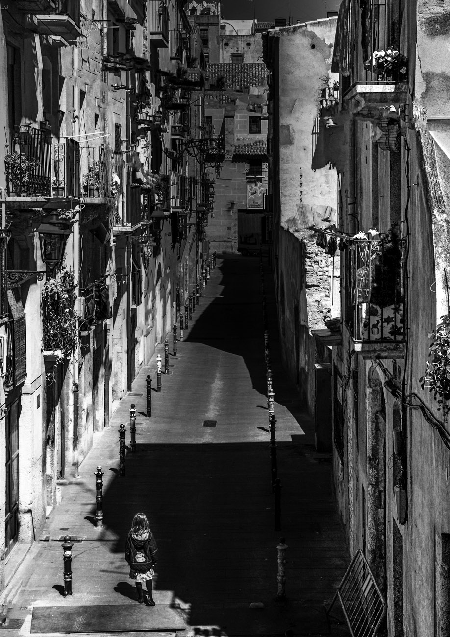
Randy, a compelling image that draws me in, as does your sense of humor! Your camera angle (perhaps from the top of a flight of stairs?) yields an interesting perspective from which to view the scene. The balconies create a busy image - but not in a bad sense - that allows my eye to wander and study the details.
In the vein of malevolence, murder and mayhem, I offer up two other renditions just for fun. Both images darken the building at the far end of the alley, thus disguising the slight softness in that area as well as enhancing the feeling of the traveler walking into the darkness.
|
Sep 4th |
 |
| 99 |
Sep 22 |
Comment |
Hi Kathleen.
You've captured an interesting close-up study. Your image is nicely in focus and I enjoy the range of tonality as well as the sepia monochrome rendering. There is a lot of textures and details to appreciate: - the socks; the shoe; the cobblestones; the wheel - to keep me interested.
Regarding the composition, I agree with Peter that perhaps some additional context would have improved the image and told a broader story. Cropped as you have, it is not clear to me that the leg and foot belong to the same person as the hand. That said, all of the other technical aspects of the image are well done. Thank you for sharing this photo. |
Sep 4th |
| 99 |
Sep 22 |
Comment |
Hi Linda. WOW! What a dramatic scene! The composition + edit gives off a distinct post-apocalyptic vibe. Very dark. Very moody. Very well done. I like the composition and the flip from the original. In my opinion, I don't feel any additional cropping is necessary. I like it as-is. I think the original color image can stand on its own, but in color, it evokes an entirely different feeling and mood. I like them both, but I prefer what you've done with the mono version. Two thumbs up! |
Sep 4th |
| 99 |
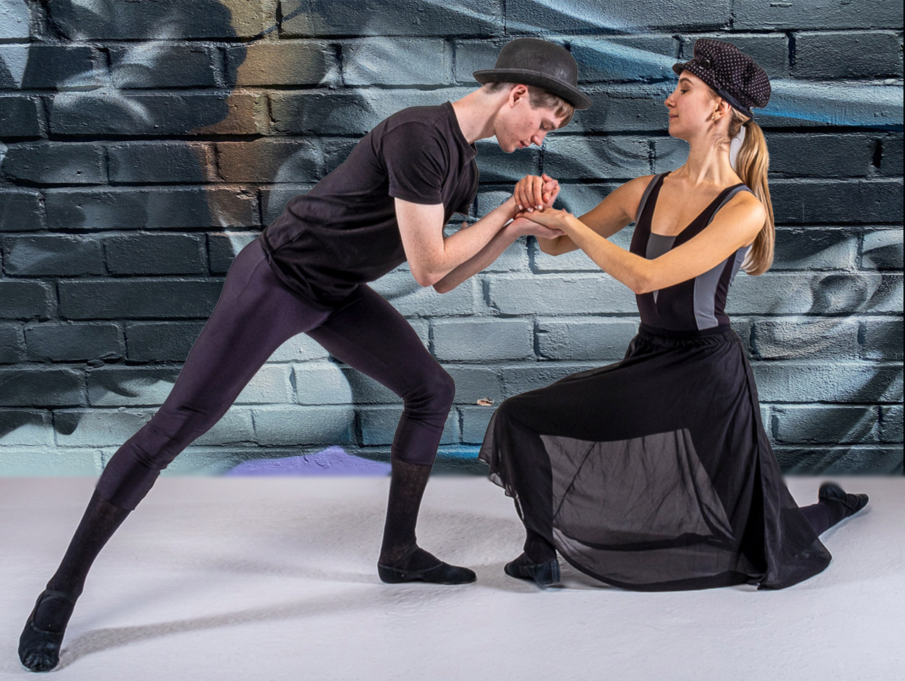
Sep 22 |
Comment |
Hi Peter.
I think you were on the right track with your concept but I don't think it quite works for me. As someone who struggles with composites myself, I appreciate the work you did to get to this point. Yet, this one might benefit from a reworking. I think two things are off for me: Perspective and scale.
I do not have the compositing skills to give you precise visual feedback, but I'll try a quick edit in Photoshop. The perspective and scale are still off and I didn't spend time to try to get the whole mural to fit into the background but I hope you get a sense as to what I was thinking.
I also realize that maybe I've gone off on a tangent that in no way represents what YOU were trying to convey and that I may be completely missing your point! So please take this with a grain of salt! |
Sep 4th |
 |
| 99 |
Sep 22 |
Comment |
Hi Gerard.
There are many things that make a photograph engaging besides a pretty subject. In your image I find the overall SUBJECT rather boring.... but the PHOTO is most certainly NOT boring because I don't see your photo as being about the subject, if that makes sense. To me, there are several things that make your image interesting and enjoyable:
I like how you have isolated the one section of the building to limit the context (context in my view isn't always needed). This allows the viewer to appreciated only that which you have chosen to show. There is a lot to like in viewing the shapes, tones and textures.
Your composition is well chosen. The gutter and downspout form a square and the rectangular window is made up of squares. The rectangles are repeated in the brickwork and other rectangles are formed by the sill and the bottom stucco or concrete.
The wires add to the industrial feel of the image and I would definitely leave them in. I do not find them distracting. Overall, a successful image! |
Sep 4th |
| 99 |
Sep 22 |
Comment |
Hi Barbara
I am becoming more and more a fan of monochrome flower images and yours does not disappoint! With the absence of color, one is free to explore the difference in tones and intricate details that are often overlooked and overshadowed by color. I like the pose and the position of the flower in the frame. The square crop works perfectly. I'm impressed by the sharp focus front-to-back - especially in light of the f/8 aperture. Well done. Both your version and Linda's are meritorious. I find Linda's version does, indeed, brings the flower forward and allows my eye to better focus on and appreciate the flower it the bright background. A lovely image! |
Sep 4th |
| 99 |
Sep 22 |
Reply |
Peter, thanks for your honest assessment. I'm wondering if you might give me some visual feedback with a re-edit? |
Sep 4th |
10 comments - 6 replies for Group 99
|
24 comments - 13 replies Total
|


