|
| Group |
Round |
C/R |
Comment |
Date |
Image |
| 3 |
Aug 22 |
Reply |
Christine, thank you for your comments and encouragement. Of course I know and agree with everything you said. I never (well��.rarely) take comments personally. I've had my share of bombs. But nevertheless it is just interesting to me how the reactions from one arena - camera club- can be so diametrically opposed to the reactions in another - here, for example.
I am in process of selecting and preparing prints and digital images for our Northwest Council of Camera Clubs annual meeting and competition. Most of my entries are run-of-the-mill - i.e., "conventional" images. I decided to throw in another "out there" creative flower image just for the heck of it and to see what kinds of comments it might generate. I plan on sharing it with y'all as my September contribution. Should be interesting! |
Aug 28th |
| 3 |
Aug 22 |
Reply |
Wow! Thanks so much. I will definitely check it out. |
Aug 23rd |
| 3 |
Aug 22 |
Reply |
Kieu-Hanh, thank you for your comments and interesting suggestion of making the flowers into brushes. I'll have to refresh my memory on how to accomplish that in PhotoShop��and then I'd have to figure out how I would make use of them - an interesting challenge. If you have done something similar, I'd be interested to see what kinds of effects can be made. |
Aug 21st |
| 3 |
Aug 22 |
Reply |
Thank you, Ruth. I appreciate your comments. |
Aug 21st |
| 3 |
Aug 22 |
Comment |
Hi Christine and WELCOME! Nice to have you in our group. Since travel is one of my passions, it was fun to see your image. I think what sets your image apart from the "usual" shots one sees from Venice is the perspective through the opening and between the buildings. Nice composition.
The opening forms a vignette of sorts to direct my eye to the bridge and beyond. I did find the brightness at the bottom of the frame a bit distracting and LuAnn's suggestion to crop some of the foreground seems like a good suggestion. In addition, you might also consider taking down the highlights a bit in that area. Otherwise, your edit is nicely balanced in tones and exposure with excellent focus on the main parts of the image. Besides the unique perspective, you've also successfully captured the mood of modern day Venice with its infestation of tourists (present company accepted LOL!). Very nicely done.
Thought Experiment and musing: While traveling I have had so many "if only" situations. For your image I imagine having a tripod and all my ND filters and being alone in that (most likely, crowded) hallway. A 5 minute exposure would capture "ghosts of Venice" on the bridge and gondolli and would smooth out the water for an interesting effect. But, alas, sometimes we tourists have to take what we can get��and you got a creative and interesting shot. Thanks for sharing it with us. |
Aug 18th |
| 3 |
Aug 22 |
Reply |
Hi Bob, thanks for visiting and thanks for your comments and encouragement! Your work producing digital art renditions of flowers is inspiring. You have convinced me to share more of my digital art images on this forum as well as in camera club. Thanks again! |
Aug 13th |
| 3 |
Aug 22 |
Reply |
Mary Ann, thanks for letting me know and I'm glad she liked it. Please don't let my comments about camera club dissuade you from joining one. I continue to enjoy my membership, the fellowship and the education. There are also competition opportunities. I'm quite certain you would find membership in a camera club very rewarding.
I am finally in a position to exert some influence by virtue of having been elected as a Board member. The newly elected Digital Director and I have proposed changing the monthly "Assignments" to monthly "Challenges". We would like to see some more Challenges that are out-of-the-box. I'll be sure to keep you posted on how it goes. |
Aug 13th |
| 3 |
Aug 22 |
Reply |
Thank you, LuAnn. I suspected as much. I did enter it under the Creative/Altered category. There were only two entries under this category and both received a 20/27. One of the judges mentioned to me she thought it would make a really nice kitchen towel pattern...and I'm not sure that was a compliment!
I will be one of the commentators at tonight's Camera Club Digital Night. There are a couple of images where I will be saying some appreciative words for their outside-the-box compositions. Also, as a newly-elected board member, I am going to push for some out-of-the-box assignments for the coming year. Hope my strategy works to get some of the members to let go of their stodginess!
|
Aug 8th |
| 3 |
Aug 22 |
Comment |
Hi Kieu-Hanh. I must say this is one of my favorite images I've seen you create. It is as if the butterfly and flower are having an intimate conversation. You've captured the color of the lily beautifully and it is set off by the lovely, soft bokeh. I also like how you've positioned the flower's stem to come in on a diagonal which forms a nice leading line. I have an observation and a suggestion: On my iPad, the very top of the petals appear overly bright and I'm wondering if you might be able to bring that down a bit. Also, parts of the image seem a little soft��but I never know whether that is an in-camera issue, or if it is simply because the image size requirements make it appear so. In any event, I'm curious if you've had an opportunity to try Topaz Sharpen AI? The app is really quite amazing and I have resurrected images that were way softer than yours. Softness aside, it is a lovely image. |
Aug 5th |
| 3 |
Aug 22 |
Reply |
Thank you, Mary Ann, for your kind comments. Of course you have my permission to share my photo with your friend.
So far I have to say I am surprised at all the positive comments I've received here. That's mostly due to the fact that the judges in my camera club didn't seem so impressed given the low score my print earned. In any event, I'm glad you like it. |
Aug 5th |
| 3 |
Aug 22 |
Comment |
Hi Mary Ann. What? Fog in San Francisco? Who would've thought! (LOL). Your composite does, indeed, work! You have created a lovely night time cityscape. Your choice of crop works well and given your focal length, the moon looks about right in terms of size and perspective. It is often difficult to make moon composites look natural, but you pulled it off. Please see my comments for Ruth's photo regarding dark backgrounds. I think a subtle stroke border of a lighter color would present your image better against the black page. |
Aug 3rd |
| 3 |
Aug 22 |
Comment |
Hi Ruth. I think your image is nicely composed and exposed. It really gives me the feeling I'm inside one of the cabins looking out. You did a nice job of balancing the exposures between the outside and inside. My only suggestion for improvement is a general one for all photos with primarily dark backgrounds that are presented in the PSA Digital Dialog groups: Because the PSA DD pages are black, it is often difficult to visualize the boundaries of photos with similarly dark / black backgrounds. Therefore I feel a subtle lighter stroke border helps to bring the photo forward for better appreciation and enjoyment. |
Aug 3rd |
| 3 |
Aug 22 |
Comment |
Hi LuAnn. I really like your image. You've taken a "just-a-tree-trunk-and-some leaves" photo and turned it into a beautiful work of art. Very skillfully edited! What editing app did you use? I think "filtered" images are generally under-appreciated and under-rated and I think this is because a lot of photographers and judges don't look at this genre as "real" photography. It's a shame, because the creative possibilities are really quite endless. As far as a PID image goes, the texture that simulates watercolor paper works really well. I wonder if you could do a different version where you subtract the digital watercolor texture, and instead, print it on a textured paper. It would make a beautiful print. |
Aug 2nd |
| 3 |
Aug 22 |
Reply |
Thank you, Angela. I appreciate your comment.
|
Aug 2nd |
| 3 |
Aug 22 |
Reply |
Thank you, Gerard. Art?��.well, I'm glad you think so! Art or not, it took a lot of time to put it all together, so I'll take kudos for the effort in any event. The effects were all done in Topaz Studio 2 using some custom Expressionism filters. |
Aug 2nd |
5 comments - 11 replies for Group 3
|
| 99 |
Aug 22 |
Reply |
Thank you for your comments, Kathleen. Much appreciated. |
Aug 4th |
| 99 |
Aug 22 |
Reply |
Peter, thanks so much. Please see my response to Gerard that addresses some of your comments as well. |
Aug 4th |
| 99 |
Aug 22 |
Reply |
Thanks, Linda. I appreciate your comments and suggestions. Please see my comments and re-crop in my response to Gerard. |
Aug 4th |
| 99 |
Aug 22 |
Reply |
Thanks, Barbara. Glad you like it. |
Aug 4th |
| 99 |
Aug 22 |
Reply |
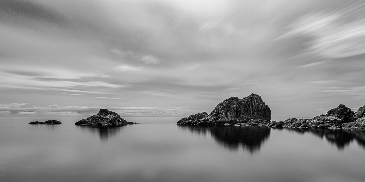
Gerard, thank you for your comments / observations. I went back to my original to look at three things: the "dark patch", the white cloud streaks and the crop. Interestingly, in my original, the dark patch renders as a medium grey and is barely noticeable. And the cloud streaks are not any brighter than any of the other clouds . Not sure what happened in the export. Very strange. Regarding the transparent water... yes, I see what you mean, although to my eye I'm not bothered by it. I stacked my ND filter on top of a CPF, to eliminate harsh reflections in the water. Since others commented on the crop decision, I did go back and move things around to eliminate the "dark spot" and bring the rocks and horizon closer to the lower 1/3. I decided to leave the white clouds as-is. I did a luminosity mask and the upper right clouds are no more bright than the others and to my eye the streaks, rather than being a distraction, point my eye to the main rock formation. ...just my artistic decision. |
Aug 4th |
 |
| 99 |
Aug 22 |
Comment |
Randy, sometimes there are no "accidents"! Classic example of turning lemons into lemonade. Nice recovery and good photoshop skills. I like this type of photographic art but I feel it is often much maligned as not being "real photography". To that I say POPPYCOCK! It does, however, make commenting and evaluation more difficult because the more one departs from the parameters of "classic" photography (exposure, white balance, sharpness, etc.) the more subjective it becomes. So, my "classic" comment is to agree that the image needed straightening. But as far as the rest of the image goes, the appeal is in the eyes of the beholder...and I like it.
Variations of this sort of image are infinite, and I've thrown my version in for comparison. I used a preset "Look" in Topaz Studio 2 and then played around with the parameters (I was trying to see if I could come close to your "look") until I was satisfied. Then I brought it into PS to straighten which also required some Content Aware Fill to compensate for the rotation. What do you think?
(As an aside, I feel so-called "real" photographers look down on the use of apps such as Topaz because it's too easy. But my feeling is this: in art, only the end result is what counts. I like your end result) |
Aug 4th |
 |
| 99 |
Aug 22 |
Comment |
Hi Kathleen and welcome to our group! Nice to meet a fellow Pacific Northwesterner! (I live in Edmonds and am a member of the Puget Sound Camera Club). I was really captivated by your image. When I first looked at it I thought you had taken it from under water, but as I studied it and saw the boat name reversed, I realized you flipped it and in doing so, it made all the difference in the world. Very creative indeed! My only suggestion mirrors that of Gerard - I prefer the tighter crop. Nicely done!
As an aside, I would encourage you to sign up with Lance for his B&W mentorship program. I completed it several months ago and I really got a lot out of it. In addition to Lance's advice / opinions on composition and editing, he throws in a hefty dose of philosophy. He is a deep thinker and his thoughtful and detailed comments will challenge you to rise to a higher level in your photography. |
Aug 4th |
| 99 |
Aug 22 |
Comment |
Linda, what an awesome capture! I really like the camera angle, the pose and the crop. I did find I wanted a little more contrast between subject and background - In my visual feedback I decreased the subject's exposure by -.35; Contrast -8; Highlights -2; Shadows -5 and Blacks -4. But of course, this is simply a personal preference and irrespective of my suggestion, your image is very well done and it made me smile. Thank you for sharing! |
Aug 4th |
 |
| 99 |
Aug 22 |
Comment |
Hi Peter. I think you've captured a superb studio portrait. I love the play of light and shadows and the feeling of intrigue in your image. A great example of a classic Film Noir vibe. No suggestions. Well done. |
Aug 4th |
| 99 |
Aug 22 |
Comment |
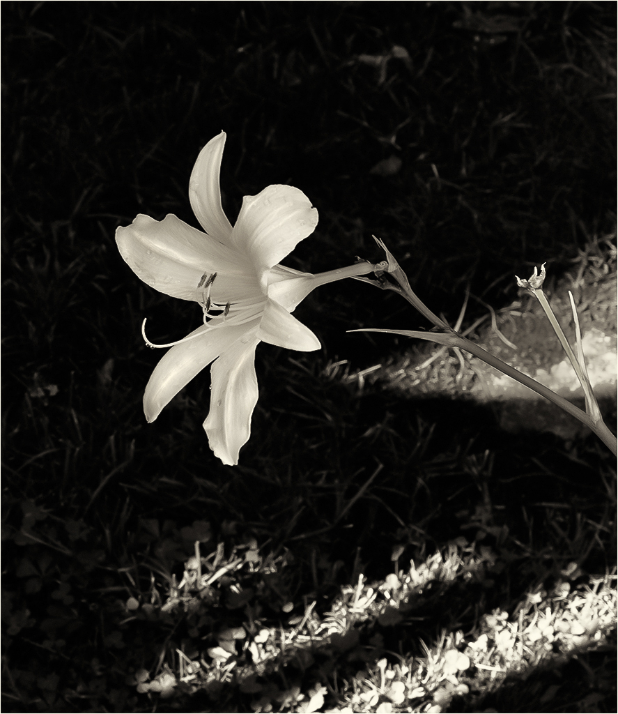
Hi Gerard. I am drawn to the simplicity of your image. Minimalist. Zen. Tranquil. I like it. I particularly like the soft, ripply background and what appears to be a natural gradient. The lighter part of the gradient contrasts nicely with the detail of the flower head. I also like the placement of the flower head. For me, the most interest is in the flower head itself and I felt the stem-to-flower ratio was unbalanced. In my visual feedback you will see I cropped and rotated the image to give the flower head more prominence and create a stronger diagonal leading line. I also used a radial filter to bring out more detail in the shadows and I used a linear gradient to accentuate the natural gradient that was already present. Lastly I applied some sharpening. Please let me know what you think. |
Aug 3rd |
 |
| 99 |
Aug 22 |
Comment |
Hi Barbara. Sunlight can be fleeting and you captured this lovely flower portrait at just the right moment. I think the flower is beautifully sharp and placed well in the frame and your use of a minimal border sets the image apart from the page. I like the subtle texture of the grass and the light stripes on the grass add interest and context for me. The only thing I found distracting was the brightness of the stem at the far right of the frame. Because there is texture in the background, I found myself wanting the flower to stand out a bit more. In my visual feedback, I increased the overall brightness of the flower just a smidge. Then I used a brush to bring up the highlights a bit on the petal ridges and to lower the highlights on the stem. Lastly I darkened the anthers and increased their contrast to make them stand out more from the rest of the flower. My visual feedback below. |
Aug 3rd |
 |
6 comments - 5 replies for Group 99
|
11 comments - 16 replies Total
|


