|
| Group |
Round |
C/R |
Comment |
Date |
Image |
| 3 |
Jul 22 |
Comment |
Hi Kieu-Hanh. I really like your image this month. Very creative and nicely composed. I do think, however, that some additional editing would improve the image. In addition to LuAnn's suggestions, some additional sharpening - perhaps with Topaz Sharpen AI, would finish it off nicely. Another option for up-res is also a Topaz app: Gigapixel. I love all the Topaz apps and use at least one of them on every image of mine. |
Jul 25th |
| 3 |
Jul 22 |
Comment |
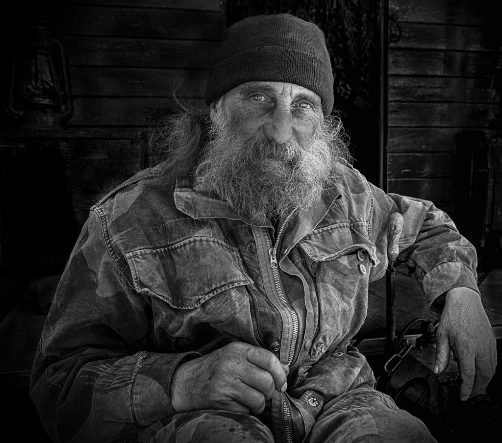
Hi John. Your image is very engaging to my eye. I contemplated it for quite some time and found myself wondering what possessed this man to develop the skill of nose banana balancing! You captured a great moment and no, I don't think the tree is distracting - it creates a nice dark backdrop that makes the banana stand out. One thing to consider: To my eye, the exposure on the man is a bit dark. Since you use LR, clicking on Select Subject and brightening him and the banana would make him stand out more from the background. It is a really fun image. |
Jul 25th |
| 3 |
Jul 22 |
Reply |
John, I shoot with a Sony a6600 - APSC; 24MP. I have been tempted to go to a full frame but there's a trade off. I love the light weight of the camera and I especially like the extra range you can get with your lenses due to the crop factor. For example, my 70-350 is equivalent to a 525. Greater range and lighter weight. Of course you lose on the wide angle range. It all depends on what and how you shoot. I would love to see Sony come out with the next iteration with a higher resolution sensor��. But with Gigapixel, I can up-res my images up to 4X. |
Jul 6th |
| 3 |
Jul 22 |
Reply |
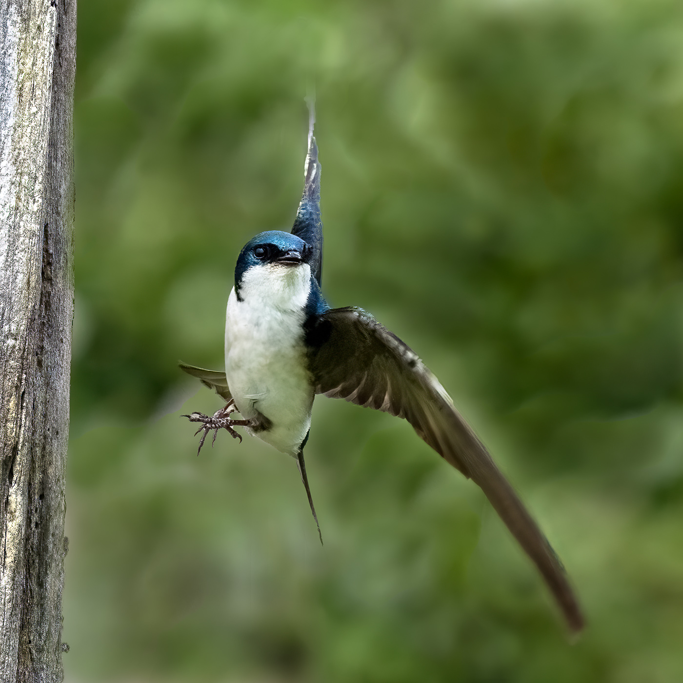
Kieu-Hanh, thanks for your perspective. To answer your question: sort of. He flew in and landed on the side of the tree with his body and head facing me. They sort of push off with their legs and twist as they dart off in their intended direction. The position of his head tells you the direction in which he ultimately flew. |
Jul 5th |
| 3 |
Jul 22 |
Reply |
Thanks, Ruth. The re-edit was done rather quickly and I wasn't happy with the re-re-edited wingtip (top). I wound up cutting a portion of it off. I don't mind that the wingtips are blurry as I think it adds a sense of motion and a nod to how fast the critters fly. I was happy to have gotten so much of the head and body in focus. |
Jul 4th |
| 3 |
Jul 22 |
Reply |
LuAnn, thank you for your suggestion. I think the re-edit does indeed work better. Please tell me if you agree. I selected the subject then inverted the selection. I used the clone stamp tool as you suggested. I don't know if you have tried the CS tool with the blending mode set to Darker Color, but it has a more subtle effect when you are trying to clone out distracting highlights or halos.
Regarding the hand-of-man... the "wood piece" is a dead tree, but it is dead because of the hand-of-man (or maybe of woman?). The Nature Reserve was reclaimed a few decades ago. At the beginning of the last century, farmers created dikes to make more farmland. As a consequence, what had been a salt water marsh was converted to dry land and trees eventually grew. Then Skagit County decided to return the marsh to its original state. The dikes were removed and the salt water moved back in and killed the trees. Now the trees provide nesting habitat for a variety of native birds. |
Jul 3rd |
 |
| 3 |
Jul 22 |
Reply |
Thanks, John. Appreciate your comments. You might consider purchasing the entire Topaz editing apps. They really are marvelous. Sharpen AI and DeNoise AI are my go-to and I use one or the other on 90% of my images. Additionally, I think you would find Topaz Studio 2 really fun. |
Jul 3rd |
| 3 |
Jul 22 |
Reply |
John, I did notice the lens distortion but it's so slight I was not distracted by it. Although you didn't say, I'm assuming you used a wide angle lens? You will always get some distortion with wide angle lenses - that combined with your camera angle. It sounds like your editor of choice is Luminar AI. I'm not familiar enough with it to know whether it has a Transform function. In Adobe Lightroom and Adobe Camera Raw (within Photoshop) one has the ability to improve lens distortion to a certain extent. Also, in the DXO NIK Collection there is an app called Perspective Efex that has more functionality to make those sorts of corrections. |
Jul 3rd |
| 3 |
Jul 22 |
Comment |
Hi LuAnn. I've heard mention of Lensbaby lenses from various sources but I have no experience with them. It appears the lens you used lived up to its name, as it has given the original image some softness which you have enhanced with your edit. I find the muted colors and soft focus to be relaxing to my eye. In general, I'm not a fan of softness in my photography, but in this case with your subject, composition and edit, the softness works well. Your composition further gives the image a touch of the abstract that I think fulfills your intent for the photo. I cannot think of anything I would change. |
Jul 3rd |
| 3 |
Jul 22 |
Comment |
Hi Mary Ann. I am impressed with your capture and edit of this beautiful bird. You clearly don't need more "practice" with that lens, because you nailed the shot. I'm further impressed at the sharp focus of the entire bird, wing tip to wing tip given your long focal length and f/stop combination. With my long lens, I struggle sometimes, even at f/11, to get my bird pictures in 100% sharpness throughout (witness my image for this month). I also like how bringing up the shadows revealed all that detail. Well done. I think your sky replacement works well and was a good choice, but to my eye there is still a discrepancy between brightness values. Maybe it's that the bird appears "warm" and the sky appears cool. I might play around with upping the brightness a bit more on the bird and bringing down the brightness and adding some slight warmth to the sky. |
Jul 3rd |
| 3 |
Jul 22 |
Comment |
Ruth, what a great story your image tells! Where did this person go? Did s/he wander off into the sand, never to be heard from again? Another fellow photographer looking for the last shot before darkness? VERY engaging! I see your original image as being washed out and flat��.but in B & W you have created a beautiful image with depth, texture and tone. A beautiful composition that I like very much. I cannot think of anything I would change. |
Jul 3rd |
| 3 |
Jul 22 |
Comment |
Hi John. I really like what you've done with your image. You have a very artful crop that brings my eye to the most important buildings without distraction. Your image is sharp, well exposed and in focus front-to back. Your use of a CPF has really brought out the clouds. I think your edit in Luminar AI has greatly enhanced the image. In your (updated) original I felt the vibrance of the sky took away from the color of the buildings and added distraction. So, the warmer sky tones with decreased saturation of the blue in your edit brings my eye back to the colorful buildings. Lastly, I really like the color toning in the buildings - it gives an old film look that to my eye is very pleasing. I have no suggestions for improvement. Nicely done. [And, by the way, I'm really glad you decided to stay in the group! We are all here to learn. If you have questions about anything, I hope you will feel comfortable throwing them out to the group. Everyone is happy to help!] |
Jul 2nd |
6 comments - 6 replies for Group 3
|
| 64 |
Jul 22 |
Comment |
Hi Helen. Congratulations on thinking outside the monochrome box! And what better way to do it than with a detail of one of Calatrava's pieces of architectural art. Lovely image. |
Jul 13th |
1 comment - 0 replies for Group 64
|
| 99 |
Jul 22 |
Comment |
Not sure how that happened! |
Jul 13th |
| 99 |
Jul 22 |
Reply |
(Thank you for calling out the similarities of my photograph and the painting by this great artist!) |
Jul 12th |
| 99 |
Jul 22 |
Reply |
(Thank you for calling out the similarities of my photograph and the painting by this great artist!) |
Jul 11th |
| 99 |
Jul 22 |
Reply |
Gerard, thank you for your comments and observation about the reflection. You have a keen eye! I went back to my RAW file, and indeed, you are correct. |
Jul 11th |
| 99 |
Jul 22 |
Reply |
Thank you, Peter. One thing is for sure: there is no "right" or "wrong" way to edit an image. The various re-interpretations from above are all beautiful in their own right and it does go to show that beauty is, indeed, in the eye of the beholder. |
Jul 9th |
| 99 |
Jul 22 |
Reply |
Lance, as always, I'm appreciative of your observations, and suggestions and it was nice to see your interpretation of my image. I know you are not a fan of heavy toning (especially blue!😉) so I wasn't surprised that you kept your re-edit to a more traditional B&W. You mentioned having applied a Silver-Copper tone to the image, but on my monitor I'm not able to distinguish any toning whatsoever. Curious how you got a blend of Silver and Copper from within Silver EFEX because that combination isn't in the Tone window. I'm still learning SilverEFEX so any tips are always welcome. |
Jul 9th |
| 99 |
Jul 22 |
Reply |
Thank you for the explanation. I think you have mastered the technique! |
Jul 5th |
| 99 |
Jul 22 |
Reply |
Barbara, I assumed your original was in the standard 35mm sensor ratio��unless you shot it with a medium format camera with a square sensor. Was the original image taken in portrait or landscape? I assumed portrait, in which case you would have gotten more of the stems. Don't get me wrong, you image is lovely as is. I was just curious.
(PS - please check your email for a private message) |
Jul 4th |
| 99 |
Jul 22 |
Reply |
Thanks for your comments, Barbara. I thought quite a bit about the crop and ultimately decided on one that put the sun and its reflection at opposite and equal positions in the frame. This led to the horizon being dead center. Usually I wouldn't place it there (as in my original composition) but in this instance I find the symmetry pleasing to my eye. |
Jul 4th |
| 99 |
Jul 22 |
Reply |
Lovely! Thanks for that info. |
Jul 3rd |
| 99 |
Jul 22 |
Reply |
Linda, I like what you did with the eyes but as I mentioned in my comments to Peter, the radial filter on "Pete's" face without balancing the light elsewhere in the image gives, to my eye, a bit of an unnatural appearance. But you were definitely going in the right direction. Also, as I mentioned to Peter, don't take my comments too seriously since I suck at taking people pictures (LOL). |
Jul 3rd |
| 99 |
Jul 22 |
Comment |
Hi Randy. Somber. Moving. And yes, haunting. We create monuments to those fallen in war...yet we continue to wage war. Will it ever stop? These are my thoughts and feelings when I look at your powerful image. IT MAKES ME THINK, as all good photographs should make one think. You've created a simple image that says so much. Nice sharp focus. Well exposed. Perfect conversion. Thank you for sharing. |
Jul 2nd |
| 99 |
Jul 22 |
Comment |
Hi Linda. Wow- SO dramatic - especially the sky! I like your composition and the flip, for some reason, improves the image to my eye. I love the detail in the grass and the barn and your focal length and f-stop combination gives a nice sharp image front-to-back. Might a twister touch down at any moment? I am a huge fan of dramatic skies, but in this case I think I would have not made the clouds totally black. I tried playing around with the sky in ACR, but I was unsuccessful in lightening the all-black areas and have it look natural (possibly due to working on a jpeg?). All in all, a lovely, moody photograph. Nicely done. |
Jul 2nd |
| 99 |
Jul 22 |
Comment |
Hi Gerard. I really like what you did with the conversion. Flowers are tricky to render in monochrome, but when it's done successfully - as you have done - it forces the viewer to appreciate the other characteristics (form, nuance of tones, details etc.) that are often overpowered by the color. Additionally, your lighting of the subject enhances those aforementioned characteristics. I think it's a very pleasing image. As for the 5 vs. 3 issue - both work and it's totally the artist's choice. Nicely done. |
Jul 2nd |
| 99 |
Jul 22 |
Comment |
Peter, once again you've created a beautiful and dynamic portrait. Before I read your description, I thought "Pete" to be another professional model. You've captured him so naturally and it's obvious you have a way of making your subjects feel at ease. A lovely pose and an appropriate crop. I like how you darkened the background just shy of obliterating the details. It adds context without being distracting. One thing bothers me a little: to my eye his face in the mono version looks dirty compared with your original. In Linda's version it appears to my eye that his entire face was brightened and I think it looks a bit unnatural. I do, however, like what Linda did with his eyes. I took a different approach. I noticed in the original the light appears to be coming from Pete's left and consequently the left side of his face is brighter. That seemed to get lost in the B&W conversion. I took the image back into ACR and did a gradient on the left of the image to bring down the exposure; a gradient on the right to bring up the exposure; a radial gradient on the left side of his face (his left) to slightly bring up the exposure and contrast. Finally, two radial gradients on the eyes alone to up the highlights. (I'm still not sure why his face still looks dirty to me in the mono versions but not in the color version.). Take my suggested edit with a grain of salt - or a grain of film (LOL) given my absolute ignorance about portraiture! In any event, a well done image. |
Jul 2nd |
 |
| 99 |
Jul 22 |
Reply |
Linda, you are getting quite handy with photo painting! |
Jul 2nd |
| 99 |
Jul 22 |
Comment |
Barbara, I, too, am a fan of faded / fading flowers. You've captured these beautifully. I like how you positioned the three flowers to show different sides and the lighting is artful. I also like the background and I'm curious is it an applied texture...or, when you set up the shot, did you use a backdrop? The square crop works for this image as presented, but I would have liked to have seen the ORIGINAL original - i.e., full frame. Curious how a portrait crop might alter the presentation? I do like the extra details in the shadows in Linda's rendition. The added frame is also a nice touch as well. That said, your image stands on its own merits and definitely falls into the Fine Art category. It would look beautiful framed! |
Jul 2nd |
| 99 |
Jul 22 |
Comment |
Thanks, Linda, for your edit. I like how you brought out some extra detail - especially in the large tree immediately under the sun...although I'm not quite understanding exactly how you accomplished it. Did you actually use a fine black brush and paint? Regarding the control points - do you remember which sliders you used? |
Jul 2nd |
7 comments - 11 replies for Group 99
|
14 comments - 17 replies Total
|


