|
| Group |
Round |
C/R |
Comment |
Date |
Image |
| 3 |
Jun 22 |
Reply |
Mary Ann, I think that is an improvement as it better isolates your beautiful subject. I would, however, keep your 1:1 crop choice to further emphasize and isolate the rose. Very nicely done. |
Jun 16th |
| 3 |
Jun 22 |
Reply |
Mary Ann, I think that is an improvement as it better isolates your beautiful subject. I would, however, keep your 1:1 crop choice to further emphasize and isolate the rose. Very nicely done. |
Jun 16th |
| 3 |
Jun 22 |
Comment |
John, what a great capture of this piece of old technology. It's a reminder of how quickly new developments can make some things obsolete seemingly over night. I like the composition and, unlike the others, I prefer your original crop. To my eye, the colors are slightly over-saturated and the highlights on one of the cords is a bit blown out. Curious if you shot it in RAW? I enjoyed your image very much. |
Jun 10th |
| 3 |
Jun 22 |
Comment |
Wow, Kieu-Hanh, Your image tells such a great story! Great composition and an appropriate crop. When viewing your image, one can't help but pause and reflect on the the Ultimate Sacrifice these fallen men and women made. I can also imagine the pride the Marine must be feeling as he goes about his solemn task. Regarding the image, my only wish was that you would have used a faster f-stop, as I feel a more blurred background would call more attention to the Marine. Alternatively, brining down the highlights and perhaps adding a slight vignette might accomplish the same effect. From an artistic perspective, John's edit with the headstone removed makes sense��but I see this more as a documentary photograph in which case the headstone should remain. Thank you for sharing this emotional image. |
Jun 10th |
| 3 |
Jun 22 |
Reply |
Thanks, Mary Ann! |
Jun 10th |
| 3 |
Jun 22 |
Reply |
Thank you for your comments! |
Jun 10th |
| 3 |
Jun 22 |
Reply |
Suggestions taken. lowered the white balance. Desaturated the blues, yellows and oranges. Better? |
Jun 7th |
 |
| 3 |
Jun 22 |
Reply |
Yes, John, that's an improvement. ...can't tell you how many times I've had to go back to the drawing board myself after receiving feedback! |
Jun 7th |
| 3 |
Jun 22 |
Reply |
LuAnn��.You caught me! Yes, I upped the white balance to give more warmth to the sky. Looks like I might need to be a little more subtle next time! |
Jun 5th |
| 3 |
Jun 22 |
Reply |
LuAnn, your edit is lovely. You say you used the clone stamp tool to do the background. To my eye, it looks like an added texture, so I would love to know more about your technique as well as some information on the course you are taking. |
Jun 4th |
| 3 |
Jun 22 |
Comment |
Hi Mary Ann. Your rose portrait is beautiful. I particularly like the lighting and how you achieved a perfect exposure on the rose. I can almost smell the fragrance! I also like how the rose is on the diagonal in the frame. It is such a beautiful specimen that should really stand out on its own without any distracting elements. To my eye, the bud at the lower left and the other flowers, even though blurred, take away from the main subject.
For those reasons, I really like what LuAnn was able to accomplish - the rose, the whole rose and nothing but the rose. If you are willing, might I challenge you to do a re-edit? |
Jun 4th |
| 3 |
Jun 22 |
Comment |
Hi Ruth. There is a lot to like about your image. It's well exposed, with the woman and birds standing out well against the background. The woman's gaze follows the diagonal formed by the three center birds and the two other birds along with the center bird form an opposing diagonal. The woman is well placed in the frame and you've captured her expression perfectly. I really don't have any suggestions for improvement. It tells a great story. |
Jun 4th |
| 3 |
Jun 22 |
Reply |
Since I wasn't there, I don't have the advantage of knowing what your eyes saw. But to me, the RAW image looks perfectly natural. I like the colors and the more subdued lighting. It looks more like 5 a.m. soft morning light to me than does your edit. To my eye, your edit looks harsh, especially in the man's face and the luminosity of the fog . I'm not saying one is good and the other bad - it's just my preference and sometimes that's hard to put into words. I would also call your attention to the two sensor dust spots in the fog above and to the left of the rock. I must reiterate how much I like your image. I think it would look fabulous as a large print on metal. |
Jun 2nd |
| 3 |
Jun 22 |
Comment |
Hi John. Lighthouses always make for interesting subjects. This one is unique - looking like a cross between a lighthouse and a water tower. I think your composition is good and I like how you have framed the top of the tower with the palm trees. I also like how the vertical tree trunk parallels the tower. But I'll be honest with you and say I don't like your edit as I don't feel it is believable. To me the image looks way over processed. I have both Luminar AI and Neo. Neo does a better job in my opinion but I find I don't always like the results the AI produces. I took your image into Photoshop to see what I could do. First I straightened the image, as the lighthouse is leaning to the left. Next I selected the subject and gave it more saturation. I tried playing around with the sky, but because I was working off a jpeg, there wasn't enough information in the file to do anything with. Instead I used Photoshop's sky replacement feature and used one of my own skies. Your thoughts? |
Jun 2nd |
 |
| 3 |
Jun 22 |
Comment |
LuAnn - How lovely! It is, indeed, a stunning image that tells a great story and I can see why you won an award. But I must confess, I like your "original" image better (the awarded version minus the trees?). I absolutely agree that the trees are part of the story and I certainly do not find them distracting! |
Jun 2nd |
6 comments - 9 replies for Group 3
|
| 99 |
Jun 22 |
Reply |
Linda, thank you for your comments and your flip/re-crop. I like it! Thanks for the suggestion. I would like to return to this spot at an earlier time of day when we are fortunate to have a) decent weather and b) a particularly low tide. I think there are several other compositions to be had. |
Jun 19th |
| 99 |
Jun 22 |
Reply |
Thank you, Barbara. When we did the photo critique the week following the outing, Thibault commented that he thought the composition would have been a bit stronger had I moved my camera position a little to the right (in my original version) in order to gain a bit more separation from the foreground rock and the middle one. |
Jun 19th |
| 99 |
Jun 22 |
Comment |
Randy, congratulations on a well-captured image. I like everything about it and my only editing comment is to bring down the brightness of the Omega sign as others have pointed out. I've been reading about composition and looking at the great artists of the past - how they used repeating and opposing elements to create compositions that enthrall. My attached "edit" is really just to point out the repeating lines that contribute to the success of your image. [If the church in question was THE cathedral in Vienna, it is St. Stephen's - Der Stefansdom] |
Jun 2nd |
 |
| 99 |
Jun 22 |
Comment |
Linda, I think you've captured a very nice animal portrait. It gives me inspiration for this month's camera club Print Night where the assignment is "monochrome wildlife". I really like your edit, especially the nuance of tones and the light reflections off the horse's muscles. I don't think that Gerard's edit and crop are as successful. Also, as to Peter's suggestion for a sky replacement.... It is my opinion that adding clouds (assuming that's what he meant) would detract from the strong subject. Nicely done. |
Jun 2nd |
| 99 |
Jun 22 |
Comment |
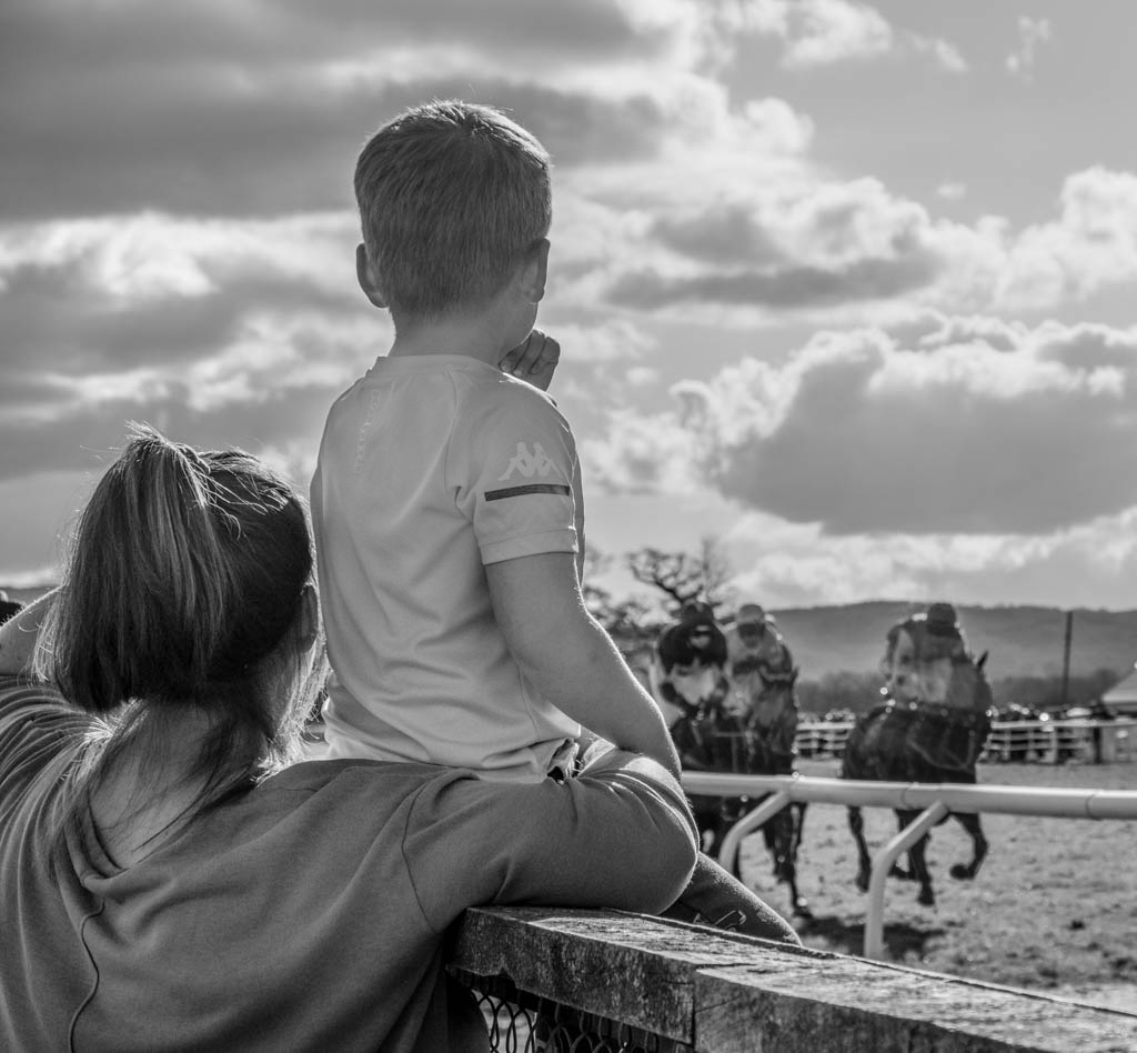
Peter, I love the image for the story it tells. I think it is an excellent composition and an ideal crop. It is my impression that the subjects are a little dark. I took your image into PS and dodged the boy and his mother. I also tried something funky that would have been much better in-camera with a slower shutter speed: I attempted (poorly!) to give the horses some motion blur to try to capture the idea of speed. Overall, a really nice capture. |
Jun 2nd |
 |
| 99 |
Jun 22 |
Comment |
Oh Barbara...Spectacular! It looks like the leaves are illuminated from inside. I'm not familiar with the "invert" function in PS - going to have to check that out. Once again you inspire me with your still life composition, lighting and editing skills. Beautiful sharp with lovely textures. Very well done! |
Jun 2nd |
| 99 |
Jun 22 |
Comment |
Photoshop version |
Jun 2nd |
 |
| 99 |
Jun 22 |
Comment |
Hi Gerard. I like industrial close-ups like this. It focuses my eye to appreciate the texture and detail of the subject. It has horizontals, verticals and a diagonal to guide me through the frame. From your image as presented, one can only imagine it is rusty. I thought some different toning might enhance the suggestion of rust. At first I just tried desaturating your original image but it didn't achieve the look I was imagining. The first version is from Silver EFEX using a copper tone. The second image is from Photoshop with the image desaturated and color toning added back in. Curious what you think. (Both of my images are cropped too tightly - so ignore the crop in favor of the toning). |
Jun 2nd |
 |
| 99 |
Jun 22 |
Reply |
Peter, thanks for your comments. Please see my replies to Randy. |
Jun 2nd |
| 99 |
Jun 22 |
Reply |
Cropped version 2 |
Jun 2nd |
 |
| 99 |
Jun 22 |
Reply |
Randy, thanks for the comments. I do think the horizon is an important part of my image, but I think you (and Peter) are correct that I could do away with some of the sky. I tried cropping out the horizon completely, but that cut off the top of the taller rock at the right of the frame. I didn't like that. Do you think this crop improves the image: |
Jun 2nd |
 |
| 99 |
Jun 22 |
Reply |
Gerard, thank you for your comments and questions. As mentioned above, the editing was difficult. Shooting conditions were less than ideal and I had to set my tripod in about an inch of water on loose rocks. Even though it was only a 30 sec exposure I think there was some very slight camera movement. If you compare the sharpness of the original and presented versions, I think you'll see the difference. In general, however, I think the wide angle + "Live View" focusing yielded the basic DOF focus. I had to sharpen the image in LR (come to think of it, I may have also used Topaz Sharpen AI, but I can't remember) and the up-res algorithm of Gigapixel adds additional sharpness. |
Jun 2nd |
6 comments - 6 replies for Group 99
|
12 comments - 15 replies Total
|


